Harvest plot
Evidence matrix bar chart
MA
One bar per study, grouped by outcome and direction of effect, with bar height and shading for study quality and design.
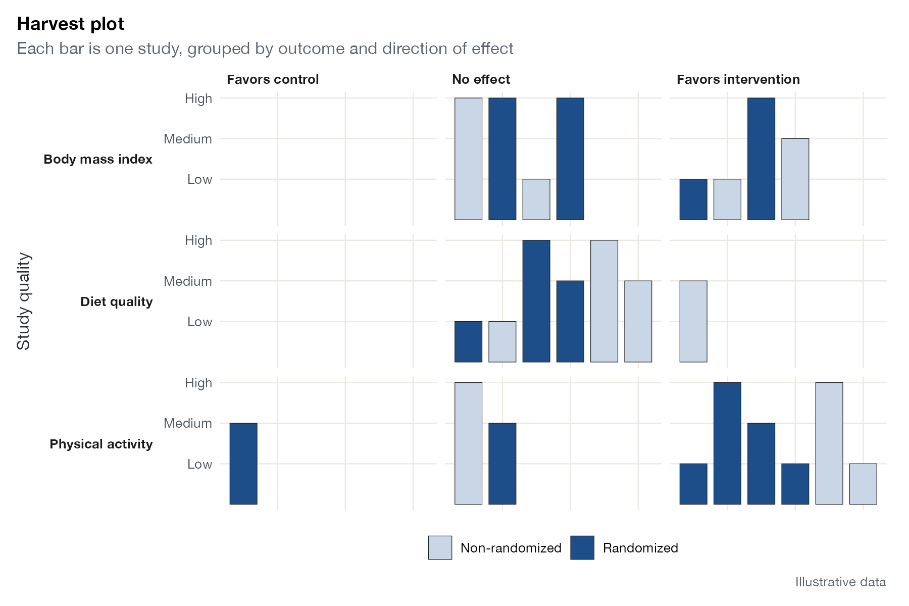
Harvest plot for three outcomes: each bar is a study, placed by the direction of its finding, with height showing study quality and shading showing design. Illustrative data.
Family
Synthesis without meta-analysis
Purpose
Display the distribution of evidence across outcomes and directions when effects cannot be pooled.
Inputs
For each study and outcome: direction of effect, quality rating, and design.
Software
Custom
ggplot2 (shown); spreadsheet tools
What it shows
Ogilvie and colleagues introduced the harvest plot to summarize complex, heterogeneous evidence, such as the effects of population-level interventions on health inequalities. Studies are sorted into a matrix of outcomes and the direction of their findings. Each study is a bar, so the matrix shows at a glance where evidence clusters, and bar height and shading add its quality and design.
How to read it
- Rows: outcomes; columns: direction of effect.
- Bars: individual studies.
- Height: study quality or risk of bias.
- Shading: design (for example randomized or not).
Interpretation
For physical activity most studies, including several randomized and higher-quality ones, favor the intervention. For diet quality most findings show no effect, and body mass index is split evenly between no effect and benefit. The single study favoring control for physical activity is a randomized study of medium quality.
Pitfalls
- Counting studies by direction (vote counting) ignores effect size and precision.
- Classification of “no effect” often depends on statistical significance, which favors large studies.
- Make the rules for categorizing direction explicit.
Code
library(ggplot2)

# Studies classified by the direction of their findings for each outcome,
# with bar height showing study quality and shading showing design.
# Illustrative data.
set.seed(12)
d <- data.frame(
  outcome = rep(c("Physical activity", "Diet quality", "Body mass index"), times = c(9, 7, 8)),
  direction = c(sample(c("Favors intervention", "No effect", "Favors control"), 9, TRUE, c(.6, .3, .1)),
                sample(c("Favors intervention", "No effect", "Favors control"), 7, TRUE, c(.4, .5, .1)),
                sample(c("Favors intervention", "No effect", "Favors control"), 8, TRUE, c(.3, .5, .2))),
  quality = sample(c(1, 2, 3), 24, TRUE),
  design = sample(c("Randomized", "Non-randomized"), 24, TRUE, c(0.6, 0.4))
)
d$id <- ave(seq_len(nrow(d)), d$outcome, d$direction, FUN = seq_along)
d$direction <- factor(d$direction, levels = c("Favors control", "No effect", "Favors intervention"))

ggplot(d, aes(id, quality, fill = design)) +
  geom_col(width = 0.8, colour = "#1b1f24", linewidth = 0.2) +
  facet_grid(outcome ~ direction, switch = "y") +
  scale_fill_manual(values = c(Randomized = "#1d4e89", `Non-randomized` = "#c9d6e6"), name = NULL) +
  scale_y_continuous(breaks = 1:3, labels = c("Low", "Medium", "High")) +
  labs(x = NULL, y = "Study quality", title = "Harvest plot",
       subtitle = "Each bar is one study, grouped by outcome and direction of effect",
       caption = "Illustrative data") +
  theme(axis.text.x = element_blank(), panel.grid = element_blank(),
        strip.placement = "outside", strip.text.y.left = element_text(angle = 0, hjust = 1))
References
- Ogilvie D, Fayter D, Petticrew M, et al. The harvest plot: a method for synthesising evidence about the differential effects of interventions. BMC Med Res Methodol. 2008;8:8. doi:10.1186/1471-2288-8-8
- Campbell M, McKenzie JE, Sowden A, et al. Synthesis without meta-analysis (SWiM) in systematic reviews: reporting guideline. BMJ. 2020;368:l6890. doi:10.1136/bmj.l6890