Radial plot
Galbraith plot
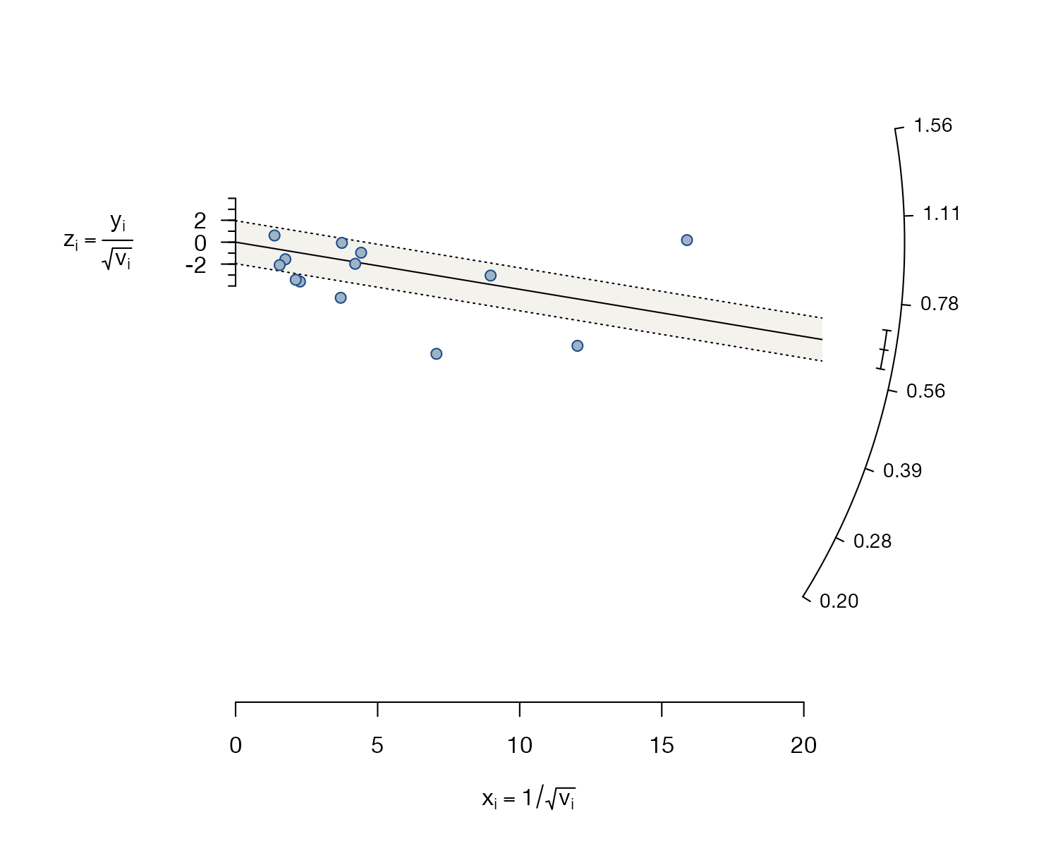
metadat::dat.bcg.
metafor::radial(), meta::radial(); Stata meta galbraithplot
What it shows
Galbraith’s radial plot puts each study at its precision \(x_i = 1/\text{SE}_i\) and its standardized effect \(z_i = y_i/\text{SE}_i\). Under a common-effect model all studies scatter around a line through the origin whose slope is the pooled estimate, with roughly 95% of them inside a band of ±2. Studies outside the band contribute disproportionately to heterogeneity. The effect of each study can be read from the angle of the line joining it to the origin, which is what the curved scale on the right shows.
How to read it
- Horizontal axis: precision, \(1/\text{SE}\). Large studies lie to the right.
- Vertical axis: the \(z\)-statistic of each study.
- Solid line through the origin: the pooled estimate (its slope).
- Shaded band: ±2 standard deviations around the line.
- Arc: effect scale; project a line from the origin through a study to read its effect.
Interpretation
The common-effect pooled risk ratio is 0.65, but many trials lie outside the ±2 band, several of them precise, and Cochran’s Q is 152 on 12 degrees of freedom. A single common effect clearly does not describe these trials, which motivates the random-effects and meta-regression analyses in the rest of this gallery.
Pitfalls
- The plot is usually drawn for a common-effect model; under a random-effects model the geometry changes and the band is harder to interpret.
- It is less intuitive than a forest plot for clinical audiences.
- Points outside the band flag studies to investigate, not studies to delete.
- A related regression of \(z_i\) on \(x_i\) is Egger’s test for small-study effects; the radial plot itself is not that test.
Code
library(metafor)

data(dat.bcg, package = "metadat")
dat <- escalc(measure = "RR", ai = tpos, bi = tneg, ci = cpos, di = cneg,
              data = dat.bcg, slab = paste(author, year))

# Common-effect model: the radial plot's slope is the pooled estimate
fit <- rma(yi, vi, data = dat, method = "EE")

radial(fit, transf = exp, pch = 21, bg = "#9fb3c8", col = "#1d4e89",
       back = "#f4f2ed", main = "")
meta esize tpos tneg cpos cneg, esize(lnrratio) common
meta galbraithplotReferences
- Galbraith RF. A note on graphical presentation of estimated odds ratios from several clinical trials. Stat Med. 1988;7:889-894. doi:10.1002/sim.4780070807
- Galbraith RF. Graphical display of estimates having differing standard errors. Technometrics. 1988;30:271-281. doi:10.1080/00401706.1988.10488400