Vitruvian plot
Multi-outcome circular bar plot
NMA
Small multiple circular bar charts, one per treatment, showing absolute outcome rates colored by evidence against the reference.
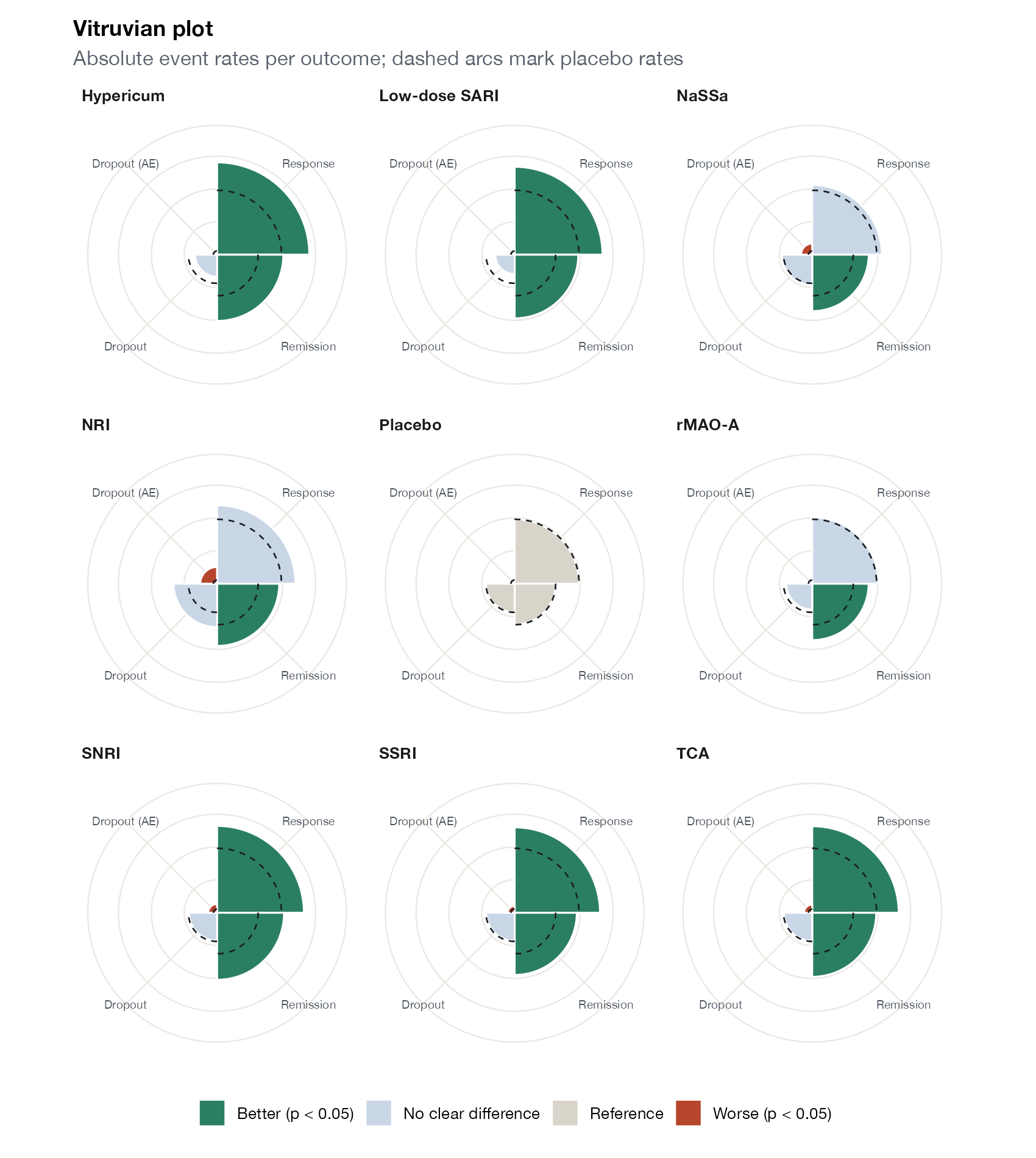
Vitruvian-style plot for the antidepressant network: for each treatment, sector length is the absolute event rate for each of four outcomes, colored by whether the treatment is better, worse, or not clearly different from placebo (p < 0.05); dashed arcs mark placebo rates. Custom implementation. Data:
netmeta::Linde2015.
Family
Treatment ranking
Purpose
Give a treatment-by-treatment visual summary of benefits and harms on the absolute scale.
Inputs
Absolute outcome rates per treatment and outcome, and a reference treatment.
Software
Custom
ggplot2 (shown); original R code from the authors
What it shows
Ostinelli and colleagues proposed the Vitruvian plot to communicate NMA results for several outcomes to clinicians and patients. Each treatment gets its own circular chart; each outcome is a sector whose length shows the absolute rate on that treatment, and whose color shows the strength of evidence compared with a reference such as placebo. The design emphasizes absolute effects and makes each treatment’s profile recognizable at a glance.
How to read it
- One chart per treatment.
- Sectors: outcomes; length is the absolute event rate.
- Colors: better, worse, or not clearly different from the reference.
- Dashed arcs: reference (placebo) rates for comparison.
Interpretation
TCA, SSRI, and SNRI charts are green for response and remission and red for dropout due to adverse events. Hypericum and low-dose SARI are green for efficacy without red sectors. NRI shows a red adverse-event dropout sector with no clear benefit on response.
Pitfalls
- Circular sectors distort perception of length and area.
- Categorizing evidence by < 0.05$ discards information; consider graded colors.
- The absolute rates depend on the assumed baseline risk.
Code
library(netmeta)

# Antidepressants in primary care (Linde et al. 2015): arm-level binary outcomes
data(Linde2015)
d <- Linde2015
nma_for <- function(v, small) {
  p <- pairwise(treat = list(d$treatment1, d$treatment2, d$treatment3),
                event = list(d[[paste0(v, 1)]], d[[paste0(v, 2)]], d[[paste0(v, 3)]]),
                n = list(d$n1, d$n2, d$n3), studlab = d$id, sm = "OR", allstudies = TRUE)
  netmeta(p, common = FALSE, reference.group = "Placebo", small.values = small)
}
library(ggplot2)

outs <- list(Response = list(v = "resp", small = "undesirable", good = "high"),
             Remission = list(v = "remi", small = "undesirable", good = "high"),
             Dropout = list(v = "loss", small = "desirable", good = "low"),
             `Dropout (AE)` = list(v = "loss.ae", small = "desirable", good = "low"))

# Absolute event rates on each treatment (from the NMA and the median placebo
# risk), colored by the strength of evidence against placebo
bars <- do.call(rbind, lapply(names(outs), function(o) {
  s <- outs[[o]]
  net <- nma_for(s$v, s$small)
  pl <- c(d[[paste0(s$v, 1)]][d$treatment1 == "Placebo"] / d$n1[d$treatment1 == "Placebo"],
          d[[paste0(s$v, 2)]][d$treatment2 == "Placebo"] / d$n2[d$treatment2 == "Placebo"],
          d[[paste0(s$v, 3)]][d$treatment3 %in% "Placebo"] / d$n3[d$treatment3 %in% "Placebo"])
  p0 <- median(pl, na.rm = TRUE)
  lor <- net$TE.random[, "Placebo"]; se <- net$seTE.random[, "Placebo"]
  p <- 2 * pnorm(-abs(lor / se))
  better <- if (s$good == "high") lor > 0 else lor < 0
  data.frame(outcome = o, treatment = names(lor), rate = plogis(qlogis(p0) + lor), p0 = p0,
             evidence = ifelse(names(lor) == "Placebo", "Reference",
                        ifelse(p < 0.05, ifelse(better, "Better (p < 0.05)", "Worse (p < 0.05)"),
                               "No clear difference")))
}))
bars$outcome <- factor(bars$outcome, levels = names(outs))

ggplot(bars, aes(outcome, rate, fill = evidence)) +
  geom_col(width = 1, colour = "white") +
  geom_errorbar(aes(ymin = p0, ymax = p0), width = 1, colour = "#1b1f24", linetype = "dashed",
                linewidth = 0.4) +
  coord_polar() +
  facet_wrap(~ treatment, ncol = 3) +
  scale_y_continuous(labels = scales::percent, limits = c(0, 0.7)) +
  scale_fill_manual(values = c("Better (p < 0.05)" = "#2a7f62", "No clear difference" = "#c9d6e6",
                               "Worse (p < 0.05)" = "#b5452b", "Reference" = "#d9d4ca"), name = NULL) +
  labs(x = NULL, y = NULL, title = "Vitruvian plot",
       subtitle = "Absolute event rates per outcome; dashed arcs mark placebo rates") +
  theme(axis.text.y = element_blank(), axis.text.x = element_text(size = 7),
        panel.grid.major = element_line(colour = "#ebe8e2"), legend.position = "bottom")
References
- Ostinelli EG, Efthimiou O, Naci H, et al. Vitruvian plot: a visualisation tool for multiple outcomes in network meta-analysis. Evid Based Ment Health. 2022;25:e65-e70. doi:10.1136/ebmental-2022-300457