Rank-heat plot
Circular multi-outcome ranking plot
netmeta::Linde2015.
ggplot2 with coord_polar() (shown); original Excel macro by the authors
What it shows
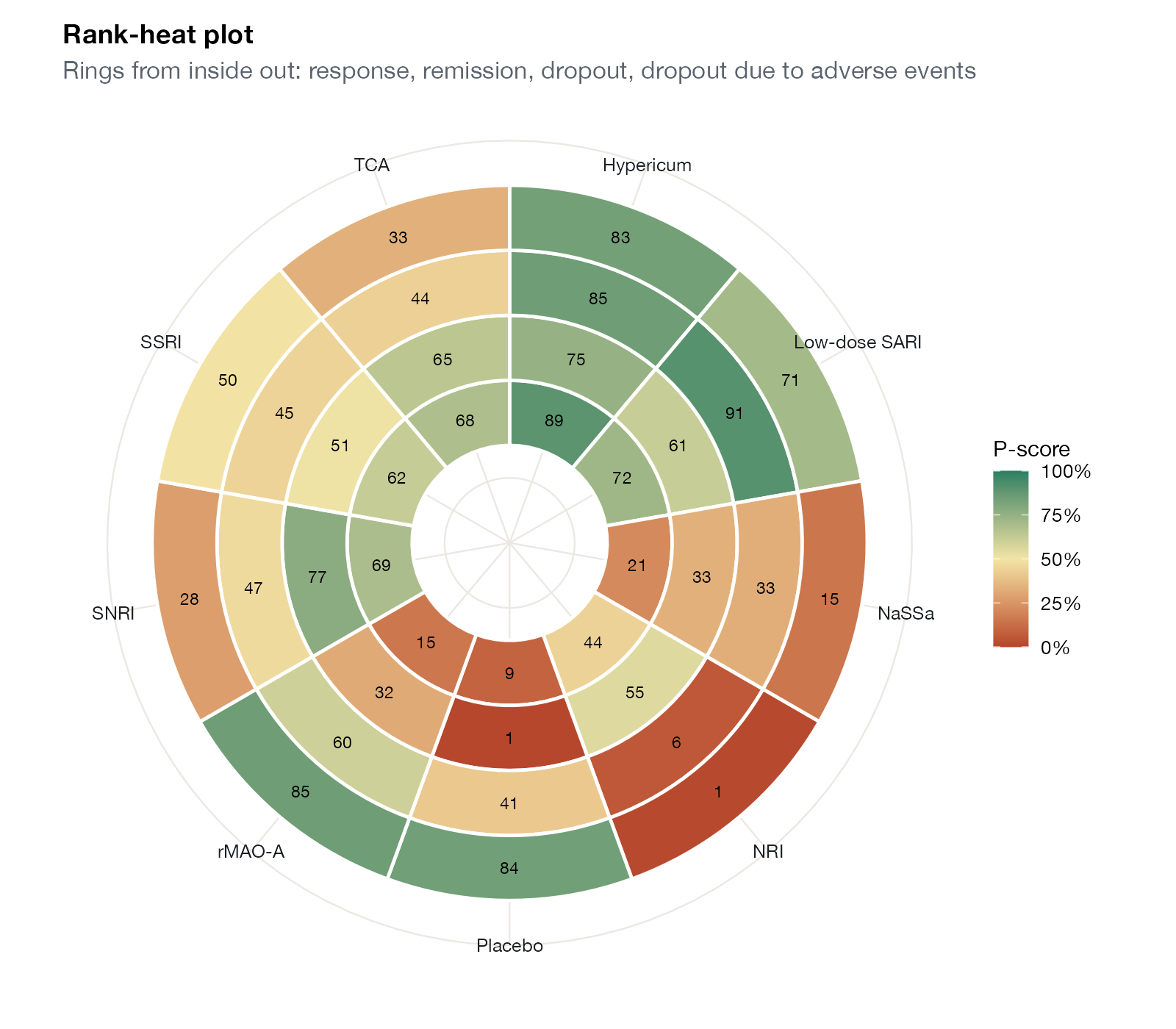
Veroniki and colleagues proposed the rank-heat plot for NMAs with many outcomes. Each outcome is a ring and each treatment a sector of the circle; the cell where they meet is colored by the treatment’s SUCRA or P-score for that outcome, from red (low) through yellow to green (high). A treatment that performs well across outcomes appears as a green wedge from center to edge.
How to read it
- Rings: outcomes, here from the center outward: response, remission, dropout, dropout due to adverse events.
- Sectors: treatments.
- Color and number: ranking score.
Interpretation
Hypericum’s and low-dose SARI’s wedges are green across all four rings. NRI’s wedge is yellow for the efficacy rings and red for both dropout rings. Placebo is red for efficacy but green for dropout due to adverse events, where it naturally does well. The display compresses 36 numbers into a single pattern, at the cost of hiding effect sizes and uncertainty.
Pitfalls
- Ranking scores for different outcomes are not comparable in clinical importance.
- Circular layouts distort area; outer rings look larger than inner ones.
- The plot shows rankings only; it must be accompanied by effect estimates.
Code
library(netmeta)

# Antidepressants in primary care (Linde et al. 2015): arm-level binary outcomes
data(Linde2015)
d <- Linde2015
nma_for <- function(v, small) {
  p <- pairwise(treat = list(d$treatment1, d$treatment2, d$treatment3),
                event = list(d[[paste0(v, 1)]], d[[paste0(v, 2)]], d[[paste0(v, 3)]]),
                n = list(d$n1, d$n2, d$n3), studlab = d$id, sm = "OR", allstudies = TRUE)
  netmeta(p, common = FALSE, reference.group = "Placebo", small.values = small)
}
library(ggplot2)

outcomes <- list(Response = nma_for("resp", "undesirable"),
                 Remission = nma_for("remi", "undesirable"),
                 Dropout = nma_for("loss", "desirable"),
                 `Dropout (AE)` = nma_for("loss.ae", "desirable"))

# P-score of each treatment for each outcome
ps <- do.call(rbind, lapply(names(outcomes), function(o) {
  r <- netrank(outcomes[[o]])$ranking.random
  data.frame(outcome = o, treatment = names(r), pscore = as.numeric(r))
}))
ps$ring <- as.numeric(factor(ps$outcome, levels = names(outcomes))) + 1
ps$treatment <- factor(ps$treatment)

# Veroniki rank-heat plot: one ring per outcome, one sector per treatment
ggplot(ps, aes(x = treatment, y = ring, fill = pscore)) +
  geom_tile(colour = "white", linewidth = 0.8, height = 1) +
  geom_text(aes(label = round(100 * pscore)), size = 3) +
  coord_polar(start = 0) +
  scale_y_continuous(limits = c(0, 5.5)) +
  scale_fill_gradientn(colours = c("#b5452b", "#f2e4a6", "#2a7f62"), limits = c(0, 1),
                       labels = scales::percent, name = "P-score") +
  labs(x = NULL, y = NULL, title = "Rank-heat plot",
       subtitle = "Rings from inside out: response, remission, dropout, dropout due to adverse events") +
  theme(axis.text.y = element_blank(), panel.grid = element_blank(),
        axis.text.x = element_text(size = 9, colour = "#1b1f24"), legend.position = "right")
References
- Veroniki AA, Straus SE, Fyraridis A, Tricco AC. The rank-heat plot is a novel way to present the results from a network meta-analysis including multiple outcomes. J Clin Epidemiol. 2016;76:193-199. doi:10.1016/j.jclinepi.2016.02.016