Nested loop plot
Nested loop display of simulation results
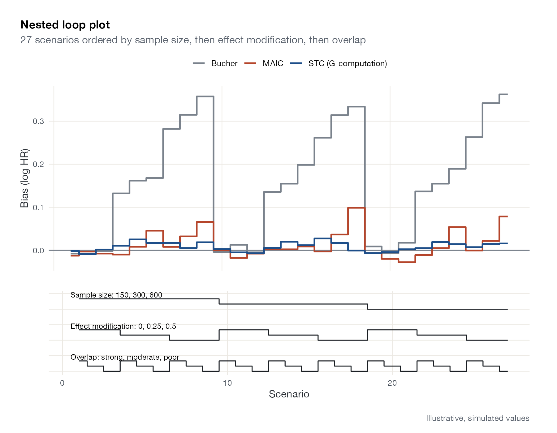
looplot (GitHub), custom ggplot2 (shown)
What it shows
Simulation studies of meta-analysis and indirect comparison methods often cross several factors, producing dozens or hundreds of scenarios. Rücker and Schwarzer’s nested loop plot orders the scenarios lexicographically by the factors, like nested loops in a program, and draws each method’s performance as a step line along that order. Step lines underneath show each factor’s level, so patterns can be traced back to the factors that cause them. Remiro-Azócar and colleagues used this layout for their MAIC and STC simulations.
How to read it
- Horizontal axis: scenario number, ordered by the outermost factor first.
- Main panel: performance (here bias) for each method.
- Lower panel: the level of each factor, outermost at the top.
- Repeating patterns: effects of inner factors; blocks: effects of outer factors.
Interpretation
Bucher’s bias grows with the strength of effect modification within every block of sample sizes, because it ignores the imbalance. MAIC’s bias is small but rises when overlap is poor and effect modification strong. STC (G-computation) stays close to zero throughout. Sample size, the outermost loop, barely changes bias, as expected.
Pitfalls
- The ordering of factors changes the visual impression; put the most important factor outermost.
- Without the lower panel, the plot is hard to decode; always include it.
- Monte Carlo error is not shown in a basic nested loop plot.
Code
library(ggplot2)
library(patchwork)

# Illustrative simulation results: bias of three population-adjustment
# methods across a 3 x 3 x 3 factorial design
grid <- expand.grid(overlap = c("Strong", "Moderate", "Poor"),
                    em = c(0, 0.25, 0.5),
                    n = c(150, 300, 600))
grid$scenario <- seq_len(nrow(grid))
o <- as.numeric(grid$overlap)
set.seed(9)
res <- rbind(
  data.frame(grid, method = "Bucher", bias = 0.45 * grid$em * (1 + 0.2 * o) + rnorm(27, 0, 0.01)),
  data.frame(grid, method = "MAIC", bias = 0.02 * o^2 * grid$em - 0.004 * o + rnorm(27, 0, 0.012)),
  data.frame(grid, method = "STC (G-computation)", bias = 0.03 * grid$em + rnorm(27, 0, 0.008))
)

top <- ggplot(res, aes(scenario, bias, colour = method)) +
  geom_hline(yintercept = 0, colour = "#7a828c") +
  geom_step(linewidth = 0.9, direction = "mid") +
  scale_colour_manual(values = c("#7a828c", "#b5452b", "#1d4e89"), name = NULL) +
  labs(x = NULL, y = "Bias (log HR)", title = "Nested loop plot",
       subtitle = "27 scenarios ordered by sample size, then effect modification, then overlap") +
  theme(axis.text.x = element_blank(), legend.position = "top")

# Step lines below show the level of each factor in each scenario
steps <- rbind(
  data.frame(scenario = grid$scenario, y = -1 - as.numeric(factor(grid$n)) / 3, factor = "Sample size: 150, 300, 600"),
  data.frame(scenario = grid$scenario, y = -3 - as.numeric(factor(grid$em)) / 3, factor = "Effect modification: 0, 0.25, 0.5"),
  data.frame(scenario = grid$scenario, y = -5 - o / 3, factor = "Overlap: strong, moderate, poor")
)
bottom <- ggplot(steps, aes(scenario, y, group = factor)) +
  geom_step(direction = "mid", colour = "#1b1f24") +
  geom_text(data = aggregate(y ~ factor, steps, max), aes(x = 0.5, y = y + 0.25, label = factor),
            hjust = 0, size = 3.1, inherit.aes = FALSE) +
  labs(x = "Scenario", y = NULL) +
  theme(axis.text.y = element_blank(), panel.grid = element_blank())

top / bottom + plot_layout(heights = c(2.2, 1)) +
  plot_annotation(caption = "Illustrative, simulated values")
References
- Rücker G, Schwarzer G. Presenting simulation results in a nested loop plot. BMC Med Res Methodol. 2014;14:129. doi:10.1186/1471-2288-14-129
- Remiro-Azócar A, Heath A, Baio G. Methods for population adjustment with limited access to individual patient data: a review and simulation study. Res Synth Methods. 2021;12:750-775. doi:10.1002/jrsm.1511