The graphics of meta-analysis and indirect comparison
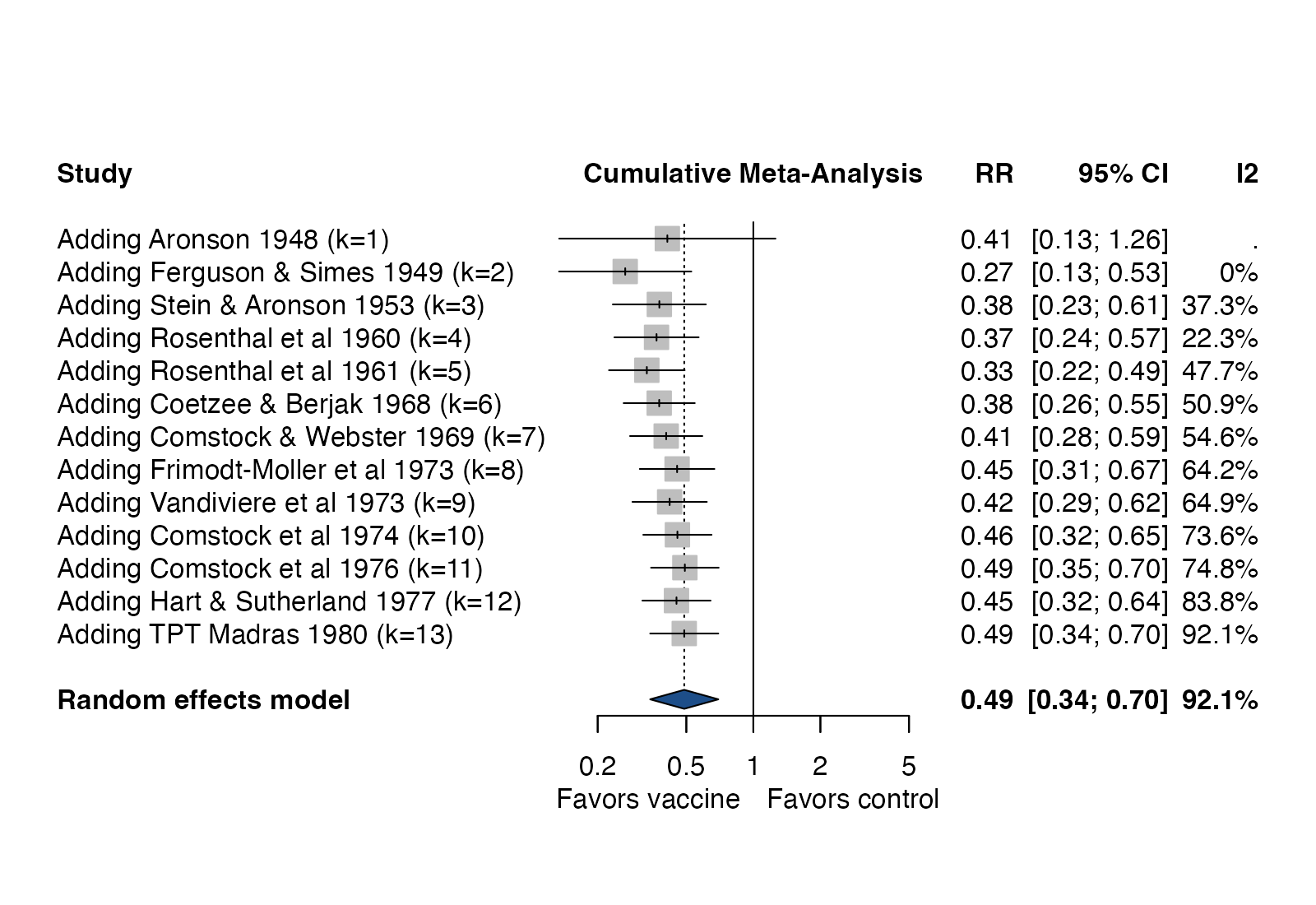
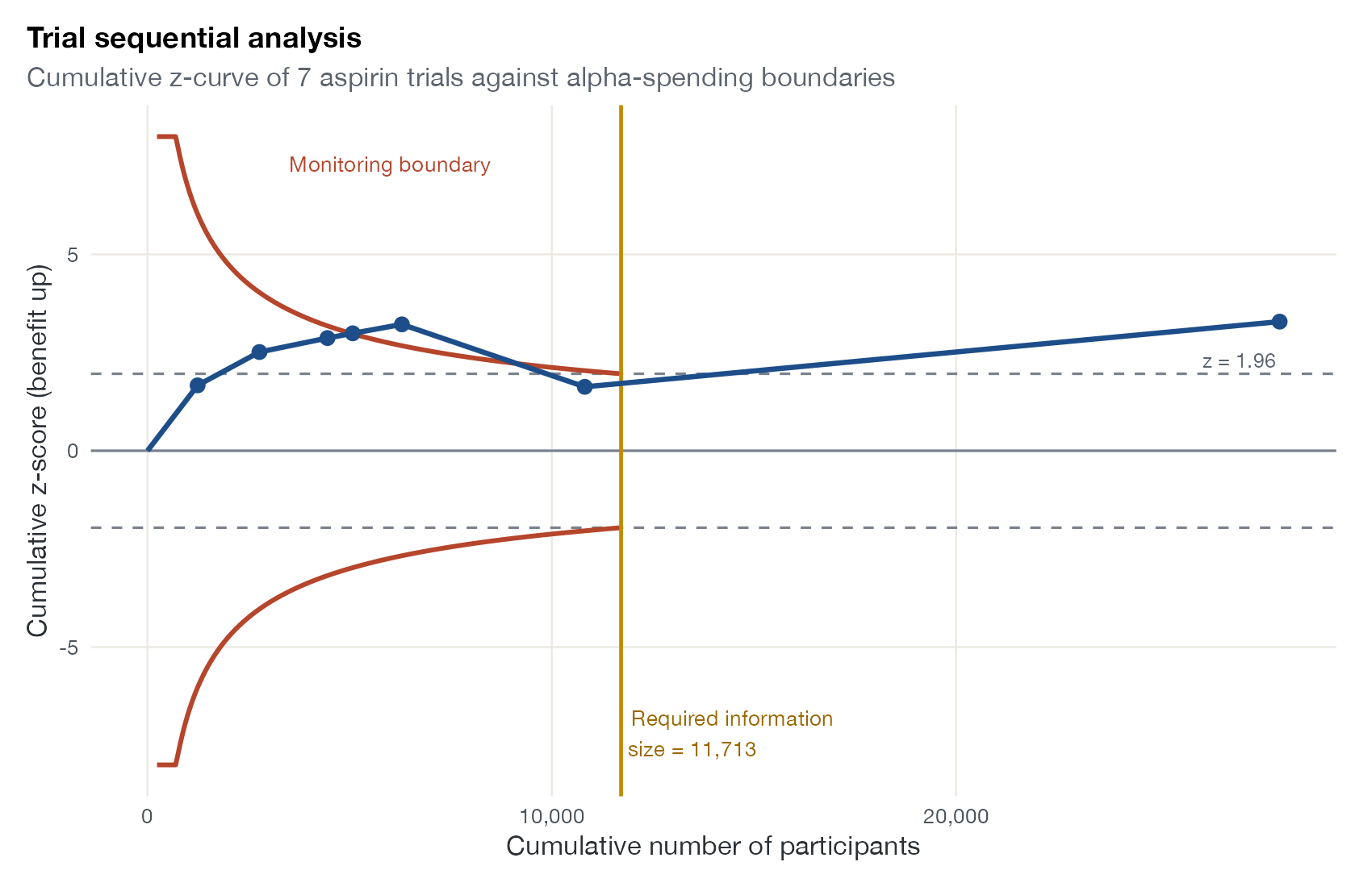
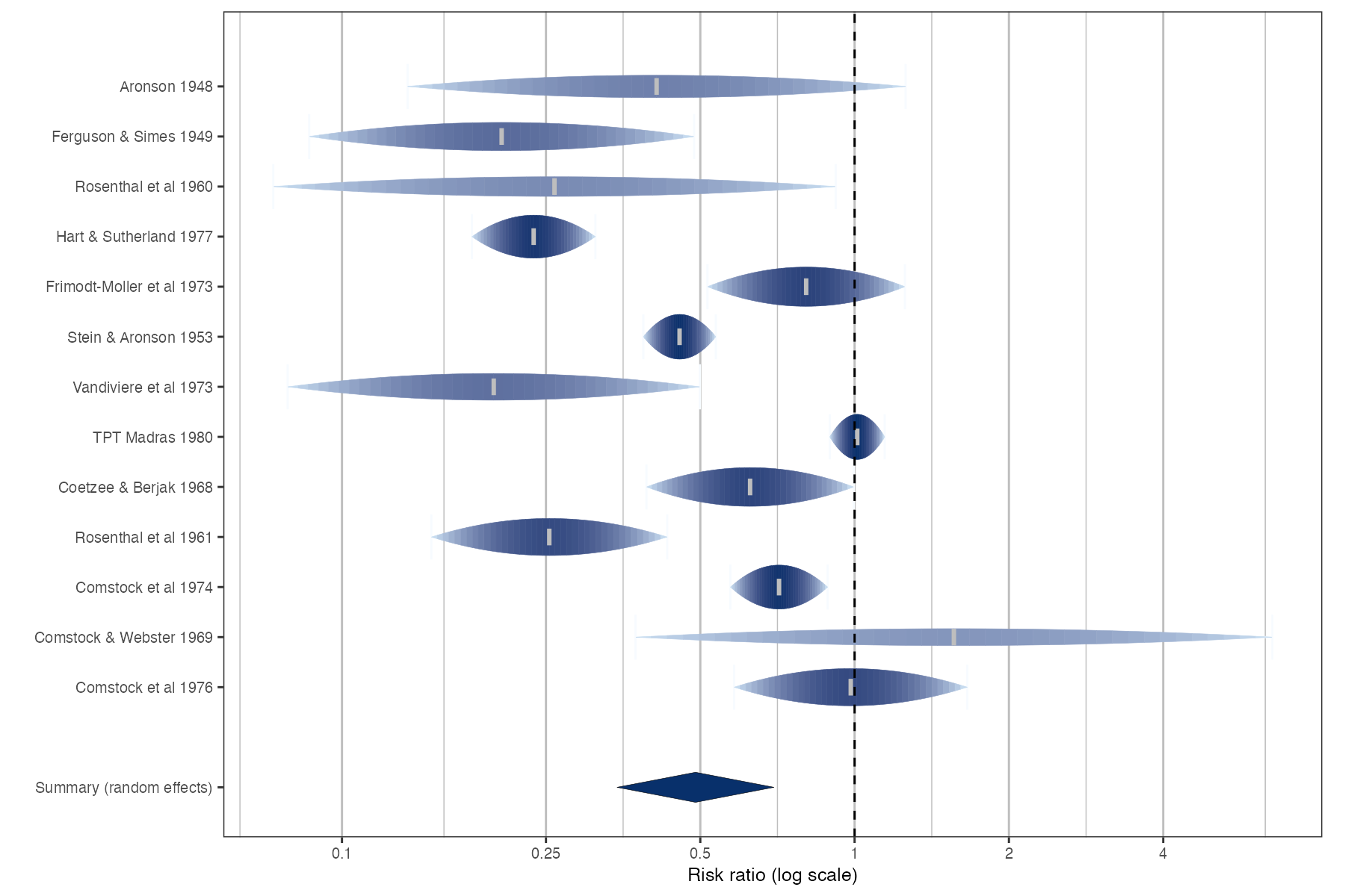
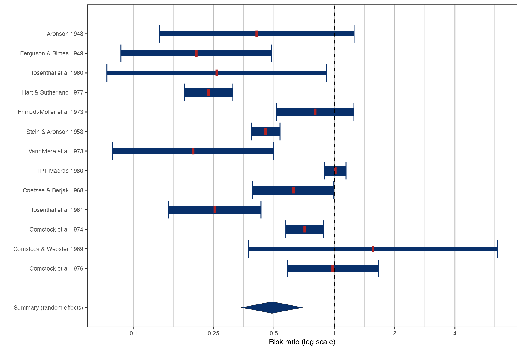
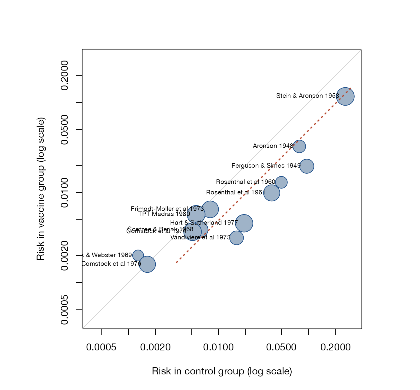
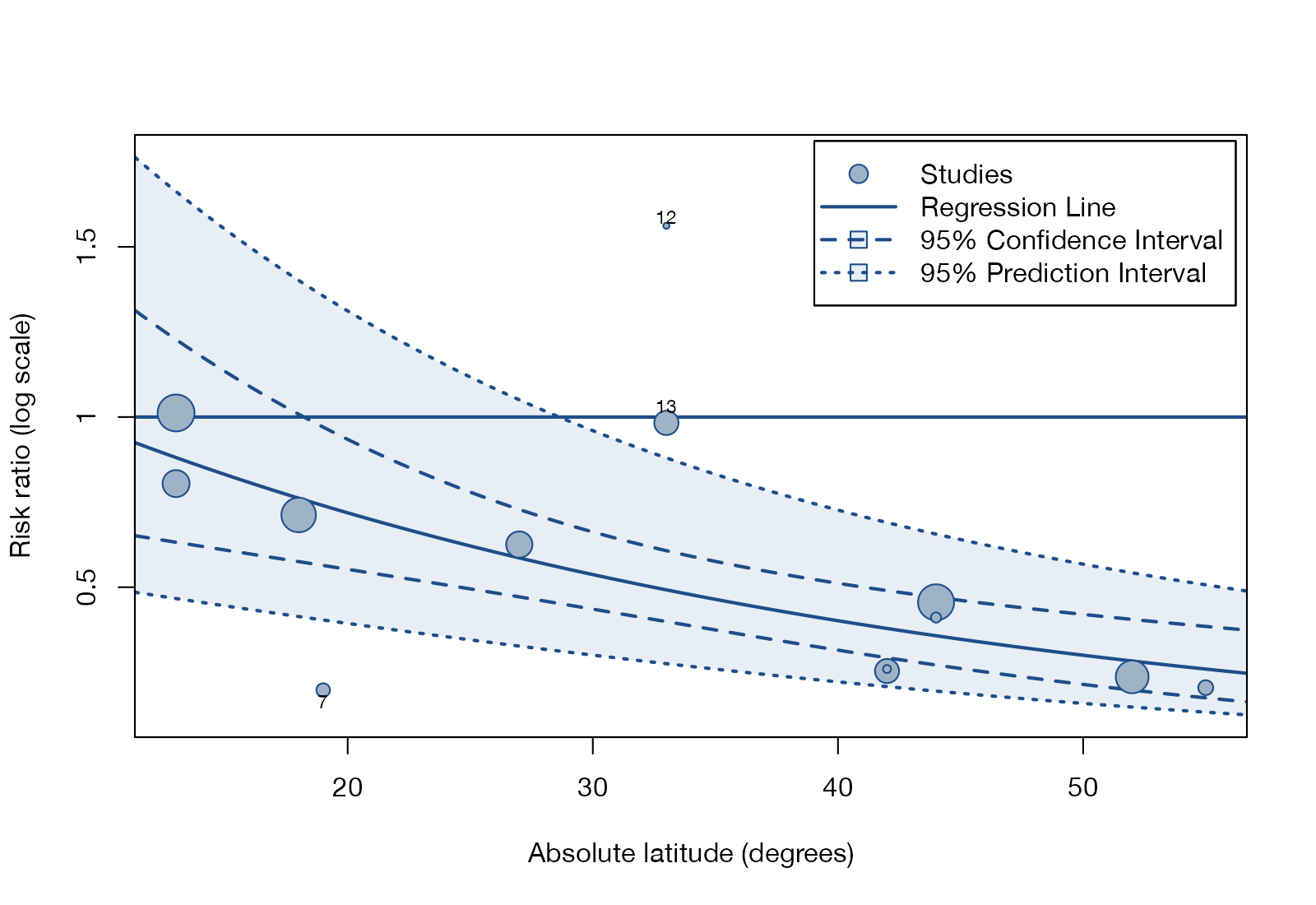
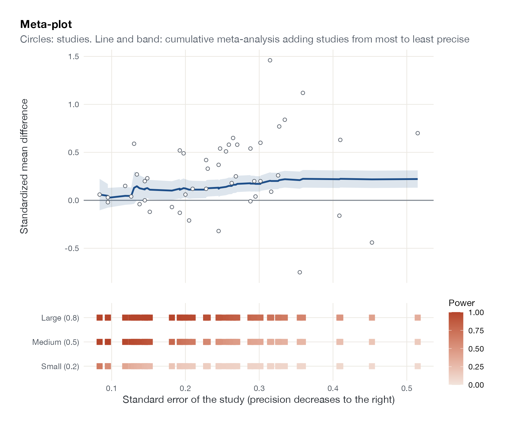
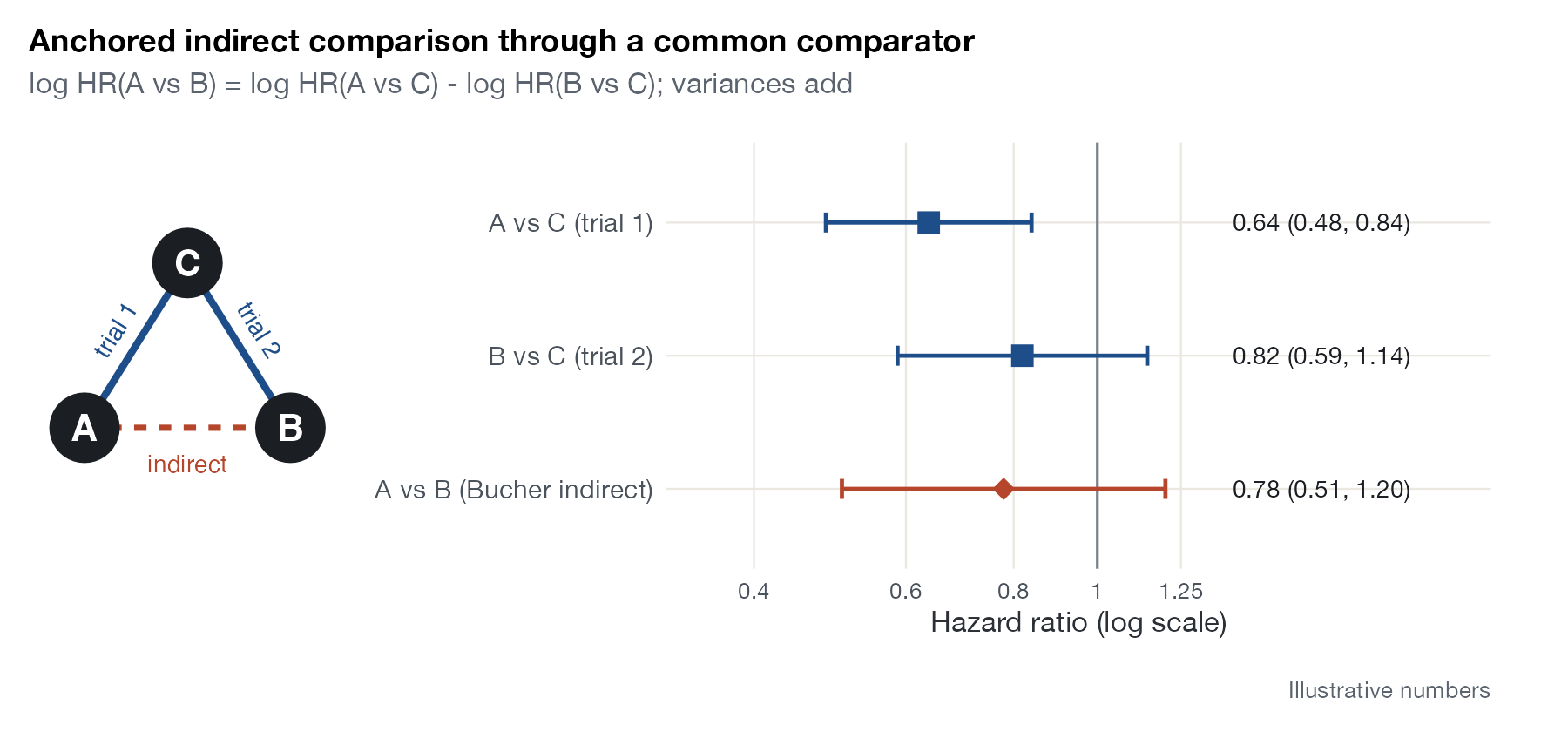
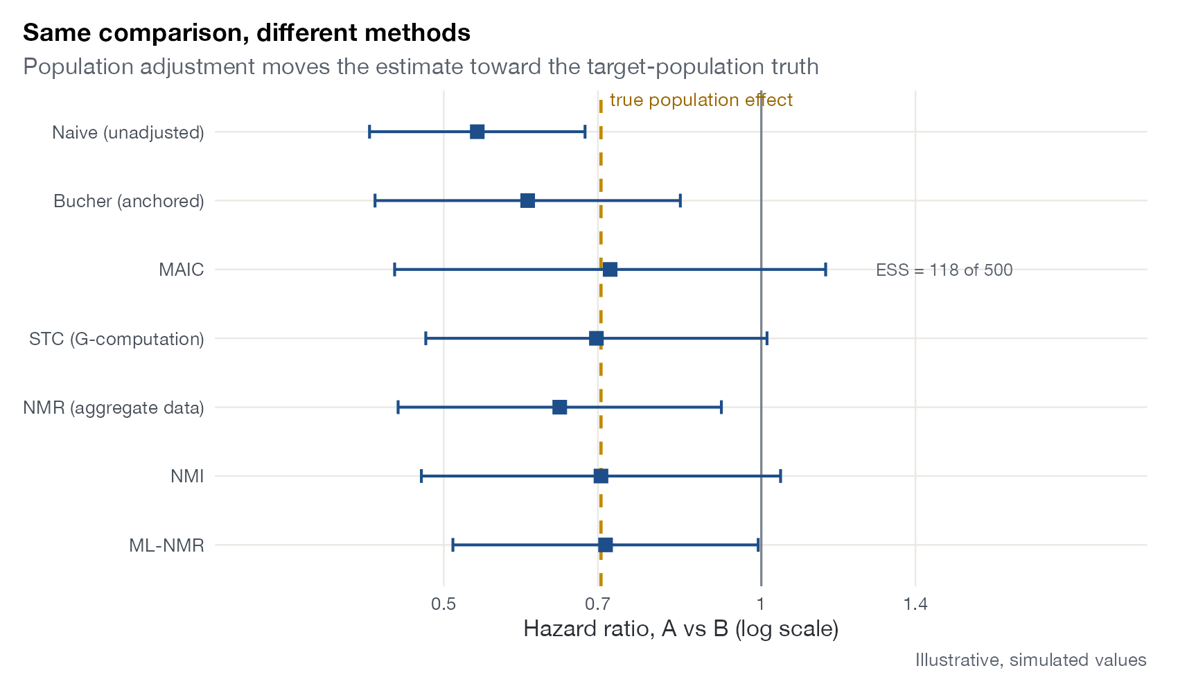
MetaPlots catalogs the plots used or proposed for pairwise meta-analysis, network meta-analysis, and population-adjusted indirect treatment comparisons, from the forest plot to diagnostics for MAIC, STC, ML-NMR, NMI, and ML-UMR. Every entry pairs a figure rendered from real R code with how to read it and how it is misread.
Effect display
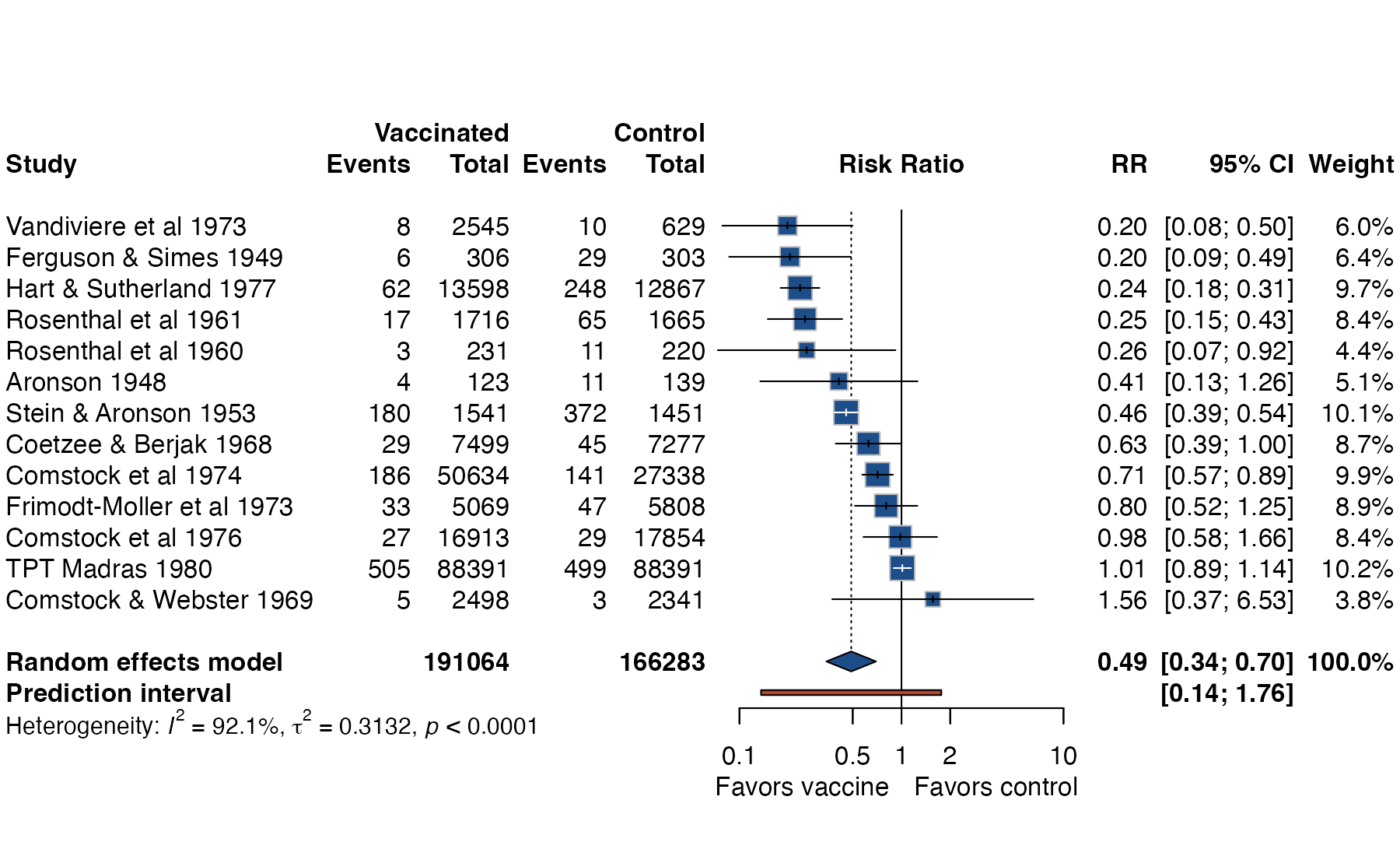
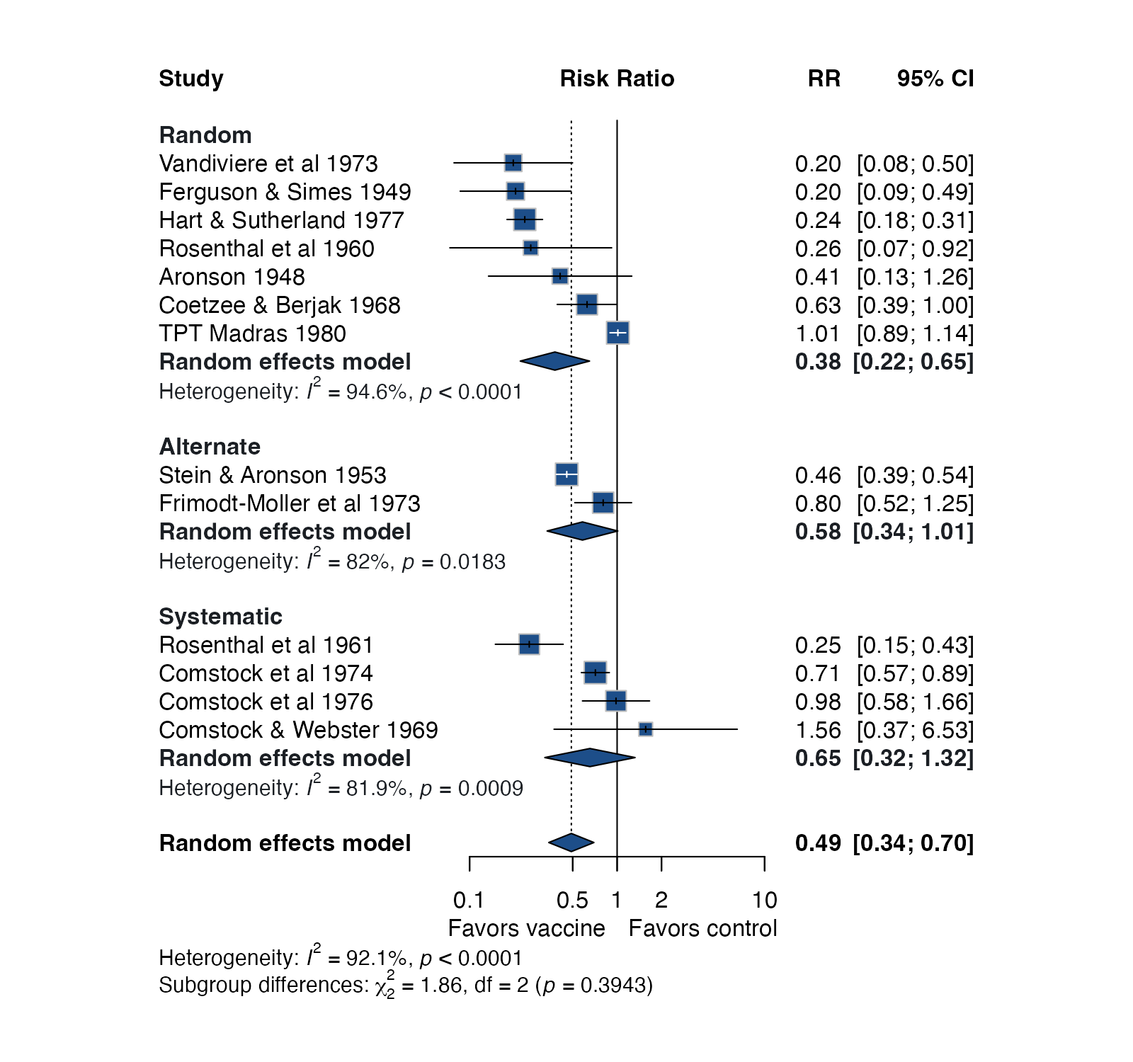
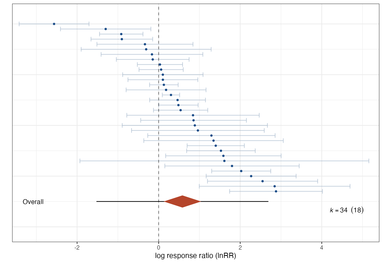
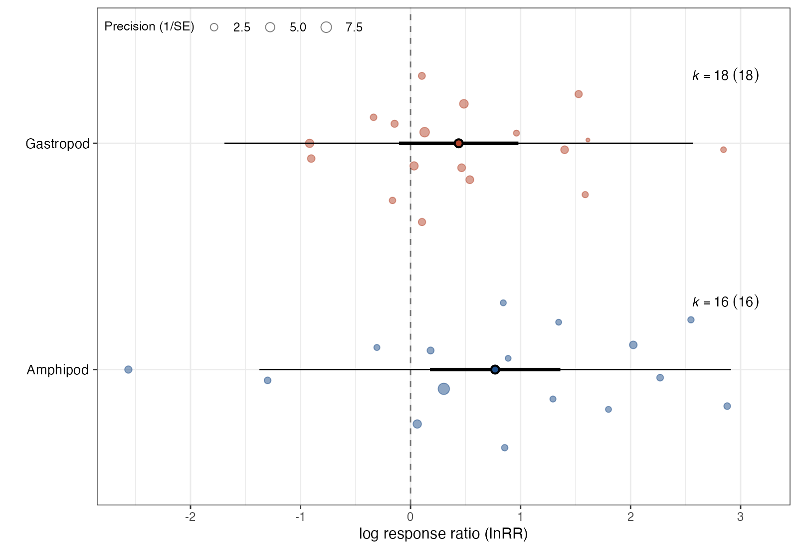
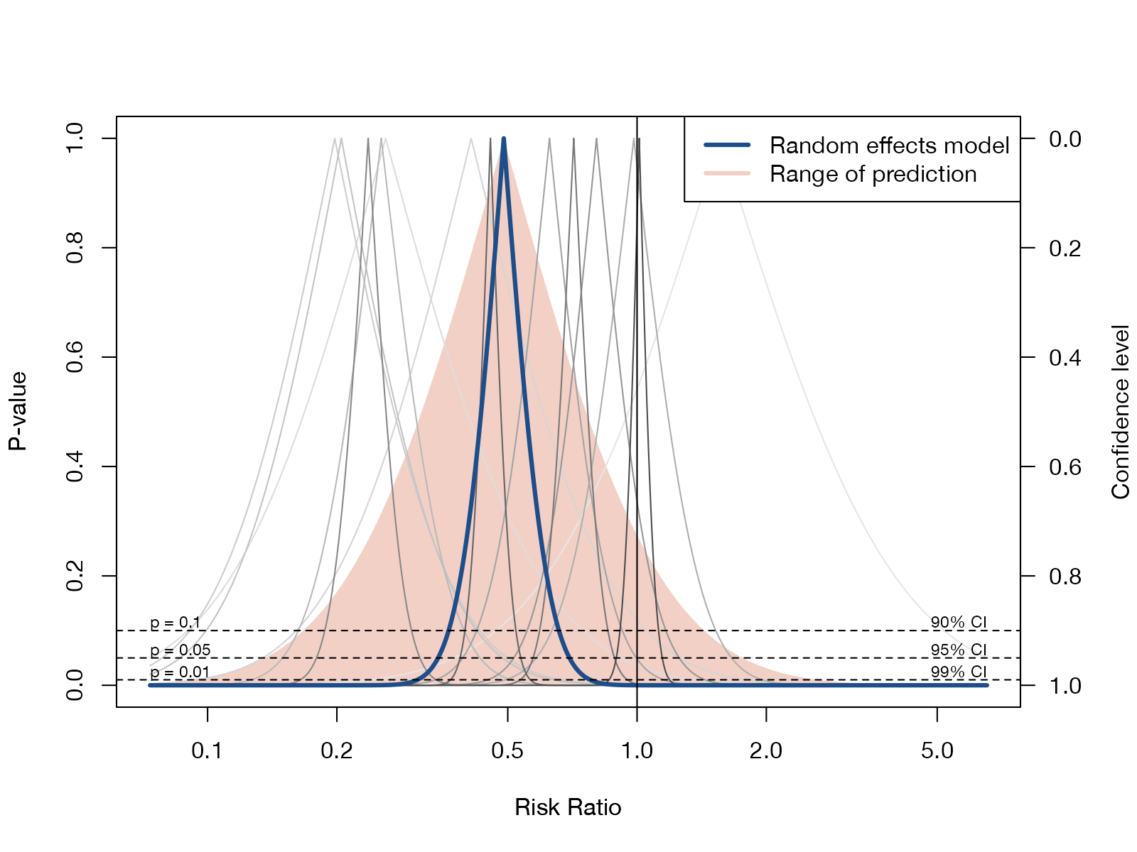
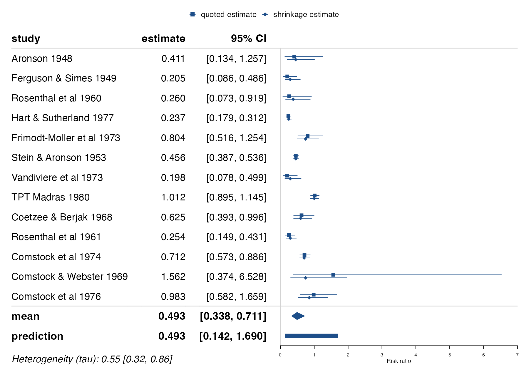
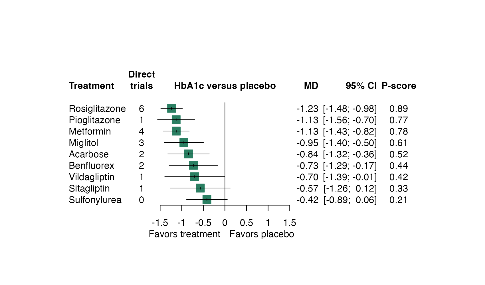
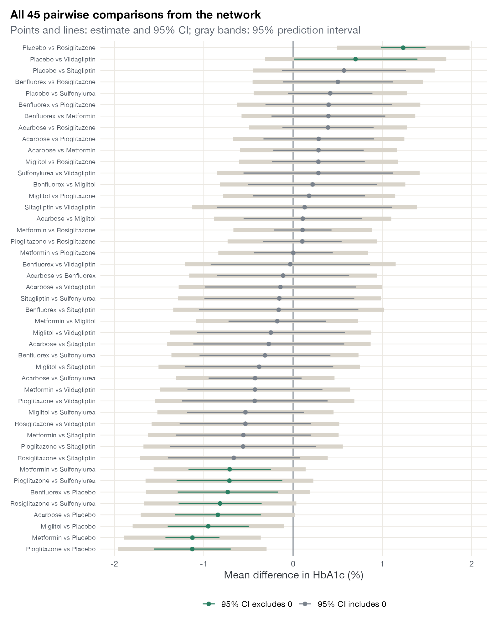
Estimates, intervals, and pooled summaries: the forest plot and its many descendants.

Heterogeneity and influence
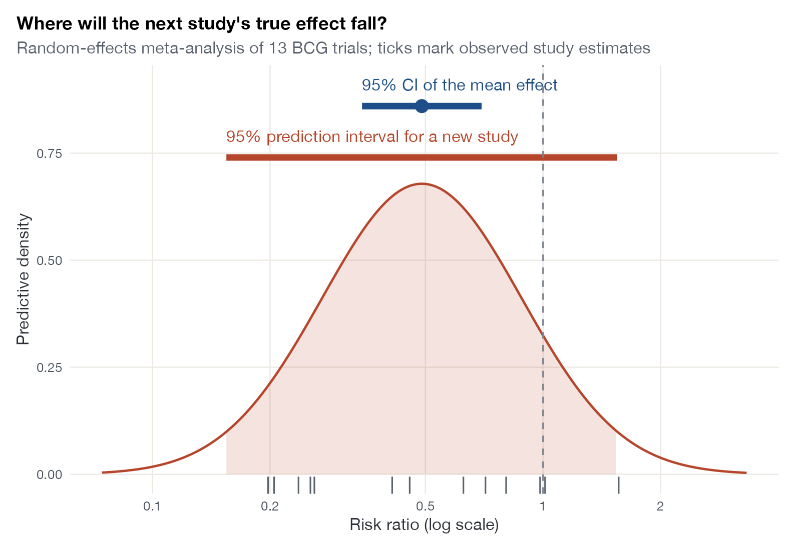
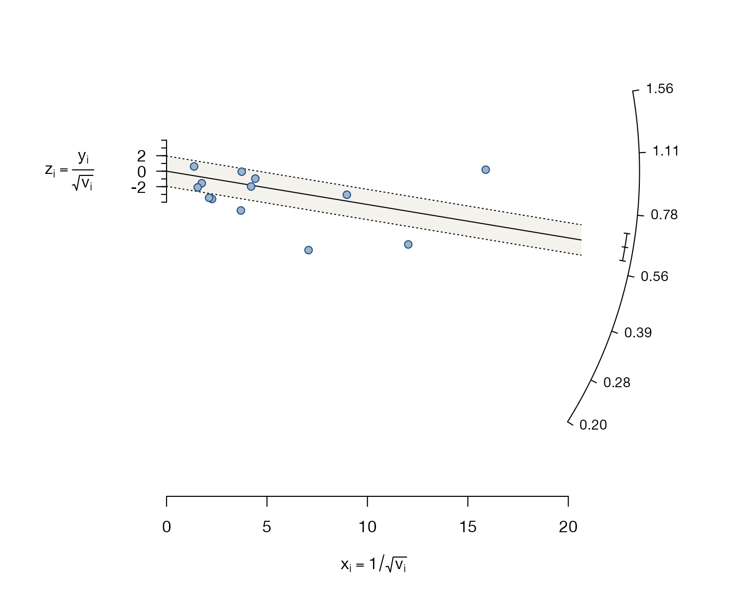
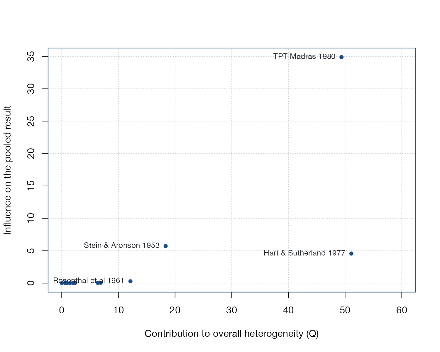
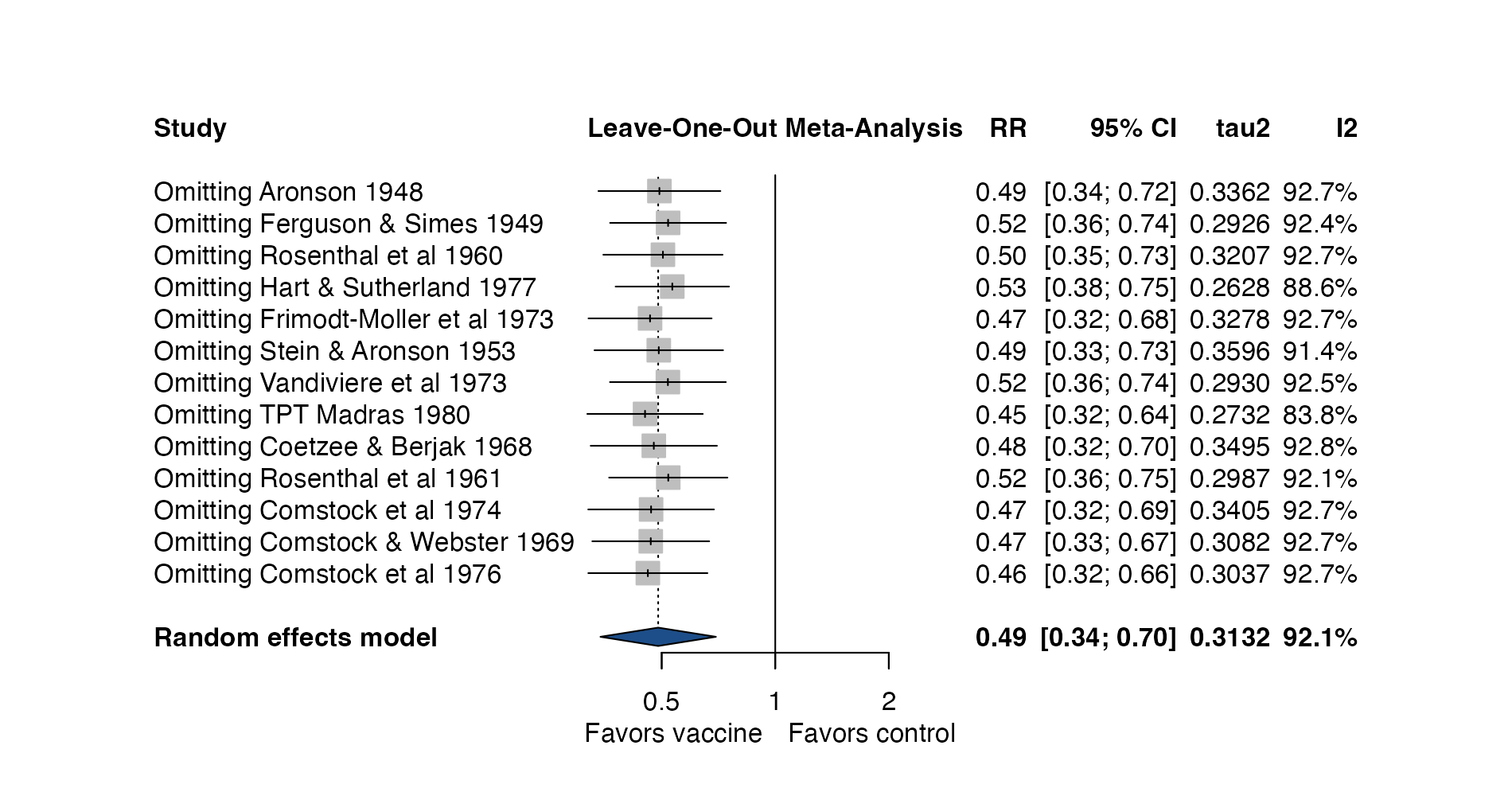
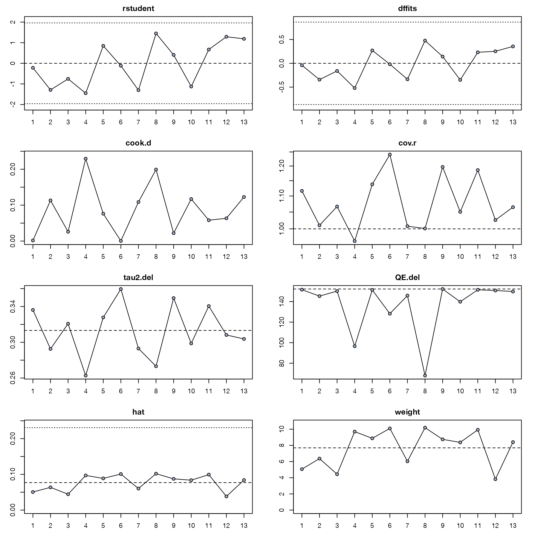
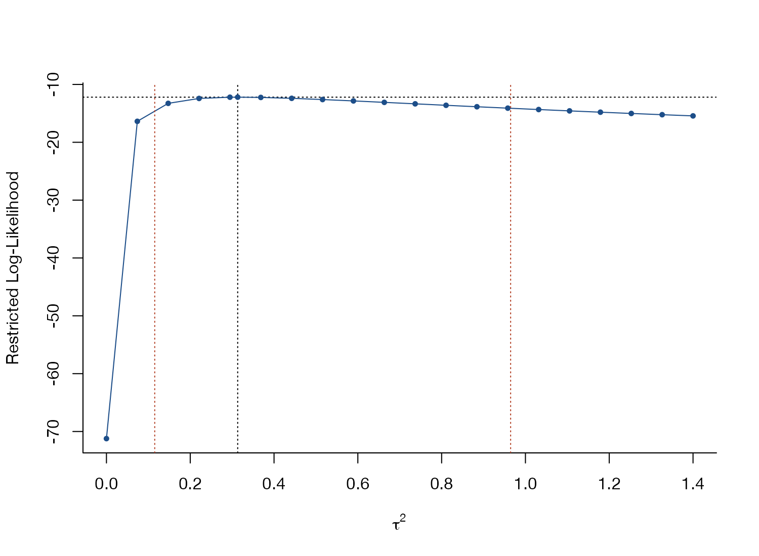
Where between-study variation comes from, and which studies move the pooled result.

Small-study effects and reporting bias
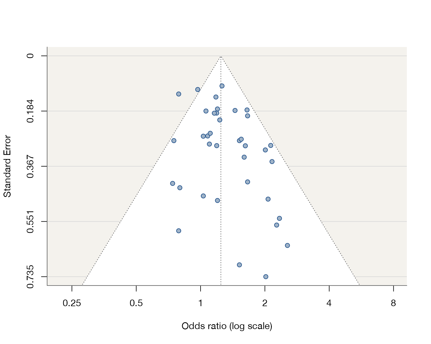
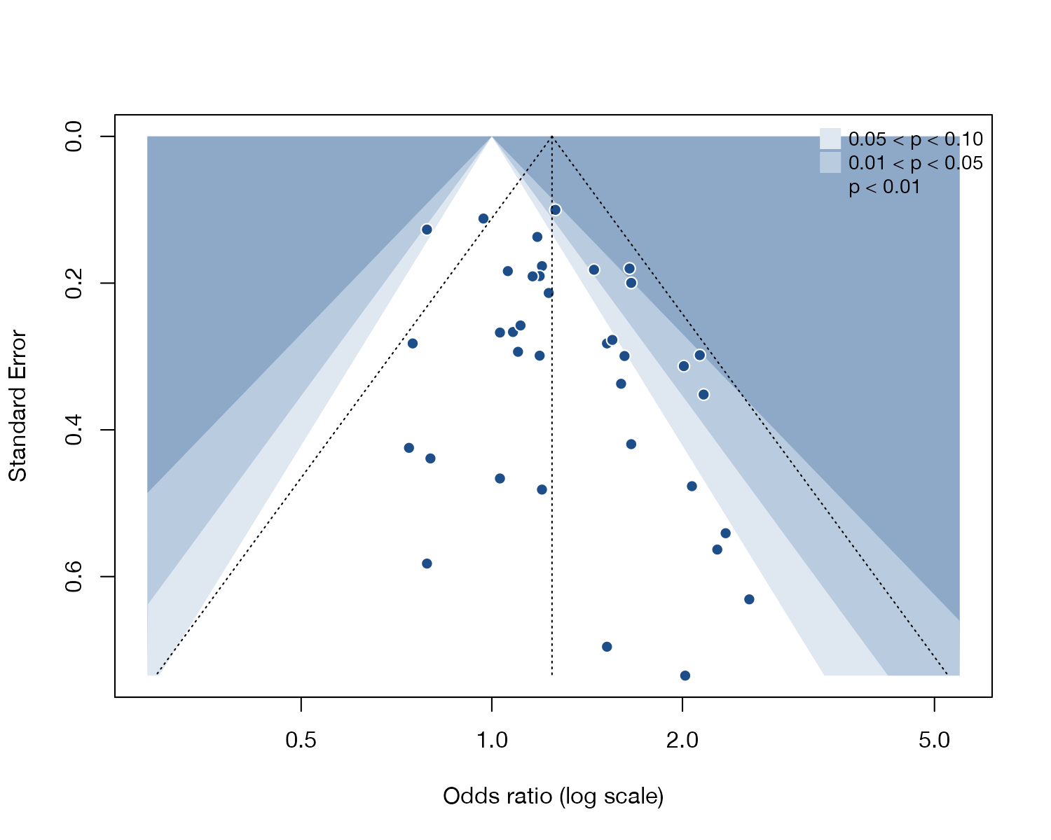
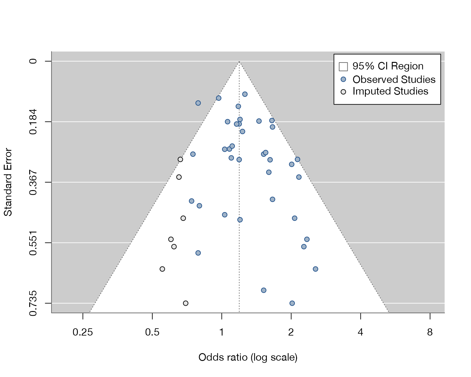
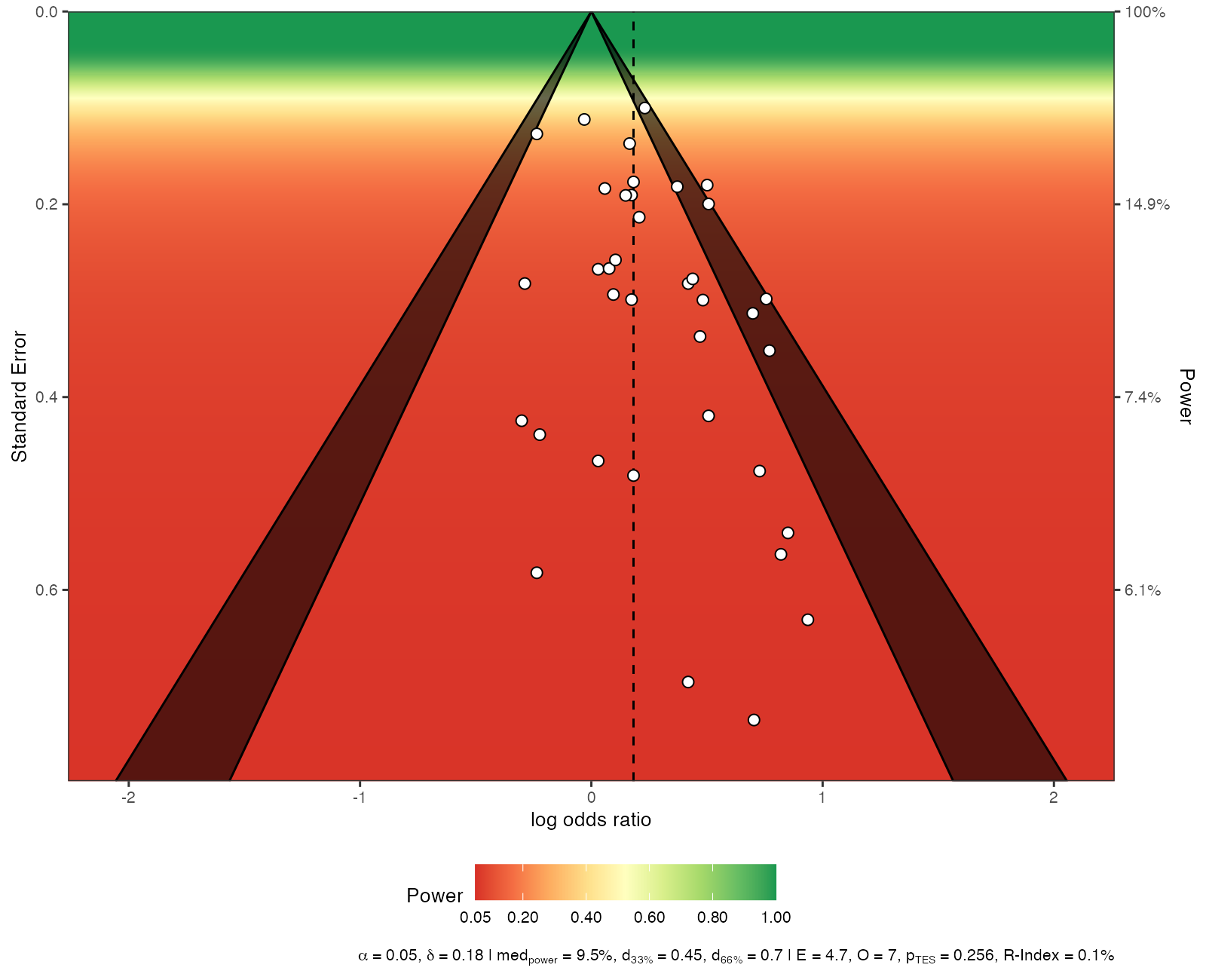
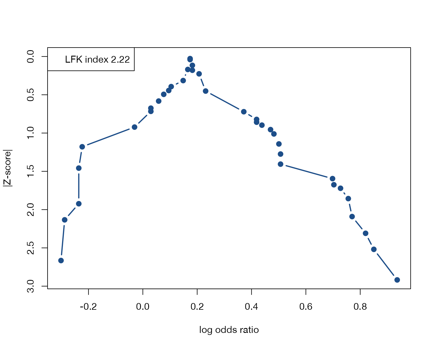
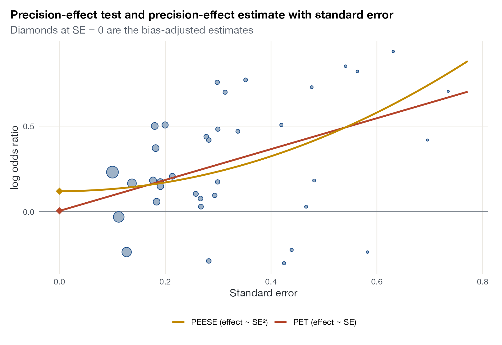
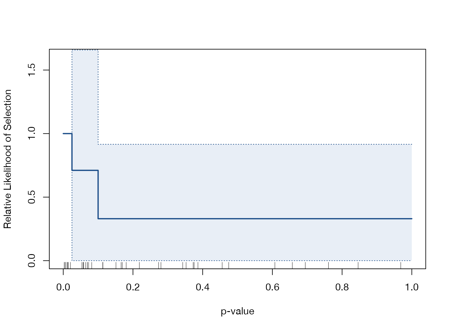
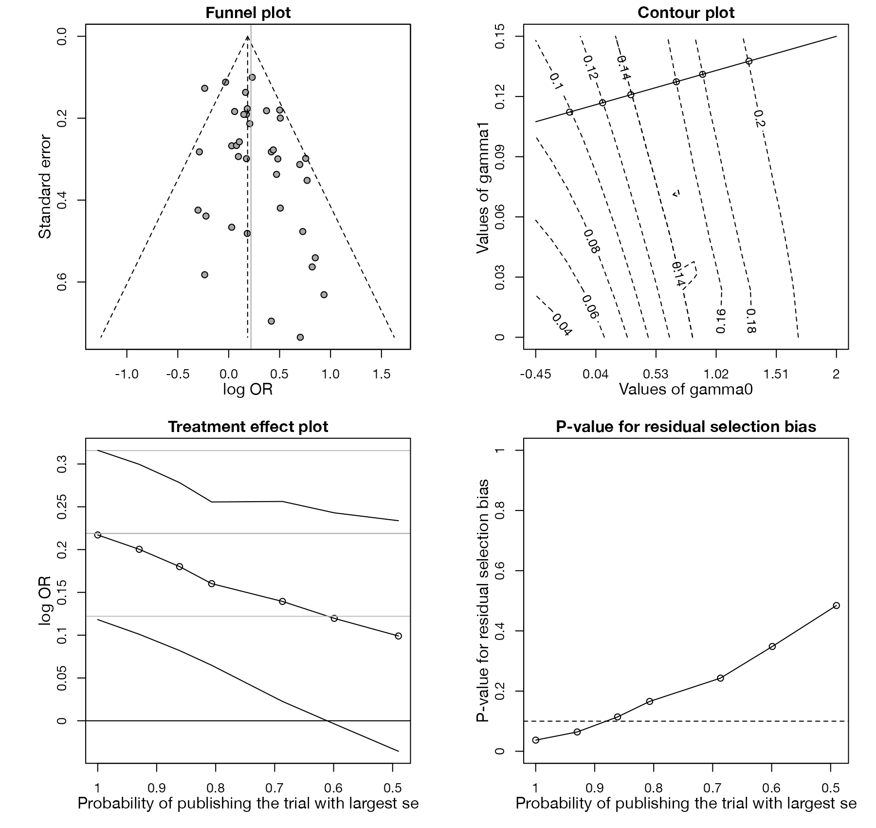
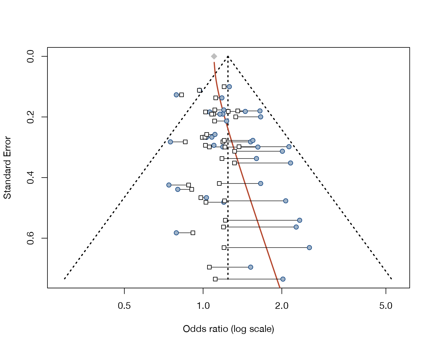
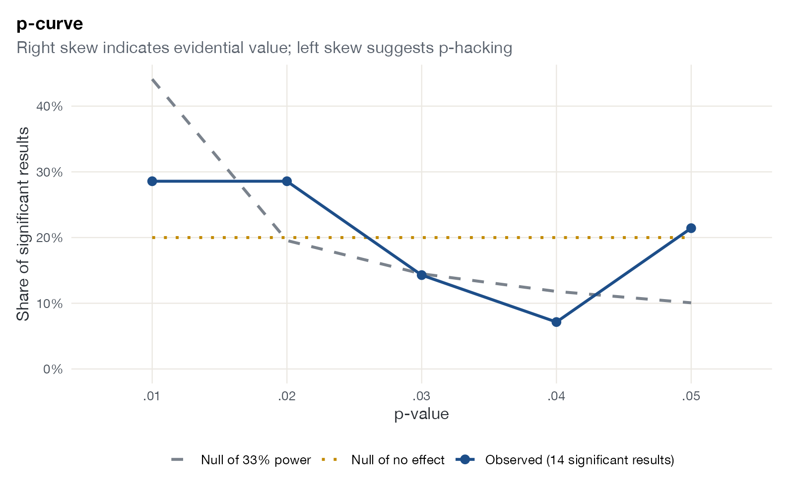
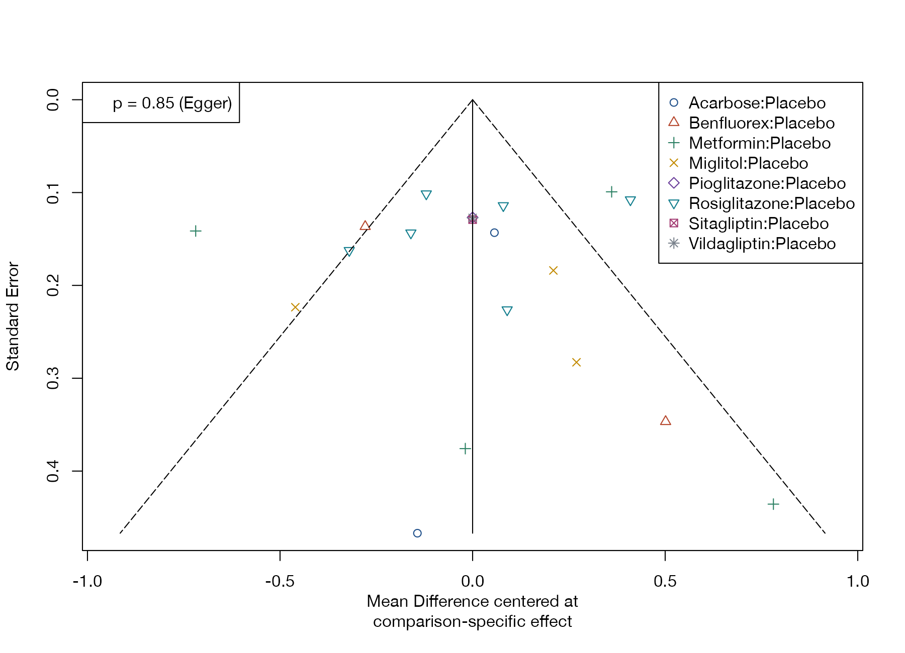
Funnel plots and their successors for exploring asymmetry, selective reporting, and sensitivity to it.
Model checking and Bayesian diagnostics
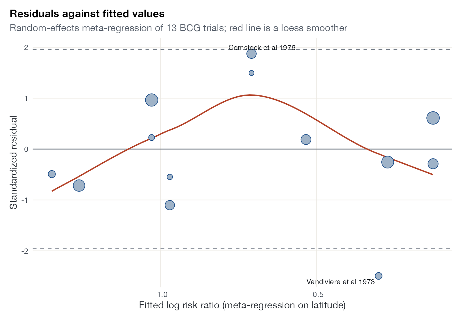
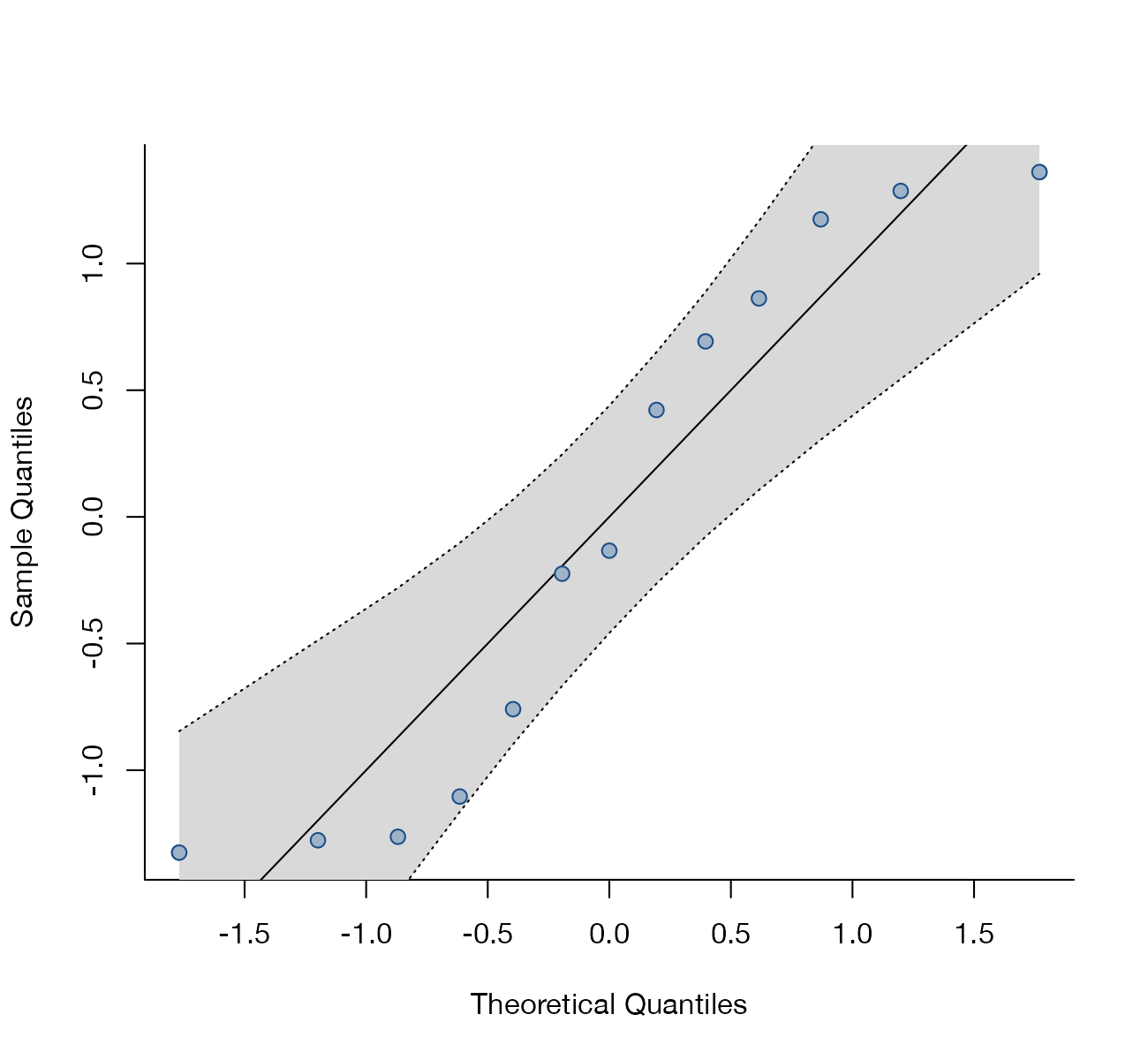
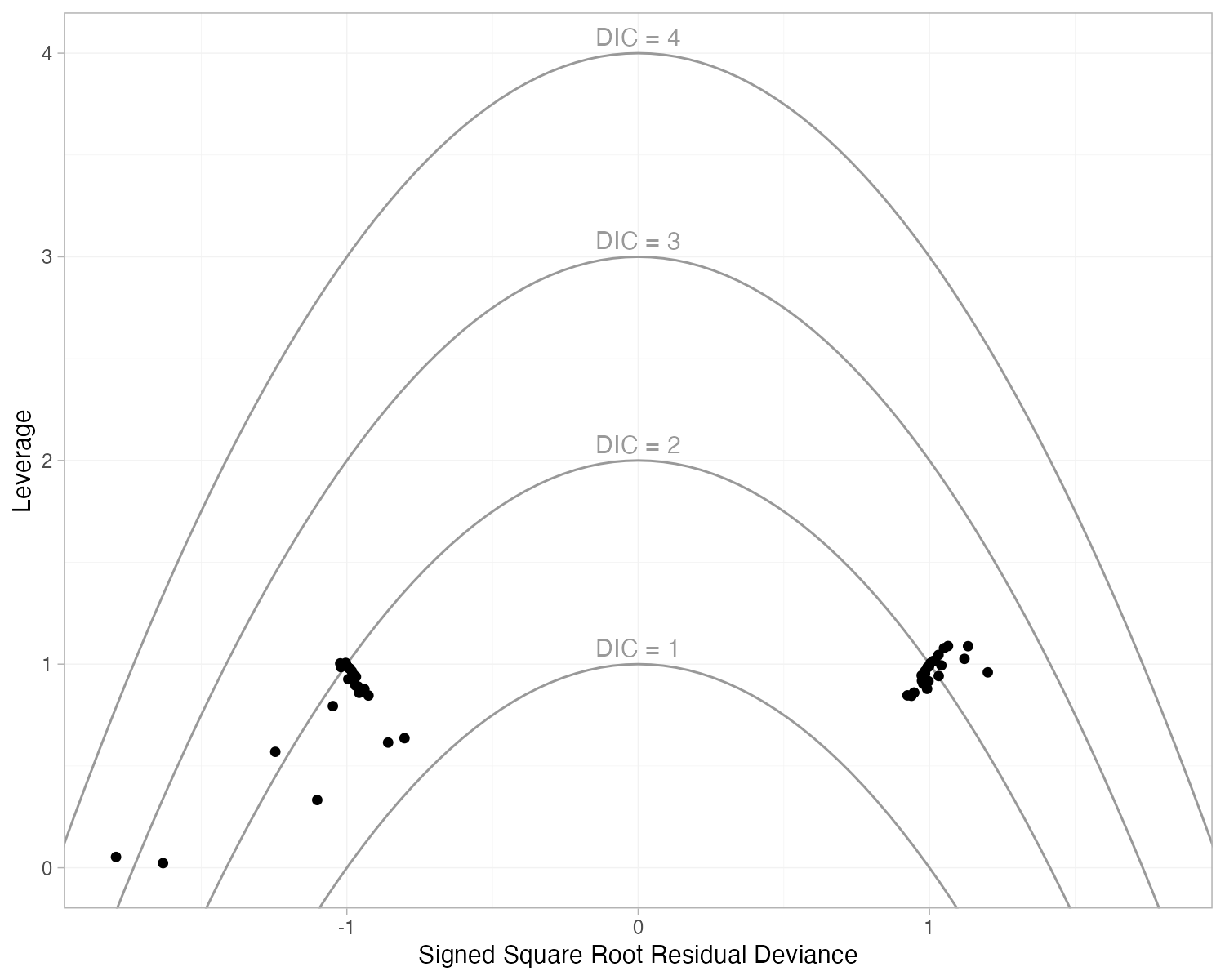
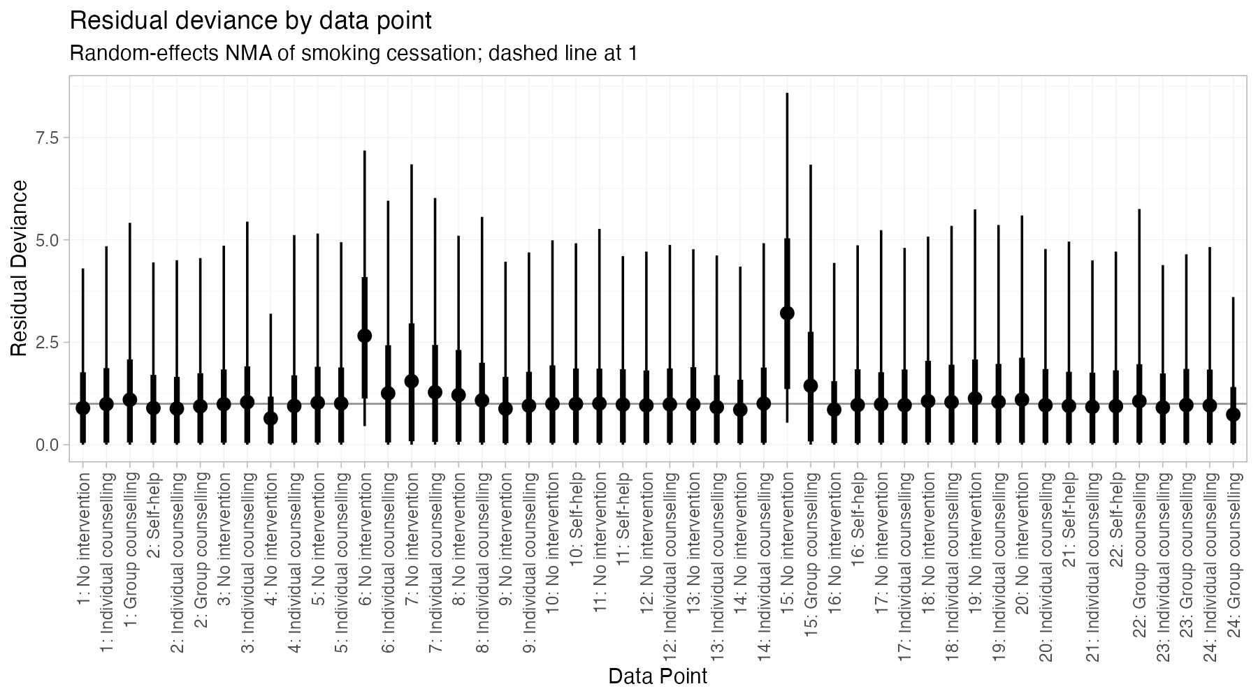
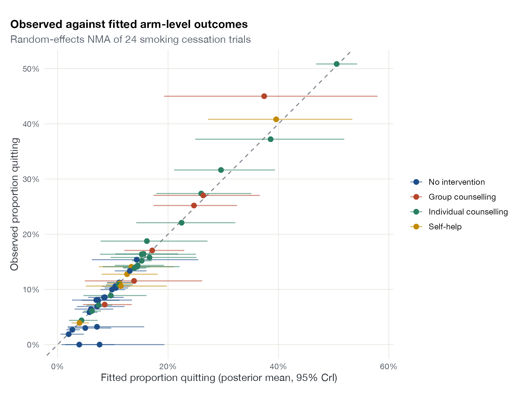
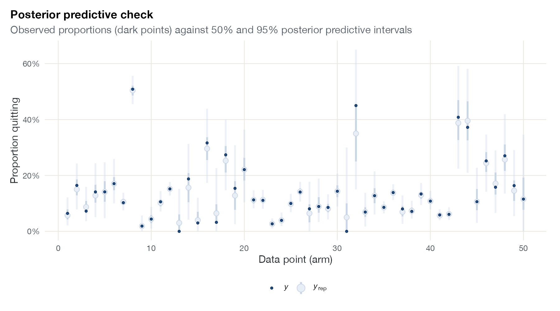
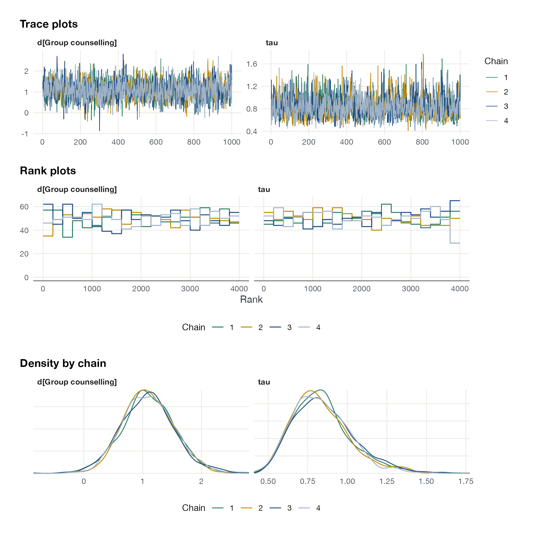
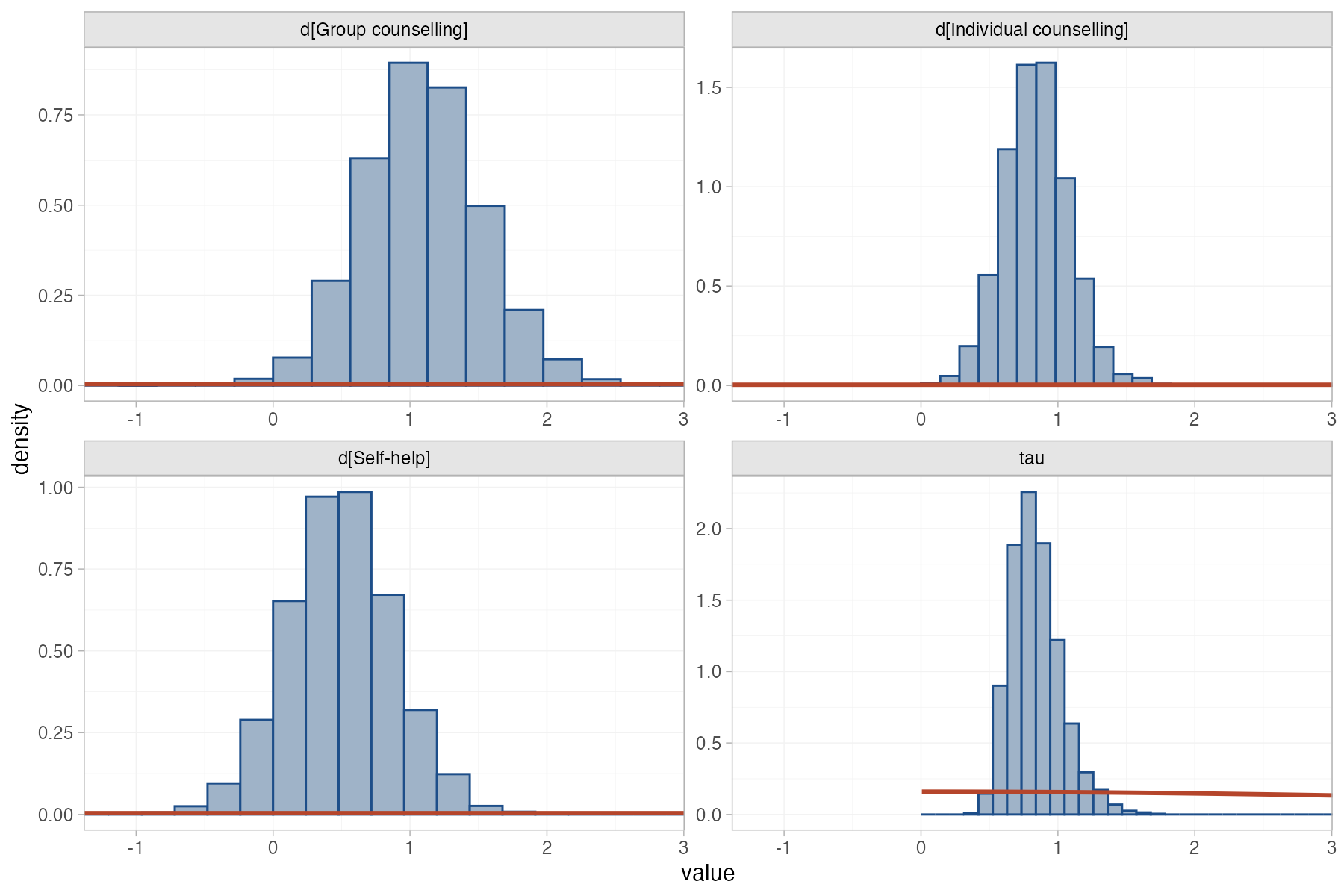
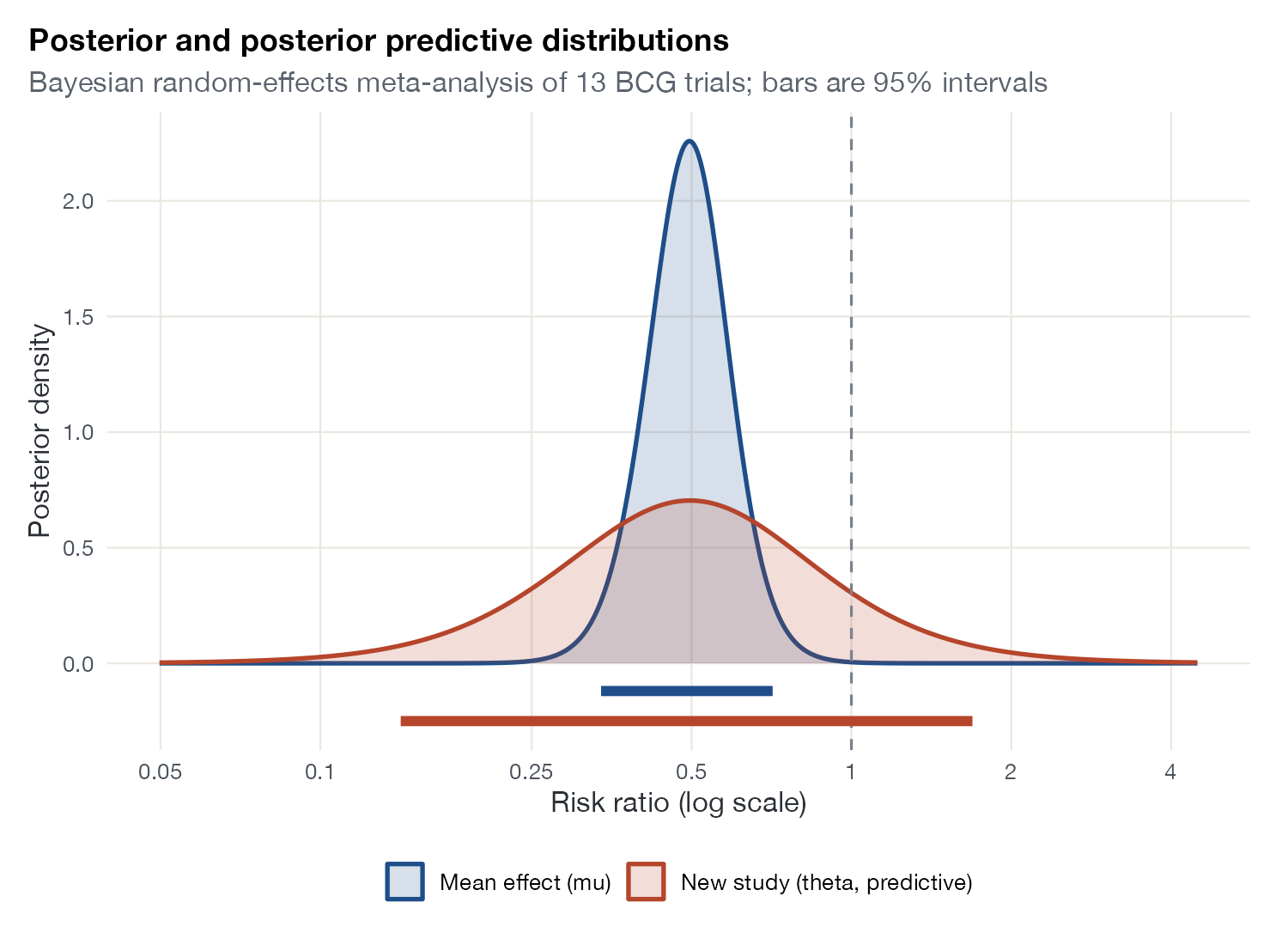
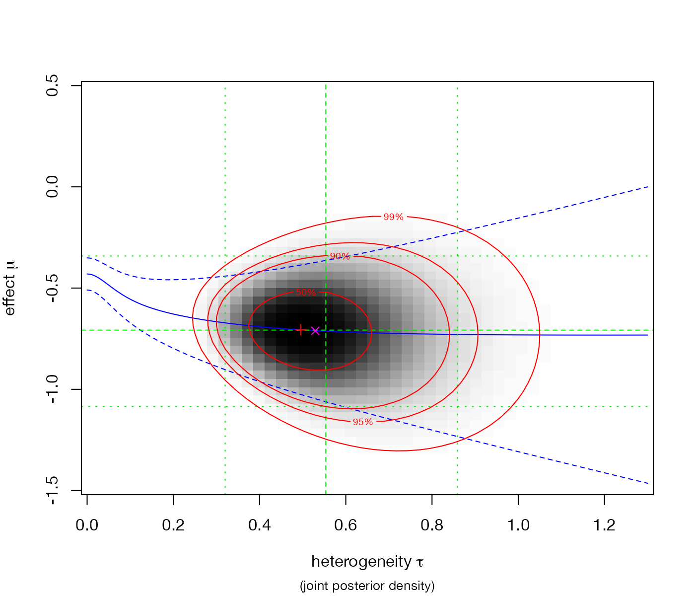
Residuals, fit, predictive checks, and the computational health of Bayesian models.
Network geometry and evidence flow
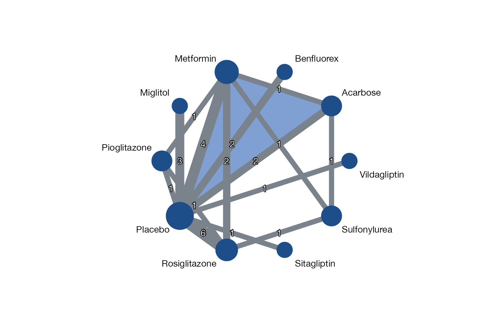
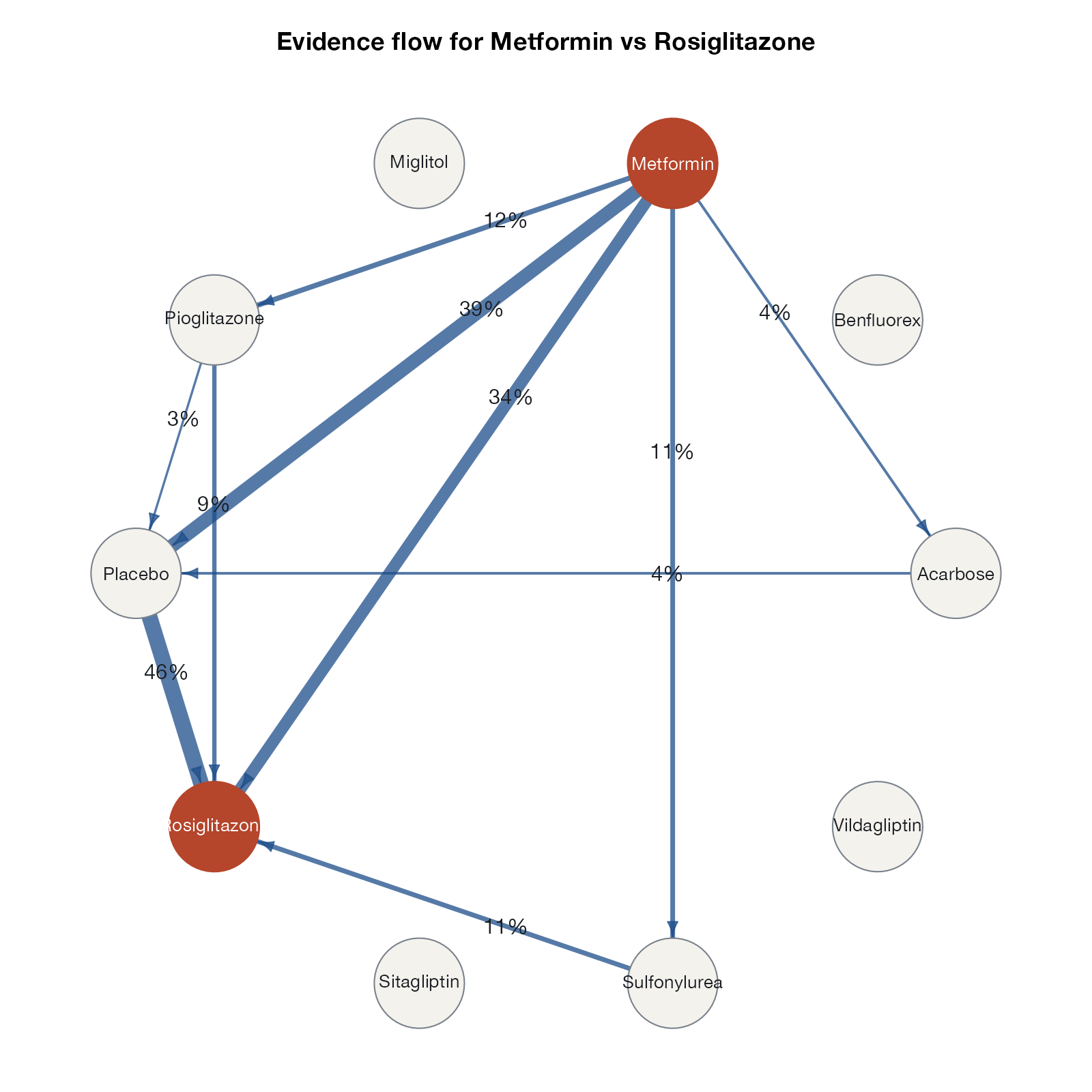
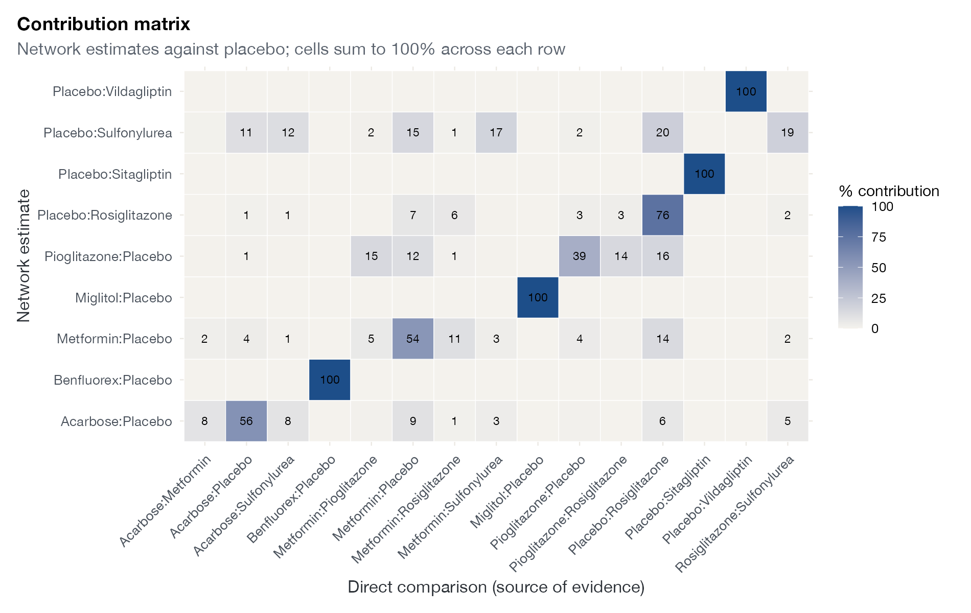
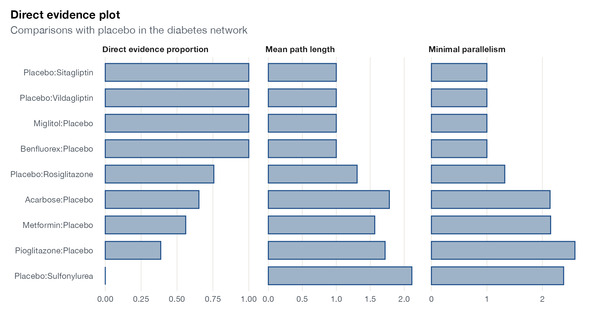
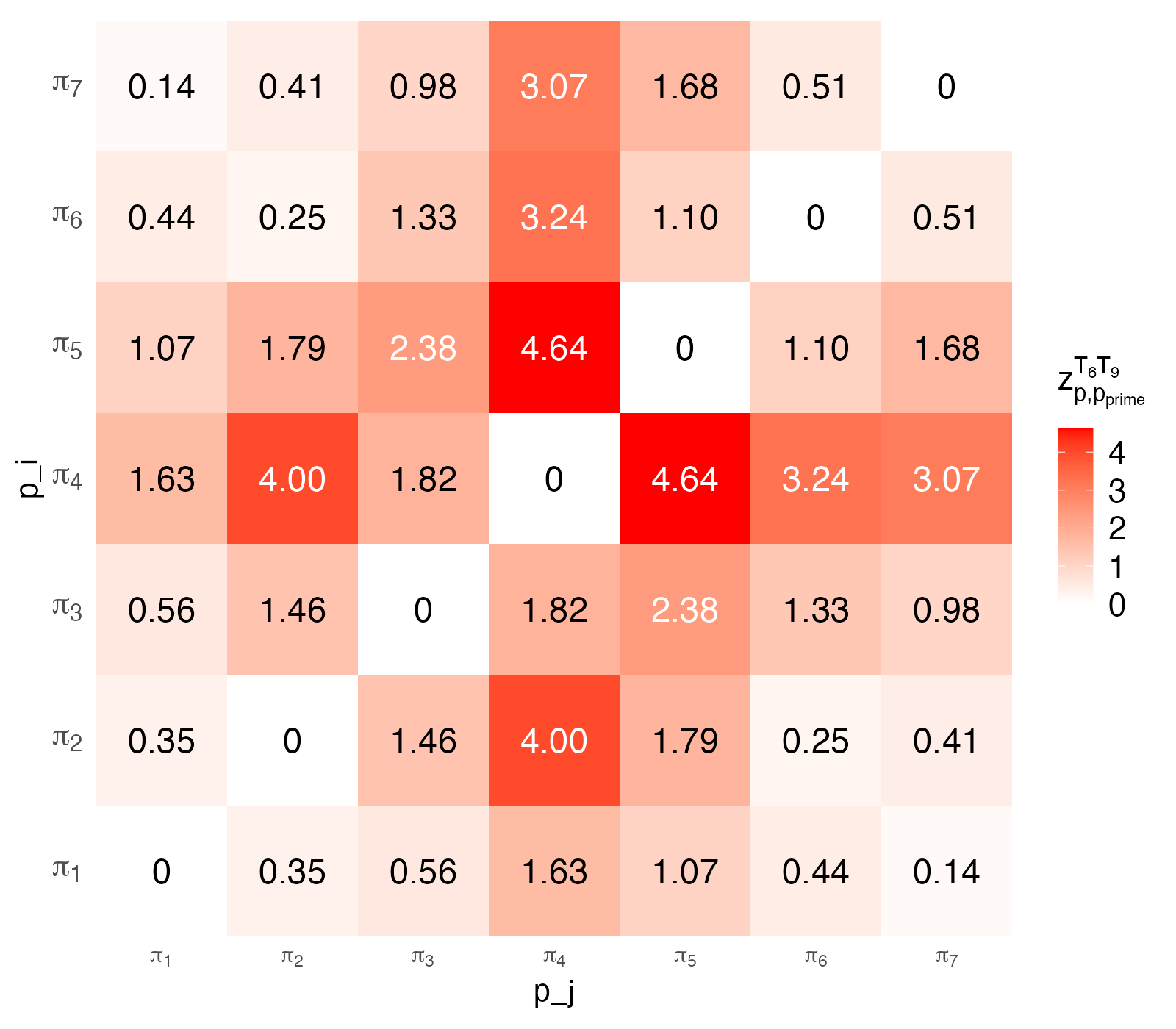
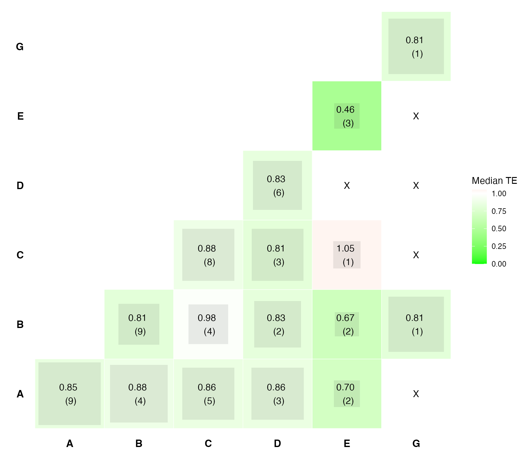
Which treatments are compared directly, how much evidence each comparison carries, and where it flows.

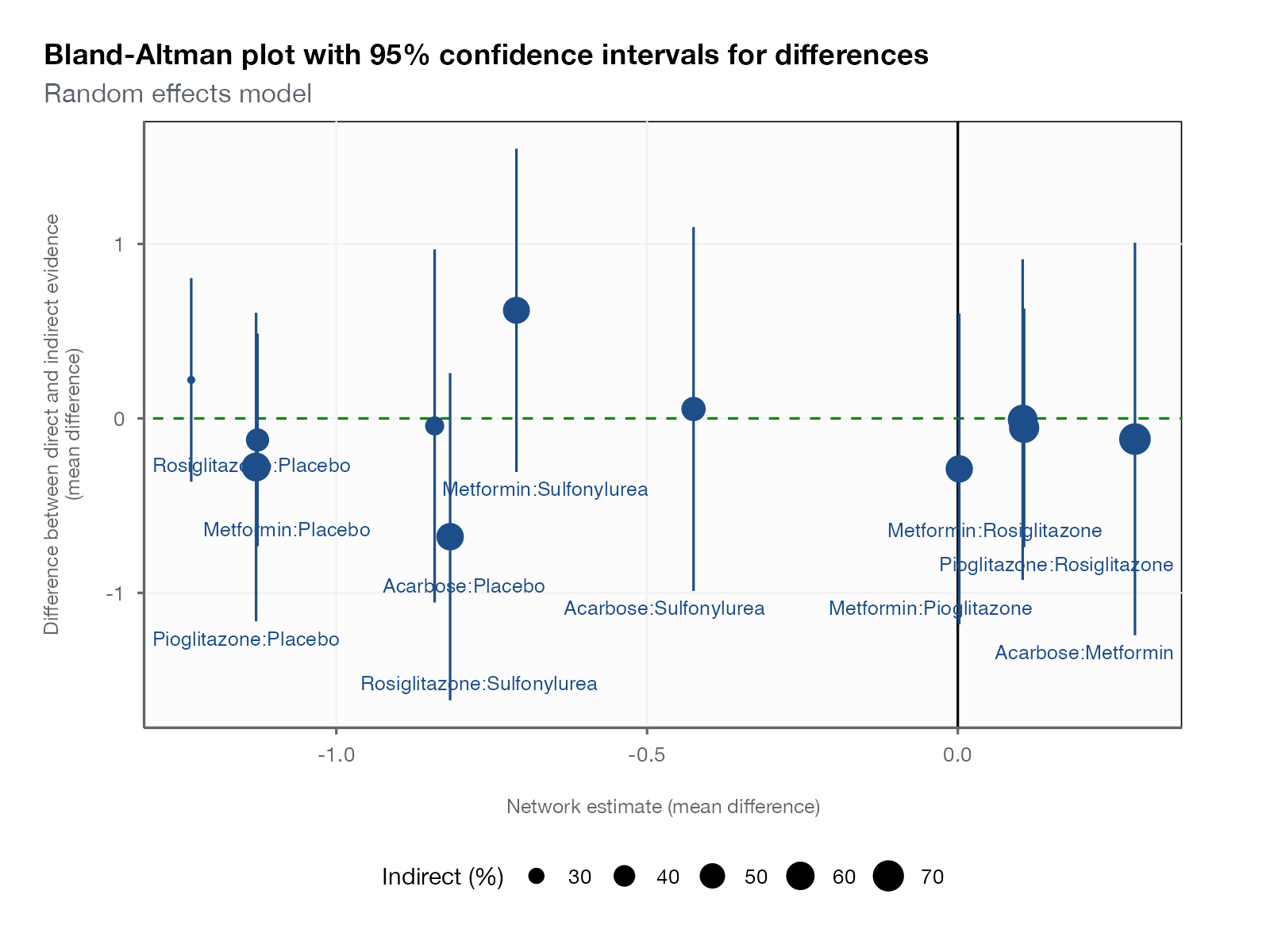
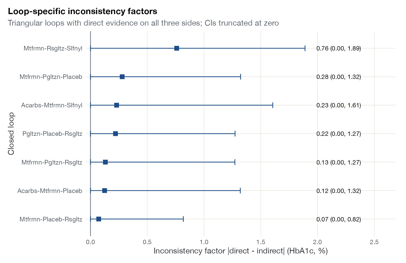
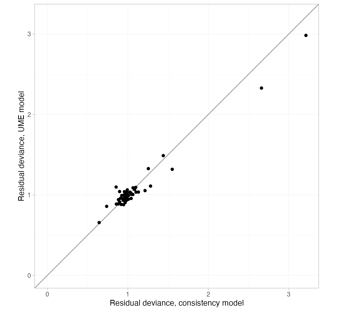
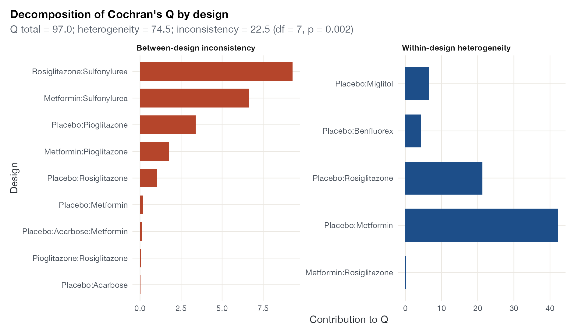
Inconsistency
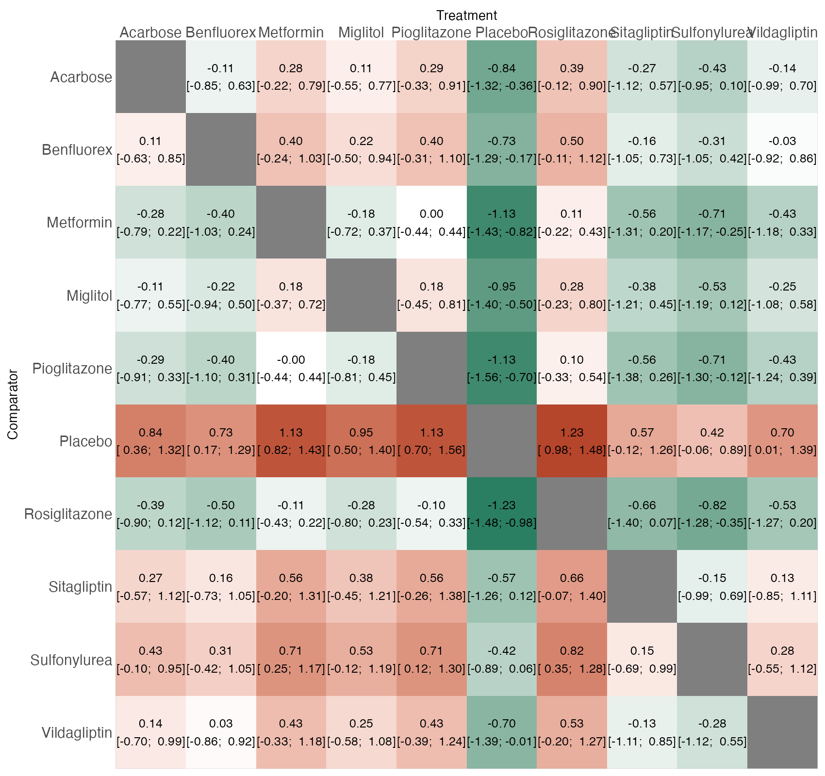
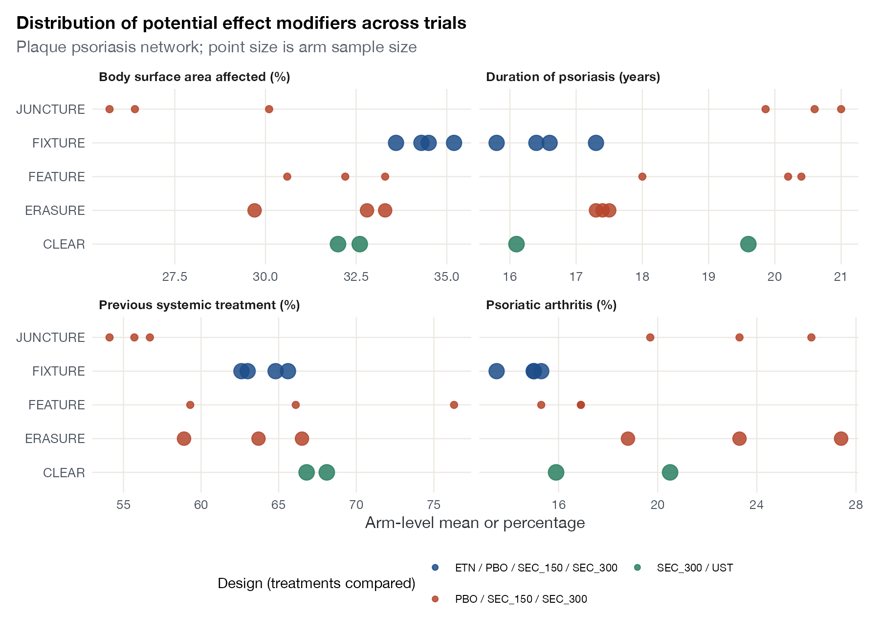
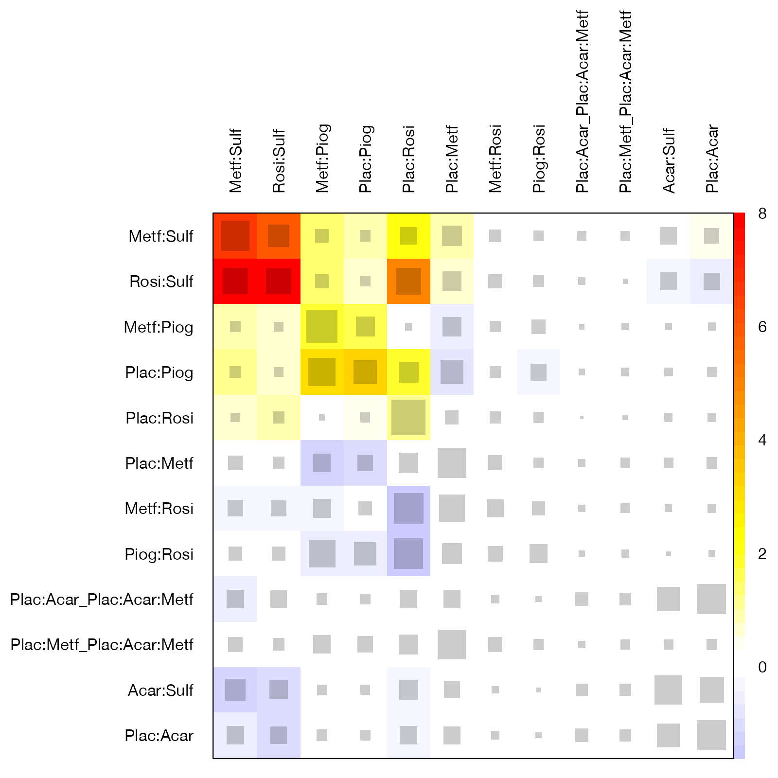
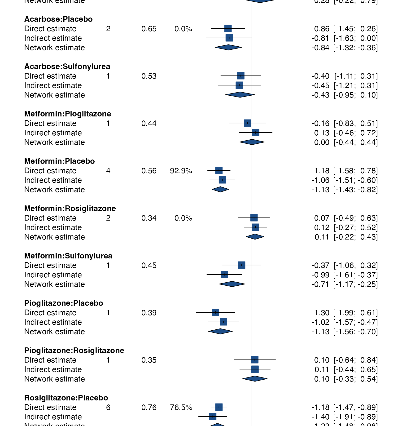
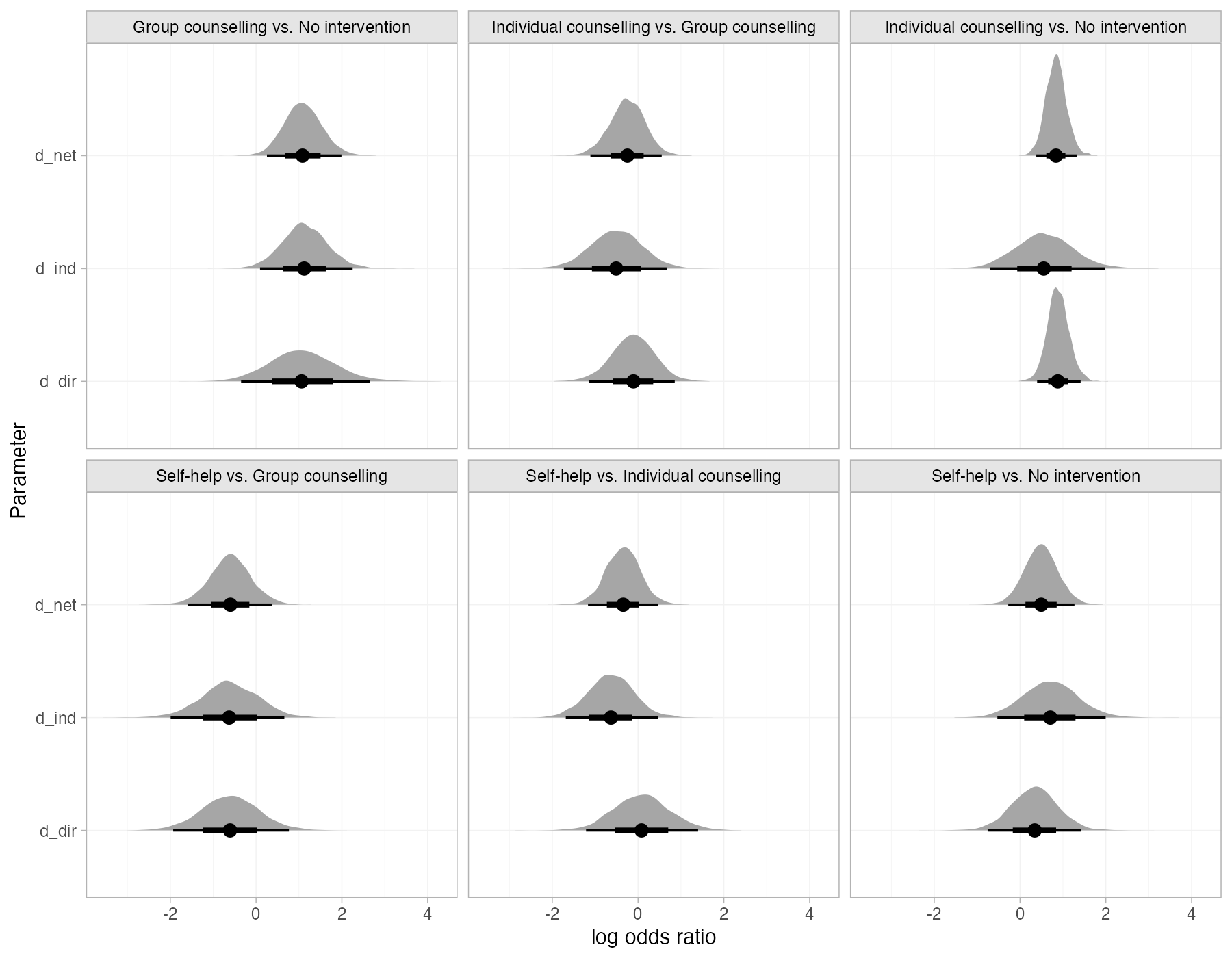
Agreement between direct and indirect evidence, locally and across the whole network.
Treatment ranking
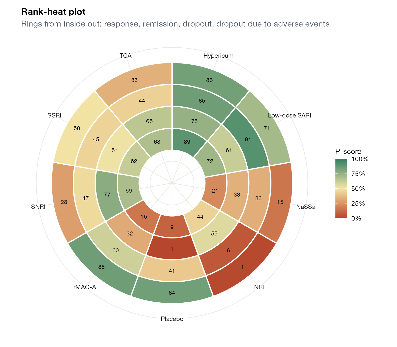
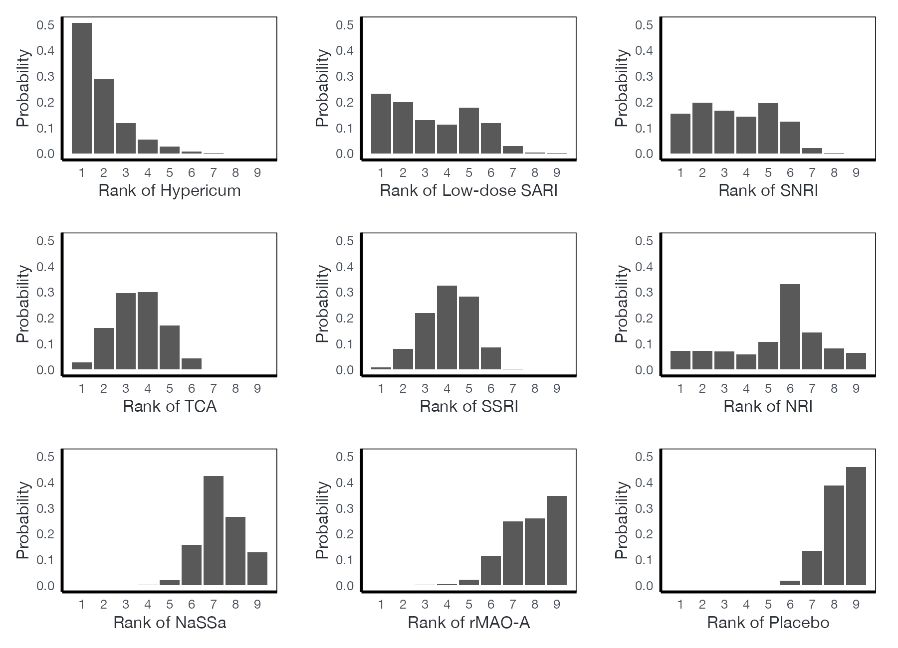
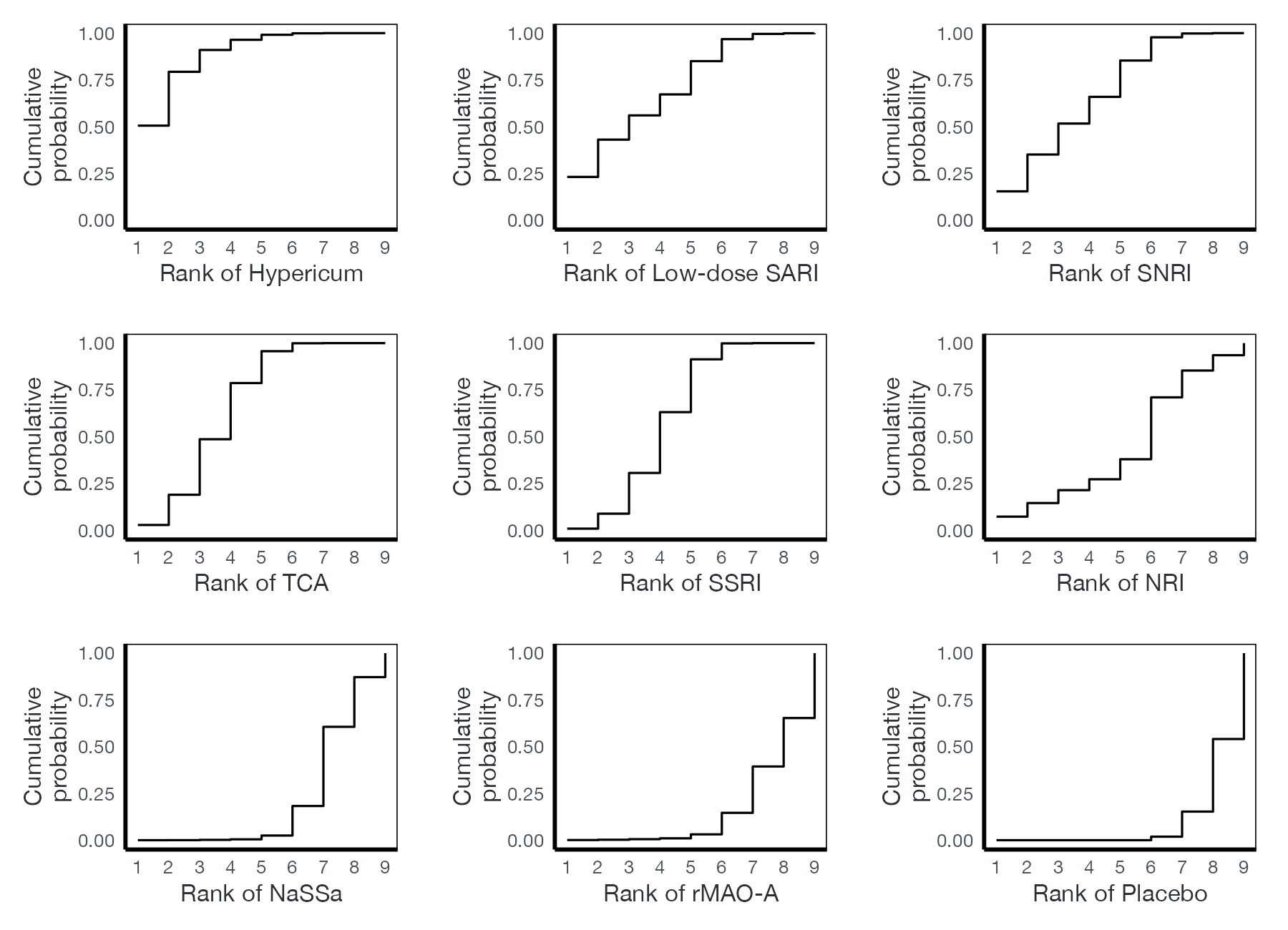
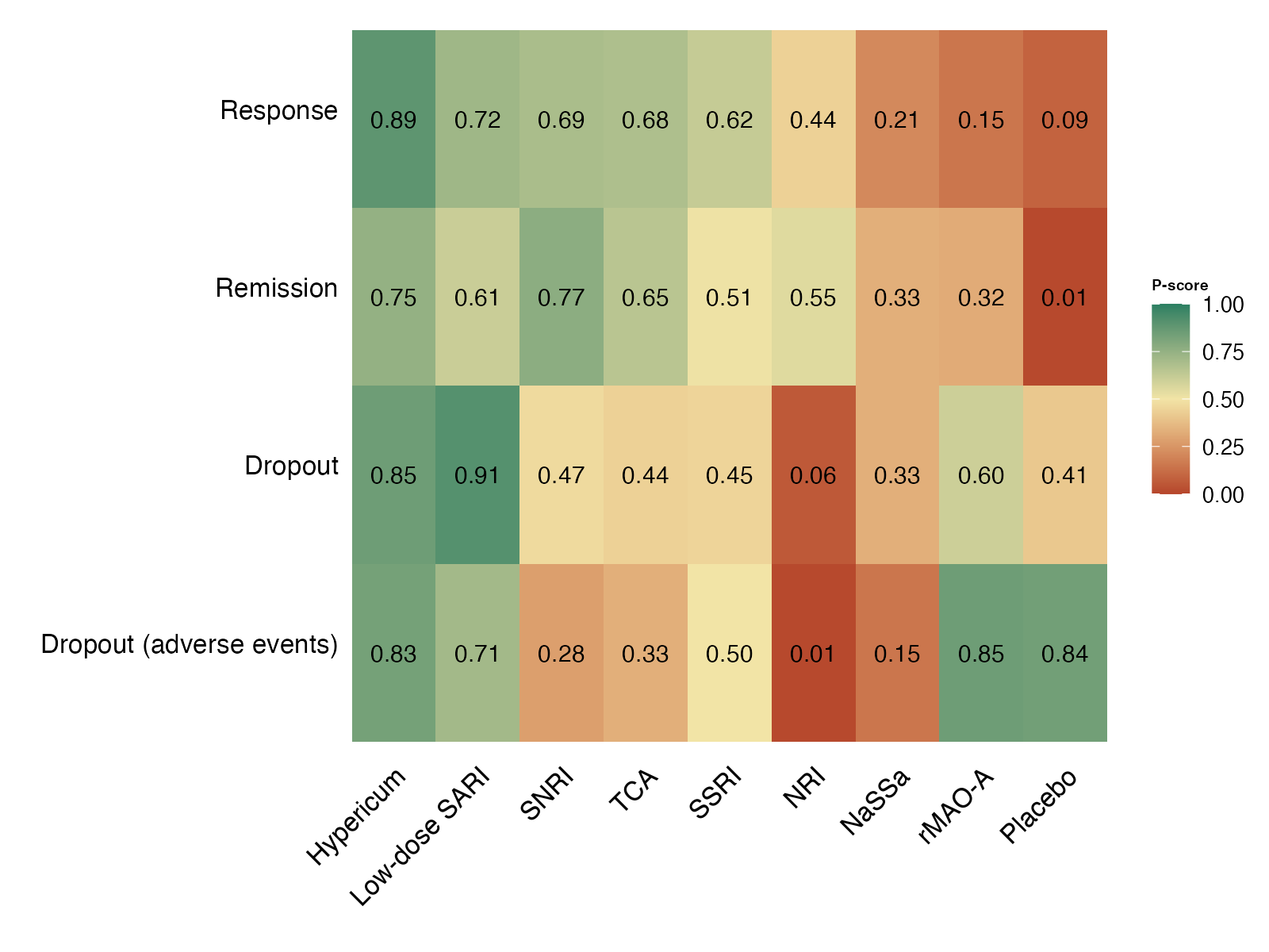
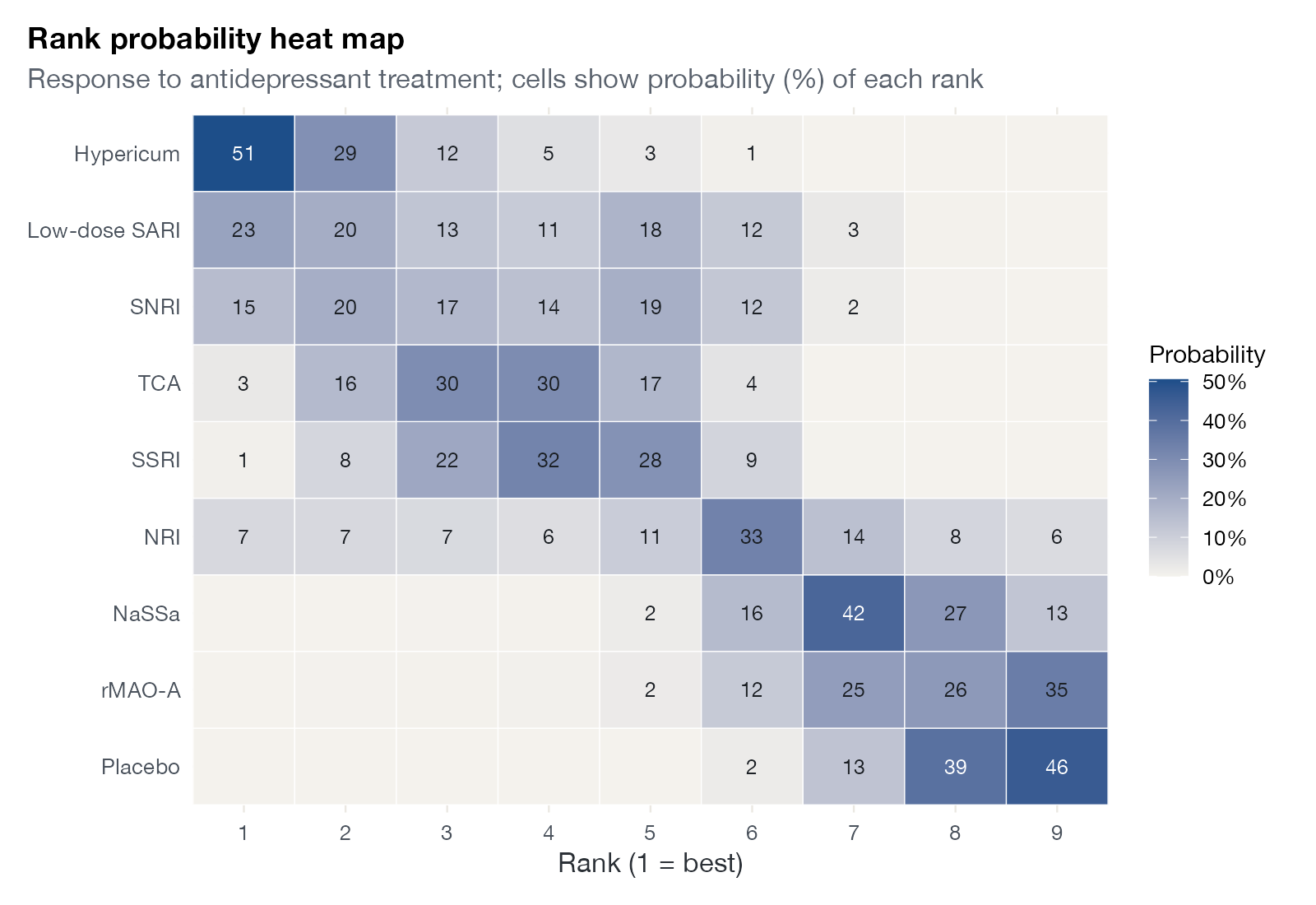
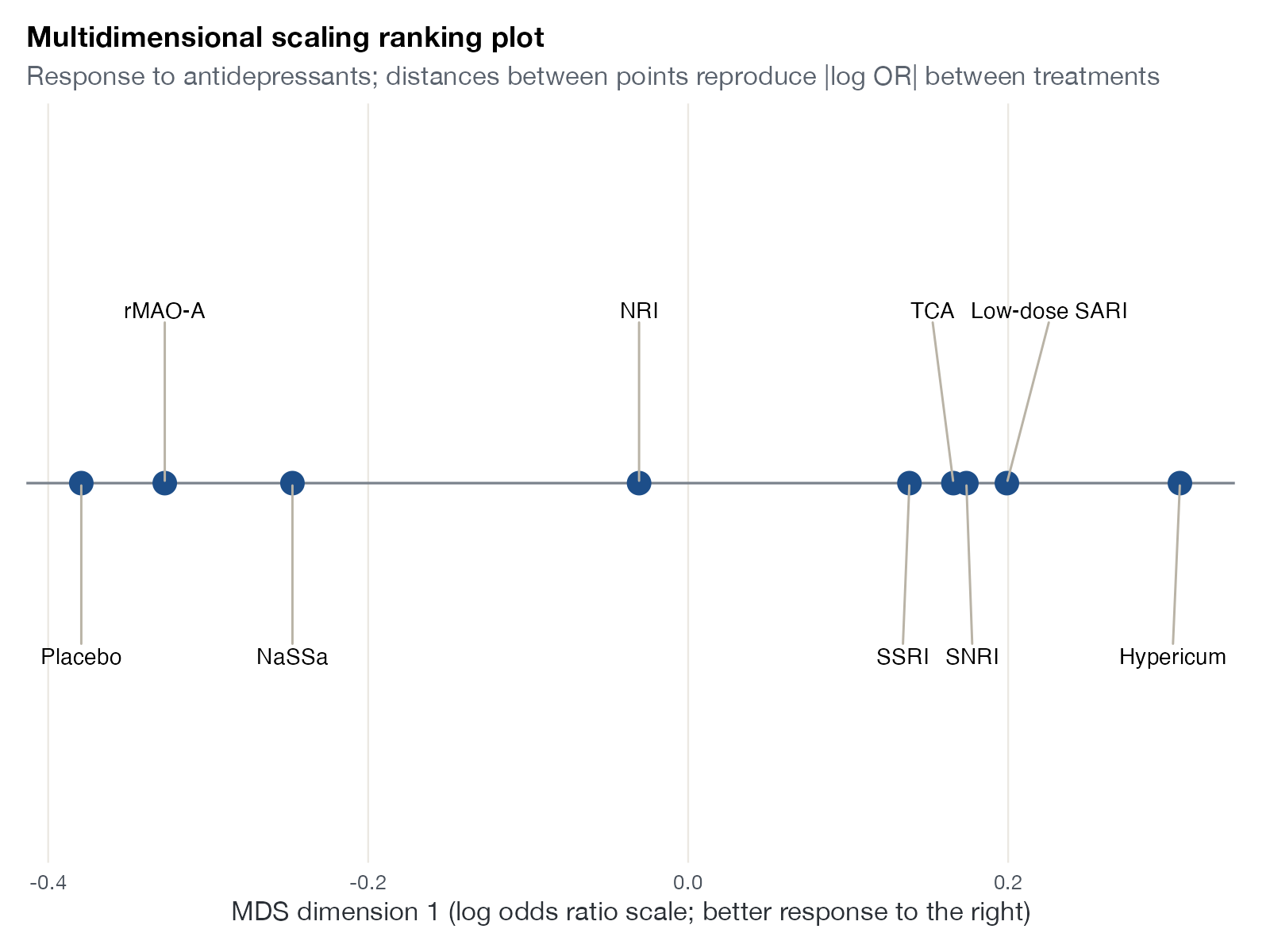
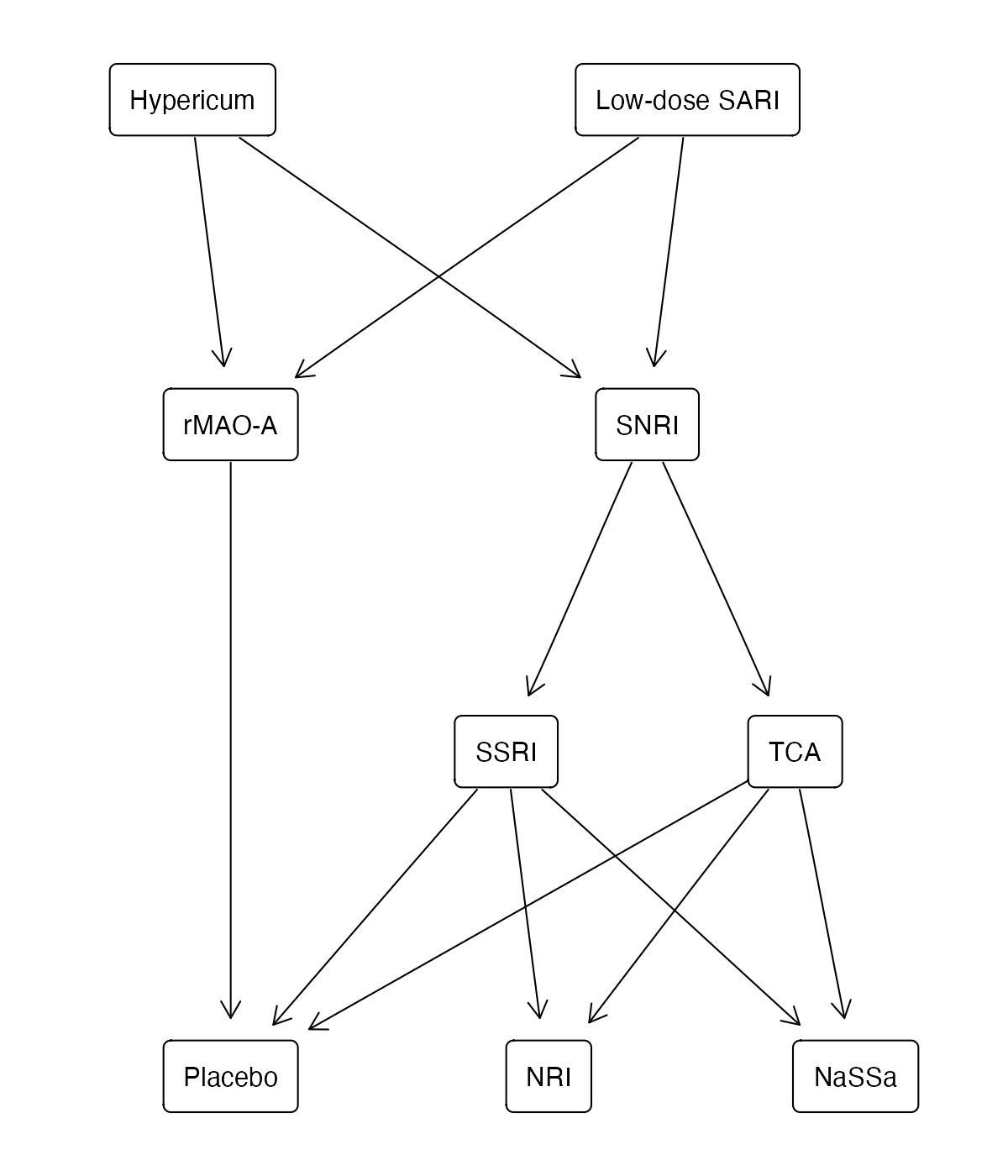
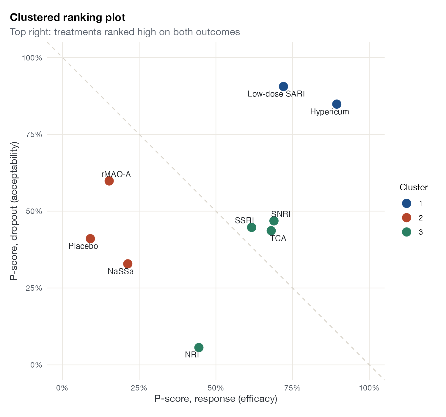
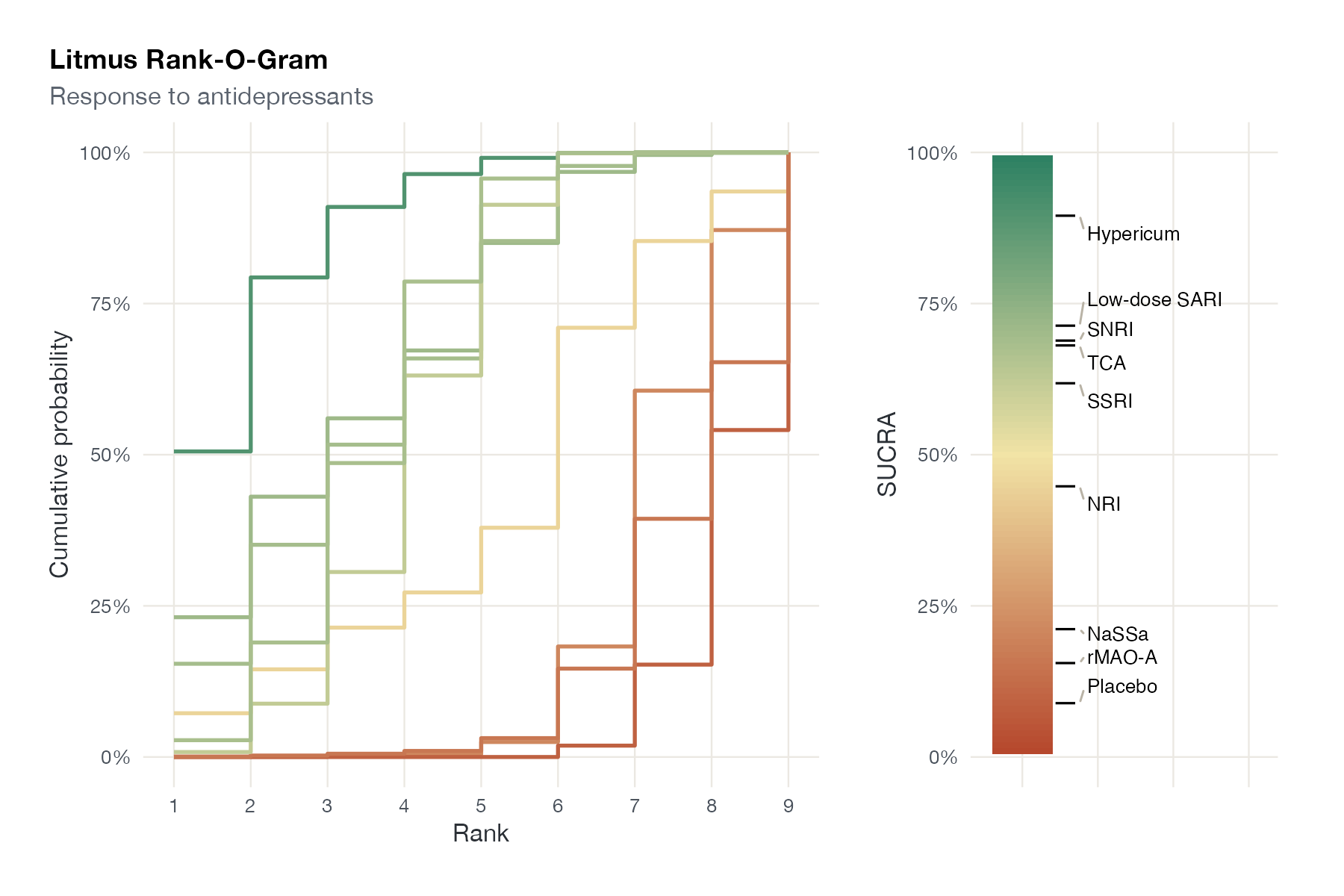
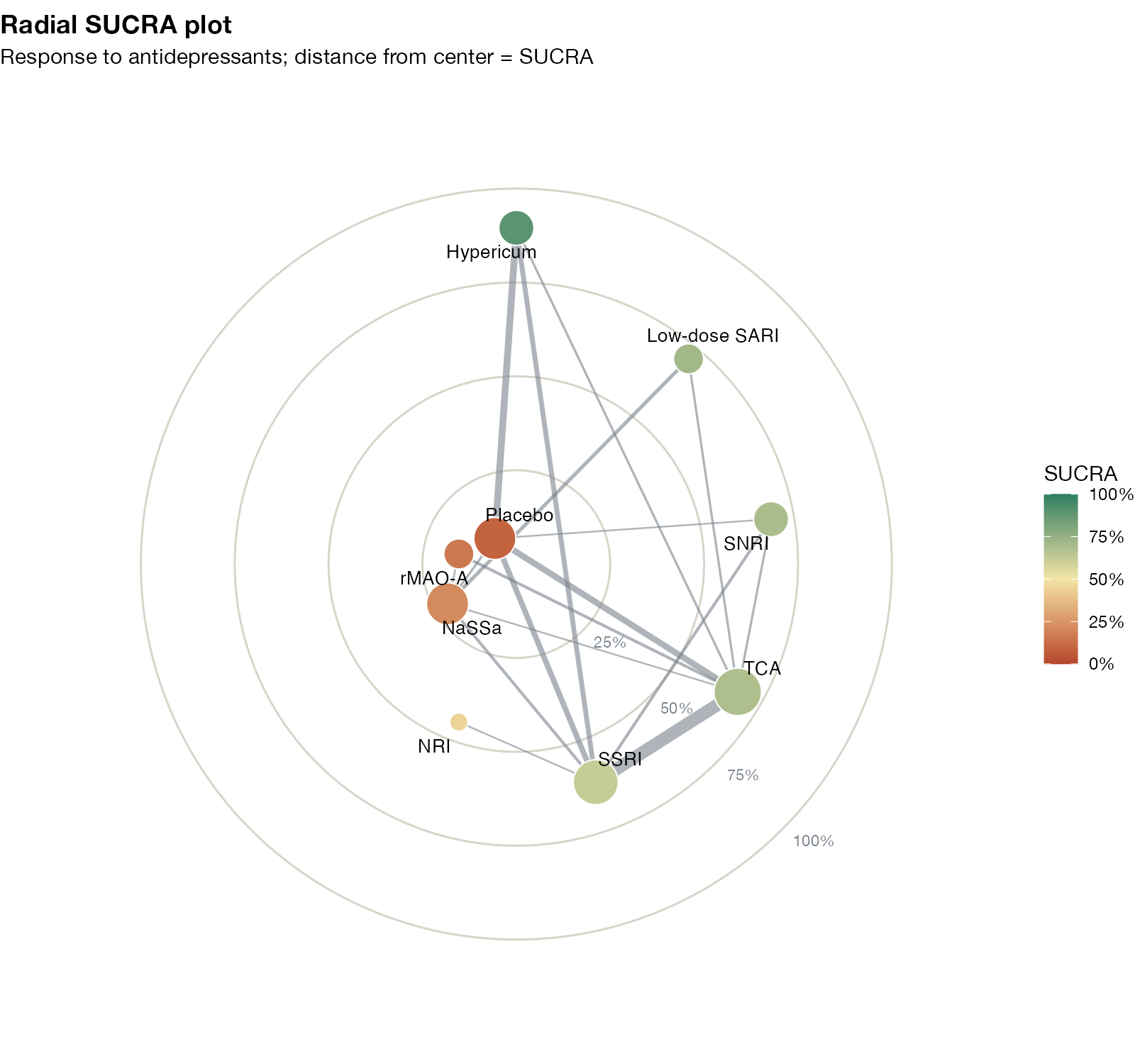
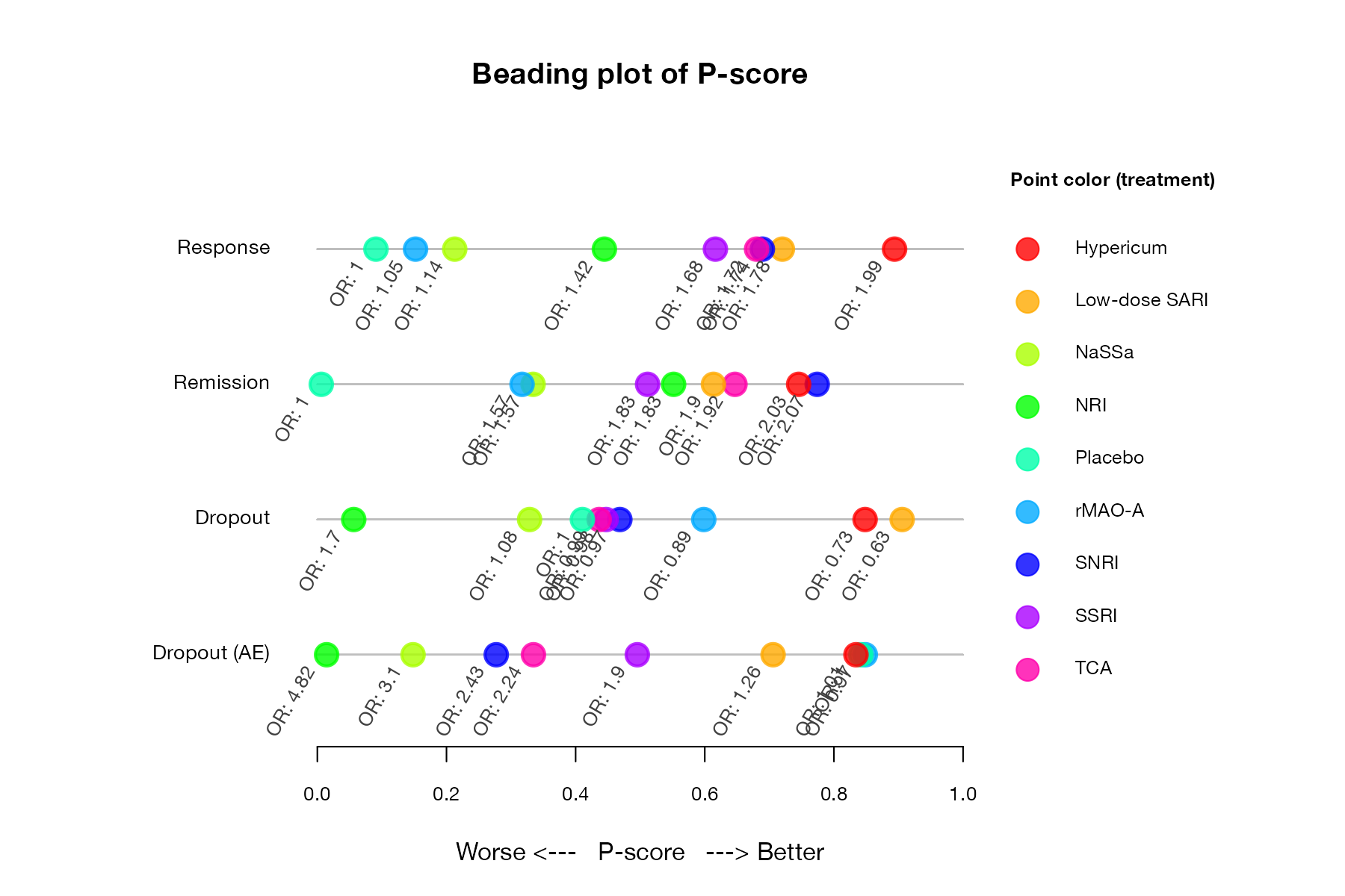
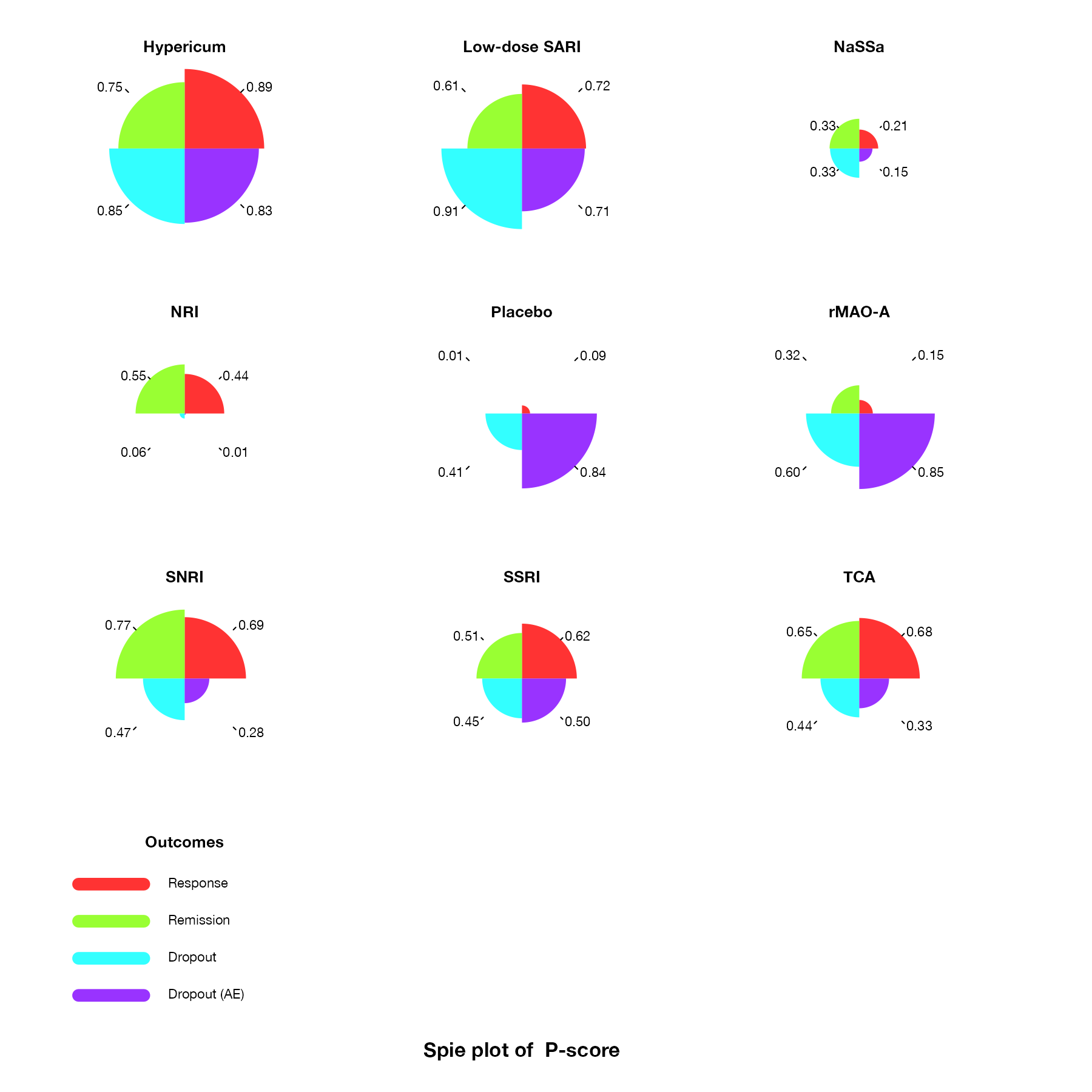
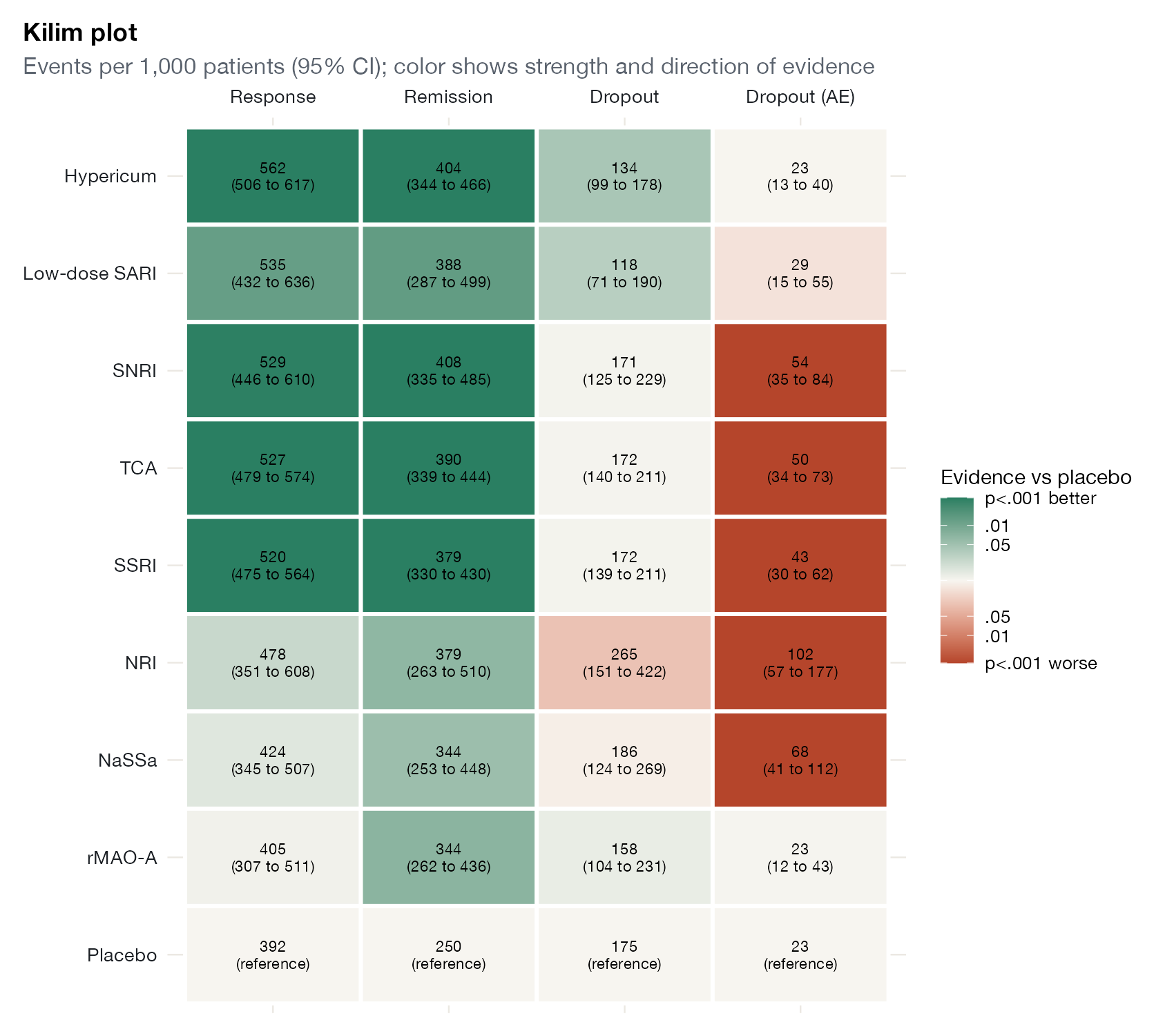
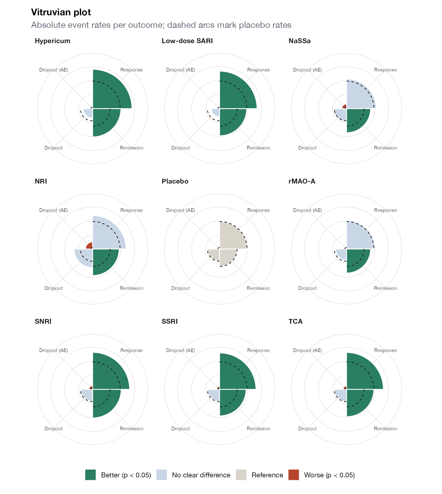
Rank probabilities and their summaries. Always read them next to the effect estimates.

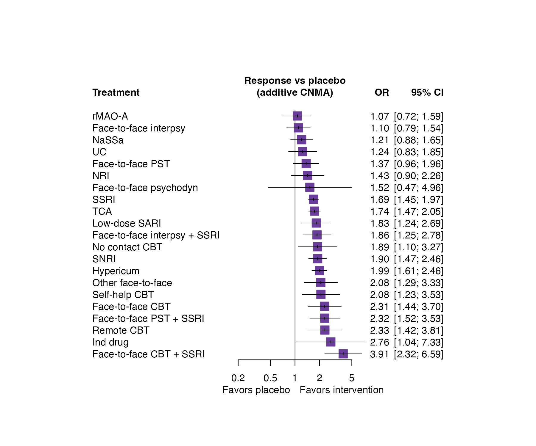
Component, dose-response, and threshold NMA
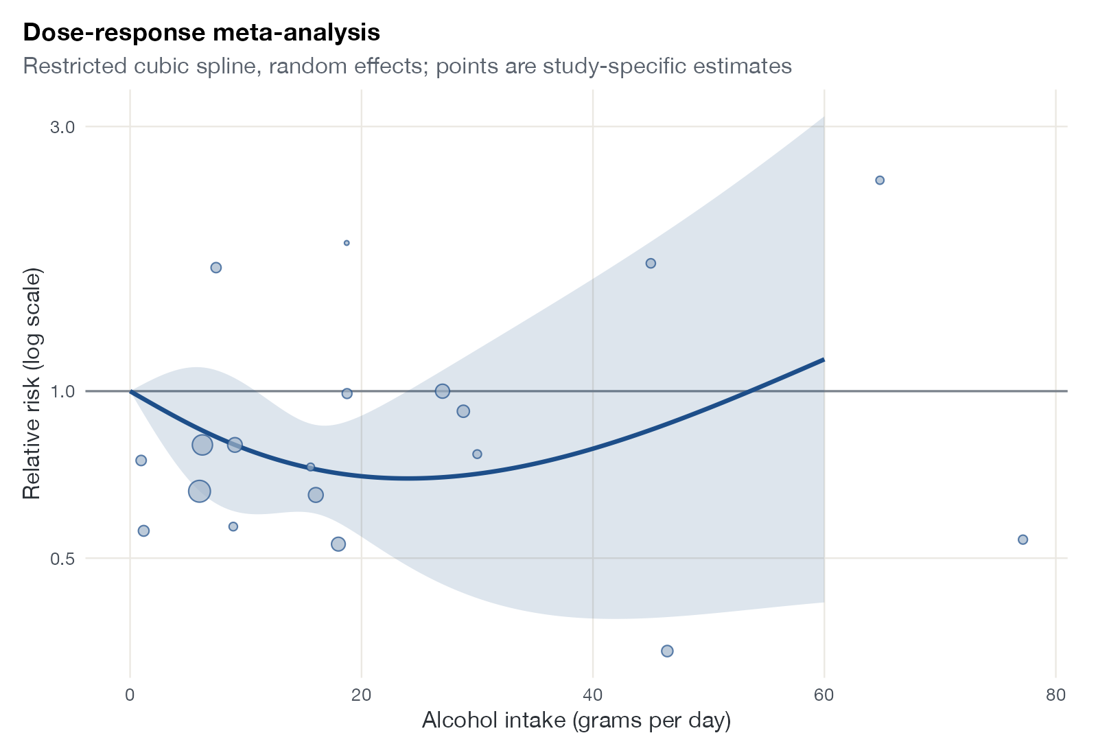
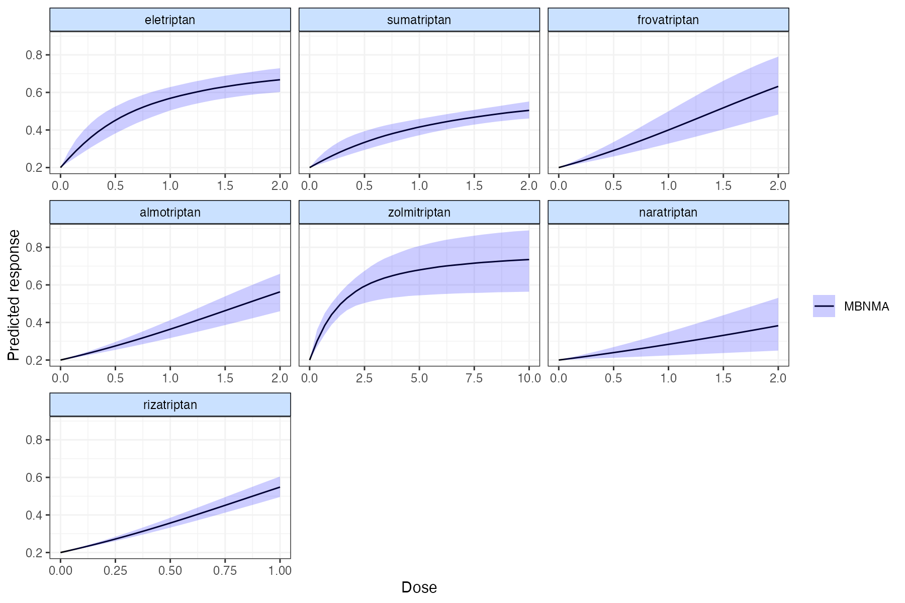
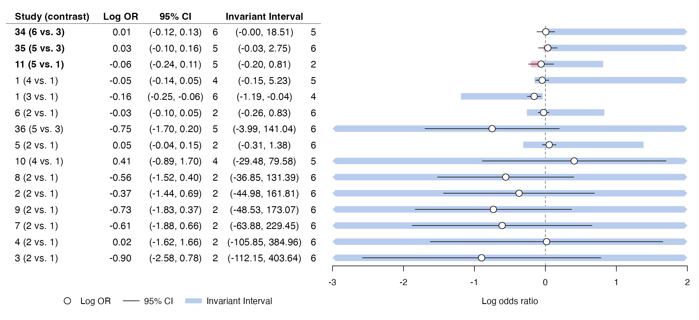
Extensions of NMA for complex interventions, dose-response relationships, and decision robustness.
Weighting, balance, and overlap
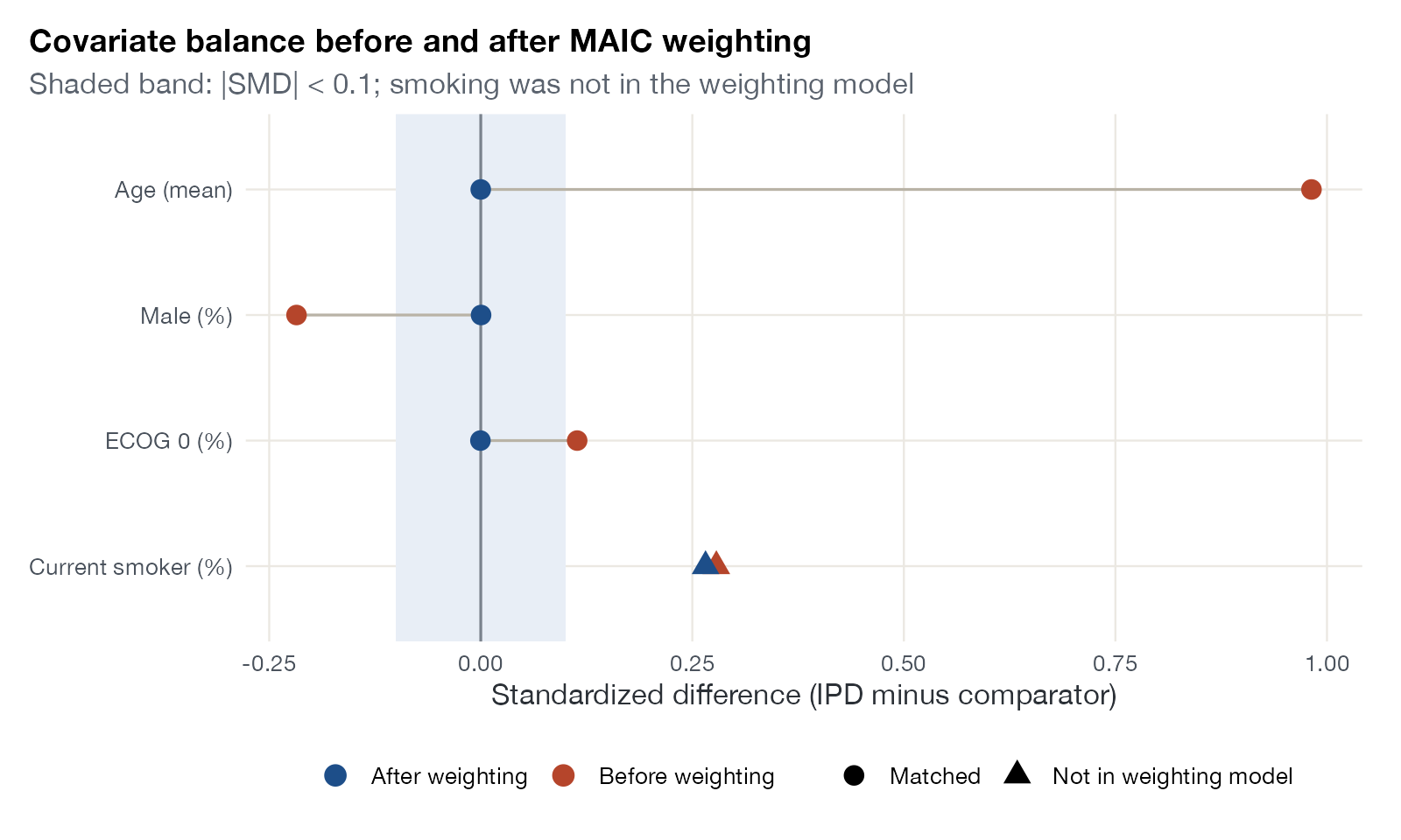
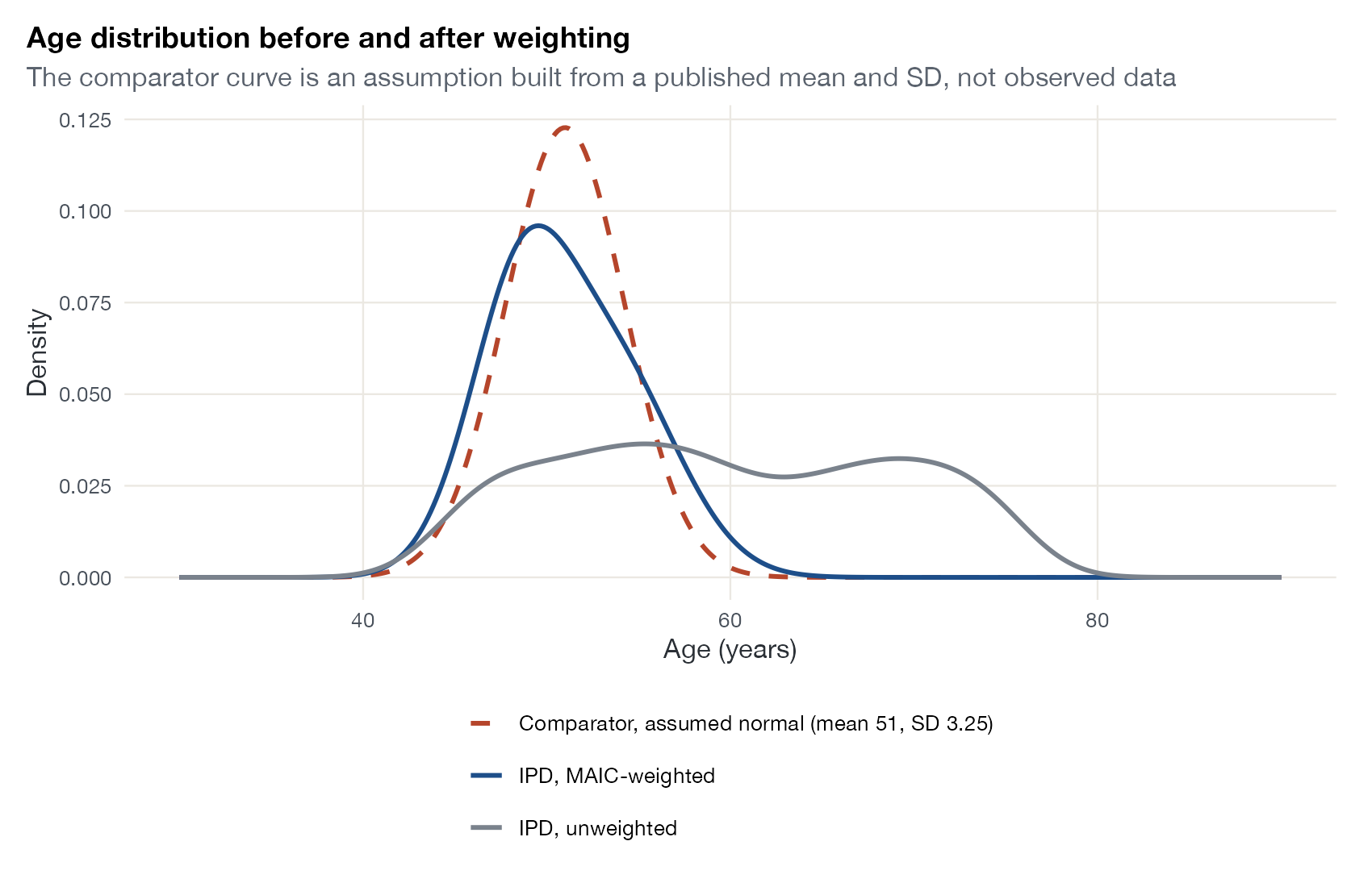
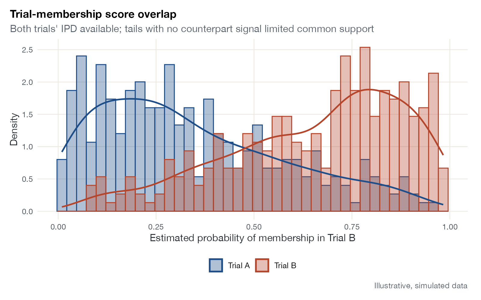
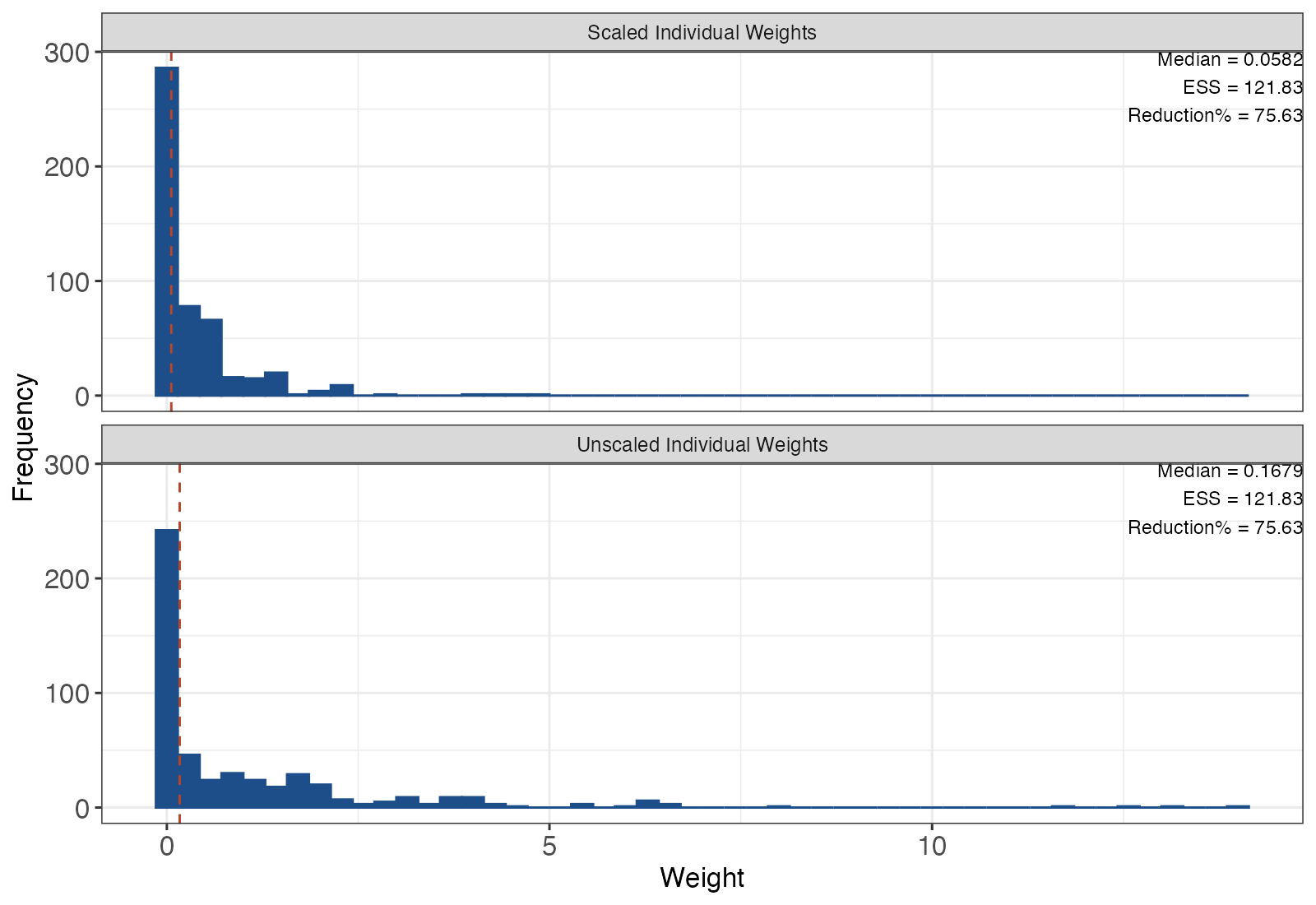
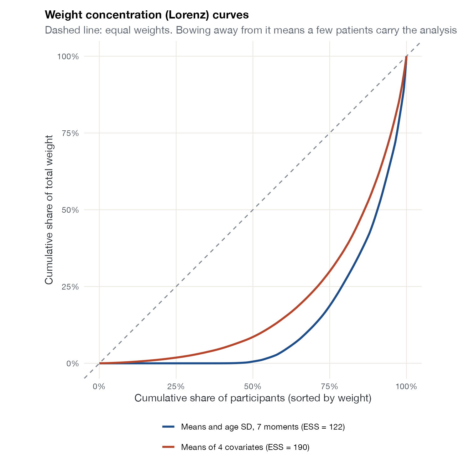
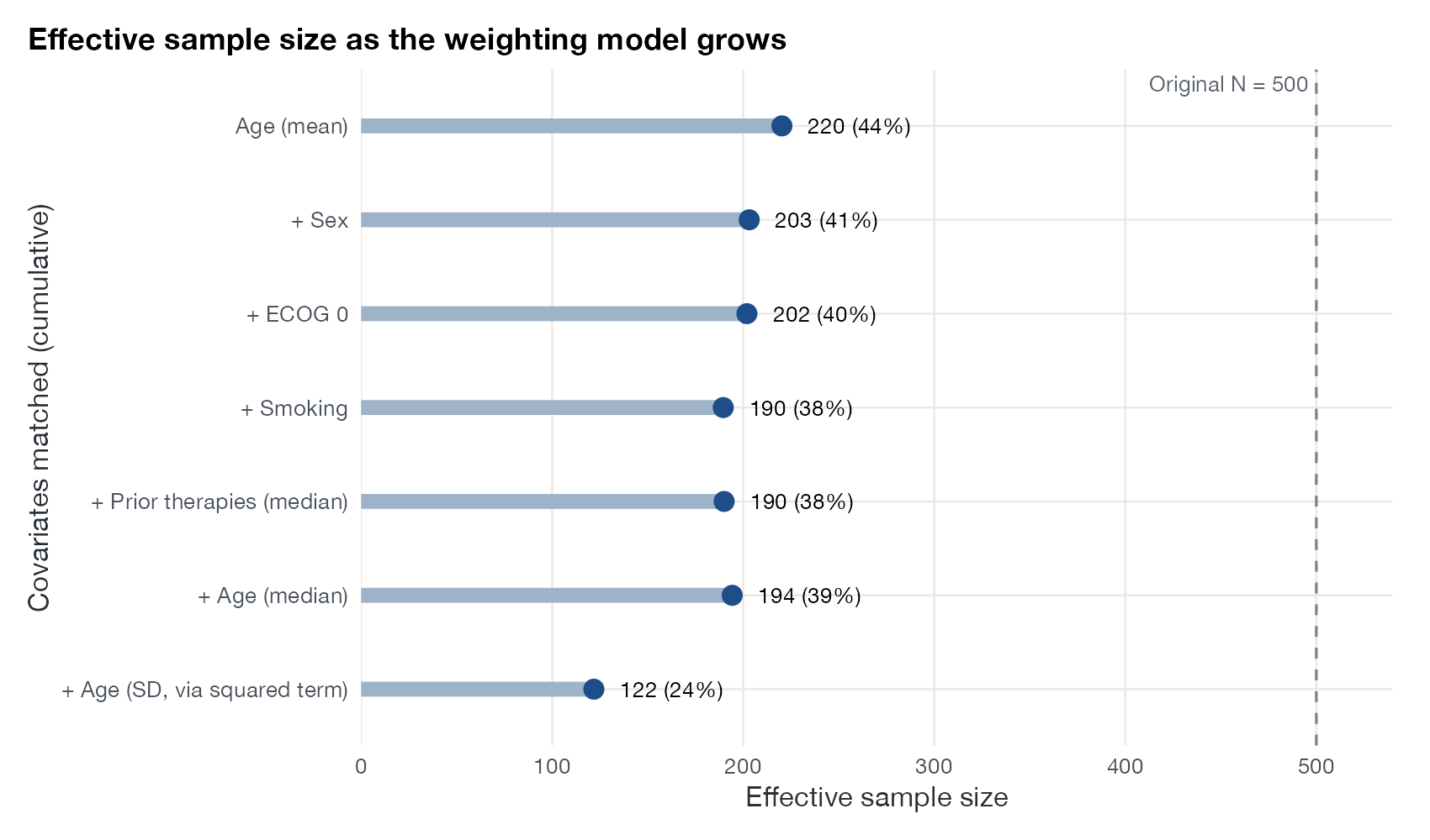
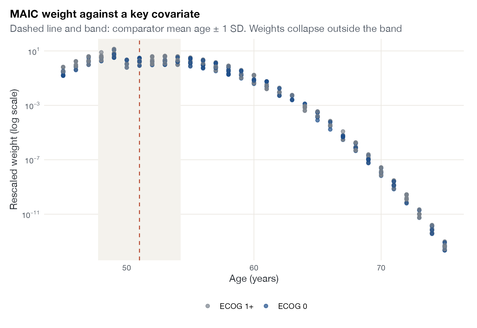
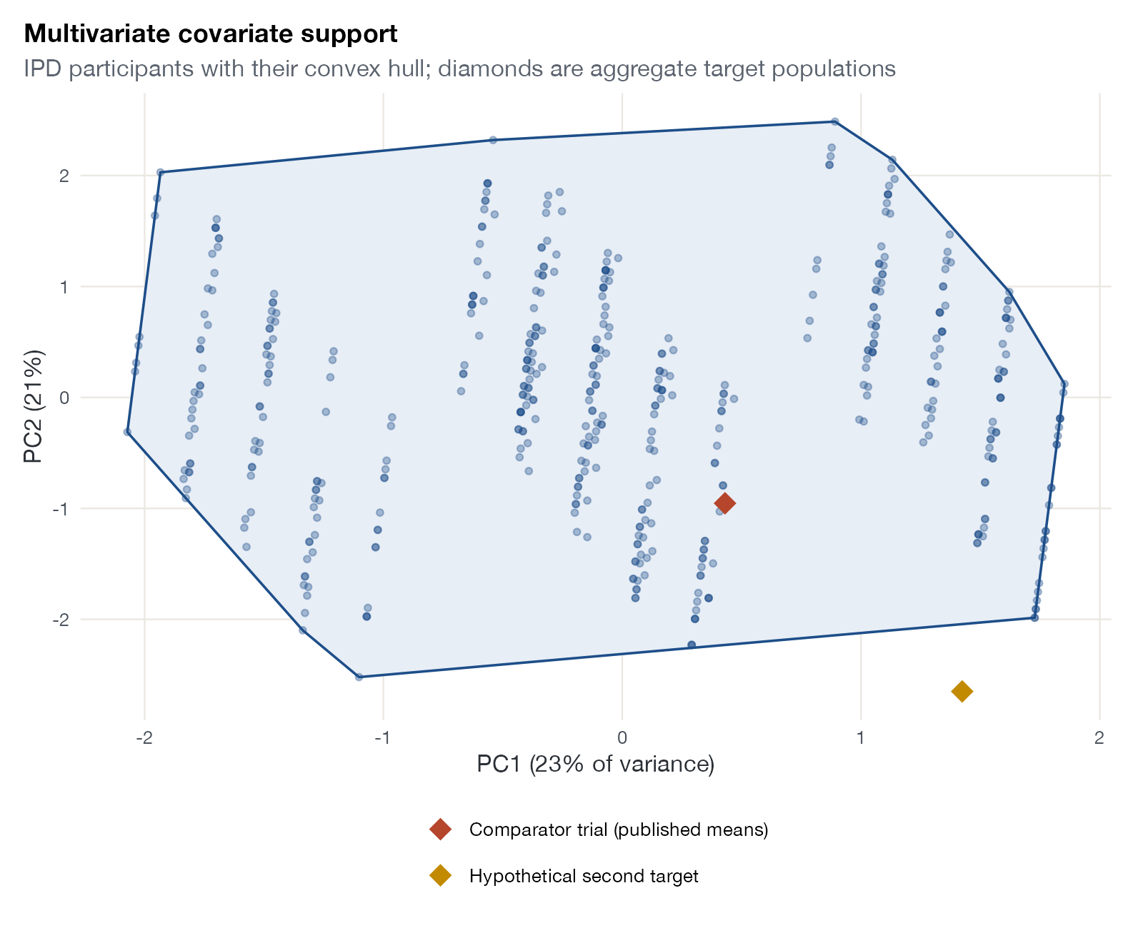
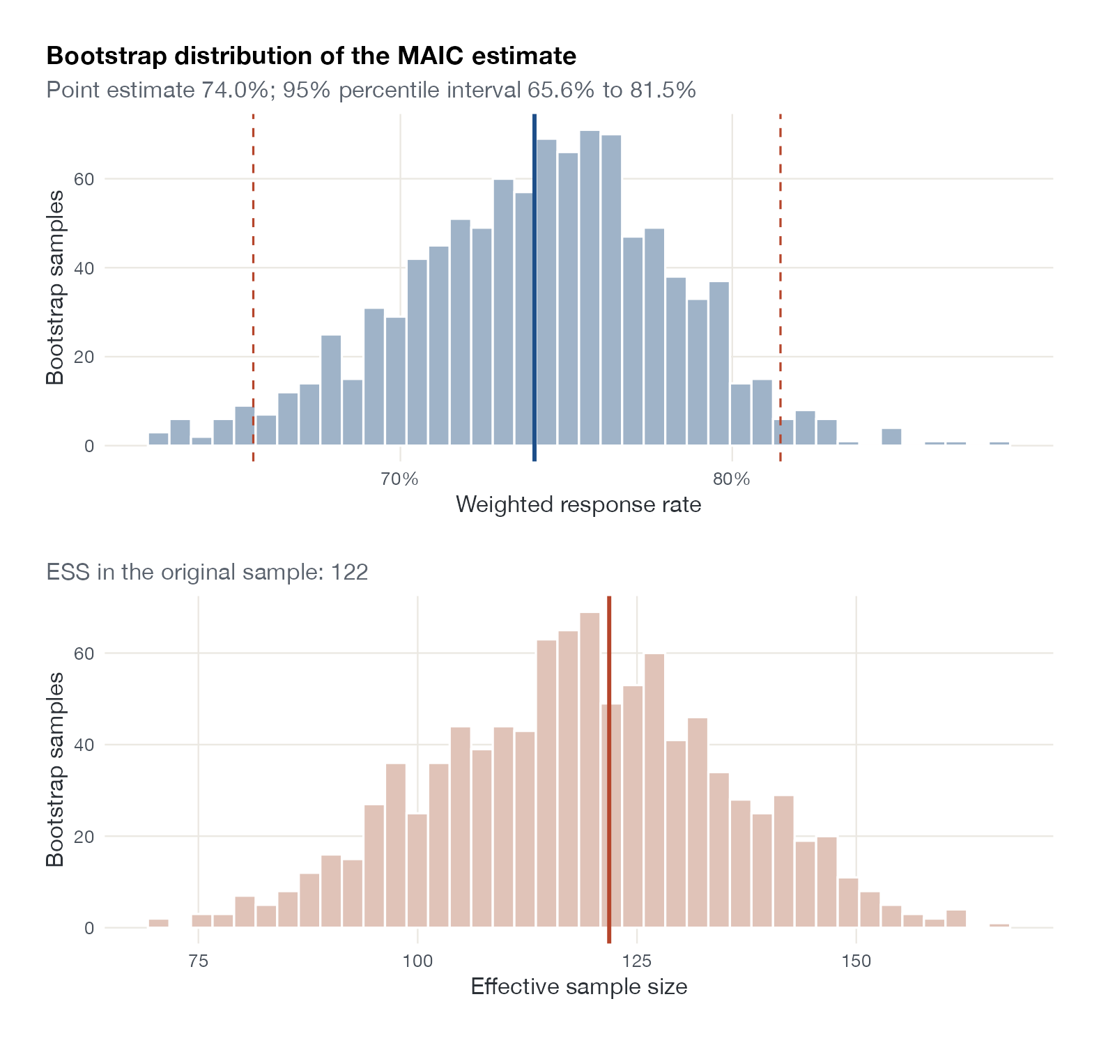
MAIC diagnostics: what the weights did, how much information survived, and whether populations overlap.

Outcome regression and transportability
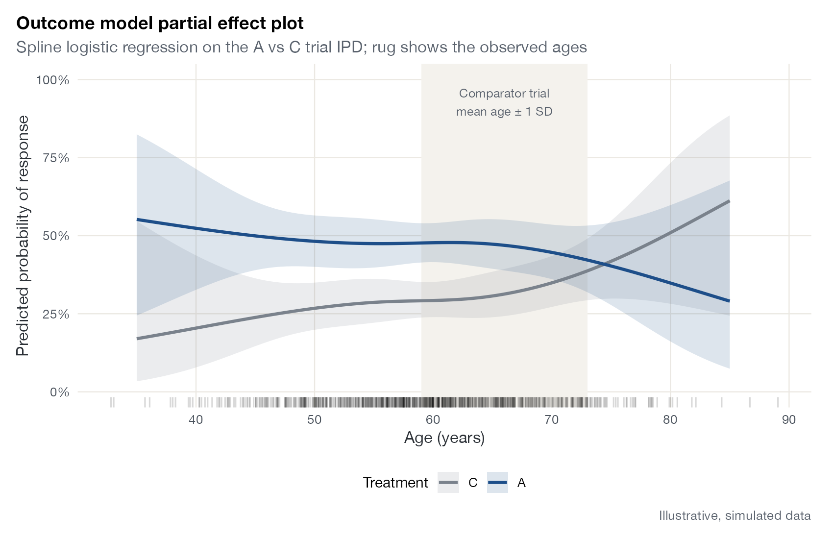
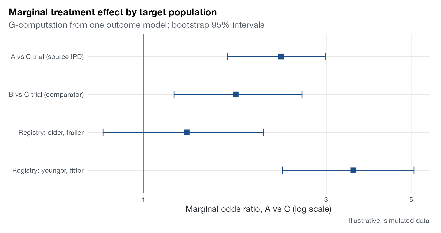
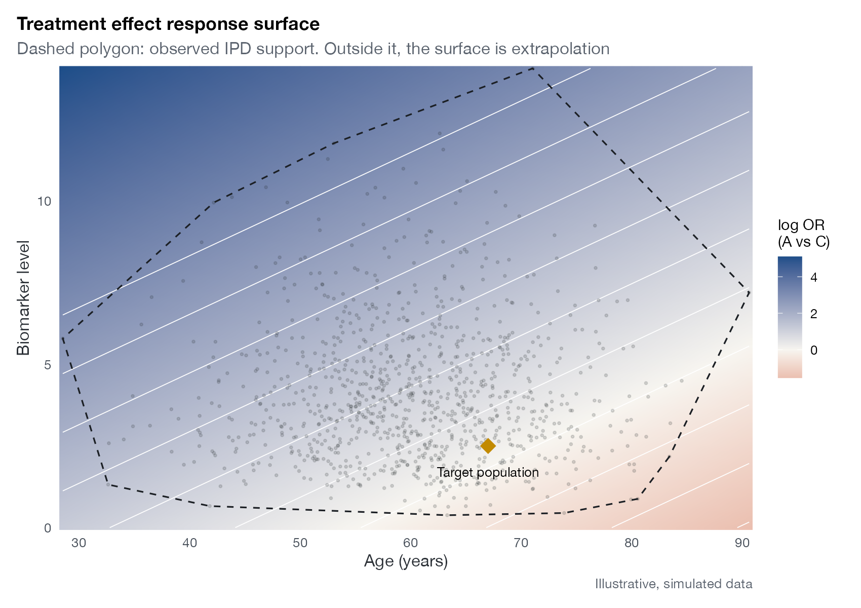
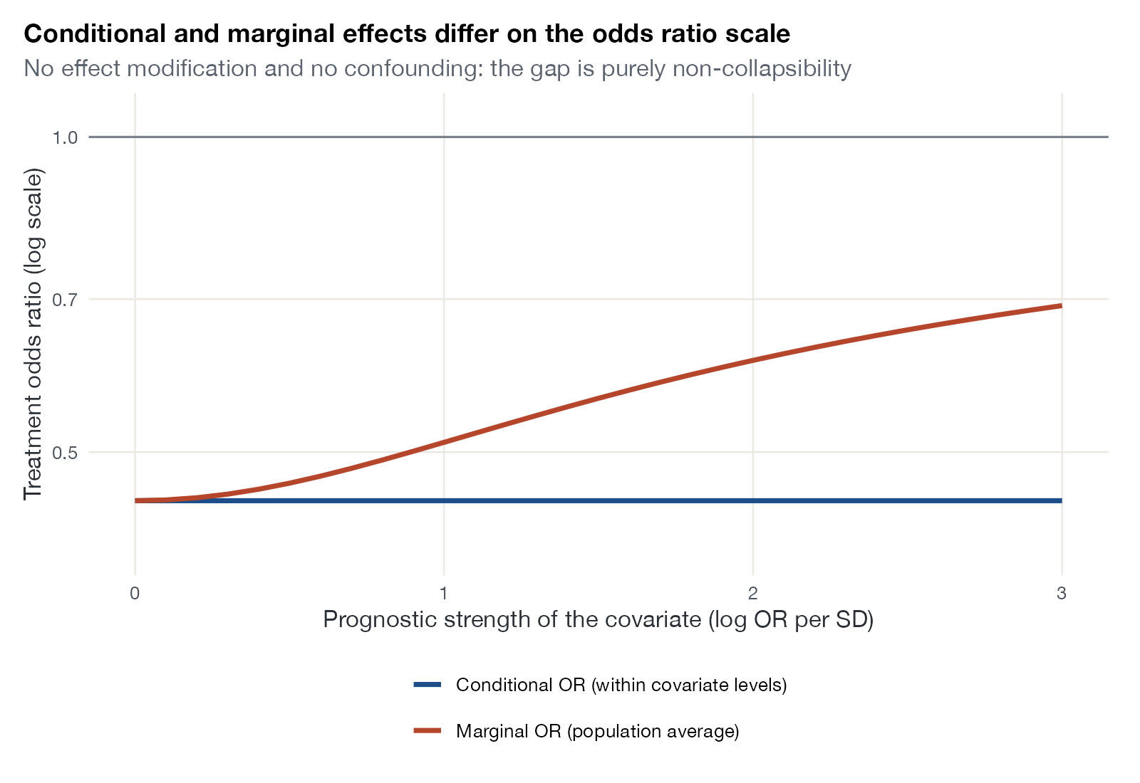
STC and G-computation diagnostics: functional form, extrapolation, and effects in a target population.
Multilevel network meta-regression
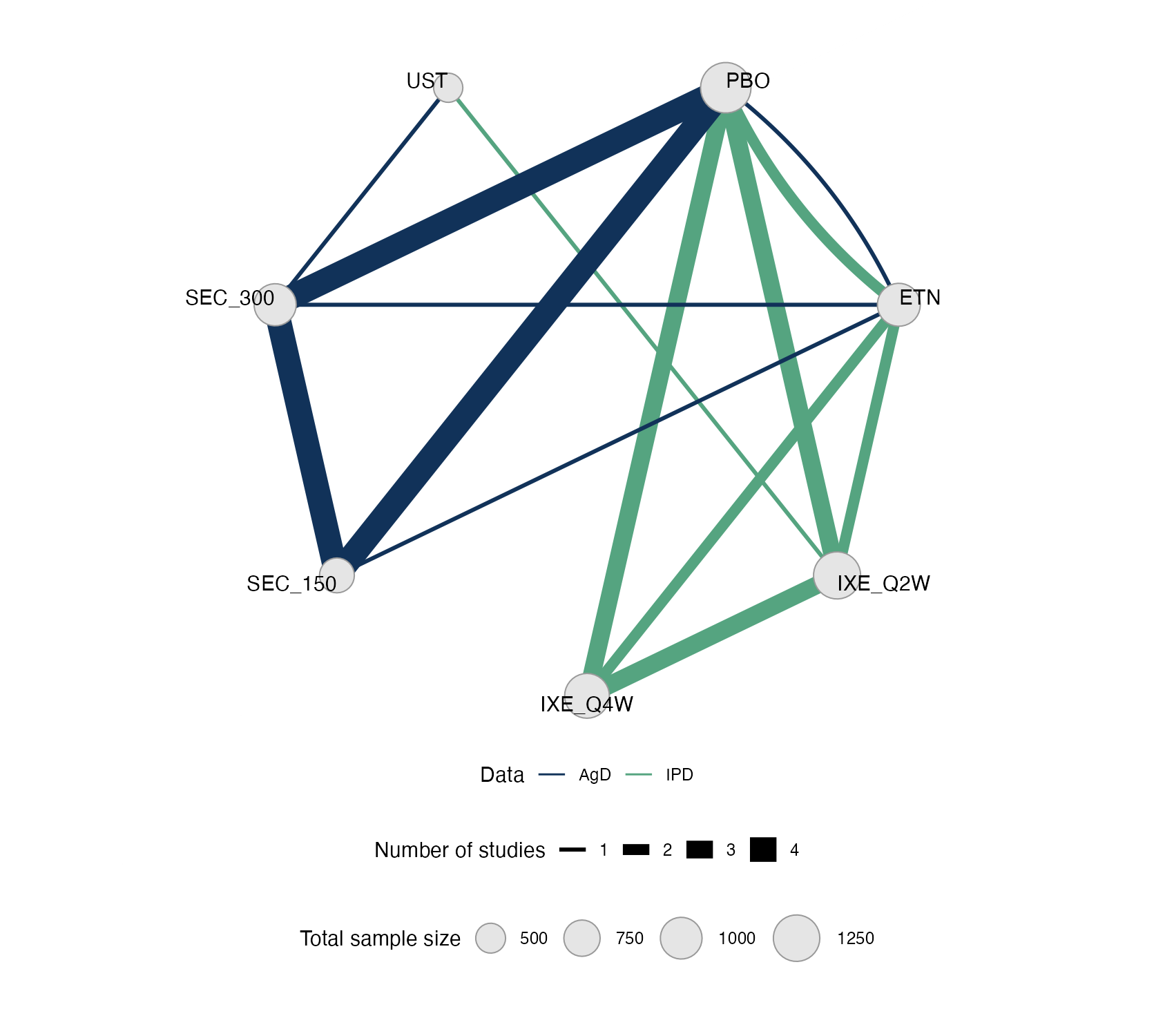
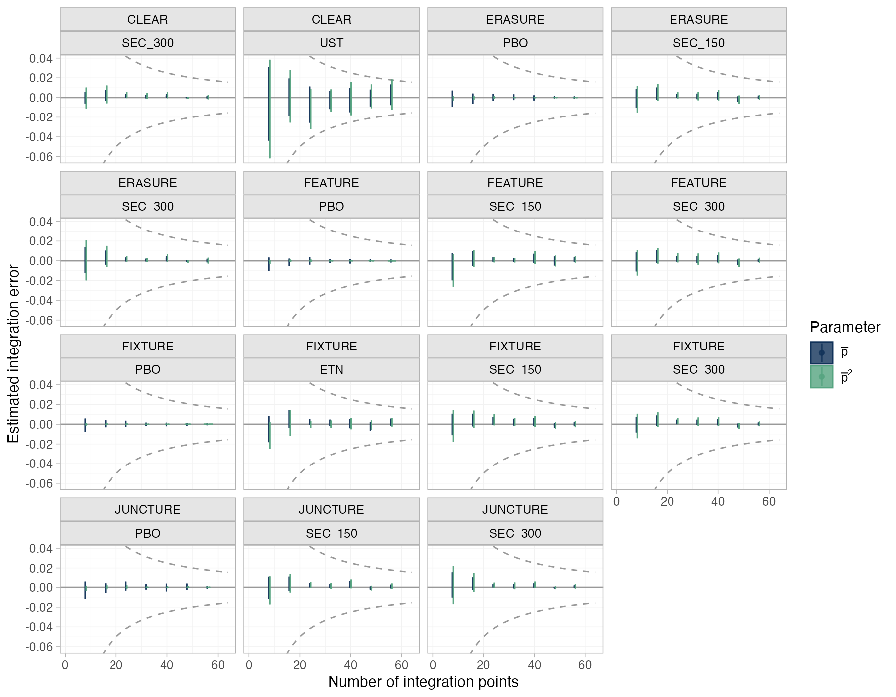
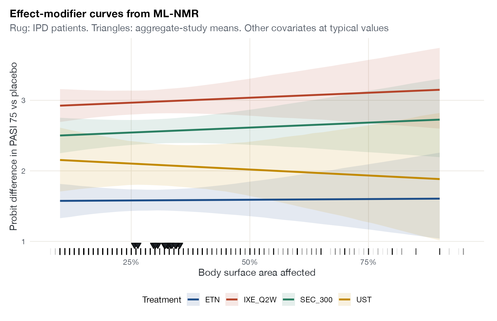
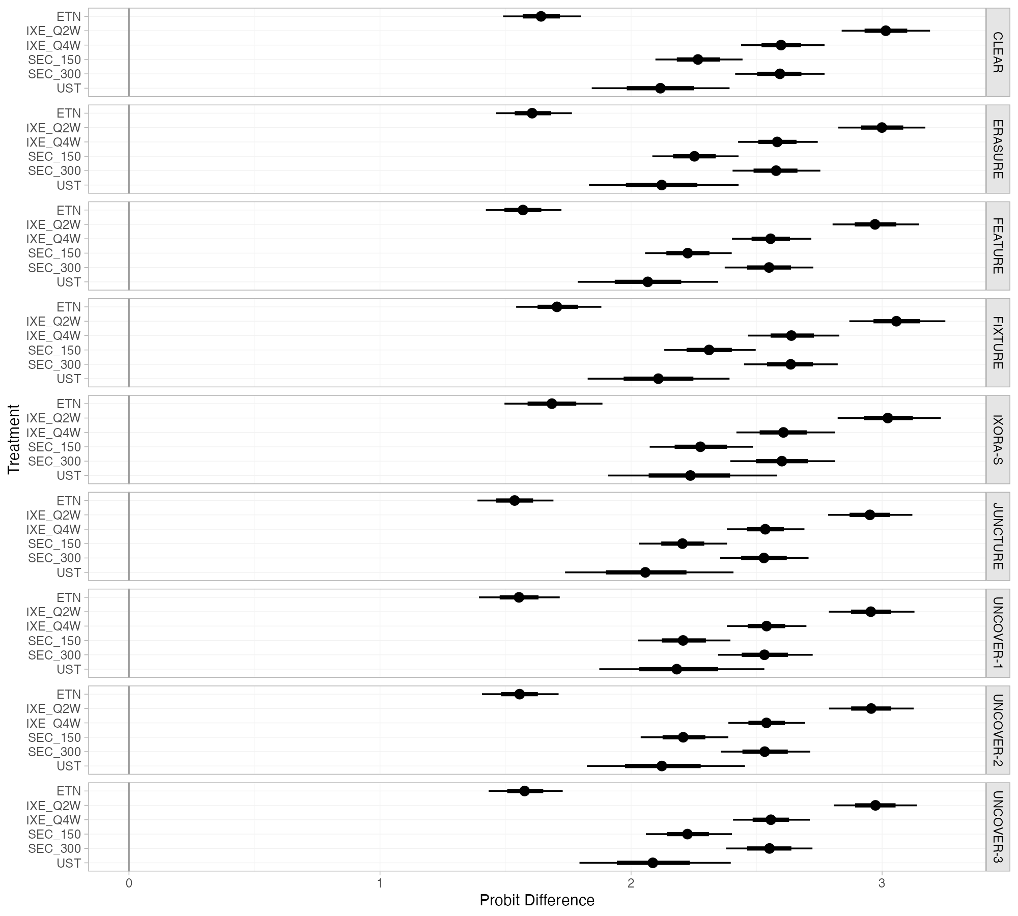
ML-NMR graphics for mixed IPD and aggregate networks, numerical integration, and population-specific effects.
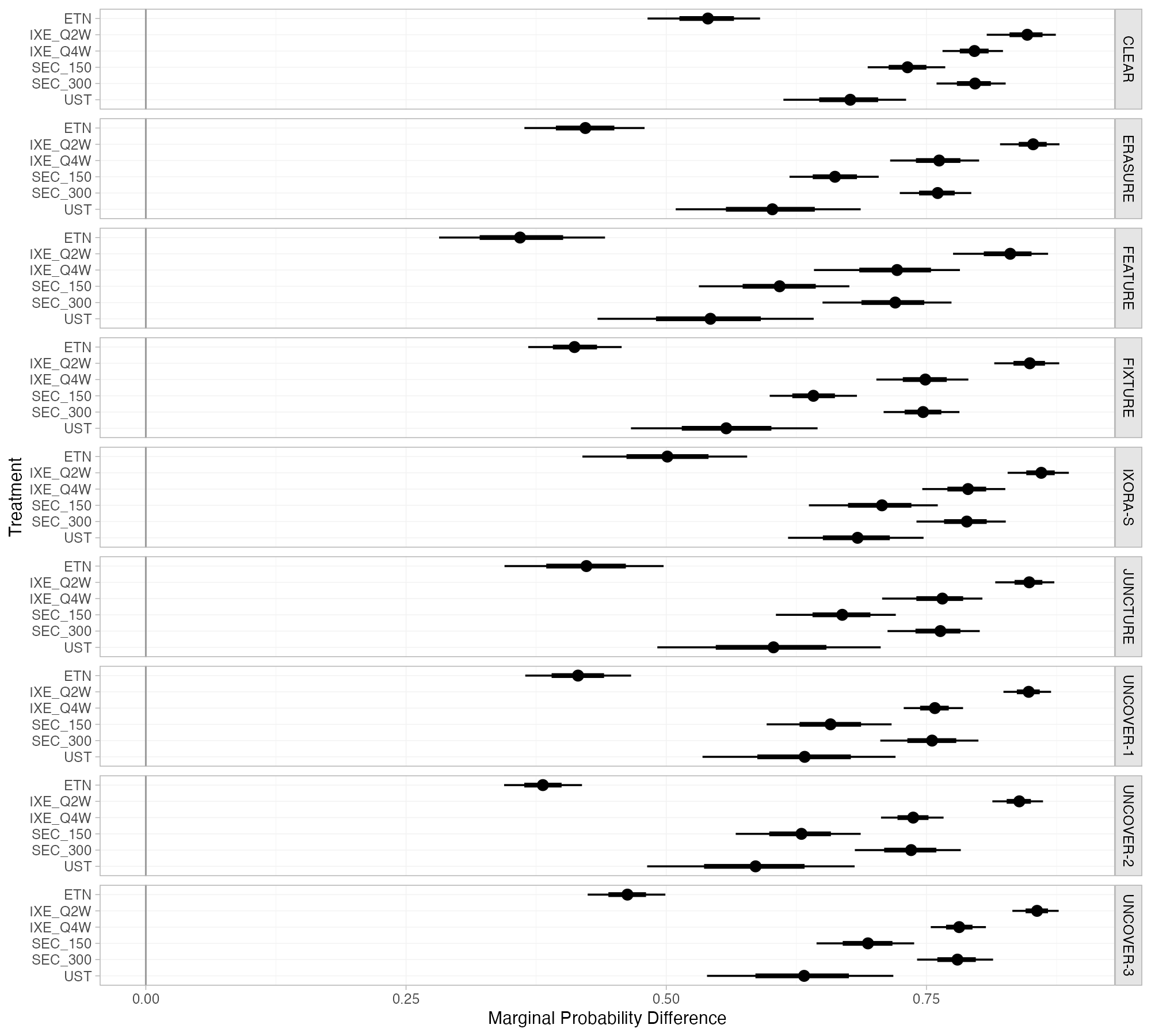
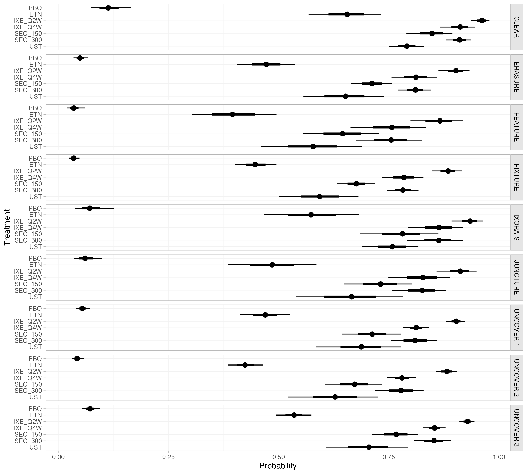
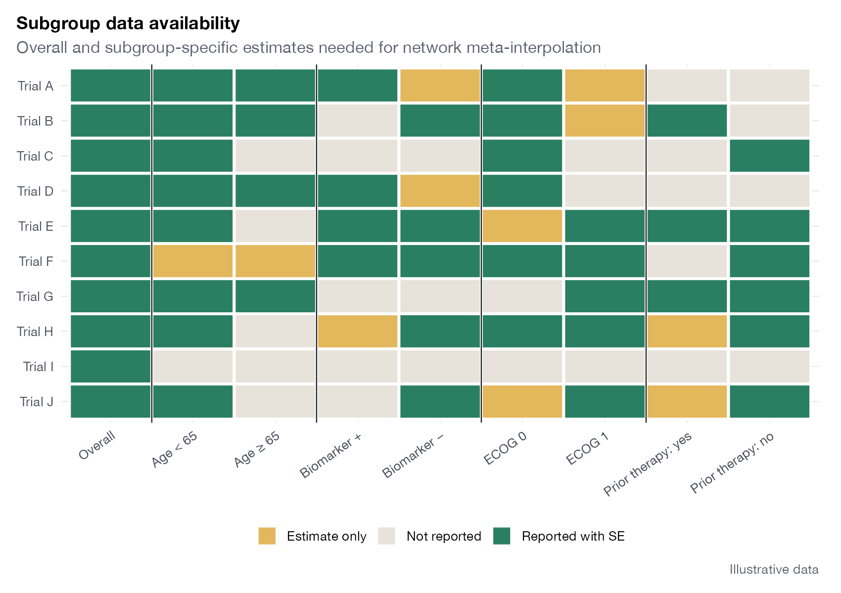
Network meta-interpolation
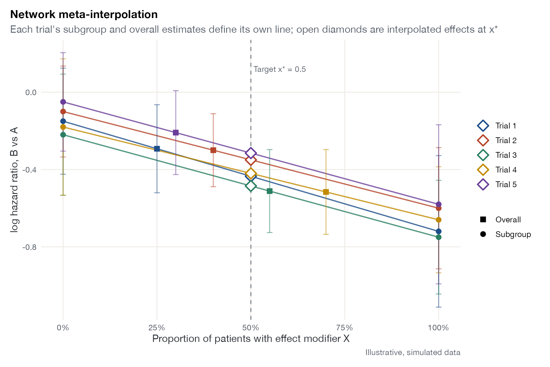
NMI graphics built on subgroup evidence and interpolation to a common effect-modifier value.

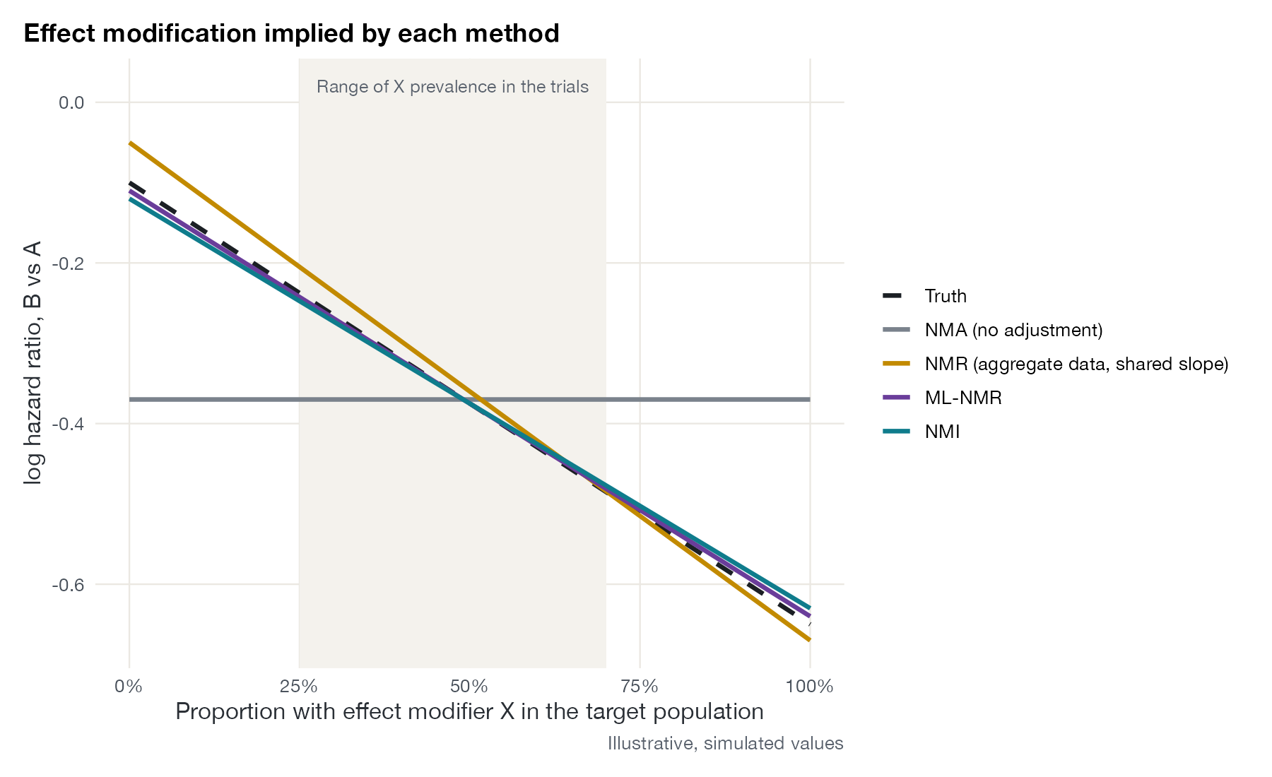
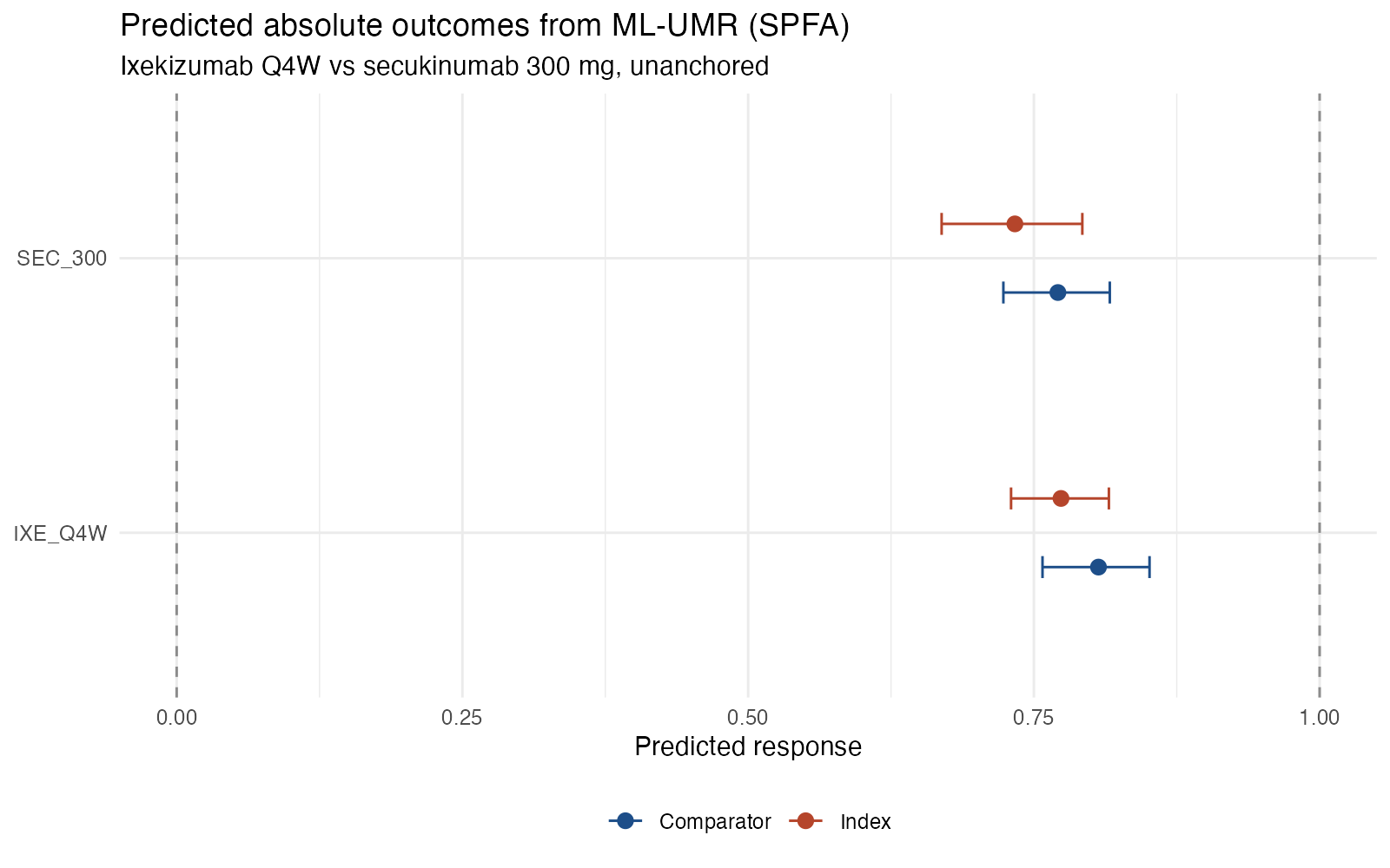
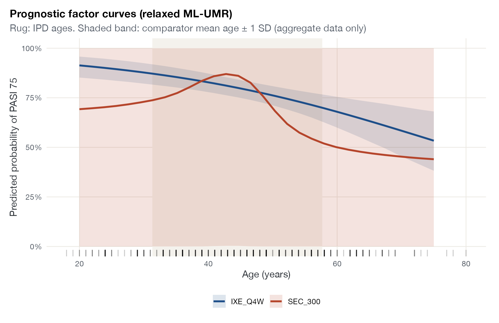
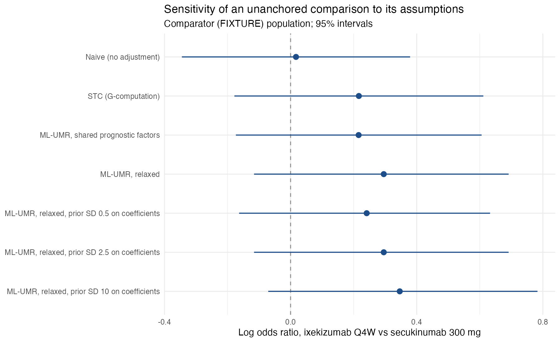
Unanchored multilevel meta-regression
ML-UMR graphics for disconnected evidence, where prognostic modeling carries the whole comparison.
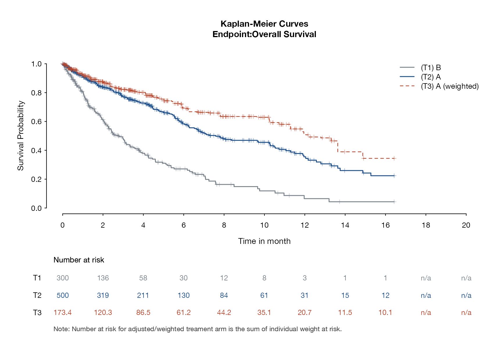
Survival and time-to-event
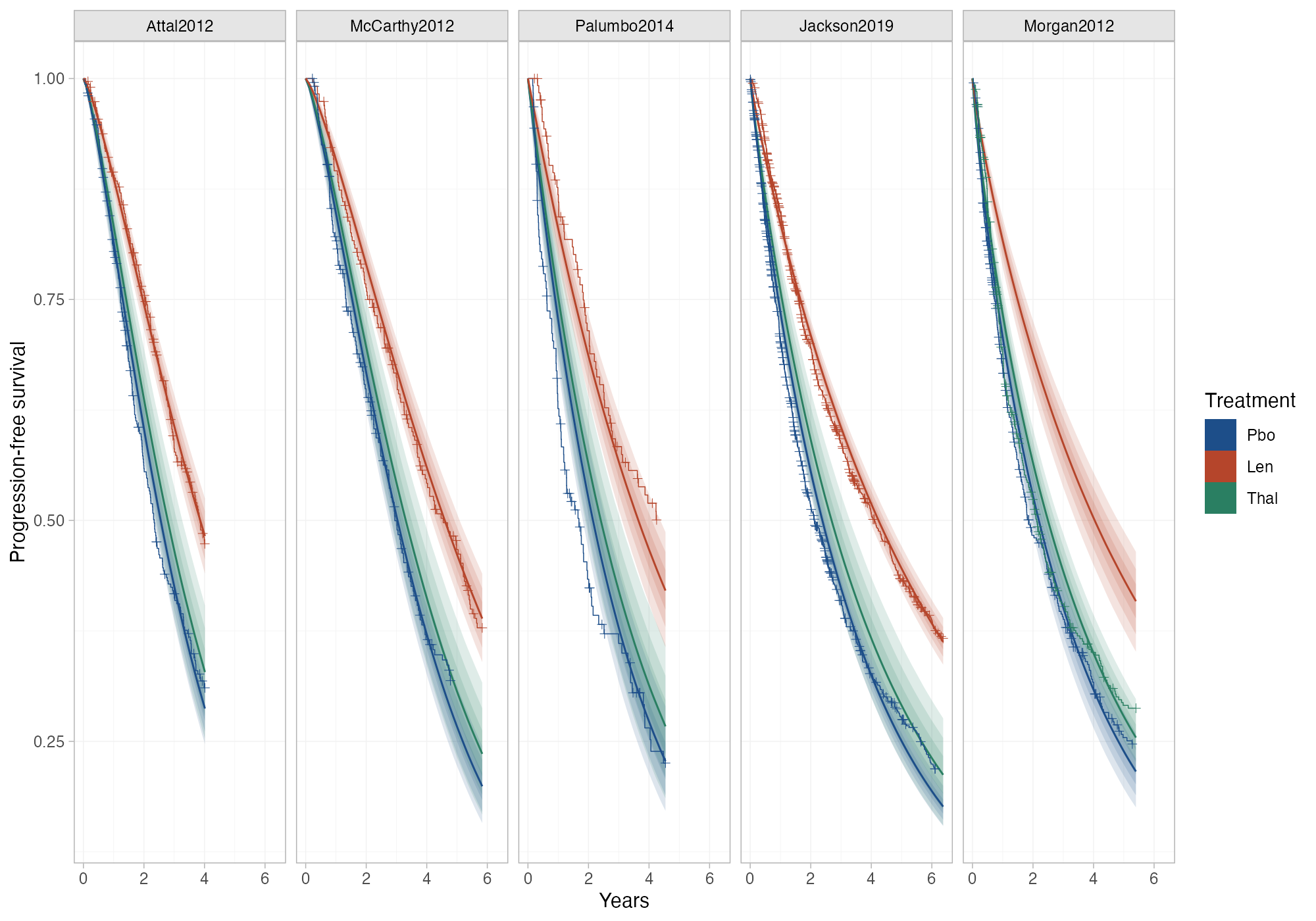
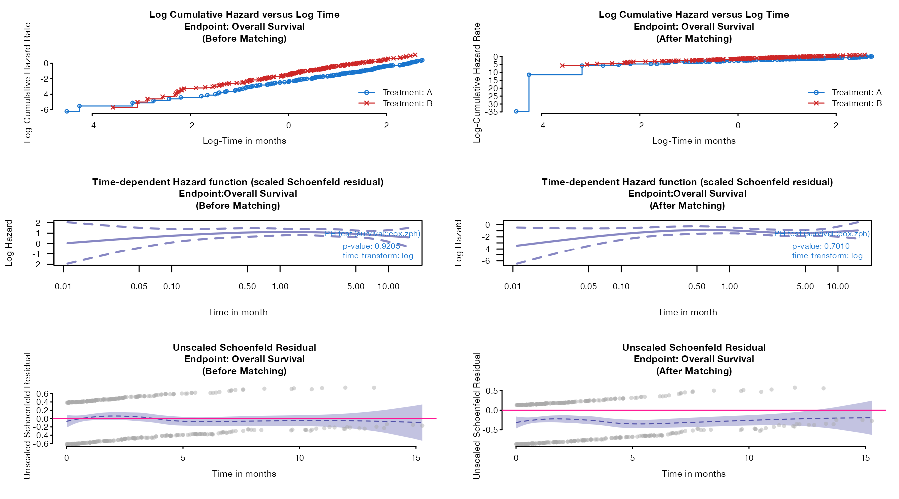
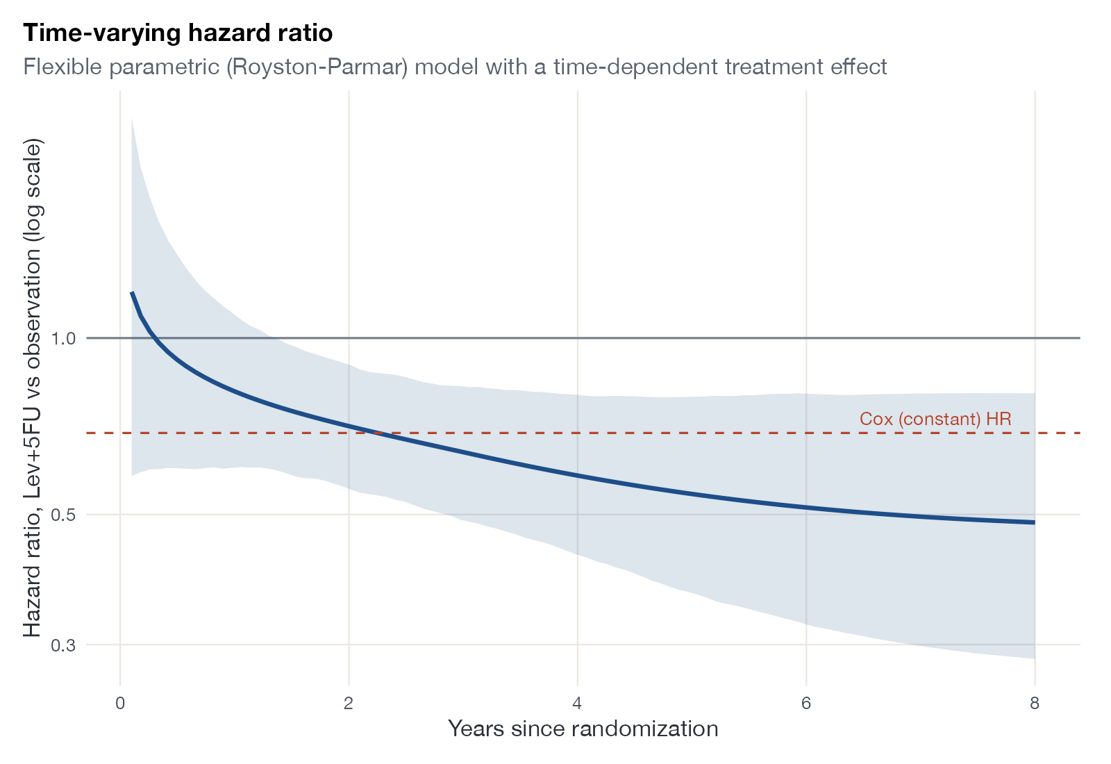
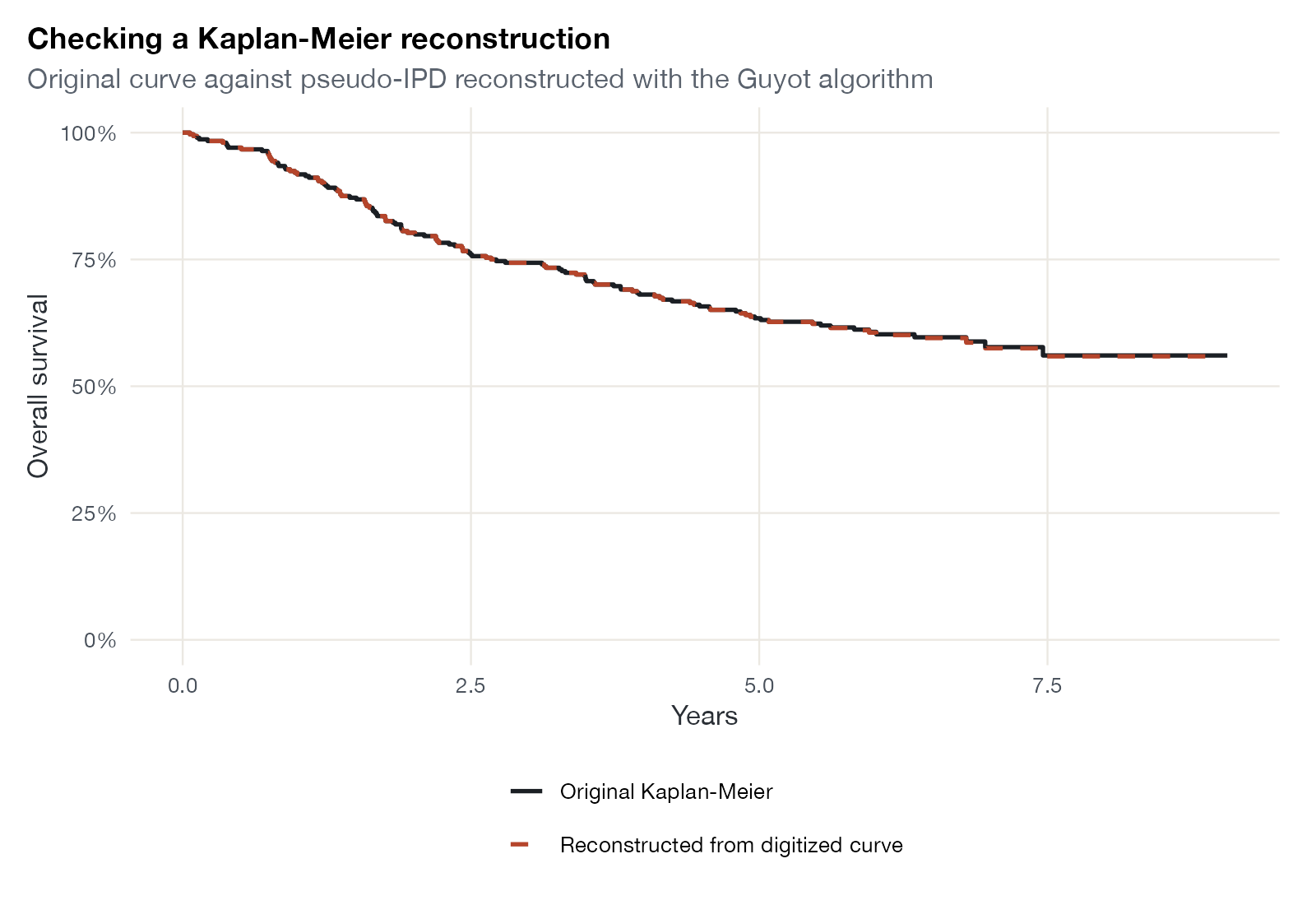
Kaplan-Meier displays, proportional hazards checks, and time-varying effects across ITC methods.
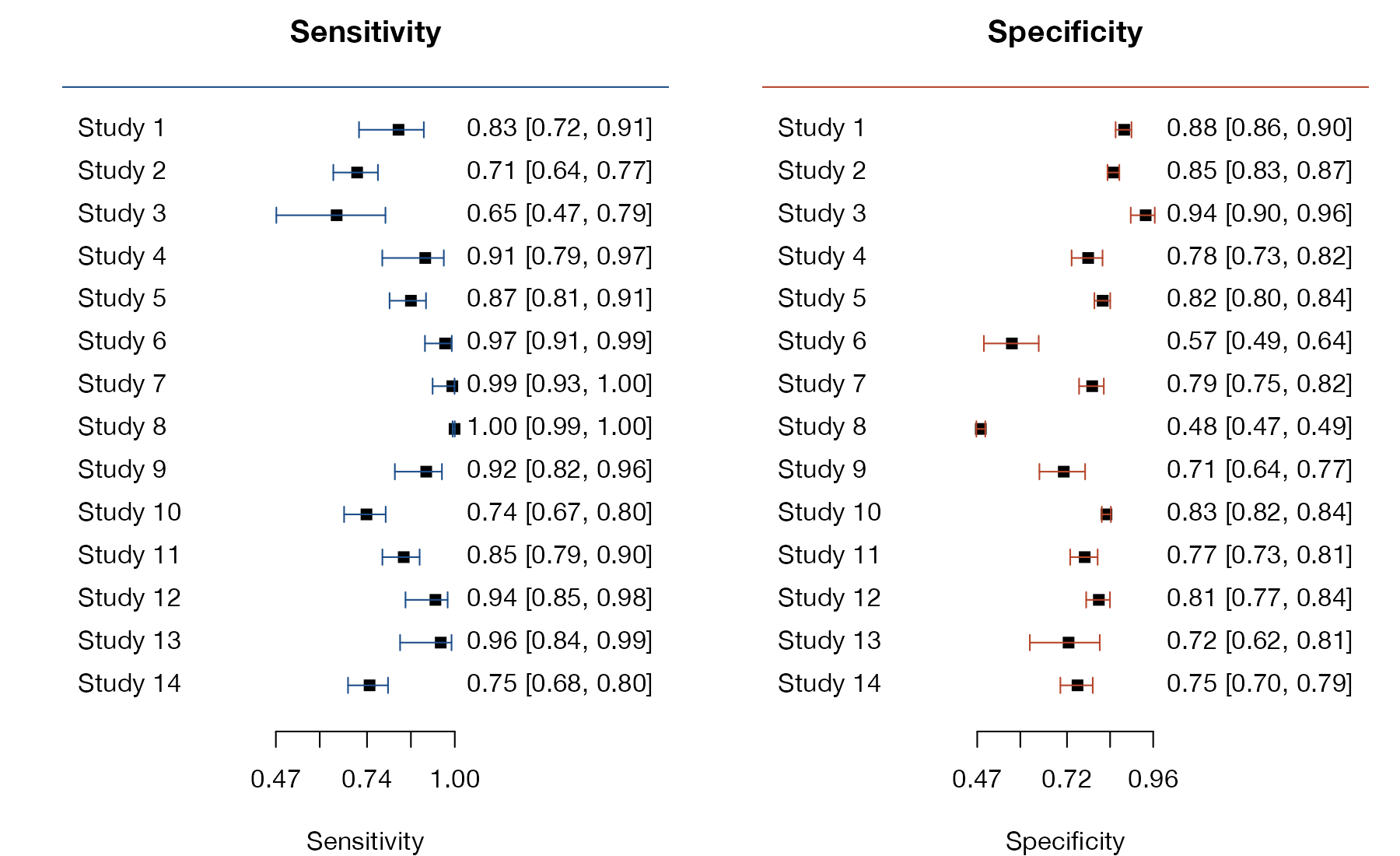
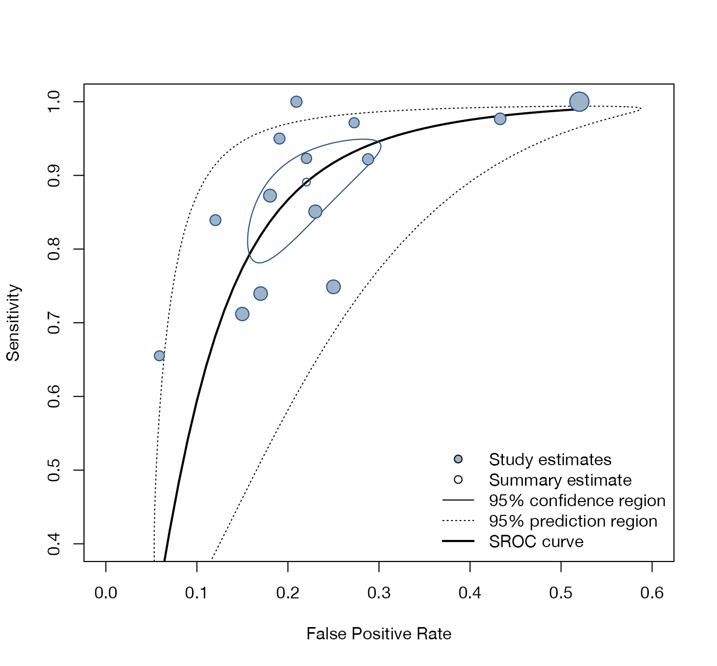
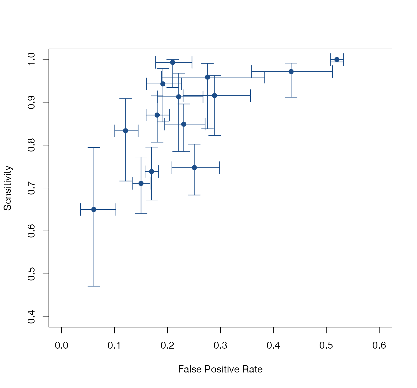
Diagnostic test accuracy
Paired sensitivity and specificity displays and summary ROC curves for DTA meta-analysis.
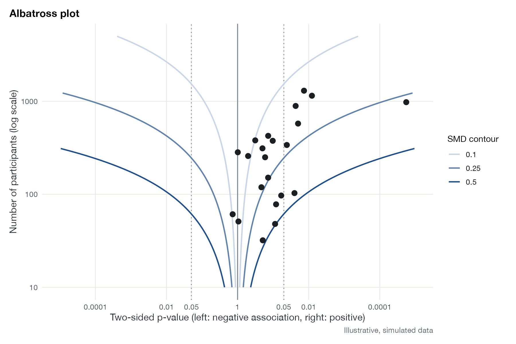
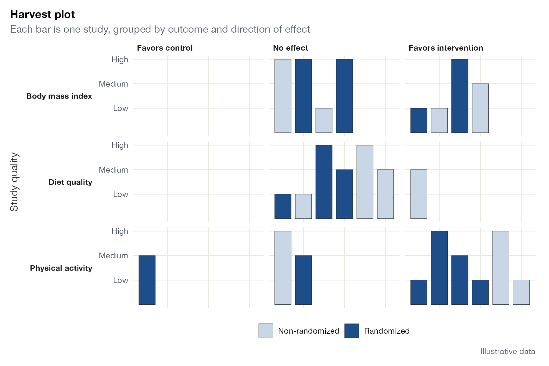
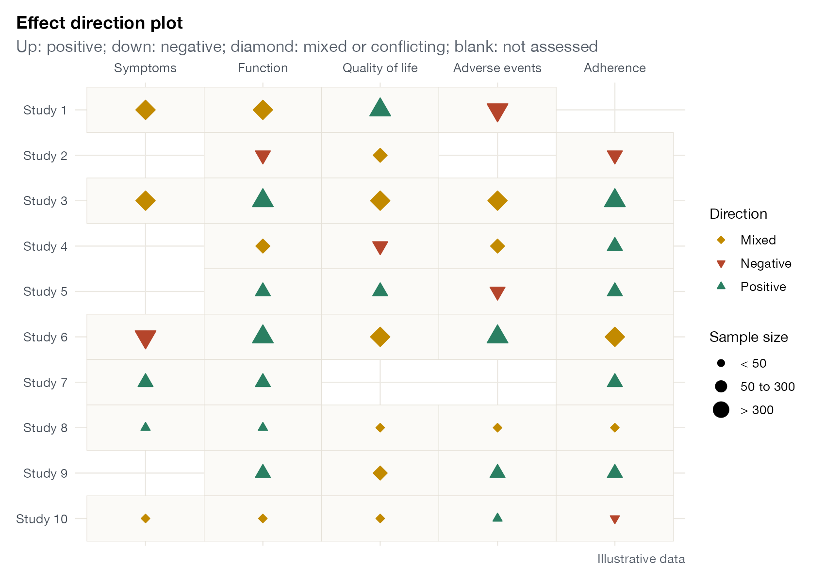
Synthesis without meta-analysis
Graphics for reviews where effect sizes cannot be pooled.
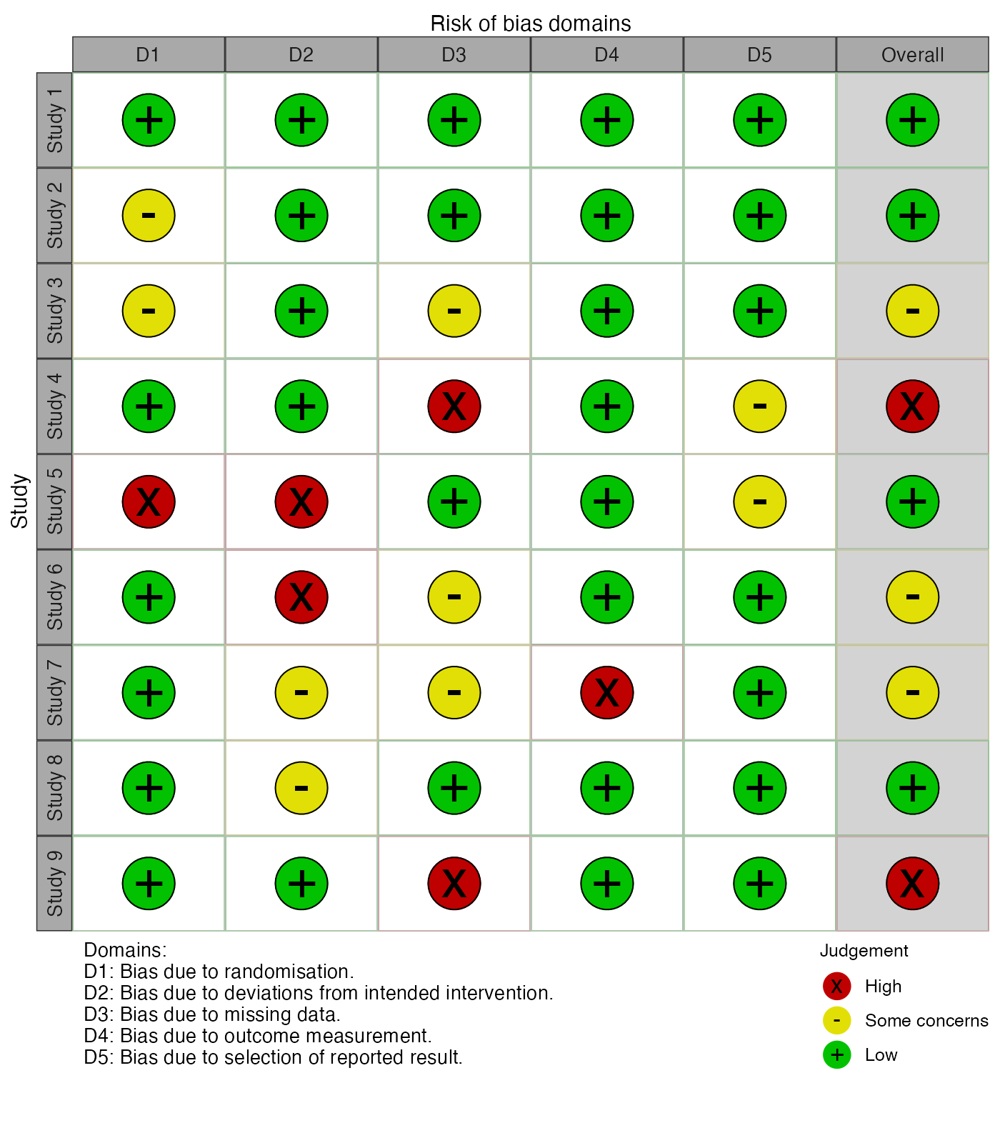
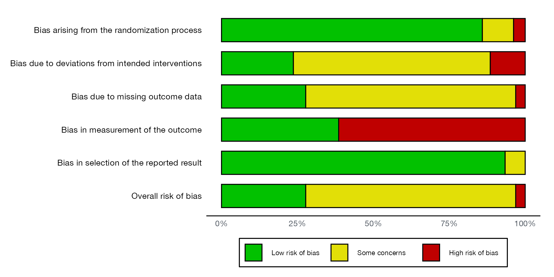
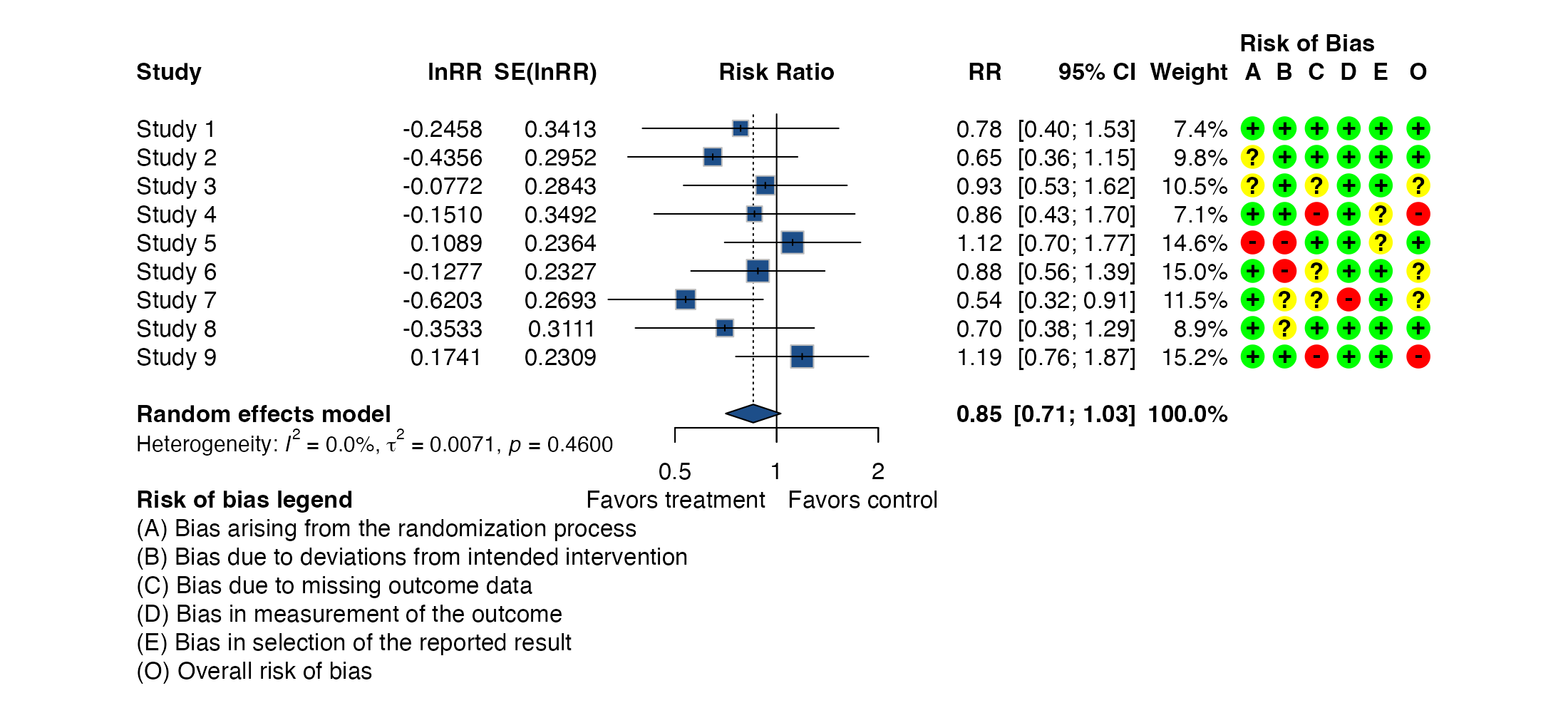
Risk of bias and reporting
Study-level quality displays that accompany the quantitative synthesis.
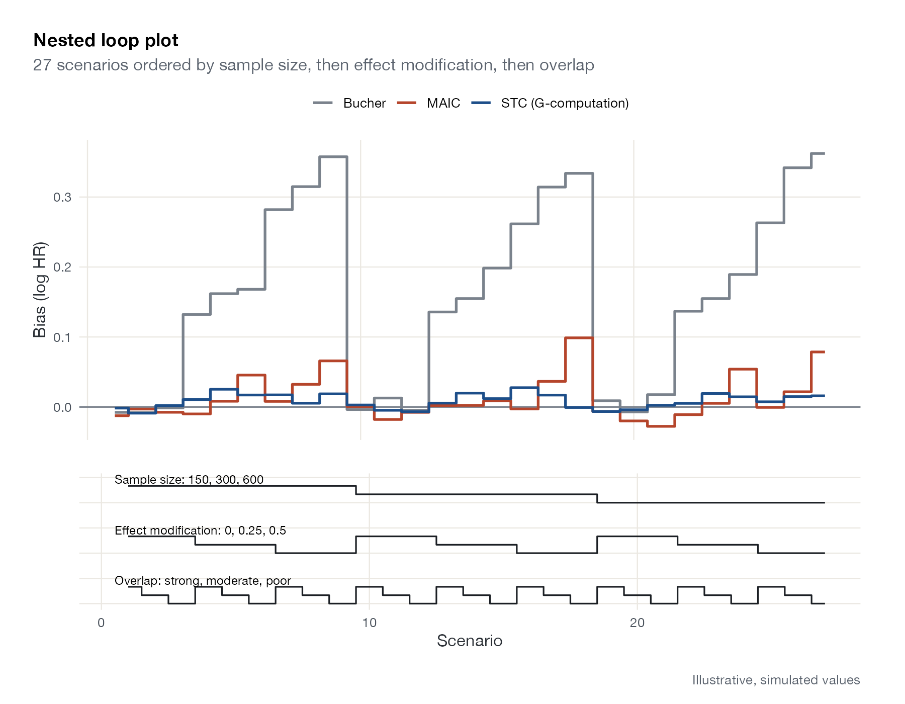
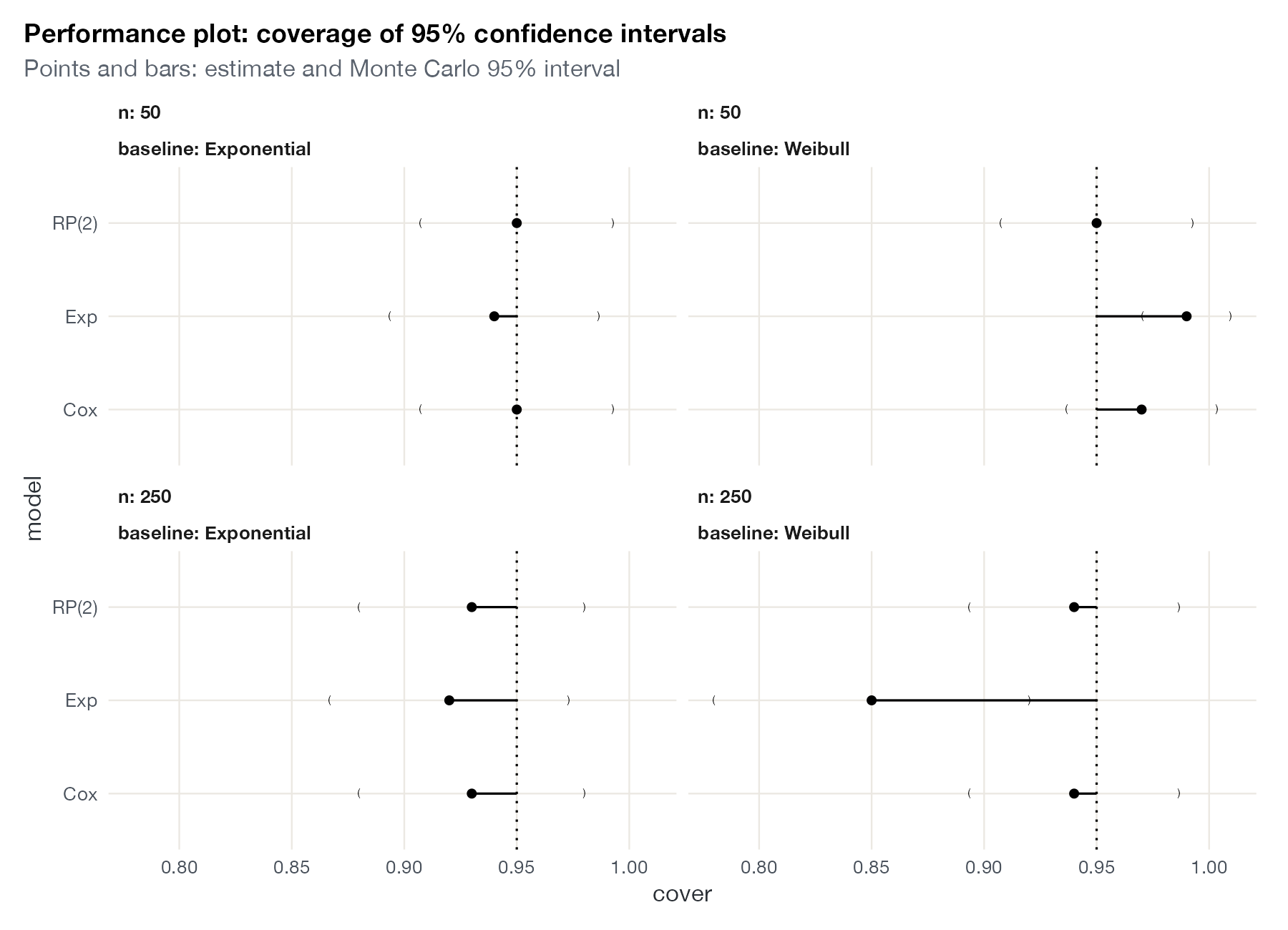
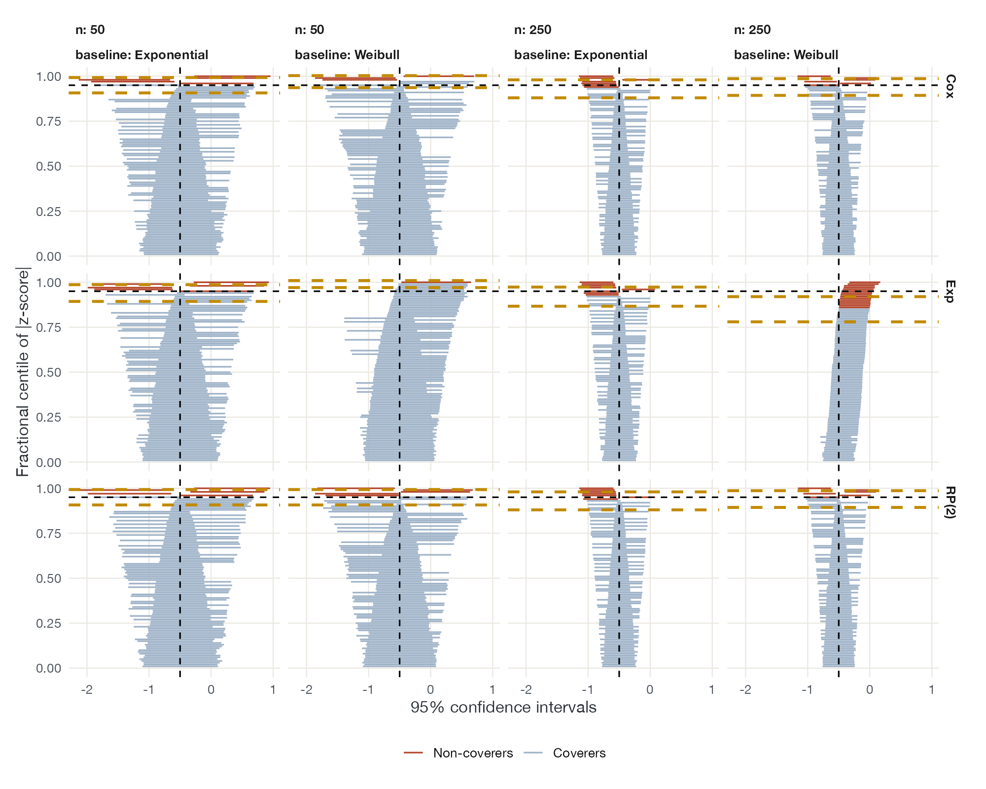
Simulation and method evaluation
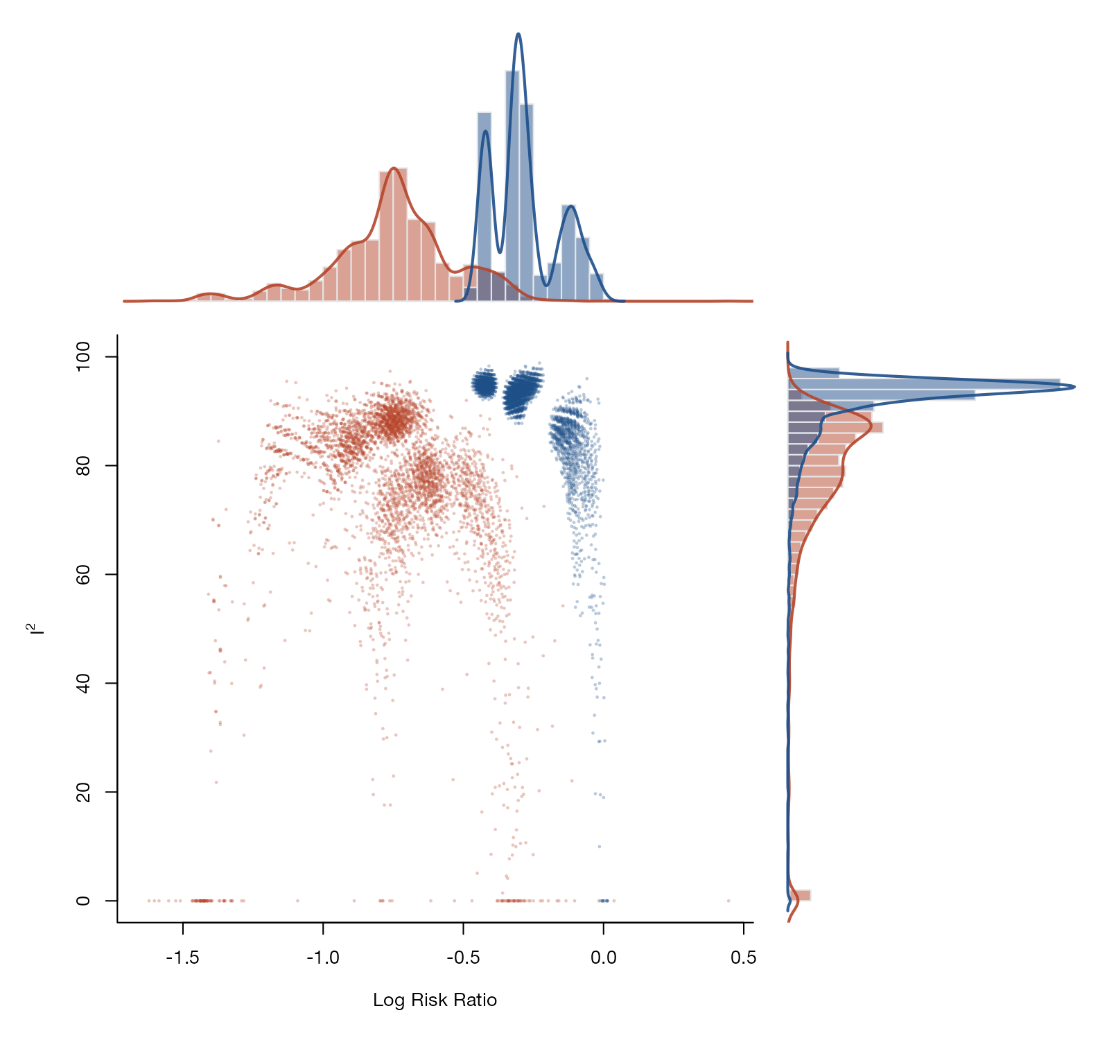
Graphics from the proof-of-concept literature that evaluates methods under known truth.
No plots match this filter. Try another method or search term.