League table heat plot
League table, treatment matrix, heat map of relative effects
netmeta::Senn2013.
netmeta::heatplot(), netmeta::netleague(); Stata netleague
What it shows
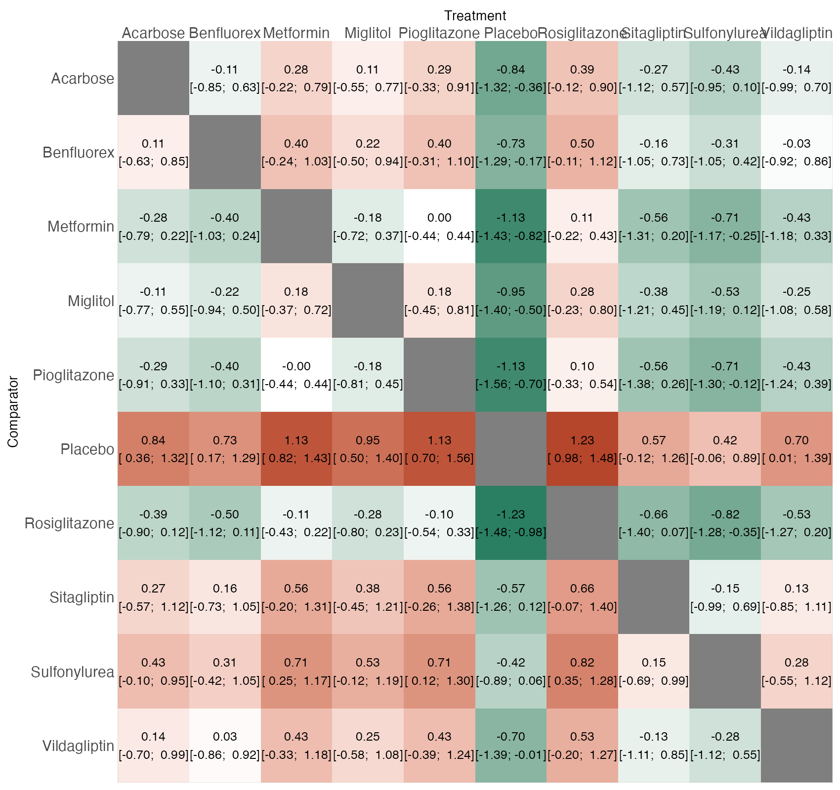
A network of \(T\) treatments yields \(T(T-1)/2\) relative effects. The league table arranges them in a square matrix with treatments on the diagonal (or rows and columns), so that any comparison can be looked up. Coloring the cells turns the table into a heat map in which clusters of similar treatments and strongly separated pairs stand out.
How to read it
- Rows and columns: treatments. Here each cell is the row treatment minus the column treatment.
- Cell text: point estimate and 95% confidence interval.
- Color: direction and magnitude. For HbA1c, negative values (green) favor the row treatment.
- Gray diagonal: a treatment compared with itself.
Interpretation
The placebo row is red almost everywhere: every active drug lowers HbA1c relative to placebo, most by more than 0.7 percentage points. Among active drugs the colors are pale and the intervals mostly include zero, apart from rosiglitazone, metformin, and pioglitazone, which outperform sulfonylurea. The ranking suggested by a rankogram rests on these modest differences.
Pitfalls
- Direction conventions vary between software and papers (row vs column, or column vs row). Always state which, because a reversed reading flips every conclusion.
- The league table is a reporting device, not a diagnostic; it says nothing about inconsistency or the source of each estimate.
- Color scales centered at zero can make small, uncertain differences look important; always print the intervals.
- Large networks make the table unwieldy; consider an interval plot.
Code
library(netmeta)

data(Senn2013)

net <- netmeta(
  TE, seTE, treat1.long, treat2.long, studlab,
  data = Senn2013, sm = "MD",
  common = FALSE, reference.group = "Placebo"
)

# League table as a heat map: each cell gives the row treatment versus the
# column treatment; color encodes the size and direction of the difference
heatplot(net, low.colour = "#2a7f62", mid.colour = "white",
         high.colour = "#b5452b", size = 3.2, size.trt = 11, size.axis = 10)
network meta consistency
netleague, sort(...) eformReferences
- Chaimani A, Higgins JPT, Mavridis D, Spyridonos P, Salanti G. Graphical tools for network meta-analysis in STATA. PLoS One. 2013;8:e76654. doi:10.1371/journal.pone.0076654
- Balduzzi S, Rücker G, Nikolakopoulou A, et al. netmeta: an R package for network meta-analysis using frequentist methods. J Stat Softw. 2023;106(2):1-40. doi:10.18637/jss.v106.i02