Risk-of-bias summary plot
Weighted risk-of-bias bar chart
MA
NMA
Stacked bars showing the proportion of studies, or of statistical information, at each level of risk in each domain.
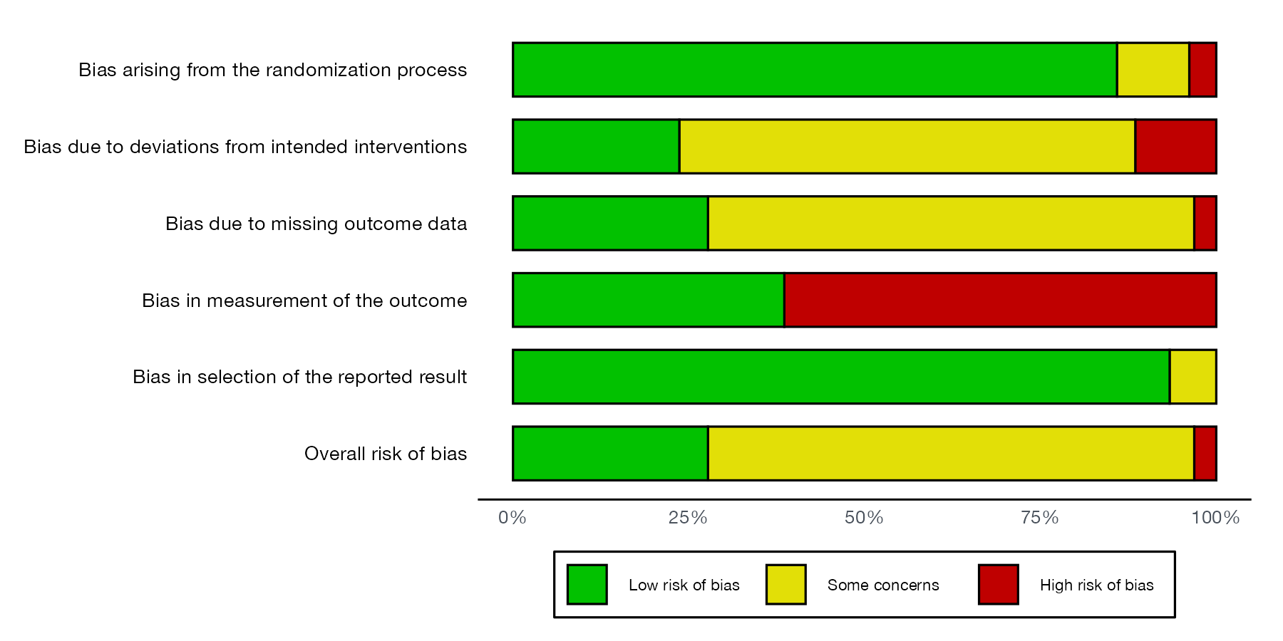
RoB 2 summary for the nine example studies, weighted by each study’s weight in the meta-analysis: proportion of information at low risk, some concerns, and high risk in each domain and overall. Data:
robvis::data_rob2.
Family
Risk of bias and reporting
Purpose
Summarize how much of the evidence is at risk of bias in each domain.
Inputs
Risk-of-bias judgments and, optionally, study weights.
Software
R
robvis::rob_summary(); RevMan
What it shows
The summary plot condenses the traffic light plot into one stacked bar per domain. Weighting each study by its weight in the meta-analysis, as recommended, shows the share of the statistical information, rather than the share of studies, that is at each risk level.
How to read it
- Rows: domains and the overall judgment.
- Bar segments: proportion of information (or of studies) at low risk, some concerns, and high risk.
Interpretation
Most of the information is at low risk for the randomization and selective reporting domains. Measurement of the outcome is the weak point: a single study at high risk in that domain (study 7) carries about 60% of the weight, so the bar looks far worse than the study count suggests. Overall, most of the evidence has some concerns.
Pitfalls
- Unweighted summaries treat a tiny study like a large one; use weights when a meta-analysis exists.
- Weights differ by outcome and by model, so the plot is outcome specific.
- The plot hides which studies are at risk; keep the traffic light plot in an appendix.
Code
library(robvis)

data(data_rob2)

# Proportion of information (weighted by study weight) at each risk level,
# per domain and overall
rob_summary(data_rob2, tool = "ROB2", overall = TRUE, weighted = TRUE)
References
- McGuinness LA, Higgins JPT. Risk-of-bias VISualization (robvis): an R package and Shiny web app for visualizing risk-of-bias assessments. Res Synth Methods. 2021;12:55-61. doi:10.1002/jrsm.1411