Rainforest plot
Likelihood drop forest plot
metadat::dat.bcg.
metaviz::viz_rainforest()
What it shows
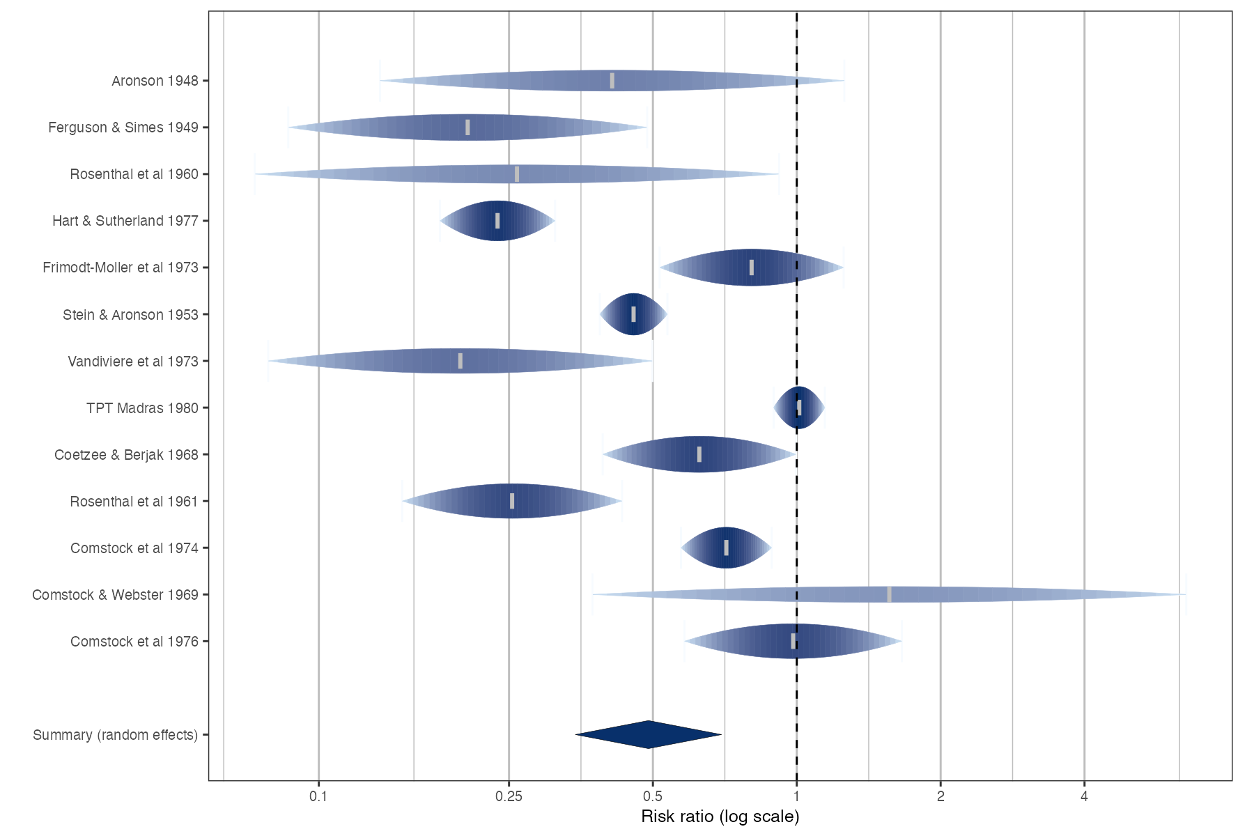
In a conventional forest plot every value inside the 95% confidence interval looks equally plausible, and the eye is drawn to the longest lines, which belong to the least informative studies. The rainforest plot, proposed by Schild and Voracek, redraws each interval as a “raindrop” whose height follows the likelihood of the effect. Shading intensity is also tied to weight, so precise studies stand out and imprecise ones fade.
How to read it
- Rows: studies, with a summary drop or diamond at the bottom.
- Drop width: the 95% confidence interval.
- Drop height and shape: the relative likelihood (a normal curve on the analysis scale), largest at the point estimate.
- Color intensity: proportional to the study’s weight.
- Tick inside the drop: the point estimate.
Interpretation
The large trials (Stein and Aronson, TPT Madras, Comstock 1974, Hart and Sutherland) appear as short, dark, concentrated drops, while small trials such as Comstock and Webster fade into long, pale streaks. The eye is now drawn to the studies that actually carry the evidence, which is the main design goal.
Pitfalls
- The likelihood shape assumes approximate normality on the analysis scale, as in any standard forest plot.
- Drops shrink visually for imprecise studies, which is the intention, but it can make outlying imprecise studies easy to overlook.
- It is less familiar to clinical readers than a standard forest plot; include a legend.
Code
library(metafor)
library(metaviz)

data(dat.bcg, package = "metadat")
dat <- escalc(measure = "RR", ai = tpos, bi = tneg, ci = cpos, di = cneg,
              data = dat.bcg)

# Each "raindrop" traces the likelihood of the study effect across its CI
viz_rainforest(
  x = dat[, c("yi", "vi")] |> transform(vi = sqrt(vi)),
  study_labels = paste(dat$author, dat$year),
  summary_label = "Summary (random effects)",
  method = "REML",
  xlab = "Risk ratio (log scale)",
  col = "Blues",
  text_size = 3.2
) +
  ggplot2::scale_x_continuous(name = "Risk ratio (log scale)", breaks = log(c(0.1, 0.25, 0.5, 1, 2, 4)),
                              labels = c(0.1, 0.25, 0.5, 1, 2, 4))
References
- Schild AHE, Voracek M. Finding your way out of the forest without a trail of bread crumbs: development and evaluation of two novel displays of forest plots. Res Synth Methods. 2015;6:74-86. doi:10.1002/jrsm.1125
- Kossmeier M, Tran US, Voracek M. Charting the landscape of graphical displays for meta-analysis and systematic reviews: a comprehensive review, taxonomy, and feature analysis. BMC Med Res Methodol. 2020;20:26. doi:10.1186/s12874-020-0911-9