Baujat plot
Heterogeneity versus influence plot
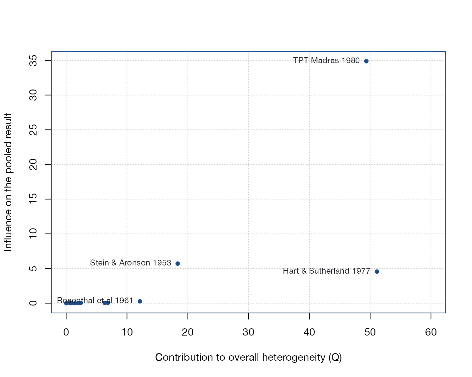
metadat::dat.bcg.
metafor::baujat(), meta::baujat()
What it shows
Baujat and colleagues proposed plotting, for each study, two quantities side by side: its contribution to Cochran’s heterogeneity statistic \(Q\) (horizontal) and its influence on the overall estimate, measured as the standardized squared difference between the pooled estimates with and without that study (vertical). The plot separates studies that are merely discordant from those that also move the answer, which a forest plot cannot do.
How to read it
- Horizontal axis: contribution to \(Q\), \(w_i(y_i - \hat\theta)^2\).
- Vertical axis: influence on the pooled estimate.
- Upper right: studies that are both heterogeneous and influential; investigate these first.
- Lower right: discordant but not influential (often imprecise or offset by others).
- Upper left: influential but consistent.
Interpretation
Three trials stand out. TPT Madras contributes 49 of the 152 units of \(Q\) and has by far the largest influence, because it is huge and shows no effect. Hart and Sutherland contributes as much heterogeneity but much less influence, since its strong benefit is partly balanced by other trials. Stein and Aronson is moderately heterogeneous and influential. The remaining trials cluster near the origin.
Pitfalls
- The plot is a diagnostic, not an exclusion rule. A clinically distinct trial can legitimately be influential.
- It is usually computed under a common-effect model; random-effects versions exist but behave differently.
- Axes are on arbitrary scales; compare positions, not absolute values.
Code
library(metafor)

data(dat.bcg, package = "metadat")
dat <- escalc(measure = "RR", ai = tpos, bi = tneg, ci = cpos, di = cneg,
              data = dat.bcg, slab = paste(author, year))

fit <- rma(yi, vi, data = dat, method = "EE")

# x: contribution to Cochran's Q; y: influence on the pooled estimate
b <- baujat(fit, symbol = 19, col = "#1d4e89", xlim = c(0, 60),
            xlab = "Contribution to overall heterogeneity (Q)",
            ylab = "Influence on the pooled result")

# Label the studies that stand out on either axis
top <- b$x > 10 | b$y > 2
text(b$x[top], b$y[top], b$slab[top], pos = 2, cex = 0.8, col = "#1b1f24")
References
- Baujat B, Mahé C, Pignon JP, Hill C. A graphical method for exploring heterogeneity in meta-analyses: application to a meta-analysis of 65 trials. Stat Med. 2002;21:2641-2652. doi:10.1002/sim.1221