Spie chart
Multi-outcome ranking pie chart
NMA
One chart per treatment with equal-angle sectors for outcomes and sector radius proportional to the ranking score.
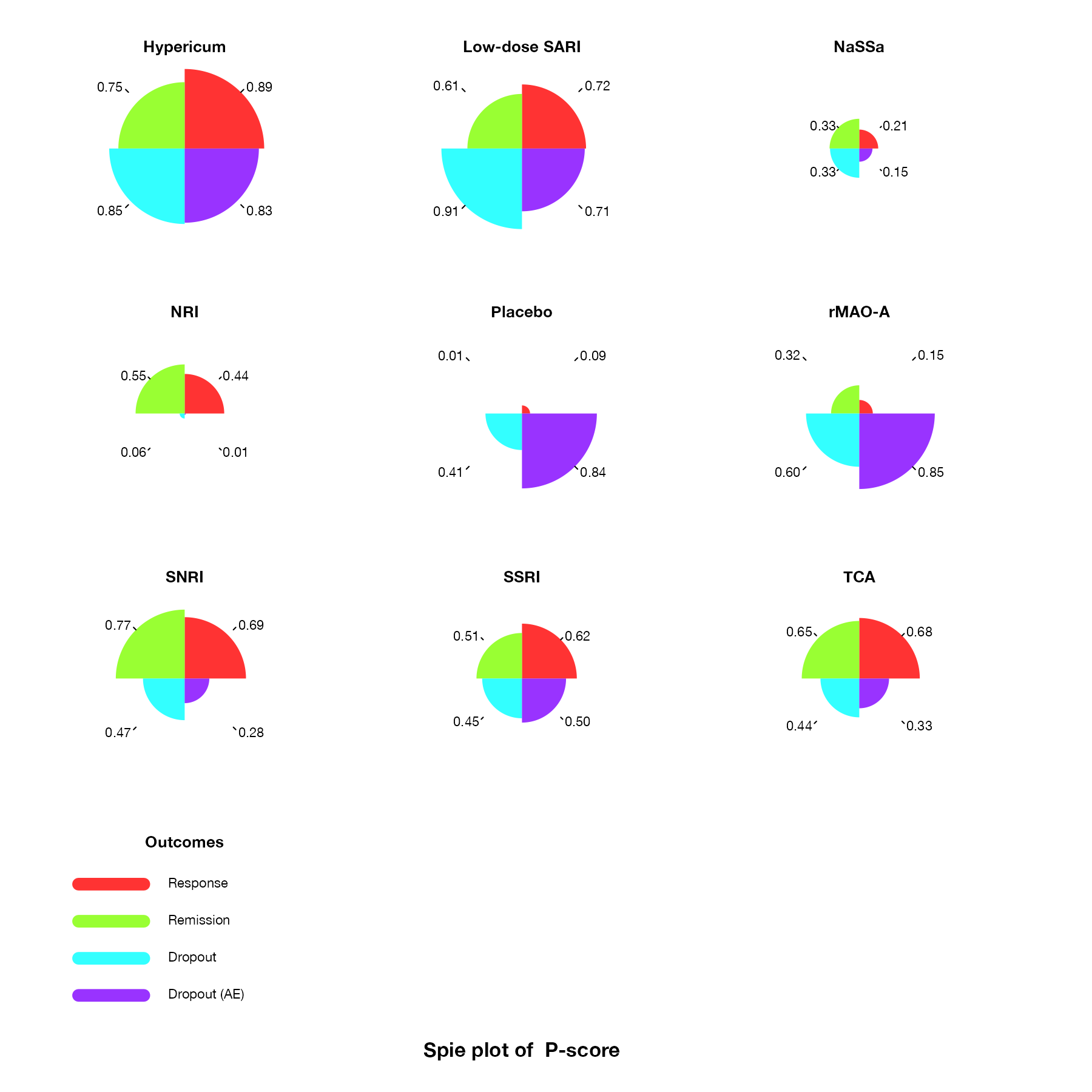
Spie charts of P-scores for response, remission, dropout, and dropout due to adverse events, one chart per antidepressant. Sector radius is proportional to the P-score; the filled area summarizes performance across outcomes. Data:
netmeta::Linde2015.
Family
Treatment ranking
Purpose
Summarize each treatment’s performance across outcomes as an area.
Inputs
Ranking scores per treatment and outcome, optionally with outcome weights.
Software
R
rankinma::PlotSpie(); custom code from the original authors
What it shows
Daly and colleagues proposed the spie chart, a combination of a pie chart and a radar chart, for multi-outcome NMA. Each outcome gets a sector of equal angle (or an angle proportional to its importance), and the sector radius is the treatment’s ranking score for that outcome. The total filled area is a single summary of benefit and harm, and unequal angles let decision makers encode how much each outcome matters.
How to read it
- One chart per treatment.
- Sectors: outcomes, colored consistently.
- Radius: ranking score for that outcome; a full sector means a score of 1.
- Area: overall summary across outcomes.
Interpretation
Hypericum and low-dose SARI fill most of their charts. SNRI, SSRI, and TCA are full for efficacy but shrink for dropout. Placebo and rMAO-A have large dropout sectors and almost no efficacy sectors, and NaSSa’s chart is small everywhere.
Pitfalls
- Area grows with the square of the radius, which exaggerates differences between scores.
- Equal angles imply equal importance of outcomes, a value judgment that should be explicit.
- The summary area inherits all limitations of the underlying ranking metric.
Code
library(netmeta)

# Antidepressants in primary care (Linde et al. 2015): arm-level binary outcomes
data(Linde2015)
d <- Linde2015
nma_for <- function(v, small) {
  p <- pairwise(treat = list(d$treatment1, d$treatment2, d$treatment3),
                event = list(d[[paste0(v, 1)]], d[[paste0(v, 2)]], d[[paste0(v, 3)]]),
                n = list(d$n1, d$n2, d$n3), studlab = d$id, sm = "OR", allstudies = TRUE)
  netmeta(p, common = FALSE, reference.group = "Placebo", small.values = small)
}
library(rankinma)

resp <- nma_for("resp", small = "undesirable")
remi <- nma_for("remi", small = "undesirable")
loss <- nma_for("loss", small = "desirable")
lossae <- nma_for("loss.ae", small = "desirable")

m <- rbind(GetMetrics(resp, outcome = "Response", prefer = "large", metrics = "P-score"),
           GetMetrics(remi, outcome = "Remission", prefer = "large", metrics = "P-score"),
           GetMetrics(loss, outcome = "Dropout", prefer = "small", metrics = "P-score"),
           GetMetrics(lossae, outcome = "Dropout (AE)", prefer = "small", metrics = "P-score"))
spie <- SetMetrics(m, tx = tx, outcome = outcome, metrics = P.score, metrics.name = "P-score")

# One spie chart per treatment: equal-angle sectors per outcome, with radius
# proportional to the P-score; the shaded area summarizes overall ranking
PlotSpie(spie)
References
- Daly CH, Mbuagbaw L, Thabane L, Straus SE, Hamid JS. Spie charts for quantifying treatment effectiveness and safety in multiple outcome network meta-analysis: a proof-of-concept study. BMC Med Res Methodol. 2020;20:266. doi:10.1186/s12874-020-01128-2