Outcome model partial effect plot
Functional form plot, predicted outcome curve
predict() and ggplot2 (shown); marginaleffects, emmeans
What it shows
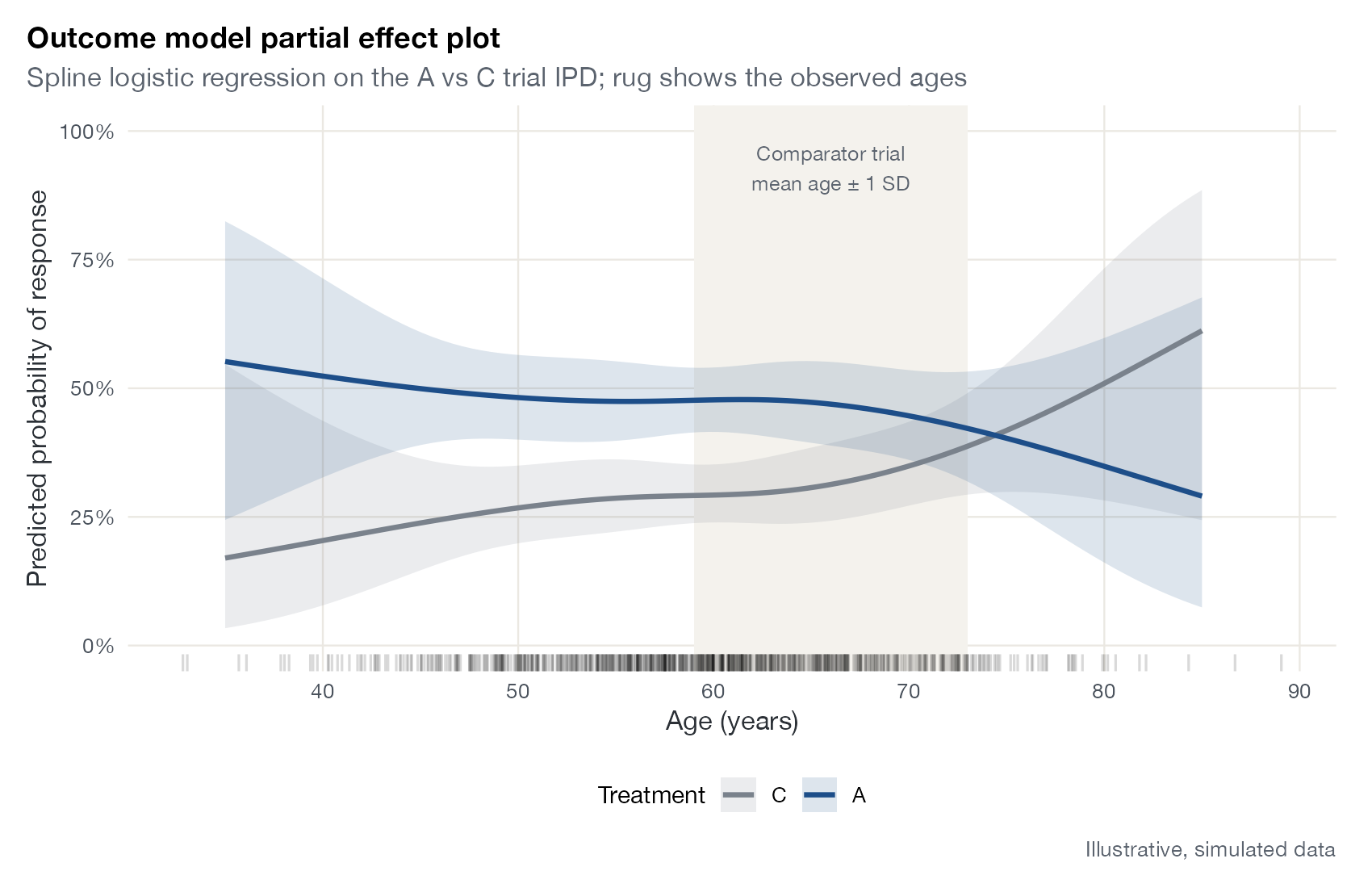
Simulated treatment comparison and G-computation rely entirely on an outcome regression fitted to IPD. The partial effect plot shows what that model assumes: the predicted outcome for each treatment across the range of one covariate, holding the others fixed, with its confidence band. Adding the observed covariate distribution (a rug) and the target population’s range shows where predictions are supported by data and where they extrapolate.
How to read it
- Horizontal axis: the covariate.
- Curves and bands: predicted outcome for each treatment with 95% confidence bands.
- Vertical distance between curves: the conditional treatment effect at that covariate value.
- Rug: observed covariate values in the IPD.
- Shaded region: the target population’s covariate range.
Interpretation
Treatment A outperforms C at younger ages, but the curves converge and cross at about 75, reflecting a treatment-by-age interaction. The comparator population (around 59 to 73 years) lies inside the IPD’s range, but toward the region where the benefit shrinks, so transporting the effect lowers it. Beyond about 80 the bands widen sharply because few patients are observed.
Pitfalls
- A partial effect plot shows the model, not the truth; a misspecified interaction produces a confident but wrong picture.
- Holding other covariates at fixed values can produce unrealistic profiles when covariates are correlated.
- Splines can wiggle at the edges of the data; do not over-read the tails.
Code
library(ggplot2)

# Simulated IPD from an A vs C trial with a treatment-by-age interaction
set.seed(42)
n <- 800
ipd <- data.frame(age = rnorm(n, 60, 9), ecog0 = rbinom(n, 1, 0.45),
                  trt = factor(rep(c("C", "A"), each = n / 2), levels = c("C", "A")))
lp <- with(ipd, -1 + 0.04 * (age - 60) + 0.5 * ecog0 +
             (trt == "A") * (0.9 - 0.05 * (age - 60)))
ipd$y <- rbinom(n, 1, plogis(lp))

# STC outcome model with a flexible (spline) age effect and interaction
fit <- glm(y ~ trt * splines::ns(age, df = 3) + ecog0, family = binomial, data = ipd)

grid <- expand.grid(age = seq(35, 85, length.out = 100), trt = levels(ipd$trt), ecog0 = 0.45)
pr <- predict(fit, grid, se.fit = TRUE)
grid$p <- plogis(pr$fit)
grid$lo <- plogis(pr$fit - 1.96 * pr$se.fit)
grid$hi <- plogis(pr$fit + 1.96 * pr$se.fit)

ggplot(grid, aes(age, p, colour = trt, fill = trt)) +
  annotate("rect", xmin = 66 - 7, xmax = 66 + 7, ymin = -Inf, ymax = Inf, fill = "#f4f2ed") +
  annotate("text", x = 66, y = 0.97, label = "Comparator trial\nmean age ± 1 SD", size = 3.2,
           colour = "#5b636e", vjust = 1) +
  geom_ribbon(aes(ymin = lo, ymax = hi), alpha = 0.15, colour = NA) +
  geom_line(linewidth = 1.1) +
  geom_rug(data = ipd, aes(x = age), inherit.aes = FALSE, alpha = 0.15, sides = "b") +
  scale_colour_manual(values = c(C = "#7a828c", A = "#1d4e89"), name = "Treatment") +
  scale_fill_manual(values = c(C = "#7a828c", A = "#1d4e89"), name = "Treatment") +
  scale_y_continuous(labels = scales::percent, limits = c(0, 1)) +
  labs(x = "Age (years)", y = "Predicted probability of response",
       title = "Outcome model partial effect plot",
       subtitle = "Spline logistic regression on the A vs C trial IPD; rug shows the observed ages",
       caption = "Illustrative, simulated data")
References
- Caro JJ, Ishak KJ. No head-to-head trial? Simulate the missing arms. Pharmacoeconomics. 2010;28:957-967. doi:10.2165/11537420-000000000-00000
- Phillippo DM, Ades AE, Dias S, Palmer S, Abrams KR, Welton NJ. NICE DSU Technical Support Document 18: Methods for population-adjusted indirect comparisons in submissions to NICE. 2016. sheffield.ac.uk/nice-dsu