Net heat plot
Inconsistency hot-spot matrix
netmeta::Senn2013.
netmeta::netheat()
What it shows
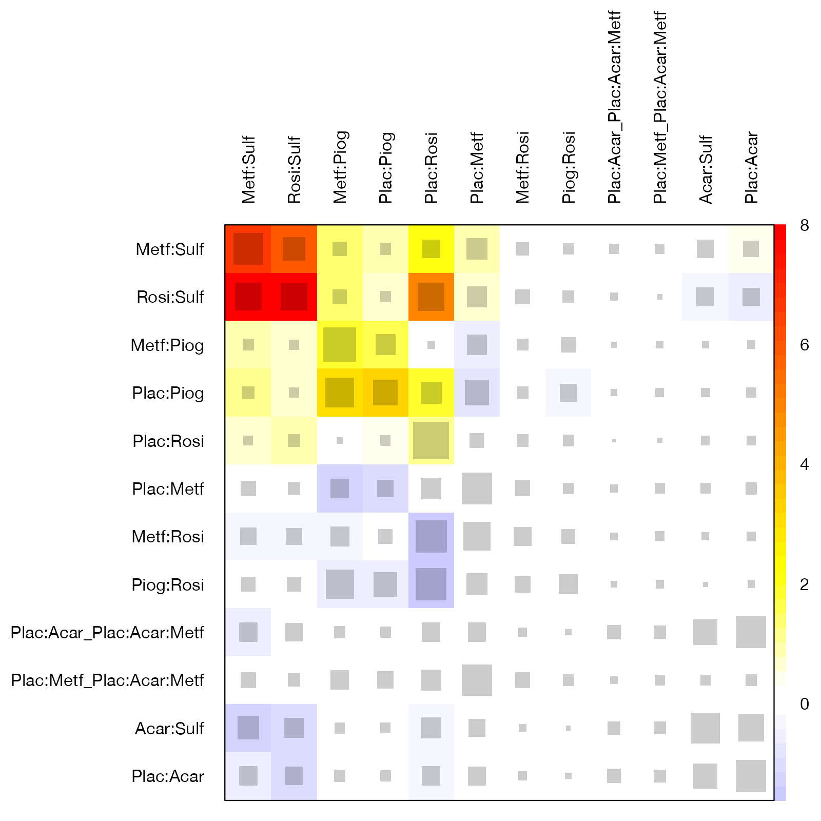
Krahn, Binder, and König proposed the net heat plot to find inconsistency “hot spots”. Each row is a network estimate and each column a design (a set of treatments compared in the same trials). Gray squares, sized by the aggregate hat matrix, show how strongly the column design contributes to the row estimate. The background color shows how the inconsistency attributed to the row estimate changes when the column design is detached from the network: warm colors mean detaching it reduces inconsistency, cool colors that it increases. Rows and columns are ordered to cluster related designs.
How to read it
- Diagonal: each design’s contribution to its own estimate, and the inconsistency in that estimate.
- Off-diagonal warm cells: detaching the column design would reduce inconsistency in the row estimate, so the column design is a candidate driver.
- Gray square area: size of the contribution; a warm cell with a small square matters less.
Interpretation
The hot spot is the block formed by metformin versus sulfonylurea and rosiglitazone versus sulfonylurea: both have deep red diagonals and redden each other. Their direct evidence disagrees with what the rest of the network implies. The same comparisons dominate the Q decomposition and have the largest loop inconsistency factor.
Pitfalls
- The plot is a screening tool; a hot spot does not prove that the highlighted design is biased.
- It is usually drawn for a common-effect model, because random effects absorb part of the inconsistency.
- Effects can propagate through the network, so a design can look hot because of evidence elsewhere; path-based methods can help untangle this.
Code
library(netmeta)

data(Senn2013)

net <- netmeta(
  TE, seTE, treat1.long, treat2.long, studlab,
  data = Senn2013, sm = "MD",
  common = TRUE, random = FALSE, reference.group = "Placebo"
)

# Rows: network estimates; columns: designs (direct comparisons).
# Gray squares: contribution of each design to each estimate (area).
# Colors: change in inconsistency when the design's evidence is detached
# (red = consistency improves, blue = worsens).
netheat(net, nchar.trts = 4)
References
- Krahn U, Binder H, König J. A graphical tool for locating inconsistency in network meta-analyses. BMC Med Res Methodol. 2013;13:35. doi:10.1186/1471-2288-13-35