Weight concentration curve
Lorenz curve of weights, cumulative weight plot
maicplus::centered_ipd_sat.
ggplot2 (shown); any plotting tool
What it shows
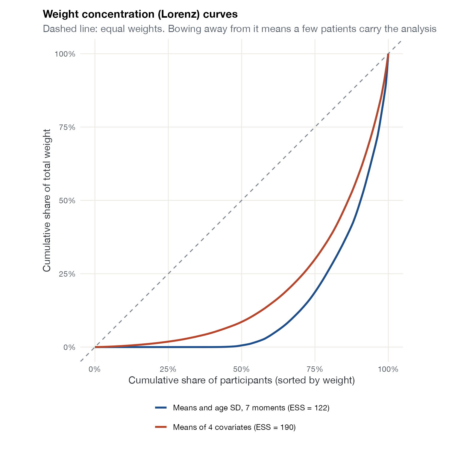
Sort participants by weight and plot the cumulative share of participants against the cumulative share of weight: this is the Lorenz curve familiar from income inequality. Equal weights give the diagonal. The further the curve bows away, the more the analysis rests on a few heavily weighted participants. It complements the weight histogram, in which a handful of extreme weights can be visually lost.
How to read it
- Horizontal axis: cumulative share of participants, sorted from smallest to largest weight.
- Vertical axis: cumulative share of total weight.
- Dashed diagonal: equal weights.
- Area between curve and diagonal: related to the Gini coefficient of the weights.
Interpretation
Matching seven moments, the top 10% of participants carry 52% of the total weight and the top 25% carry 81%, while half the sample contributes almost nothing. Matching only four means is less extreme (top 25% carry 70%). The additional moments buy closer matching of the age distribution at a large cost in effective information.
Pitfalls
- Like the ESS, the curve measures information loss, not bias.
- Rescaling weights does not change the curve.
- Compare curves only across models fitted to the same IPD.
Code
library(maicplus)
library(ggplot2)

data(centered_ipd_sat)
all <- grep("_CENTERED$", names(centered_ipd_sat), value = TRUE)
means_only <- c("AGE_CENTERED", "SEX_MALE_CENTERED", "ECOG0_CENTERED", "SMOKE_CENTERED")

# Two weighting models: matching means only, or also matching the age SD
w1 <- estimate_weights(centered_ipd_sat, centered_colnames = means_only)$data$weights
w2 <- estimate_weights(centered_ipd_sat, centered_colnames = all)$data$weights

lorenz <- function(w, label) {
  w <- sort(w)
  data.frame(people = c(0, seq_along(w) / length(w)), weight = c(0, cumsum(w) / sum(w)),
             model = sprintf("%s (ESS = %.0f)", label, sum(w)^2 / sum(w^2)))
}
d <- rbind(lorenz(w1, "Means of 4 covariates"), lorenz(w2, "Means and age SD, 7 moments"))

ggplot(d, aes(people, weight, colour = model)) +
  geom_abline(colour = "#7a828c", linetype = "dashed") +
  geom_line(linewidth = 1.1) +
  scale_colour_manual(values = c("#1d4e89", "#b5452b"), name = NULL) +
  scale_x_continuous(labels = scales::percent) +
  scale_y_continuous(labels = scales::percent) +
  coord_equal() +
  labs(x = "Cumulative share of participants (sorted by weight)",
       y = "Cumulative share of total weight",
       title = "Weight concentration (Lorenz) curves",
       subtitle = "Dashed line: equal weights. Bowing away from it means a few patients carry the analysis") +
  guides(colour = guide_legend(ncol = 1))
References
- Phillippo DM, Ades AE, Dias S, Palmer S, Abrams KR, Welton NJ. NICE DSU Technical Support Document 18: Methods for population-adjusted indirect comparisons in submissions to NICE. 2016. sheffield.ac.uk/nice-dsu
- Remiro-Azócar A, Heath A, Baio G. Methods for population adjustment with limited access to individual patient data: a review and simulation study. Res Synth Methods. 2021;12:750-775. doi:10.1002/jrsm.1511