Caterpillar plot
Ranked forest plot, sorted effect-size plot
orchaRd::eklof.
orchaRd::caterpillars(), metafor::forest() with sorting
What it shows
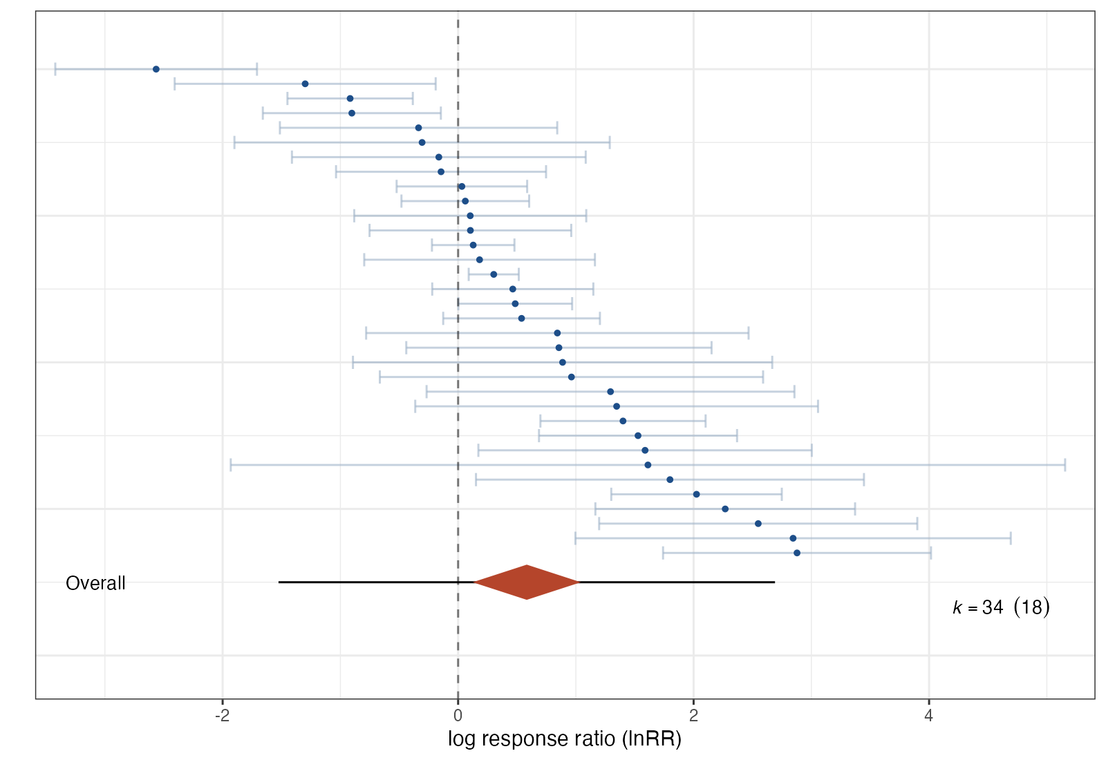
When a meta-analysis contains dozens or hundreds of effect sizes, a labeled forest plot becomes unreadable. The caterpillar plot drops study labels, sorts the effects from smallest to largest, and stacks them so that the whole distribution forms a “caterpillar”. The overall estimate, its confidence interval, and the prediction interval are drawn beneath. It is common in ecology, psychology, and any field with multilevel meta-analyses.
How to read it
- Vertical position: rank of the effect size (not a study identity).
- Points and whiskers: each effect size with its 95% confidence interval.
- Diamond: the pooled mean from the fitted model.
- Thick and thin lines under the diamond: the confidence interval and the prediction interval.
- \(k\) (number): number of effect sizes and, in parentheses, number of clusters.
Interpretation
The 34 effects span roughly −2.6 to 2.9 on the log ratio scale, and their intervals overlap the mean only partly. The multilevel mean is 0.58 (95% CI 0.12 to 1.04), yet the prediction interval runs from −1.53 to 2.69 and total \(I^2\) is about 89%. The sorted shape makes clear that the average hides effects of both signs.
Pitfalls
- Sorting by observed effect exaggerates the apparent spread, because extreme observed values are partly sampling error.
- Effect sizes from the same study are not independent. The plot shows \(k\) effects but the information is closer to the number of clusters; report both.
- Without labels, individual outliers cannot be traced back to their source; keep a labeled version in the supplement.
Code
library(metafor)
library(orchaRd)

# Predation experiments (Eklof et al. 2012): log response ratio of grazer
# abundance or biomass with versus without predators
data(eklof)
eklof <- escalc(measure = "ROM",
                m1i = mean_treatment, sd1i = SD_treatment, n1i = N_treatment,
                m2i = mean_control, sd2i = SD_control, n2i = N_control,
                data = eklof)
eklof$obs <- seq_len(nrow(eklof))

fit <- rma.mv(yi, vi, random = list(~ 1 | ExptID, ~ 1 | obs), data = eklof)

# Every effect size, sorted, with the overall mean, CI, and prediction interval
caterpillars(fit, mod = "1", group = "ExptID",
             xlab = "log response ratio (lnRR)",
             colerrorbar = "#9fb3c8", colpoint = "#1d4e89", colpoly = "#b5452b")
References
- Nakagawa S, Lagisz M, O’Dea RE, et al. orchaRd 2.0: an R package for visualising meta-analyses with orchard plots. Methods Ecol Evol. 2023;14:2003-2010. doi:10.1111/2041-210X.14152