Forest plot
Blobbogram, confidence interval plot
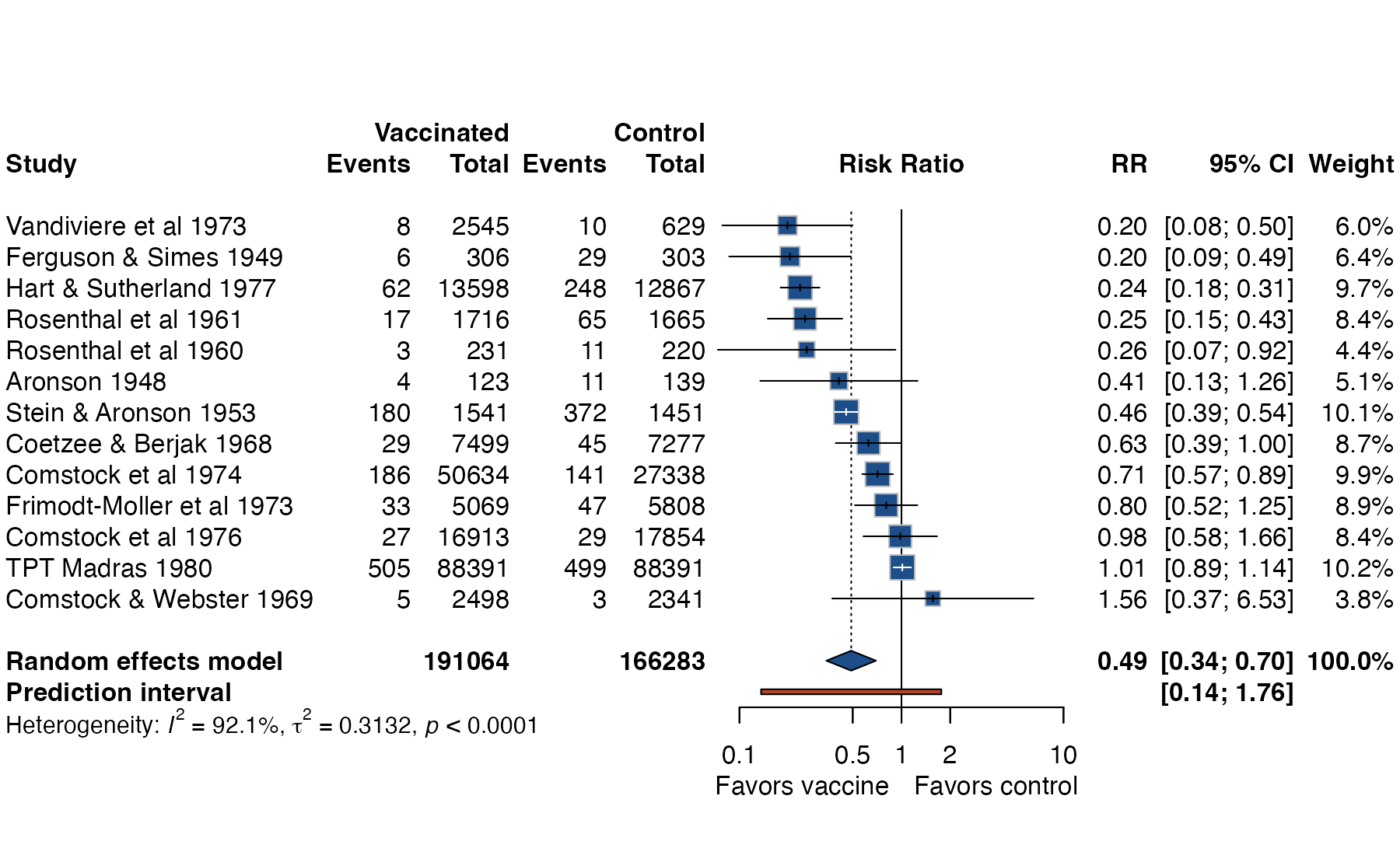
metadat::dat.bcg.
meta::forest(), metafor::forest(); Stata meta forestplot; Python statsmodels
What it shows
The forest plot is the default display of a meta-analysis. Each row is one study (or comparison, subgroup, population, or method), and each estimate is drawn with its confidence interval on a shared effect axis. A summary diamond at the bottom shows the pooled estimate. Because magnitude, direction, precision, and between-study spread are visible at once, the forest plot is also the standard way to report results from network meta-analysis, Bucher indirect comparisons, MAIC, and STC once estimates exist.
How to read it
- Rows: studies, usually sorted by year, weight, or effect size. Sorting by effect makes heterogeneity easier to see.
- Horizontal axis: the effect measure. Ratio measures (OR, RR, HR) are plotted on a log scale so that equal ratios above and below 1 are equidistant.
- Squares: the study estimate. The area is proportional to the study’s weight in the pooled analysis.
- Whiskers: the 95% confidence interval of each study.
- Diamond: the pooled estimate; its width is the confidence interval of the average effect.
- Prediction interval bar: in a random-effects analysis, the range in which the true effect of a new comparable study is expected to lie.
- Vertical lines: the line of no effect (solid) and the pooled estimate (dotted).
Interpretation
Look first at whether the study intervals overlap each other and the pooled estimate. Wide scatter of squares relative to their whiskers signals heterogeneity; the prediction interval turns that spread into a statement about future settings. In the BCG example the average risk ratio is 0.49, yet the prediction interval runs from 0.14 to 1.76: vaccination is protective on average, but some settings may see no benefit. That clinically important message is invisible if only the diamond is reported.
Pitfalls
- Overlapping or non-overlapping study intervals are not a formal test of heterogeneity or of subgroup differences.
- Ratio measures on a linear axis visually exaggerate harms and compress benefits.
- The diamond is the uncertainty about the mean effect, not the range of effects across settings. Report the prediction interval when heterogeneity is present.
- A single pooled diamond can mask serious heterogeneity; pair the forest plot with a heterogeneity diagnostic such as a Baujat plot.
- The weights shown depend on the model. Random-effects weights are more equal across studies than common-effect weights.
Code
library(meta)

# BCG vaccine trials: tuberculosis cases in vaccinated and control arms
data(dat.bcg, package = "metadat")

m <- metabin(
  event.e = tpos, n.e = tpos + tneg,
  event.c = cpos, n.c = cpos + cneg,
  studlab = paste(author, year),
  data = dat.bcg, sm = "RR",
  common = FALSE, random = TRUE, method.tau = "REML"
)

forest(
  m,
  sortvar = TE,
  prediction = TRUE,
  label.e = "Vaccinated", label.c = "Control",
  label.left = "Favors vaccine", label.right = "Favors control",
  col.square = "#1d4e89", col.diamond = "#1d4e89",
  col.predict = "#b5452b",
  print.tau2 = TRUE
)
* dat.bcg exported to Stata: tpos tneg cpos cneg study
meta esize tpos tneg cpos cneg, esize(lnrratio) studylabel(study) random(reml)
meta forestplot, eform predinterval sort(_ES)import numpy as np
from statsmodels.stats.meta_analysis import effectsize_2proportions, combine_effects
# tpos, tneg, cpos, cneg, labels: arrays from dat.bcg
log_rr, var = effectsize_2proportions(tpos, tpos + tneg, cpos, cpos + cneg,
statistic="risk-ratio")
res = combine_effects(log_rr, var, method_re="iterated", row_names=labels)
fig = res.plot_forest(use_exp=True)References
- Lewis S, Clarke M. Forest plots: trying to see the wood and the trees. BMJ. 2001;322:1479-1480. doi:10.1136/bmj.322.7300.1479
- IntHout J, Ioannidis JPA, Rovers MM, Goeman JJ. Plea for routinely presenting prediction intervals in meta-analysis. BMJ Open. 2016;6:e010247. doi:10.1136/bmjopen-2015-010247
- Balduzzi S, Rücker G, Schwarzer G. How to perform a meta-analysis with R: a practical tutorial. Evid Based Ment Health. 2019;22:153-160. doi:10.1136/ebmental-2019-300117