Thick forest plot
Weight-scaled forest plot
MA
A forest plot in which each confidence interval is drawn as a bar whose thickness reflects study weight.
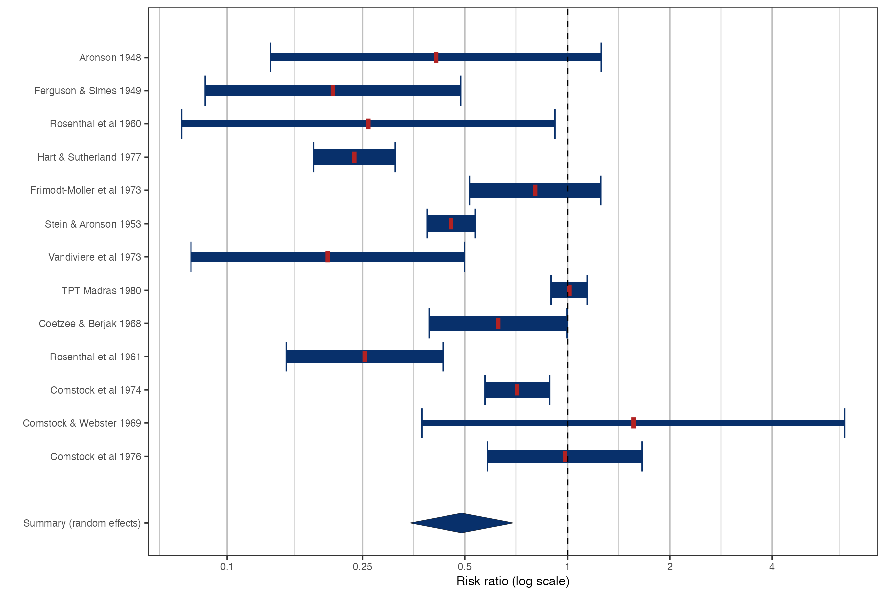
Thick forest plot of the BCG trials. Bar thickness and color intensity scale with the random-effects weight; the tick marks the point estimate. Data:
metadat::dat.bcg.
Family
Effect display
Purpose
Counter the visual dominance of wide, low-weight intervals in a standard forest plot.
Inputs
Study estimates with standard errors.
Software
R
metaviz::viz_thickforest()
What it shows
The thick forest plot is the second of the two displays proposed by Schild and Voracek. Rather than shaping the interval like a likelihood (as in the rainforest plot), it replaces the thin whisker with a bar whose thickness is proportional to the study’s weight. The design keeps the familiar rectangular geometry while making clear which intervals matter.
How to read it
- Bar length: the 95% confidence interval.
- Bar thickness and color: proportional to the weight in the pooled analysis.
- Tick: the point estimate.
- Summary diamond: the pooled estimate.
Interpretation
In the BCG example the long intervals of small trials are now thin, while the narrow intervals of the large trials are drawn as solid blocks. Scanning the plot, the eye goes where the information is, and the spread between the large trials (0.24 to 1.01) is the heterogeneity that matters.
Pitfalls
- Weights differ between common-effect and random-effects models, so the visual emphasis depends on the model. State which weights are used.
- Thickness is harder to compare precisely than length; do not rely on it for quantitative reading.
Code
library(metafor)
library(metaviz)

data(dat.bcg, package = "metadat")
dat <- escalc(measure = "RR", ai = tpos, bi = tneg, ci = cpos, di = cneg,
              data = dat.bcg)

# Box height is proportional to the study's weight; ticks mark the estimate
viz_thickforest(
  x = dat[, c("yi", "vi")] |> transform(vi = sqrt(vi)),
  study_labels = paste(dat$author, dat$year),
  summary_label = "Summary (random effects)",
  method = "REML",
  xlab = "Risk ratio (log scale)",
  col = "Blues",
  text_size = 3.2
) +
  ggplot2::scale_x_continuous(name = "Risk ratio (log scale)", breaks = log(c(0.1, 0.25, 0.5, 1, 2, 4)),
                              labels = c(0.1, 0.25, 0.5, 1, 2, 4))
References
- Schild AHE, Voracek M. Finding your way out of the forest without a trail of bread crumbs: development and evaluation of two novel displays of forest plots. Res Synth Methods. 2015;6:74-86. doi:10.1002/jrsm.1125
- Kossmeier M, Tran US, Voracek M. Charting the landscape of graphical displays for meta-analysis and systematic reviews: a comprehensive review, taxonomy, and feature analysis. BMC Med Res Methodol. 2020;20:26. doi:10.1186/s12874-020-0911-9