Funnel plot
Precision against effect scatter plot
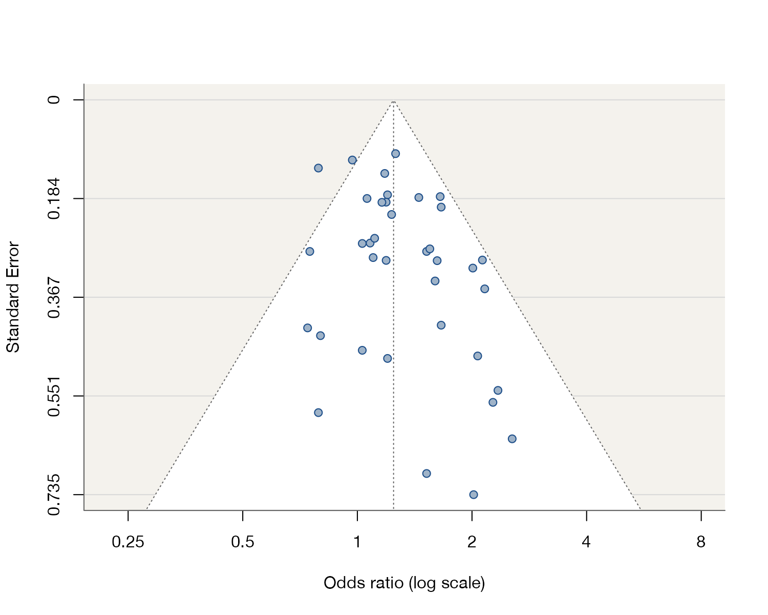
metadat::dat.hackshaw1998.
metafor::funnel(), meta::funnel(); Stata meta funnelplot; Python custom matplotlib
What it shows
The funnel plot scatters each study’s effect estimate against a measure of its precision, conventionally the standard error on a reversed vertical axis so that the largest studies sit at the top. Without bias or heterogeneity, estimates scatter symmetrically around the pooled effect and spread out as precision falls, forming an inverted funnel. A gap in one lower corner, usually where small null or harmful studies would lie, is the classic visual signal of small-study effects.
How to read it
- Horizontal axis: the effect estimate (log scale for ratios).
- Vertical axis: standard error, reversed; precision increases upward.
- Vertical line: the pooled estimate.
- Triangle: pseudo 95% confidence limits around the pooled estimate for each level of precision.
Interpretation
The pooled odds ratio is 1.24 (95% CI 1.13 to 1.37). Small studies at the bottom of the plot lie mostly to the right, with few small studies showing odds ratios below 1. Egger’s regression test agrees (\(z = 2.11\), \(p = 0.035\)). This is compatible with selective publication of positive small studies, but other explanations have to be ruled out before calling it publication bias.
Pitfalls
- Asymmetry has many causes besides publication bias: true heterogeneity related to study size, differences in quality, chance, and artifacts of the effect measure.
- With fewer than about ten studies, funnel plots and their tests have little power and should not be used.
- Plotting against sample size instead of standard error changes the shape and can create spurious asymmetry for ratio measures.
- For odds ratios, the correlation between the estimate and its standard error can itself produce asymmetry.
Code
library(metafor)

# Passive smoking and lung cancer in women who never smoked: 37 studies
data(dat.hackshaw1998, package = "metadat")

fit <- rma(yi, vi, data = dat.hackshaw1998, method = "REML")

funnel(fit, atransf = exp, at = log(c(0.25, 0.5, 1, 2, 4, 8)),
       pch = 21, bg = "#9fb3c8", col = "#1d4e89", back = "#f4f2ed",
       shade = "white", hlines = "gray85",
       xlab = "Odds ratio (log scale)")
meta set yi sei
meta funnelplot
meta bias, eggerimport numpy as np
import matplotlib.pyplot as plt
# yi: log odds ratios; sei: standard errors; mu: pooled estimate
se_max = sei.max() * 1.05
fig, ax = plt.subplots()
ax.scatter(yi, sei, color="#1d4e89")
ax.plot([mu - 1.96 * se_max, mu, mu + 1.96 * se_max], [se_max, 0, se_max], "k:")
ax.axvline(mu, color="k", lw=0.8)
ax.invert_yaxis()
ax.set(xlabel="log odds ratio", ylabel="Standard error")References
- Sterne JAC, Sutton AJ, Ioannidis JPA, et al. Recommendations for examining and interpreting funnel plot asymmetry in meta-analyses of randomised controlled trials. BMJ. 2011;343:d4002. doi:10.1136/bmj.d4002
- Egger M, Davey Smith G, Schneider M, Minder C. Bias in meta-analysis detected by a simple, graphical test. BMJ. 1997;315:629-634. doi:10.1136/bmj.315.7109.629
- Sterne JAC, Egger M. Funnel plots for detecting bias in meta-analysis: guidelines on choice of axis. J Clin Epidemiol. 2001;54:1046-1055. PubMed 11576817
- Hackshaw AK, Law MR, Wald NJ. The accumulated evidence on lung cancer and environmental tobacco smoke. BMJ. 1997;315:980-988. doi:10.1136/bmj.315.7114.980