Meta-plot
Precision-ordered cumulative meta-analysis with power display
metadat::dat.bangertdrowns2004.
ggplot2 (shown); R code from the original authors
What it shows
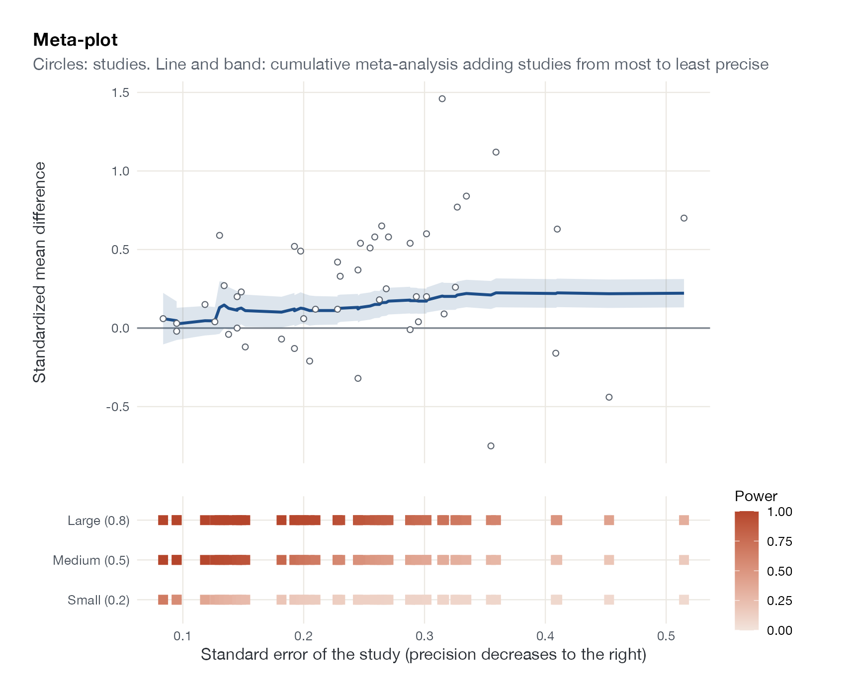
The meta-plot of van Assen and colleagues answers several questions a reader of a meta-analysis should ask at once: how precise are the primary studies, how well powered are they to detect realistic effects, how does the pooled estimate change as less precise studies are added, and is there a hint of publication bias. The horizontal axis orders studies by precision. The cumulative meta-analysis starts with the most precise study and adds the rest one at a time, so drift of the line as imprecise studies enter is a visual signal of small-study effects.
How to read it
- Horizontal axis: standard error of each study; precision falls to the right.
- Circles: individual study estimates.
- Line and band: cumulative random-effects estimate and 95% CI after adding every study at or left of that point.
- Bottom strip: power of each study to detect small (0.2), medium (0.5), and large (0.8) standardized effects; darker is higher power.
Interpretation
The most precise studies alone suggest a mean effect near 0.06. As less precise studies enter, the cumulative estimate climbs to 0.22 (95% CI 0.13 to 0.31) for all 48 studies. The small studies report larger effects, and few of them had adequate power even for a medium effect. That pattern is consistent with small-study effects and argues for caution about the full-data estimate.
Pitfalls
- Drift in the cumulative estimate is compatible with publication bias but also with genuine differences between small and large studies.
- Power is computed for hypothetical effect sizes, not the observed ones; post hoc power from observed effects is uninformative.
- This page shows an implementation of the plot’s main components; consult the original paper for the authors’ full specification.
Code
library(metafor)
library(ggplot2)
library(patchwork)

# Writing-to-learn interventions: standardized mean differences (48 studies)
data(dat.bangertdrowns2004, package = "metadat")
dat <- dat.bangertdrowns2004
dat$sei <- sqrt(dat$vi)

# Cumulative random-effects meta-analysis, adding studies from most to least precise
dat <- dat[order(dat$sei), ]
cum <- cumul(rma(yi, vi, data = dat, method = "REML"), order = seq_len(nrow(dat)))
dat$cum_est <- cum$estimate
dat$cum_lo <- cum$ci.lb
dat$cum_hi <- cum$ci.ub

top <- ggplot(dat, aes(x = sei)) +
  geom_hline(yintercept = 0, colour = "#7a828c") +
  geom_ribbon(aes(ymin = cum_lo, ymax = cum_hi), fill = "#1d4e89", alpha = 0.15) +
  geom_line(aes(y = cum_est), colour = "#1d4e89", linewidth = 1) +
  geom_point(aes(y = yi), shape = 21, colour = "#5b636e", fill = "white") +
  labs(x = NULL, y = "Standardized mean difference",
       title = "Meta-plot",
       subtitle = "Circles: studies. Line and band: cumulative meta-analysis adding studies from most to least precise") +
  theme(axis.text.x = element_blank())

# Power of each study to detect small, medium, and large effects (two-sided alpha 5%)
pw <- expand.grid(i = seq_len(nrow(dat)), d = c(0.2, 0.5, 0.8))
pw$sei <- dat$sei[pw$i]
pw$power <- pnorm(pw$d / pw$sei - qnorm(0.975)) + pnorm(-pw$d / pw$sei - qnorm(0.975))
pw$effect <- factor(pw$d, labels = c("Small (0.2)", "Medium (0.5)", "Large (0.8)"))

bottom <- ggplot(pw, aes(x = sei, y = effect, colour = power)) +
  geom_point(shape = 15, size = 3) +
  scale_colour_gradient(low = "#f2e4dc", high = "#b5452b", limits = c(0, 1),
                        name = "Power") +
  labs(x = "Standard error of the study (precision decreases to the right)", y = NULL) +
  theme(panel.grid = element_blank(), legend.position = "right")

top / bottom + plot_layout(heights = c(3, 1))
References
- van Assen MALM, et al. The meta-plot: a graphical tool for interpreting the results of a meta-analysis. 2023. Open access PDF; preprint doi:10.31234/osf.io/cwhnq
- Bangert-Drowns RL, Hurley MM, Wilkinson B. The effects of school-based writing-to-learn interventions on academic achievement: a meta-analysis. Rev Educ Res. 2004;74:29-58. doi:10.3102/00346543074001029