Contour-enhanced funnel plot
Significance contour funnel plot
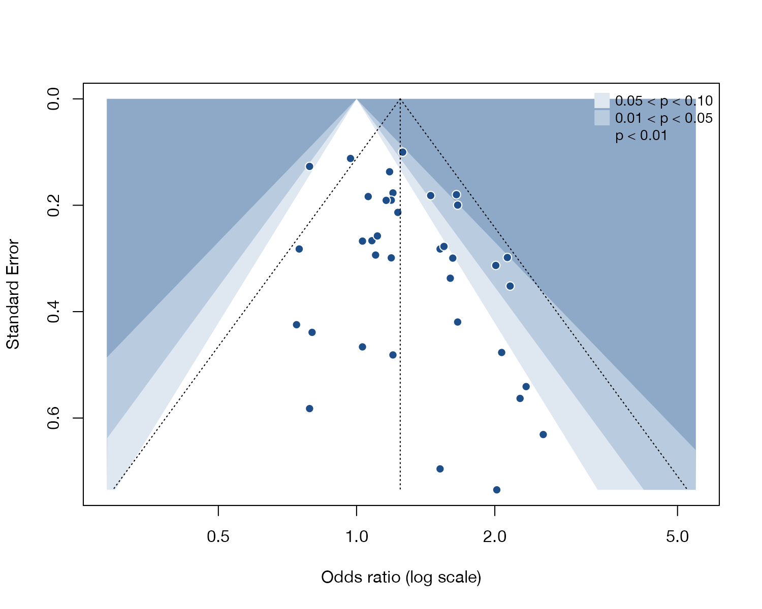
metadat::dat.hackshaw1998.
meta::funnel(contour.levels = ...), metafor::funnel(level = ..., refline = 0); Stata meta funnelplot, contours()
What it shows
Peters and colleagues proposed shading the funnel plot by the significance each study would have on its own. The contours are centered on the null effect, not on the pooled estimate. If the region that looks empty lies in the white, non-significant area, selective publication of significant findings becomes a more plausible explanation of the asymmetry. If the empty region lies inside the shaded significant areas, publication bias is a less likely cause and heterogeneity or other factors should be considered.
How to read it
- Axes: as in a funnel plot.
- White wedge centered on the null: results with \(p > 0.10\).
- Shaded bands: \(0.05 < p < 0.10\), \(0.01 < p < 0.05\), and \(p < 0.01\).
- Dotted triangle: the conventional funnel around the pooled estimate.
Interpretation
The small studies on the right sit in the shaded, significant region, while the matching area on the left, where small null or protective results would appear, is largely empty and falls inside the white non-significant wedge. That pattern is the one expected if small non-significant studies went unpublished.
Pitfalls
- The contours show where studies would be significant; they do not prove why studies are missing.
- Researchers may select on significance in either direction, or on outcomes within studies (outcome reporting bias), which the plot cannot separate.
- The same limitations on the number of studies apply as for any funnel plot.
Code
library(meta)

data(dat.hackshaw1998, package = "metadat")

m <- metagen(TE = yi, seTE = sqrt(vi), studlab = paste(author, year),
             data = dat.hackshaw1998, sm = "OR",
             common = FALSE, random = TRUE, method.tau = "REML")

# Shaded regions mark where a study would be significant at 10%, 5%, and 1%
funnel(m,
       contour.levels = c(0.90, 0.95, 0.99),
       col.contour = c("#dfe7f0", "#b9cbdf", "#8ea9c8"),
       pch = 21, bg = "#1d4e89", col = "white", cex = 1.1,
       xlab = "Odds ratio (log scale)")
legend("topright",
       c("0.05 < p < 0.10", "0.01 < p < 0.05", "p < 0.01"),
       pch = 15, pt.cex = 2, col = c("#dfe7f0", "#b9cbdf", "#8ea9c8"),
       bty = "n", cex = 0.85)
meta set yi sei
meta funnelplot, contours(1 5 10)References
- Peters JL, Sutton AJ, Jones DR, Abrams KR, Rushton L. Contour-enhanced meta-analysis funnel plots help distinguish publication bias from other causes of asymmetry. J Clin Epidemiol. 2008;61:991-996. doi:10.1016/j.jclinepi.2007.11.010