Network graph
Network map, network plot, evidence network
NMA
ML-NMR
NMI
Treatments as nodes and direct randomized comparisons as edges, showing how the evidence base is connected.
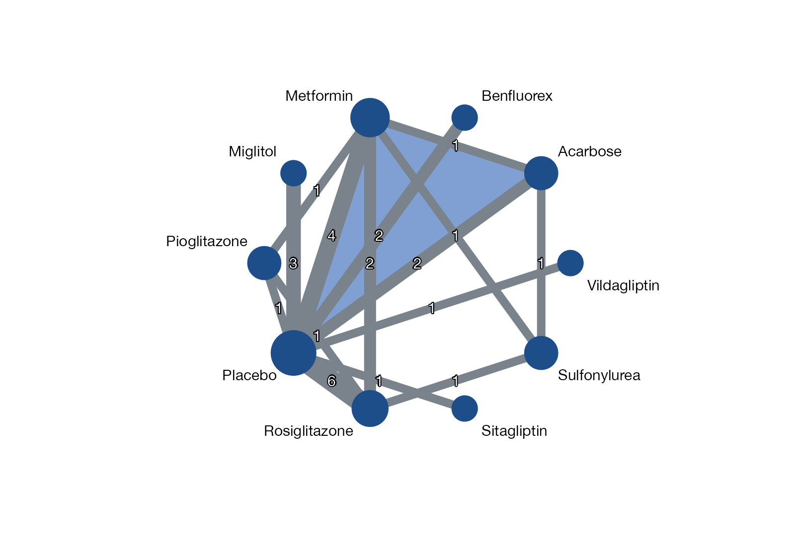
Network of 26 trials comparing ten glucose-lowering treatments on HbA1c. Node size reflects the number of trials that include each treatment; edge width and labels give the number of trials per direct comparison. The shaded triangle marks a three-arm trial. Data:
netmeta::Senn2013.
Family
Network geometry and evidence flow
Purpose
Describe connectivity, evidence volume, and multi-arm structure of the network.
Inputs
Treatment pairs (or arms) per study; optionally sample sizes.
Software
R
netmeta::netgraph(), multinma::plot(), gemtc; Stata network map, networkplot
What it shows
The network graph draws every treatment as a node and every direct randomized comparison as an edge. It answers structural questions before any effect is estimated: is the network connected, which treatments are compared only indirectly, which comparisons rest on a single trial, and whether one hub (often placebo) carries most of the evidence.
How to read it
- Nodes: treatments. Size commonly encodes the number of trials or participants, but conventions differ, so state the rule in the caption.
- Edges: at least one trial compares the two treatments directly. Width usually encodes the number of trials or the precision of the direct estimate.
- Shaded polygons: multi-arm trials, which contribute correlated comparisons.
- Missing edges: comparisons informed only through indirect evidence.
- Closed loops: places where direct and indirect evidence can disagree, and therefore where inconsistency can be checked.
Interpretation
In the diabetes example placebo and metformin are hubs, several agents (vildagliptin, sitagliptin, benfluorex) hang off a single edge, and the network contains several closed loops through placebo and metformin. Comparisons between the peripheral agents are informed purely indirectly, so they inherit the transitivity assumption in full.
Pitfalls
- A network graph contains no information about which treatment works best.
- Visual weight depends on layout. A central node can look important simply because the layout algorithm placed it there.
- Edge thickness by number of trials hides differences in trial size; consider precision or total sample size instead.
- A well-connected graph says nothing about whether effect modifiers are balanced across comparisons. Pair it with a transitivity plot.
Code
library(netmeta)

# Glucose-lowering agents in type 2 diabetes (Senn et al. 2013), HbA1c
data(Senn2013)

net <- netmeta(
  TE, seTE, treat1.long, treat2.long, studlab,
  data = Senn2013, sm = "MD",
  common = FALSE, reference.group = "Placebo"
)

# Node size: number of studies including each treatment
n_studies <- colSums(net$A.matrix > 0)

netgraph(
  net,
  thickness = "number.of.studies",
  number.of.studies = TRUE,
  points = TRUE,
  cex.points = 2 + 4 * sqrt(n_studies / max(n_studies)),
  col.points = "#1d4e89", bg.points = "#1d4e89", pch.points = 21,
  col = "#7a828c", plastic = FALSE,
  multiarm = TRUE, cex = 0.9, offset = 0.05
)
* contrast-level data: study t1 t2 TE seTE
network import, studyvar(study) tr(t1 t2) eff(TE) se(seTE)
network map
* or, with the network_graphs package
networkplot t1 t2, labels(Placebo Metformin ...)import networkx as nx
import matplotlib.pyplot as plt
# edges: list of (treat1, treat2, n_trials)
G = nx.Graph()
G.add_weighted_edges_from(edges)
pos = nx.circular_layout(G)
widths = [2 * G[u][v]["weight"] for u, v in G.edges]
nx.draw_networkx(G, pos, width=widths, node_color="#1d4e89",
font_color="black", edge_color="#7a828c")
plt.axis("off")References
- Chaimani A, Higgins JPT, Mavridis D, Spyridonos P, Salanti G. Graphical tools for network meta-analysis in STATA. PLoS One. 2013;8:e76654. doi:10.1371/journal.pone.0076654
- Salanti G, Kavvoura FK, Ioannidis JPA. Exploring the geometry of treatment networks. Ann Intern Med. 2008;148:544-553. doi:10.7326/0003-4819-148-7-200804010-00011
- Rücker G, Schwarzer G. Automated drawing of network plots in network meta-analysis. Res Synth Methods. 2016;7:94-107. doi:10.1002/jrsm.1143