Orchard plot
Forest plot with individual effects, multilevel moderator plot
orchaRd::eklof.
metafor model (often rma.mv) with a categorical moderator.
orchaRd::orchard_plot()
What it shows
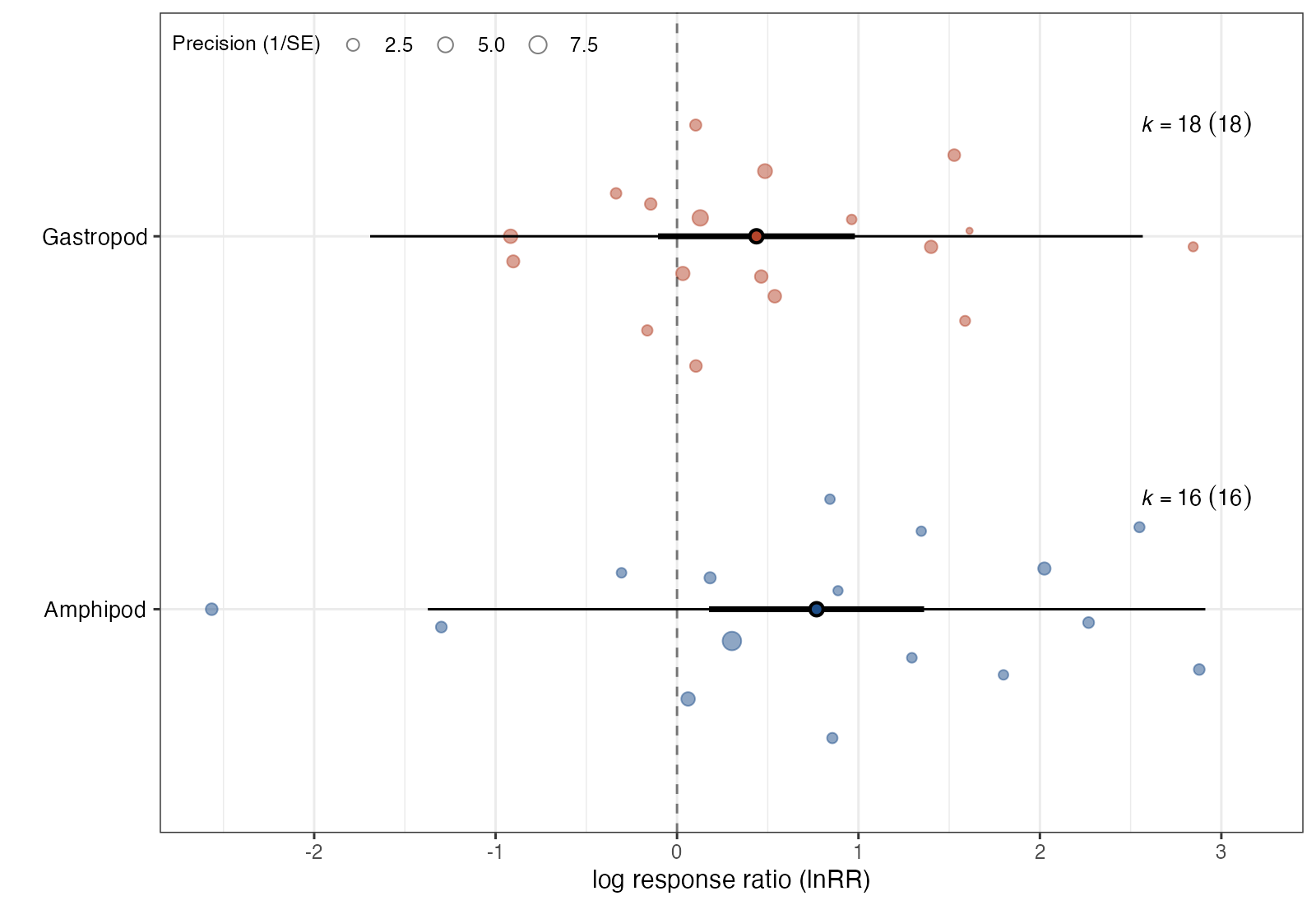
The orchard plot, introduced by Nakagawa and colleagues, adapts the forest plot to meta-analyses with many effect sizes and categorical moderators. Each moderator level gets a “trunk” (the mean), a “branch” (its confidence interval), and longer “twigs” (the prediction interval). Behind them, the individual effect sizes are scattered as “fruit”, sized by precision. Unlike a diamond alone, it never hides the distribution of the data behind the summary.
How to read it
- Rows: levels of a categorical moderator, or a single row for an intercept-only model.
- Points (“fruit”): individual effect sizes, jittered vertically; size proportional to precision (\(1/\text{SE}\)).
- Large central point: model-based mean for that level.
- Thick bar: 95% confidence interval of the mean.
- Thin bar: 95% prediction interval.
- \(k\) (\(g\)): number of effect sizes and number of clusters (studies or experiments).
Interpretation
Amphipods have a mean log response ratio of 0.77 (95% CI 0.18 to 1.36) and gastropods 0.44 (−0.10 to 0.98). The confidence intervals overlap widely and both prediction intervals span roughly −1.5 to 2.8, so the moderator explains little of the heterogeneity. The swarm shows the same thing directly: the two clouds of effects largely overlap.
Pitfalls
- The density of points suggests more independent information than exists when several effects come from one study. Report the number of clusters and the dependency structure.
- Point sizes reflect sampling precision only, not model weights in a multilevel model.
- Jitter is random; do not read vertical position within a level.
Code
library(metafor)
library(orchaRd)

# Predation experiments (Eklof et al. 2012): log response ratio of grazer
# abundance or biomass with versus without predators, by grazer type
data(eklof)
eklof <- escalc(measure = "ROM",
                m1i = mean_treatment, sd1i = SD_treatment, n1i = N_treatment,
                m2i = mean_control, sd2i = SD_control, n2i = N_control,
                data = eklof)
eklof$obs <- seq_len(nrow(eklof))

# Multilevel meta-regression: effects nested within experiments
fit <- rma.mv(yi, vi, mods = ~ Grazer.type - 1,
              random = list(~ 1 | ExptID, ~ 1 | obs), data = eklof)

orchard_plot(fit, mod = "Grazer.type", group = "ExptID",
             xlab = "log response ratio (lnRR)", angle = 0,
             legend.pos = "top.left") +
  ggplot2::scale_fill_manual(values = c("#1d4e89", "#b5452b")) +
  ggplot2::scale_colour_manual(values = c("#1d4e89", "#b5452b"))
References
- Nakagawa S, Lagisz M, O’Dea RE, et al. The orchard plot: cultivating a forest plot for use in ecology, evolution, and beyond. Res Synth Methods. 2021;12:4-12. doi:10.1002/jrsm.1424
- Nakagawa S, Lagisz M, O’Dea RE, et al. orchaRd 2.0: an R package for visualising meta-analyses with orchard plots. Methods Ecol Evol. 2023;14:2003-2010. doi:10.1111/2041-210X.14152