Drapery plot
p-value function plot, confidence curve display
metadat::dat.bcg.
meta::drapery()
What it shows
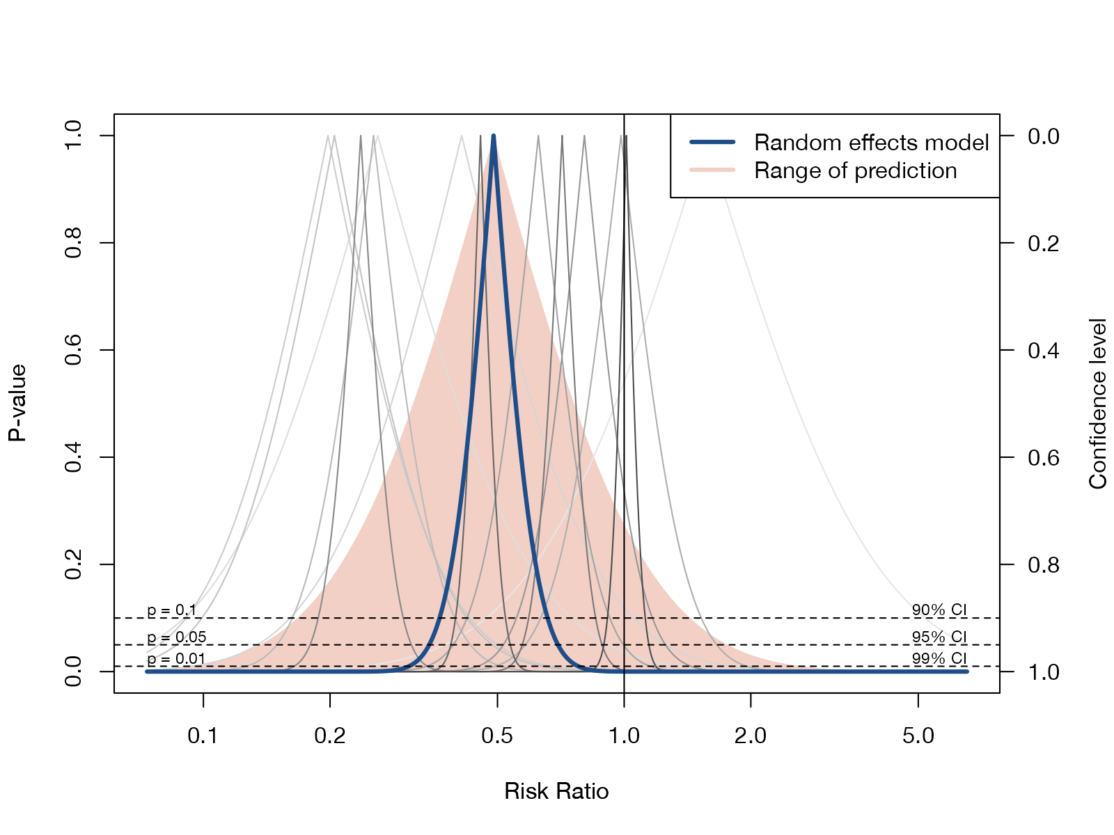
A p-value function plots, for every candidate value of the effect, the two-sided p-value for testing that value. Its peak is the point estimate, and horizontal slices at \(p = 0.05\) or \(0.01\) give the corresponding confidence intervals. The drapery plot of Rücker and Schwarzer overlays these functions for every study and for the pooled estimate, so that the reader sees the evidence at all confidence levels at once, “draped” over the effect axis.
How to read it
- Horizontal axis: the effect measure (log scale for ratios).
- Left axis: p-value; right axis: the matching confidence level.
- Gray curves: one per study; narrow peaks mean precise studies.
- Blue curve: the pooled random-effects estimate.
- Shaded region: the prediction range, which widens the pooled curve by between-study variance.
- Horizontal lines: where each curve crosses these lines gives the 90%, 95%, and 99% confidence limits.
Interpretation
The pooled curve is narrow and peaks at a risk ratio of 0.49; even at the 99% level it excludes 1. Many study curves sit far from it, and the shaded prediction region is much wider than the pooled curve, which is the heterogeneity a single diamond hides. Reading along the \(p = 0.05\) line gives the same intervals as a forest plot.
Pitfalls
- With many studies the plot becomes cluttered; labels are best omitted or restricted.
- It displays the same information as confidence intervals; it does not test anything new.
- The prediction region is not a p-value function, even though it is drawn on the same axes.
Code
library(meta)

data(dat.bcg, package = "metadat")

m <- metabin(
  event.e = tpos, n.e = tpos + tneg,
  event.c = cpos, n.c = cpos + cneg,
  studlab = paste(author, year),
  data = dat.bcg, sm = "RR",
  common = FALSE, random = TRUE, method.tau = "REML"
)

# p-value functions for every study and for the random-effects estimate
drapery(
  m,
  type = "pval",
  labels = FALSE,
  col.random = "#1d4e89", lwd.random = 3,
  col.predict = "#f2d0c6",
  legend = TRUE, pos.legend = "topright"
)
References
- Rücker G, Schwarzer G. Beyond the forest plot: the drapery plot. Res Synth Methods. 2021;12:13-19. doi:10.1002/jrsm.1410
- Infanger D, Schmidt-Trucksäss A. P value functions: an underused method to present research results and to promote quantitative reasoning. Stat Med. 2019;38:4189-4197. doi:10.1002/sim.8293