Albatross plot
p-value versus sample size plot with effect contours
albatross; custom ggplot2 (shown)
What it shows
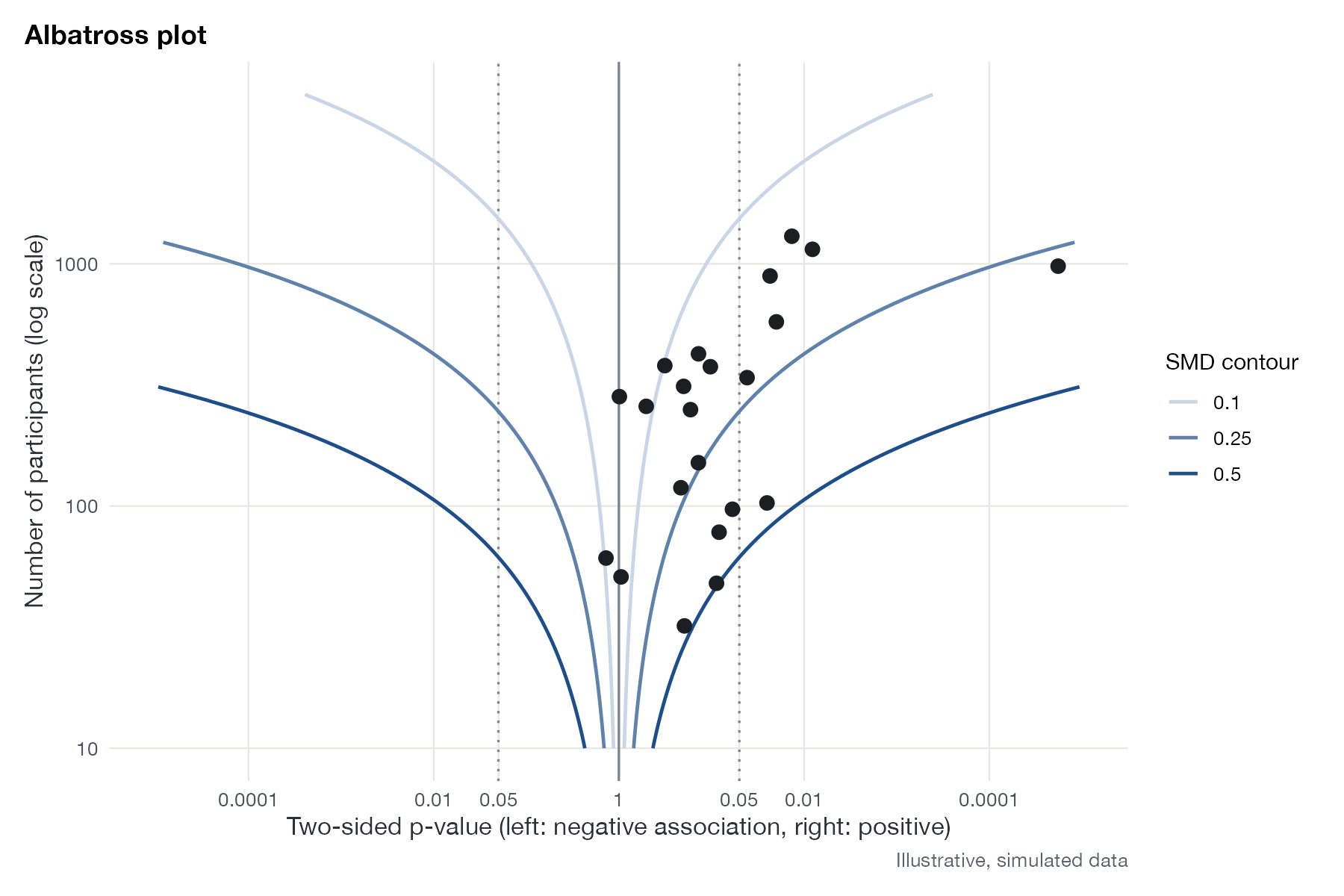
Harrison and colleagues designed the albatross plot for systematic reviews in which studies report p-values but not the statistics needed for a meta-analysis. Each study is placed by its p-value, split by direction (negative associations to the left, positive to the right), against its sample size. Contours show the p-value that a study of each size would have if the true standardized effect were a given value, so the cloud of points suggests a plausible range of effect sizes. The contours’ shape gives the plot its name.
How to read it
- Horizontal axis: two-sided p-value on a folded log scale; the center is p = 1.
- Vertical axis: sample size (log scale).
- Dotted lines: p = 0.05 in each direction.
- Contours: standardized mean difference implied by each combination of n and p.
Interpretation
Most studies lie on the positive side, between the SMD contours of 0.1 and 0.25, and the large studies are clearly significant while small ones are not. The pattern is consistent with a small positive effect, around 0.2, which is the value used to simulate these data.
Pitfalls
- The contours depend on the effect measure and assumptions (here equal group sizes and a continuous outcome).
- It is a graphical summary, not a pooled estimate; do not read an effect size to two decimals from it.
- Selective reporting of p-values affects the albatross plot just as it affects a funnel plot.
Code
library(ggplot2)

# Studies reporting only a p-value, a direction, and a sample size:
# illustrative data for a review where effect sizes are not available
set.seed(3)
studies <- data.frame(n = round(exp(runif(22, log(30), log(2000)))))
true_d <- 0.2
z <- true_d * sqrt(studies$n) / 2 + rnorm(nrow(studies))
studies$p <- 2 * pnorm(-abs(z))
studies$direction <- sign(z)

# Horizontal position: p-value on a folded scale, harm left, benefit right
fold <- function(p, dir) dir * (-log10(p))

# Contours: combinations of n and p implied by a fixed standardized mean
# difference, using z = d * sqrt(n) / 2 for two equal groups
contours <- do.call(rbind, lapply(c(0.1, 0.25, 0.5), function(d) {
  n <- exp(seq(log(10), log(5000), length.out = 200))
  zc <- d * sqrt(n) / 2
  rbind(data.frame(n, x = fold(2 * pnorm(-zc), 1), d = d),
        data.frame(n, x = fold(2 * pnorm(-zc), -1), d = d))
}))

ggplot(studies, aes(fold(p, direction), n)) +
  geom_vline(xintercept = 0, colour = "#7a828c") +
  geom_vline(xintercept = c(-1, 1) * -log10(0.05), linetype = "dotted", colour = "#7a828c") +
  geom_path(data = contours, aes(x, n, group = interaction(d, sign(x)), colour = factor(d)),
            linewidth = 0.8) +
  geom_point(size = 2.8, colour = "#1b1f24") +
  scale_colour_manual(values = c("#c9d6e6", "#5f82ab", "#1d4e89"), name = "SMD contour") +
  scale_x_continuous(breaks = c(-4, -2, -1.3, 0, 1.3, 2, 4),
                     labels = c("0.0001", "0.01", "0.05", "1", "0.05", "0.01", "0.0001"),
                     limits = c(-5, 5)) +
  scale_y_log10() +
  labs(x = "Two-sided p-value (left: negative association, right: positive)",
       y = "Number of participants (log scale)", title = "Albatross plot",
       caption = "Illustrative, simulated data") +
  theme(legend.position = "right")
References
- Harrison S, Jones HE, Martin RM, Lewis SJ, Higgins JPT. The albatross plot: a novel graphical tool for presenting results of diversely reported studies in a systematic review. Res Synth Methods. 2017;8:281-289. doi:10.1002/jrsm.1239
- McKenzie JE, Brennan SE. Chapter 12: Synthesizing and presenting findings using other methods. In: Cochrane Handbook for Systematic Reviews of Interventions. Version 6.5. Cochrane; 2024. training.cochrane.org/handbook