Weight distribution histogram
MAIC weight histogram, weight density
maicplus::centered_ipd_sat.
maicplus::plot_weights_ggplot(), maicplus::plot_weights_base(); any histogram tool
What it shows
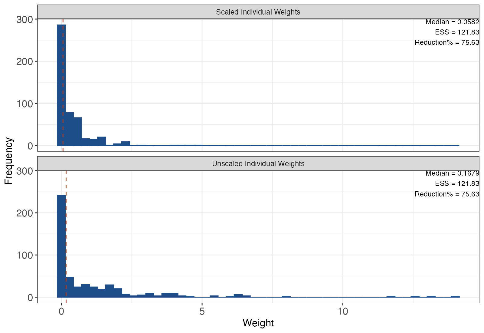
MAIC reweights individual patient data (IPD) so that selected covariate means match those published for a comparator trial. The histogram of the resulting weights shows how hard the method had to work. A tight, unimodal distribution means the two populations largely overlap. A long right tail means a few participants who happen to resemble the comparator population now stand in for many, and the estimate rests on them.
How to read it
- Horizontal axis: the weight, raw or rescaled so that the weights sum to the original sample size. A log scale often helps.
- Vertical axis: number of participants.
- Dashed line: the median weight.
- ESS annotation: the effective sample size, \(\text{ESS} = (\sum_i w_i)^2 / \sum_i w_i^2\), and its reduction from the original N.
Interpretation
Here the ESS falls from 500 to about 122, a reduction of about 76%. Most participants receive near-zero weight while a small group receives weights above 5, so the adjusted outcome is driven by roughly a quarter of the trial. That is a signal of limited overlap on the matched covariates. It does not by itself bias the estimate, but it widens uncertainty and makes the result sensitive to those few individuals.
Pitfalls
- Extreme weights indicate poor overlap and instability; they do not prove bias.
- Trimming or truncating weights after seeing them changes the target population and therefore the estimand. Pre-specify any trimming rule.
- There is no universal ESS threshold that makes an analysis valid.
- Robust sandwich variances can underestimate uncertainty when ESS is small; bootstrap intervals are safer.
- A good-looking histogram does not show balance on covariates that were not matched. Pair it with a Love plot and a weight concentration curve.
Code
library(maicplus)

# Simulated single-arm IPD, centered on the aggregate comparator means
data(centered_ipd_sat)
centered_colnames <- grep("_CENTERED$", colnames(centered_ipd_sat), value = TRUE)

weighted <- estimate_weights(
  data = centered_ipd_sat,
  centered_colnames = centered_colnames
)

# Histograms of raw and rescaled weights, annotated with the effective sample size
plot(weighted, ggplot = TRUE, bin_col = "#1d4e89", vline_col = "#b5452b")
import numpy as np
import matplotlib.pyplot as plt
# w: array of MAIC weights
ess = w.sum() ** 2 / (w ** 2).sum()
fig, ax = plt.subplots()
ax.hist(w * len(w) / w.sum(), bins=40, color="#1d4e89")
ax.axvline(np.median(w * len(w) / w.sum()), ls="--", color="#b5452b")
ax.set(xlabel="Rescaled weight", ylabel="Participants",
title=f"ESS = {ess:.1f} of N = {len(w)}")References
- Signorovitch JE, Sikirica V, Erder MH, et al. Matching-adjusted indirect comparisons: a new tool for timely comparative effectiveness research. Value Health. 2012;15:940-947. doi:10.1016/j.jval.2012.05.004
- Phillippo DM, Ades AE, Dias S, Palmer S, Abrams KR, Welton NJ. NICE DSU Technical Support Document 18: Methods for population-adjusted indirect comparisons in submissions to NICE. 2016. sheffield.ac.uk/nice-dsu
- Remiro-Azócar A, Heath A, Baio G. Methods for population adjustment with limited access to individual patient data: a review and simulation study. Res Synth Methods. 2021;12:750-775. doi:10.1002/jrsm.1511