Direct evidence plot
Network measures plot
netmeta::Senn2013.
netmeta::netmeasures() with ggplot2; older netmeta::direct.evidence.plot()
What it shows
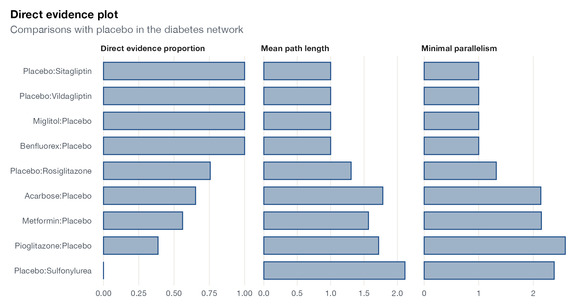
König, Krahn, and Binder proposed three measures per network estimate. The direct evidence proportion is the share of the estimate’s information that comes from head-to-head trials. The mean path length is the average length of the paths through which evidence flows; long paths mean the estimate relies on long indirect chains. Minimal parallelism is the smallest amount of evidence along parallel paths, a measure of how robust the estimate is to the failure of a single path.
How to read it
- Rows: network estimates (here against placebo).
- Direct evidence proportion: 1 means entirely direct, 0 entirely indirect.
- Mean path length: 1 for purely direct estimates; larger is more indirect.
- Minimal parallelism: larger values indicate more independent support.
Interpretation
Four comparisons (sitagliptin, vildagliptin, miglitol, benfluorex) are informed only by direct evidence, with a mean path length of 1 and little parallelism. Pioglitazone relies mostly on indirect evidence, and sulfonylurea versus placebo is entirely indirect with the longest mean path. Those are the estimates most exposed to intransitivity.
Pitfalls
- A high direct proportion is not a guarantee of validity; direct trials can be biased too.
- The measures depend on the model’s weights and heterogeneity.
Code
library(netmeta)
library(ggplot2)

data(Senn2013)

net <- netmeta(
  TE, seTE, treat1.long, treat2.long, studlab,
  data = Senn2013, sm = "MD",
  common = FALSE, reference.group = "Placebo"
)

# Network measures per comparison: proportion of direct evidence,
# mean path length, and minimal parallelism
nm <- netmeasures(net, random = TRUE)
d <- data.frame(comparison = names(nm$proportion),
                `Direct evidence proportion` = nm$proportion,
                `Mean path length` = nm$meanpath,
                `Minimal parallelism` = nm$minpar,
                check.names = FALSE)
d <- d[grepl("Placebo", d$comparison), ]
d$comparison <- factor(d$comparison, levels = d$comparison[order(d$`Direct evidence proportion`)])
long <- tidyr::pivot_longer(d, -comparison, names_to = "measure")

ggplot(long, aes(value, comparison)) +
  geom_col(fill = "#9fb3c8", colour = "#1d4e89", width = 0.7) +
  facet_wrap(~ measure, scales = "free_x") +
  labs(x = NULL, y = NULL, title = "Direct evidence plot",
       subtitle = "Comparisons with placebo in the diabetes network") +
  theme(panel.grid.major.y = element_blank())
References
- König J, Krahn U, Binder H. Visualizing the flow of evidence in network meta-analysis and characterizing mixed treatment comparisons. Stat Med. 2013;32:5414-5429. doi:10.1002/sim.6001