NMA interval plot
Interval plot of all pairwise comparisons
NMA
Every pairwise network estimate with its confidence and prediction interval on one axis.
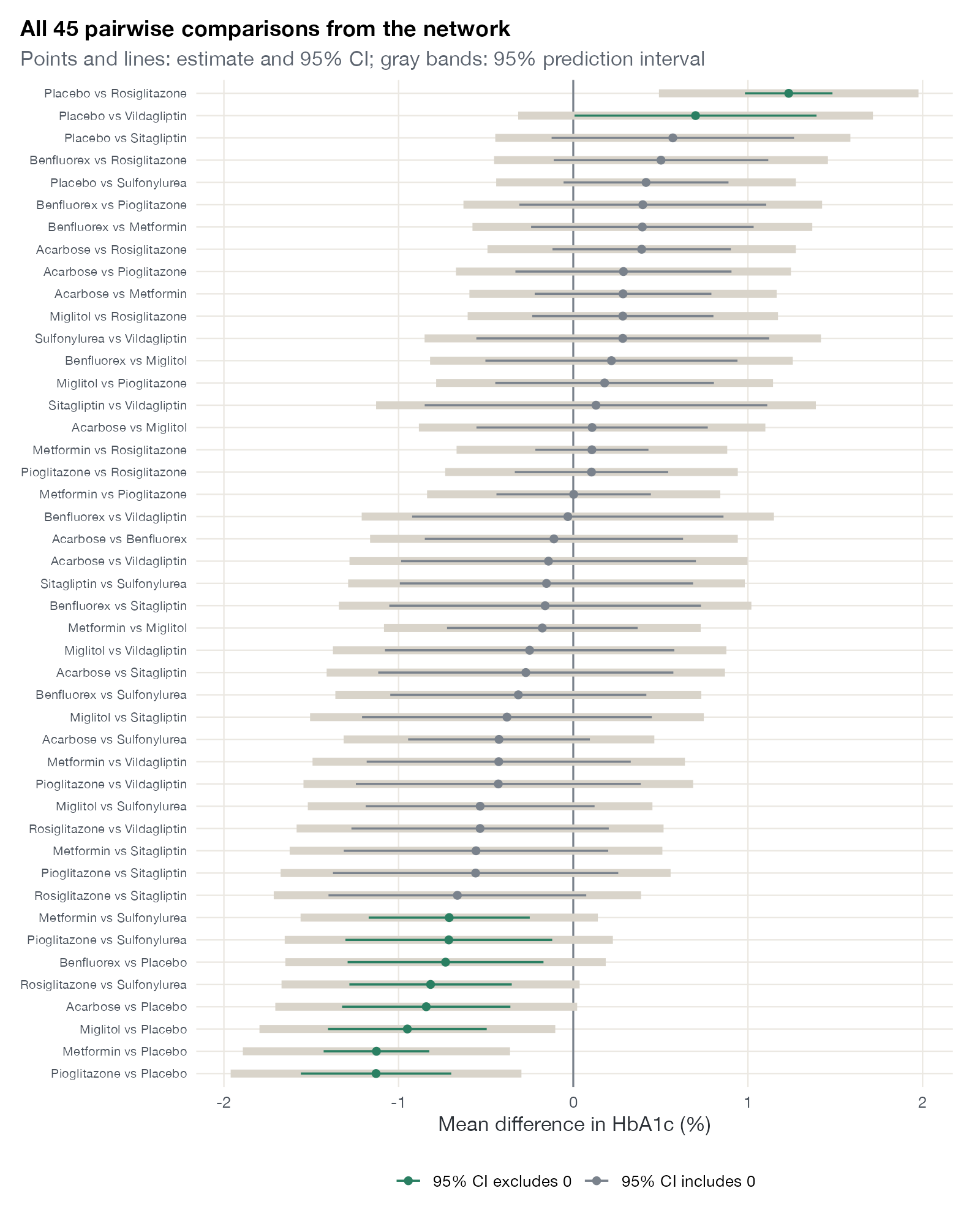
All 45 pairwise random-effects estimates from the diabetes network, sorted by effect. Colored points and lines are estimates and 95% confidence intervals; gray bands are 95% prediction intervals. Data:
netmeta::Senn2013.
Family
Effect display
Purpose
Show the precision and heterogeneity of every comparison in the network at once.
Inputs
A fitted network meta-analysis.
Software
Stata
intervalplot; R custom ggplot2 from netmeta output
What it shows
The interval plot, popularized by the Stata network graphics suite, lists all \(T(T-1)/2\) pairwise comparisons down the page and draws each network estimate with its confidence interval and, underneath, its prediction interval. Compared with a league table it trades compactness for immediate visibility of precision and of the null line.
How to read it
- Rows: pairwise comparisons, here sorted by estimate.
- Points and colored lines: network estimate and 95% confidence interval.
- Gray bands: 95% prediction intervals, which add between-study heterogeneity.
- Vertical line: no difference.
Interpretation
Ten of the 45 confidence intervals exclude zero, but only four prediction intervals do: metformin, miglitol, pioglitazone, and rosiglitazone against placebo. With \(\tau = 0.33\), most comparisons between active drugs could go either way in a new trial setting even when the average difference looks favorable.
Pitfalls
- The number of rows grows quadratically with the number of treatments; for large networks show only comparisons of interest.
- Prediction intervals in NMA assume a common heterogeneity variance across comparisons.
- Sorting by effect is convenient but hides which comparisons share a treatment.
Code
library(netmeta)
library(ggplot2)

data(Senn2013)

net <- netmeta(
  TE, seTE, treat1.long, treat2.long, studlab,
  data = Senn2013, sm = "MD",
  common = FALSE, reference.group = "Placebo"
)

# Every pairwise network estimate with its 95% CI and prediction interval
trts <- net$trts
pairs <- t(combn(trts, 2))
est <- data.frame(
  t1 = pairs[, 1], t2 = pairs[, 2],
  te = net$TE.random[pairs],
  lo = net$lower.random[pairs], hi = net$upper.random[pairs],
  plo = net$lower.predict[pairs], phi = net$upper.predict[pairs]
)
est$label <- paste(est$t1, "vs", est$t2)
est$label <- factor(est$label, levels = est$label[order(est$te)])
est$sig <- ifelse(est$hi < 0 | est$lo > 0, "95% CI excludes 0", "95% CI includes 0")

ggplot(est, aes(y = label)) +
  geom_vline(xintercept = 0, colour = "#7a828c") +
  geom_linerange(aes(xmin = plo, xmax = phi), colour = "#d9d4ca", linewidth = 2.2) +
  geom_pointrange(aes(x = te, xmin = lo, xmax = hi, colour = sig),
                  size = 0.25, linewidth = 0.6) +
  scale_colour_manual(values = c("#2a7f62", "#7a828c"), name = NULL) +
  labs(x = "Mean difference in HbA1c (%)", y = NULL,
       title = "All 45 pairwise comparisons from the network",
       subtitle = "Points and lines: estimate and 95% CI; gray bands: 95% prediction interval") +
  theme(axis.text.y = element_text(size = 7.5))
network meta consistency
intervalplot, eform predictionsReferences
- Chaimani A, Higgins JPT, Mavridis D, Spyridonos P, Salanti G. Graphical tools for network meta-analysis in STATA. PLoS One. 2013;8:e76654. doi:10.1371/journal.pone.0076654
- Chaimani A, Salanti G. Visualizing assumptions and results in network meta-analysis: the network graphs package. Stata J. 2015;15:905-950. doi:10.1177/1536867X1501500402