p-curve plot
Distribution of significant p-values
metadat::dat.bangertdrowns2004.
dmetar::pcurve(), custom ggplot2
What it shows
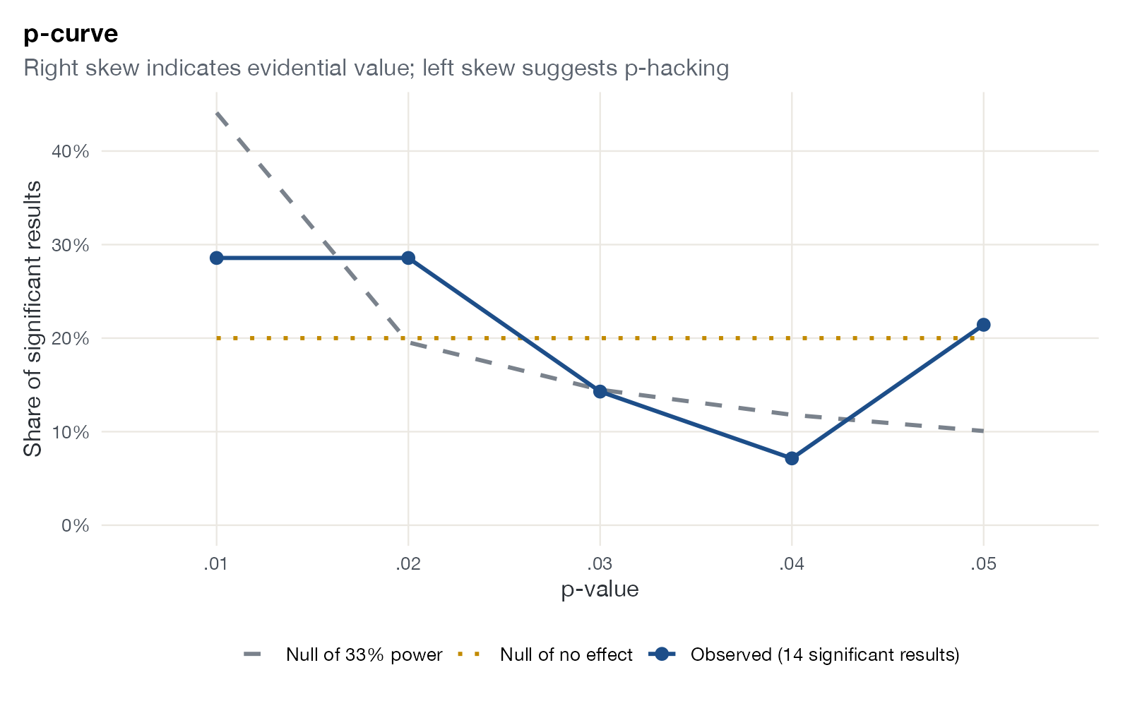
Simonsohn, Nelson, and Simmons proposed looking only at significant results. If the true effect is zero, significant p-values are uniformly distributed between 0 and 0.05. If a true effect exists, small p-values are more common and the curve is right skewed. An excess of p-values just below 0.05 (left skew) suggests p-hacking. The plot compares the observed distribution with these reference curves.
How to read it
- Horizontal axis: p-value bins between 0 and 0.05.
- Vertical axis: share of significant results in each bin.
- Blue line: observed p-curve.
- Dotted line: expected under no effect (flat at 20%).
- Dashed line: expected if studies had 33% power, a benchmark for “evidential value is inadequate”.
Interpretation
Of 48 studies, 14 are significant in the predicted direction. Eight of them have \(p < 0.02\), above the 40% expected under no effect, but the curve also rises again at 0.05, where three results cluster. The shape is weakly right skewed and does not clearly exceed the 33% power benchmark: evidence for an effect is present but not strong.
Pitfalls
- p-curve uses only significant results and assumes they are independent and correctly computed; selecting which p-value to take from each study requires rules.
- It performs poorly with heterogeneous effects and is not an estimator of the average effect in the population of studies.
- With few significant results the curve is noisy; this example has only 14.
Code
library(ggplot2)

# Writing-to-learn studies: two-sided p-values from standardized mean differences
data(dat.bangertdrowns2004, package = "metadat")
d <- dat.bangertdrowns2004
p <- 2 * pnorm(-abs(d$yi / sqrt(d$vi)))
p <- p[p < 0.05 & d$yi > 0]  # significant results in the predicted direction

bins <- cut(p, breaks = seq(0, 0.05, 0.01), labels = c(".01", ".02", ".03", ".04", ".05"))
obs <- as.numeric(table(bins)) / length(p)

# Expected p-curves: uniform under no effect; right-skewed under 33% power
ncp33 <- qnorm(0.975) - qnorm(1 - 0.33)
pz <- function(pv) qnorm(1 - pv / 2)
exp33 <- sapply(seq(0.01, 0.05, 0.01), function(u) {
  (pnorm(ncp33 - pz(u)) - pnorm(ncp33 - pz(u - 0.01))) / 0.33
})

curves <- rbind(
  data.frame(p = levels(bins), share = obs, curve = sprintf("Observed (%d significant results)", length(p))),
  data.frame(p = levels(bins), share = 0.2, curve = "Null of no effect"),
  data.frame(p = levels(bins), share = exp33, curve = "Null of 33% power")
)

ggplot(curves, aes(p, share, colour = curve, group = curve, linetype = curve)) +
  geom_line(linewidth = 1) +
  geom_point(data = subset(curves, grepl("Observed", curve)), size = 2.6) +
  scale_colour_manual(values = c("#7a828c", "#c28a00", "#1d4e89"), name = NULL) +
  scale_linetype_manual(values = c("dashed", "dotted", "solid"), name = NULL) +
  scale_y_continuous(labels = scales::percent, limits = c(0, NA)) +
  labs(x = "p-value", y = "Share of significant results",
       title = "p-curve", subtitle = "Right skew indicates evidential value; left skew suggests p-hacking")
References
- Simonsohn U, Nelson LD, Simmons JP. P-curve: a key to the file-drawer. J Exp Psychol Gen. 2014;143:534-547. doi:10.1037/a0033242
- Simonsohn U, Simmons JP, Nelson LD. Better P-curves: making P-curve analysis more robust to errors, fraud, and ambitious P-hacking. J Exp Psychol Gen. 2015;144:1146-1152. doi:10.1037/xge0000104