Bootstrap distribution plot
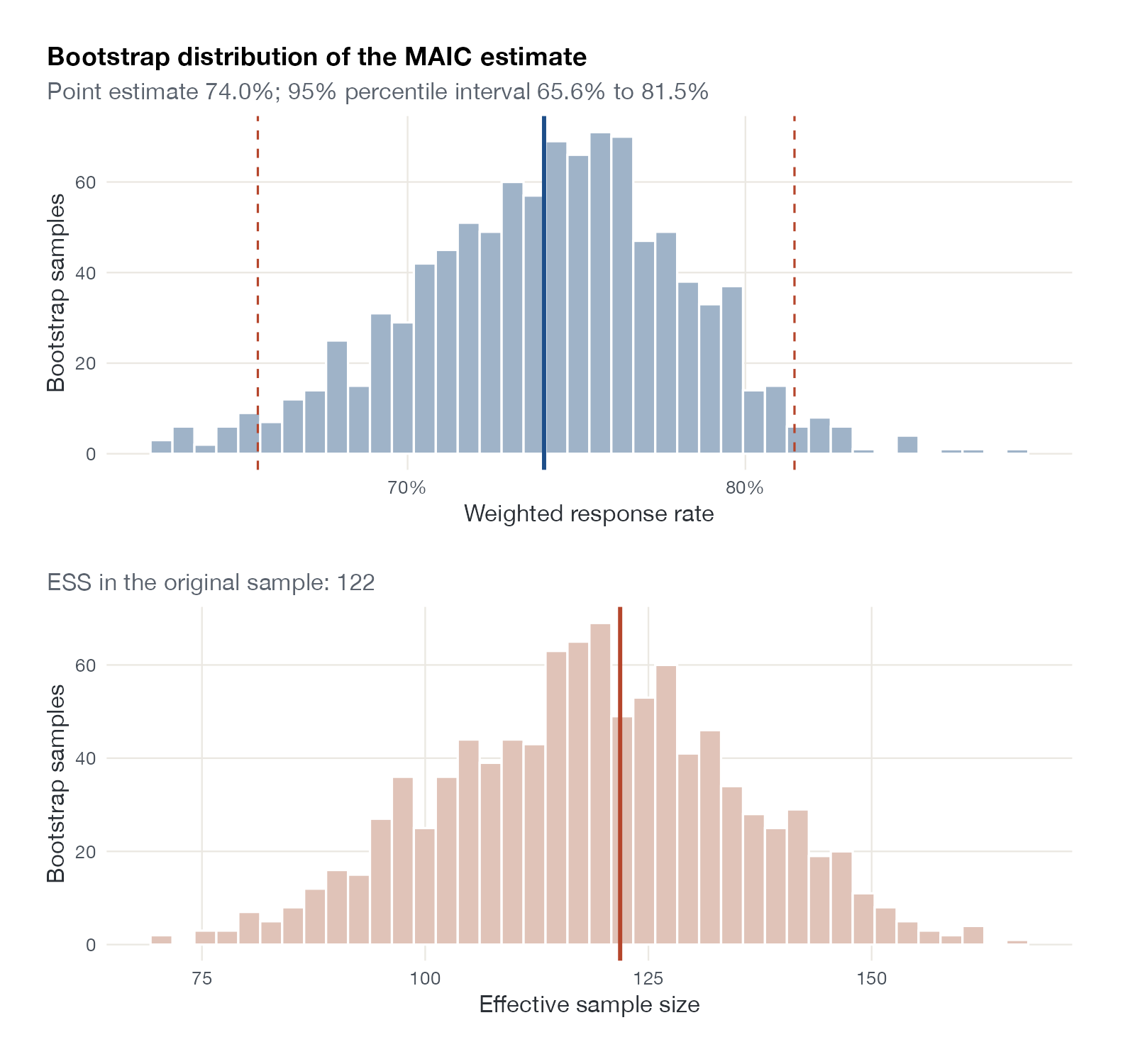
Bootstrap histogram of the MAIC estimate and ESS
maicplus::centered_ipd_sat and adrs_sat.
maicplus::estimate_weights(n_boot_iteration = ) with ggplot2 (shown); boot
What it shows
MAIC weights are estimated, and the uncertainty in them should propagate to the result. The bootstrap resamples the IPD, re-estimates the weights each time, and recomputes the estimate. Plotting the bootstrap distribution shows the interval and whether the estimate behaves well: skewness, heavy tails, or multimodality signal instability. Showing the ESS across resamples reveals how fragile the weighting is.
How to read it
- Top histogram: bootstrap estimates of the weighted outcome.
- Solid line: the estimate in the original sample.
- Dashed lines: 95% percentile interval.
- Bottom histogram: ESS in each resample.
Interpretation
The weighted response rate is 74.0% (95% bootstrap interval 65.6% to 81.5%), against 78% unweighted. The bootstrap distribution is roughly symmetric, but the ESS varies from about 70 to 160 between resamples, so the precision of the weighted analysis depends noticeably on which patients happen to be sampled.
Pitfalls
- Resample within arms (strata) in anchored comparisons.
- Percentile intervals can undercover with very small ESS; consider BCa intervals.
- The bootstrap captures sampling variability of the IPD, not uncertainty in the aggregate comparator data or in the choice of covariates.
Code
library(maicplus)
library(ggplot2)
library(patchwork)

data(centered_ipd_sat)
data(adrs_sat)
cc <- grep("_CENTERED$", names(centered_ipd_sat), value = TRUE)

# Re-estimate the weights in 1,000 bootstrap resamples of the IPD
w <- estimate_weights(centered_ipd_sat, centered_colnames = cc,
                      n_boot_iteration = 1000, set_seed_boot = 7)
resp <- adrs_sat$RESPONSE[match(centered_ipd_sat$USUBJID, adrs_sat$USUBJID)]

boot <- data.frame(t(apply(w$boot, 3, function(b) {
  wt <- b[, "weight"]
  c(rate = weighted.mean(resp[b[, "rowid"]], wt), ess = sum(wt)^2 / sum(wt^2))
})))
point <- weighted.mean(resp, w$data$weights)
ci <- quantile(boot$rate, c(0.025, 0.975))

p1 <- ggplot(boot, aes(rate)) +
  geom_histogram(bins = 40, fill = "#9fb3c8", colour = "white") +
  geom_vline(xintercept = point, colour = "#1d4e89", linewidth = 1) +
  geom_vline(xintercept = ci, colour = "#b5452b", linetype = "dashed") +
  scale_x_continuous(labels = scales::percent) +
  labs(x = "Weighted response rate", y = "Bootstrap samples",
       title = "Bootstrap distribution of the MAIC estimate",
       subtitle = sprintf("Point estimate %.1f%%; 95%% percentile interval %.1f%% to %.1f%%",
                          100 * point, 100 * ci[1], 100 * ci[2]))
p2 <- ggplot(boot, aes(ess)) +
  geom_histogram(bins = 40, fill = "#e0c3b8", colour = "white") +
  geom_vline(xintercept = w$ess, colour = "#b5452b", linewidth = 1) +
  labs(x = "Effective sample size", y = "Bootstrap samples",
       subtitle = sprintf("ESS in the original sample: %.0f", w$ess))

p1 / p2
References
- Remiro-Azócar A, Heath A, Baio G. Methods for population adjustment with limited access to individual patient data: a review and simulation study. Res Synth Methods. 2021;12:750-775. doi:10.1002/jrsm.1511
- Efron B, Tibshirani RJ. An Introduction to the Bootstrap. Chapman and Hall; 1993. doi:10.1201/9780429246593