Weight versus covariate plot
Leverage plot for MAIC weights
MAIC
MAIC weights plotted against a key covariate, revealing which regions of the IPD drive the weighted analysis.
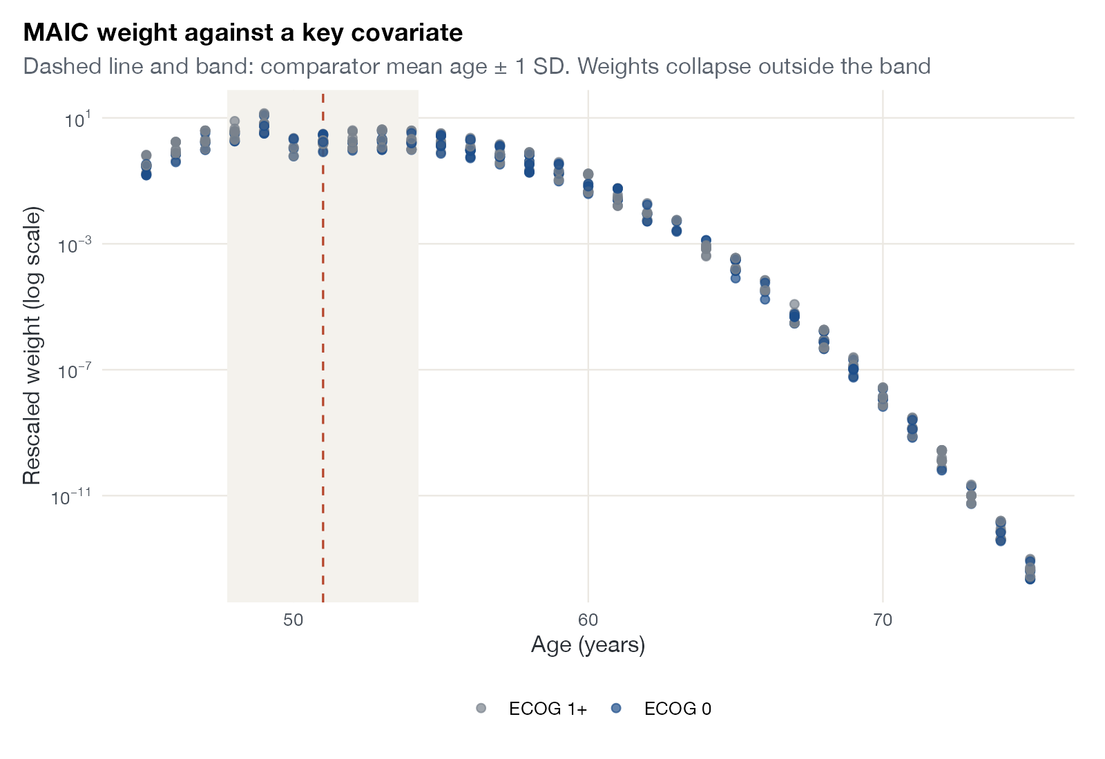
Rescaled MAIC weights (log scale) against age for simulated single-arm IPD, colored by ECOG status. The dashed line and band mark the comparator mean age ± 1 SD. Data:
maicplus::centered_ipd_sat.
Family
Weighting, balance, and overlap
Purpose
Identify the covariate regions that receive extreme or negligible weights.
Inputs
MAIC weights and IPD covariates.
Software
Custom
ggplot2 (shown)
What it shows
MAIC weights are an exponential function of the matched covariates, so each patient’s weight is determined by where they sit in covariate space. Plotting weights against a key covariate shows directly which patients the weighted analysis relies on and which are effectively discarded. It often explains an extreme weight histogram in one glance.
How to read it
- Horizontal axis: a matched covariate or effect modifier.
- Vertical axis: weight, usually on a log scale.
- Color: a second covariate or subgroup.
- Reference band: the comparator’s summary (mean ± SD) where available.
Interpretation
Weights peak for patients aged about 45 to 57, inside the comparator’s mean ± SD band, and collapse by several orders of magnitude above age 60. Participants older than 65 receive weights below 0.0001 of the average: roughly half of the IPD contribute almost nothing. Weights barely differ by ECOG status, which is well balanced to begin with.
Pitfalls
- Patterns across one covariate can be driven by correlated covariates.
- Large weights in a clinically unusual region deserve checking even if the overall ESS looks acceptable.
Code
library(maicplus)
library(ggplot2)

data(centered_ipd_sat)
cc <- grep("_CENTERED$", names(centered_ipd_sat), value = TRUE)
ipd <- estimate_weights(centered_ipd_sat, centered_colnames = cc)$data
ipd$ECOG <- factor(ipd$ECOG0, labels = c("ECOG 1+", "ECOG 0"))

# Where do the large weights come from? Rescaled weight against age
ggplot(ipd, aes(AGE, scaled_weights, colour = ECOG)) +
  annotate("rect", xmin = 51 - 3.25, xmax = 51 + 3.25, ymin = 0, ymax = Inf,
           fill = "#f4f2ed") +
  geom_vline(xintercept = 51, colour = "#b5452b", linetype = "dashed") +
  geom_point(alpha = 0.7, size = 1.8) +
  scale_y_continuous(trans = "log10", labels = scales::label_log()) +
  scale_colour_manual(values = c("#7a828c", "#1d4e89"), name = NULL) +
  labs(x = "Age (years)", y = "Rescaled weight (log scale)",
       title = "MAIC weight against a key covariate",
       subtitle = "Dashed line and band: comparator mean age ± 1 SD. Weights collapse outside the band")
References
- Phillippo DM, Ades AE, Dias S, Palmer S, Abrams KR, Welton NJ. NICE DSU Technical Support Document 18: Methods for population-adjusted indirect comparisons in submissions to NICE. 2016. sheffield.ac.uk/nice-dsu
- Signorovitch JE, Sikirica V, Erder MH, et al. Matching-adjusted indirect comparisons: a new tool for timely comparative effectiveness research. Value Health. 2012;15:940-947. doi:10.1016/j.jval.2012.05.004