L’Abbé plot
Treatment risk versus control risk plot
metadat::dat.bcg.
meta::labbe(), metafor::labbe(); Stata meta labbeplot
What it shows
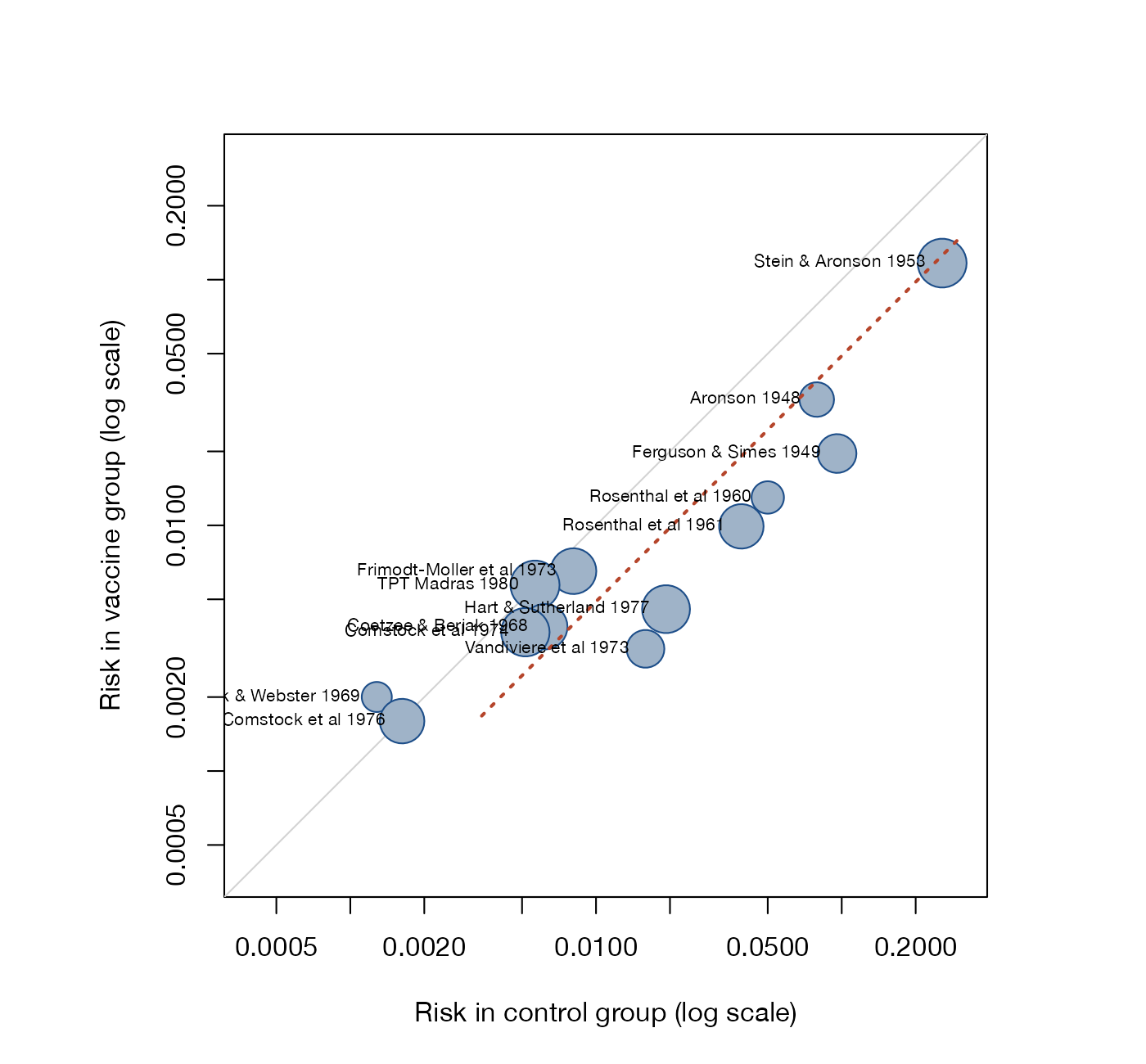
The L’Abbé plot places each trial at the event risk in its control arm (horizontal) and its intervention arm (vertical). Trials below the diagonal favor the intervention when events are harmful. Because both arms are shown rather than only their contrast, the plot exposes how effects relate to baseline risk and whether a ratio or a difference measure describes the data better.
How to read it
- Horizontal axis: control-group event risk.
- Vertical axis: intervention-group event risk.
- Diagonal: equal risks, no effect.
- Circle area: sample size or precision.
- Dotted line: the pooled effect. A constant risk ratio is a straight line through the origin on linear axes and a line parallel to the diagonal on log axes.
Interpretation
Most BCG trials fall below the diagonal, and the vertical distance to it varies widely, which is the heterogeneity seen in the forest plot. Trials with control risks below about 1% (Comstock 1976, Comstock and Webster) sit near or above the diagonal, while high-risk settings show large benefits, consistent with the latitude gradient explored in the bubble plot.
Pitfalls
- Observed control risk contains sampling error that is correlated with the treatment effect estimate. A visual trend with baseline risk can therefore be partly artifact; formal analysis needs methods that model the true baseline risk.
- Small studies with zero events are hard to show on log axes.
- The plot does not use the pooling weights; large circles only suggest them.
Code
library(meta)
options(scipen = 10)

data(dat.bcg, package = "metadat")

m <- metabin(
  event.e = tpos, n.e = tpos + tneg,
  event.c = cpos, n.c = cpos + cneg,
  studlab = paste(author, year),
  data = dat.bcg, sm = "RR",
  common = FALSE, random = TRUE, method.tau = "REML"
)

# Intervention risk against control risk; circle area reflects study size
labbe(
  m,
  studlab = TRUE, cex.studlab = 0.65,
  bg = "#9fb3c8", col = "#1d4e89",
  col.random = "#b5452b", lwd.random = 2,
  xlab = "Risk in control group (log scale)",
  ylab = "Risk in vaccine group (log scale)",
  log = "xy", xlim = c(0.0004, 0.3), ylim = c(0.0004, 0.3)
)
meta esize tpos tneg cpos cneg, esize(lnrratio)
meta labbeplotReferences
- L’Abbé KA, Detsky AS, O’Rourke K. Meta-analysis in clinical research. Ann Intern Med. 1987;107:224-233. doi:10.7326/0003-4819-107-2-224
- Song F. Exploring heterogeneity in meta-analysis: is the L’Abbé plot useful? J Clin Epidemiol. 1999;52:725-730. doi:10.1016/S0895-4356(99)00066-9
- Sharp SJ, Thompson SG, Altman DG. The relation between treatment benefit and underlying risk in meta-analysis. BMJ. 1996;313:735-738. doi:10.1136/bmj.313.7059.735