Rank probability heat map
Rank matrix heat map
NMA
ML-NMR
A matrix of treatments by ranks, colored by the probability of each rank.
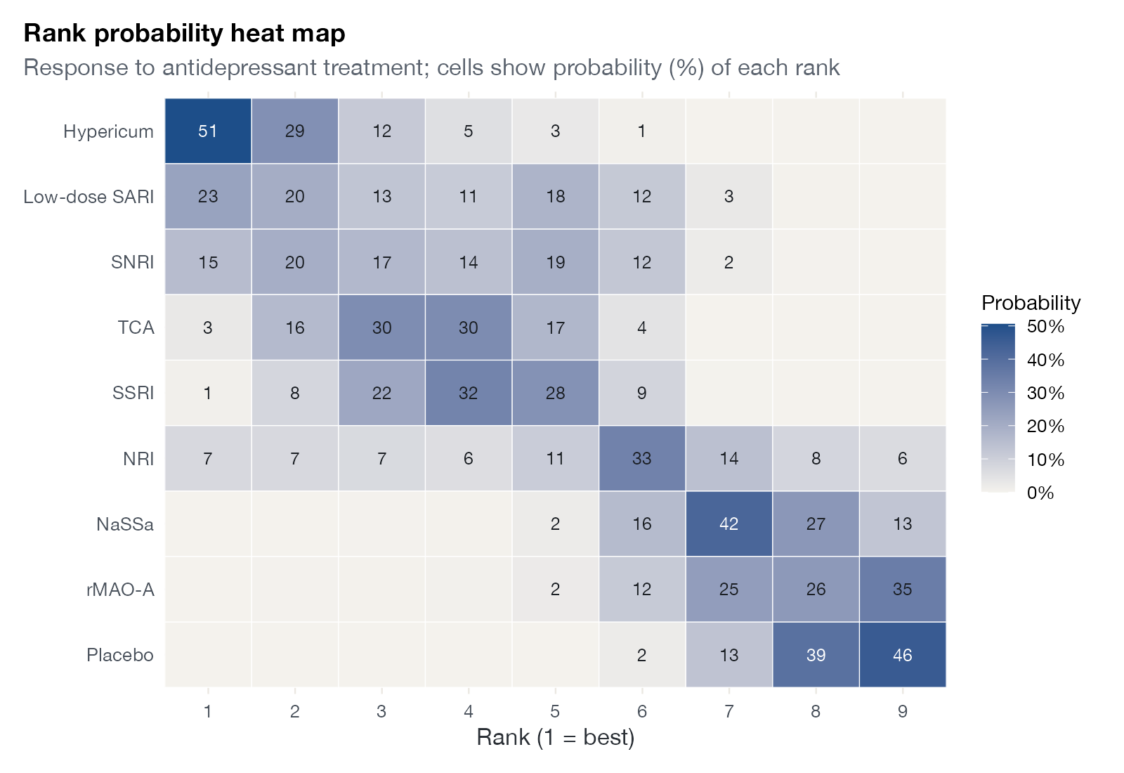
Rank probabilities for response in the antidepressant network, treatments sorted by SUCRA. Cells show the probability (%) of each rank. Data:
netmeta::Linde2015.
Family
Treatment ranking
Purpose
Show all rank distributions compactly in one table-like display.
Inputs
Rank probabilities.
Software
Custom
ggplot2 from netmeta::rankogram() output
What it shows
The rank probability heat map presents the same information as a set of rankograms, but as a single matrix: treatments in rows, ranks in columns, and color for probability. A clear diagonal band means a well-separated ranking; smears across many columns mean uncertainty.
How to read it
- Rows: treatments, sorted by SUCRA.
- Columns: ranks, 1 is best.
- Cells: probability of that rank.
Interpretation
Hypericum has a 51% probability of rank 1. Below it, low-dose SARI and SNRI spread across ranks 1 to 6, while TCA and SSRI concentrate on ranks 3 to 5. NaSSa, rMAO-A, and placebo occupy ranks 7 to 9 with little doubt. The diagonal is clean at the bottom and blurred at the top.
Pitfalls
- Color scales emphasize differences that may be small in probability terms.
- Sorting by SUCRA imposes an order that the heat map itself may show to be uncertain.
Code
library(netmeta)

# Antidepressants in primary care (Linde et al. 2015): arm-level binary outcomes
data(Linde2015)
d <- Linde2015
nma_for <- function(v, small) {
  p <- pairwise(treat = list(d$treatment1, d$treatment2, d$treatment3),
                event = list(d[[paste0(v, 1)]], d[[paste0(v, 2)]], d[[paste0(v, 3)]]),
                n = list(d$n1, d$n2, d$n3), studlab = d$id, sm = "OR", allstudies = TRUE)
  netmeta(p, common = FALSE, reference.group = "Placebo", small.values = small)
}
library(ggplot2)

resp <- nma_for("resp", small = "undesirable")
rk <- rankogram(resp, nsim = 5000)

# Treatments in rows, ranks in columns, probability as color
m <- rk$ranking.matrix.random
p <- data.frame(treatment = rep(rownames(m), ncol(m)), rank = rep(seq_len(ncol(m)), each = nrow(m)),
                prob = as.vector(m))
sucra <- rowMeans(apply(m, 1, cumsum)[-ncol(m), , drop = FALSE] |> t())
p$treatment <- factor(p$treatment, levels = names(sort(sucra)))

ggplot(p, aes(rank, treatment, fill = prob)) +
  geom_tile(colour = "white") +
  geom_text(aes(label = ifelse(prob >= 0.005, sprintf("%.0f", 100 * prob), "")), size = 3.2,
            colour = ifelse(p$prob > 0.35, "white", "#1b1f24")) +
  scale_fill_gradient(low = "#f4f2ed", high = "#1d4e89", labels = scales::percent,
                      name = "Probability") +
  scale_x_continuous(breaks = 1:9, expand = c(0, 0)) +
  labs(x = "Rank (1 = best)", y = NULL, title = "Rank probability heat map",
       subtitle = "Response to antidepressant treatment; cells show probability (%) of each rank") +
  theme(panel.grid = element_blank(), legend.position = "right")
References
- Salanti G, Ades AE, Ioannidis JPA. Graphical methods and numerical summaries for presenting results from multiple-treatment meta-analysis: an overview and tutorial. J Clin Epidemiol. 2011;64:163-171. doi:10.1016/j.jclinepi.2010.03.016