Radial SUCRA plot
Network diagram on a SUCRA scale
netmeta::Linde2015.
ggplot2 (shown)
What it shows
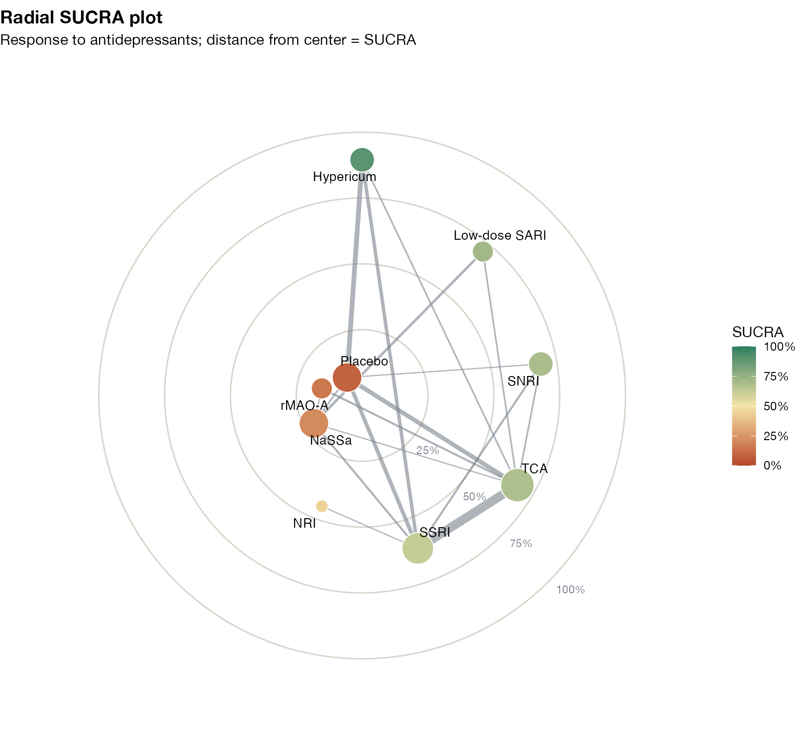
The radial SUCRA plot, also from the MetaInsight display of Nevill and colleagues, overlays the network diagram on a ranking scale. Treatments are arranged around a circle at a distance from the center given by their SUCRA, and the direct comparisons are drawn between them. Readers can see at once which highly ranked treatments rest on many direct comparisons and which are ranked on the strength of thin, indirect evidence.
How to read it
- Radius: SUCRA; the outer ring is 100%.
- Node size: amount of evidence (here, number of trials including the treatment).
- Edges: direct comparisons; thicker edges have more trials.
- Color: SUCRA, repeated for emphasis.
Interpretation
Hypericum sits near the outer ring but is linked to the network through few edges, mostly to placebo and to SSRI and TCA. SSRI and TCA, at mid-radius, are the best-connected nodes. Placebo, rMAO-A, and NaSSa huddle near the center. The high ranking of hypericum therefore rests on a small part of the network, which the plain ranking does not reveal.
Pitfalls
- The angular arrangement is arbitrary; do not read meaning into neighboring positions.
- As with every SUCRA display, effect sizes and uncertainty are not shown.
- This page shows a custom implementation; MetaInsight’s version differs in details.
Code
library(netmeta)

# Antidepressants in primary care (Linde et al. 2015): arm-level binary outcomes
data(Linde2015)
d <- Linde2015
nma_for <- function(v, small) {
  p <- pairwise(treat = list(d$treatment1, d$treatment2, d$treatment3),
                event = list(d[[paste0(v, 1)]], d[[paste0(v, 2)]], d[[paste0(v, 3)]]),
                n = list(d$n1, d$n2, d$n3), studlab = d$id, sm = "OR", allstudies = TRUE)
  netmeta(p, common = FALSE, reference.group = "Placebo", small.values = small)
}
library(ggplot2)

resp <- nma_for("resp", small = "undesirable")
rk <- rankogram(resp, nsim = 5000, cumulative.rankprob = TRUE)
cm <- rk$cumrank.matrix.random
sucra <- rowSums(cm[, -ncol(cm)]) / (ncol(cm) - 1)

# Treatments placed around a circle (ordered by SUCRA) at a radius equal to
# their SUCRA; network edges drawn between them, width by number of trials
ord <- names(sort(sucra, decreasing = TRUE))
ang <- setNames(pi / 2 - 2 * pi * (seq_along(ord) - 1) / length(ord), ord)
nodes <- data.frame(treatment = ord, r = sucra[ord],
                    x = sucra[ord] * cos(ang), y = sucra[ord] * sin(ang),
                    n = colSums(resp$A.matrix > 0)[ord])
edges <- which(upper.tri(resp$A.matrix) & resp$A.matrix > 0, arr.ind = TRUE)
edges <- data.frame(from = rownames(resp$A.matrix)[edges[, 1]],
                    to = colnames(resp$A.matrix)[edges[, 2]], k = resp$A.matrix[edges])
edges <- cbind(edges, nodes[match(edges$from, nodes$treatment), c("x", "y")],
               setNames(nodes[match(edges$to, nodes$treatment), c("x", "y")], c("xend", "yend")))
rings <- expand.grid(r = c(0.25, 0.5, 0.75, 1), t = seq(0, 2 * pi, length.out = 200))

ggplot() +
  geom_path(data = rings, aes(r * cos(t), r * sin(t), group = r), colour = "#d9d4ca") +
  annotate("text", x = c(0.25, 0.5, 0.75, 1) * cos(-pi / 4) + 0.03,
           y = c(0.25, 0.5, 0.75, 1) * sin(-pi / 4) - 0.03,
           label = c("25%", "50%", "75%", "100%"), size = 2.8, colour = "#7a828c", hjust = 0) +
  geom_segment(data = edges, aes(x, y, xend = xend, yend = yend, linewidth = k),
               colour = "#7a828c", alpha = 0.6) +
  geom_point(data = nodes, aes(x, y, size = n, fill = r), shape = 21, colour = "white") +
  ggrepel::geom_text_repel(data = nodes, aes(x, y, label = treatment), size = 3.4,
                           point.padding = 0.6, box.padding = 0.5, seed = 1) +
  scale_linewidth(range = c(0.4, 3), guide = "none") +
  scale_size(range = c(4, 11), guide = "none") +
  scale_fill_gradientn(colours = c("#b5452b", "#f2e4a6", "#2a7f62"), limits = c(0, 1),
                       labels = scales::percent, name = "SUCRA") +
  coord_equal(xlim = c(-1.25, 1.25), ylim = c(-1.2, 1.2)) +
  labs(title = "Radial SUCRA plot", subtitle = "Response to antidepressants; distance from center = SUCRA") +
  theme_void(base_family = "Helvetica Neue") +
  theme(legend.position = "right", plot.title = element_text(face = "bold"),
        plot.background = element_rect(fill = "white", colour = NA))
References
- Nevill CR, Cooper NJ, Sutton AJ. A multifaceted graphical display, including treatment ranking, was developed to aid interpretation of network meta-analysis. J Clin Epidemiol. 2023;157:83-91. doi:10.1016/j.jclinepi.2023.02.016