Method-comparison forest plot
Sensitivity forest across ITC methods, NMI adjusted-method forest
ggplot2; maicplus::maic_forest_plot() for MAIC-based variants
What it shows
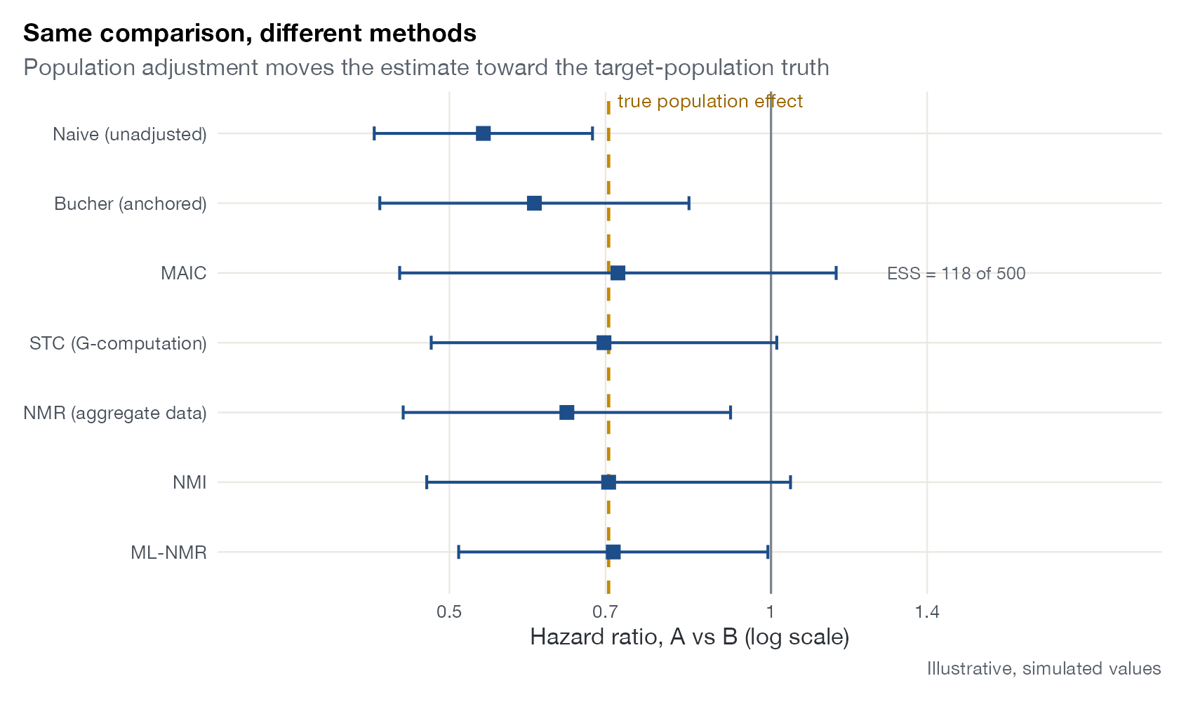
Health technology assessment submissions and methods papers often report one comparison several ways: naive, anchored (Bucher), weighted (MAIC), regression-based (STC or G-computation), network meta-regression, NMI, and ML-NMR. Stacking these as rows of a forest plot shows at a glance how much the answer depends on the method. In simulation studies, a vertical line marks the true effect in the target population, and the plot becomes a direct display of bias and precision. The NMI proof-of-concept literature presented its simulations this way, with methods on the vertical axis and the simulation truth as reference.
How to read it
- Rows: methods, ideally ordered from least to most adjusted.
- Points and whiskers: estimate and 95% confidence or credible interval.
- Dashed line: true effect (simulation only).
- Annotations: diagnostics that qualify a row, such as the MAIC effective sample size.
Interpretation
In this scenario the naive and Bucher estimates overstate the benefit of A because an effect modifier is imbalanced between trials. Methods that adjust for it (MAIC, STC, NMI, ML-NMR) cluster around the true value; MAIC does so with the widest interval, reflecting the loss of effective sample size.
Pitfalls
- Agreement between methods that share assumptions (for example, the same set of adjusted covariates) is not independent confirmation.
- A simulation shows performance under the simulated data-generating mechanism only; it does not validate the assumptions in a real application.
- Methods can target different estimands (conditional vs marginal, different target populations); rows are only comparable if the estimand is the same.
Code
library(ggplot2)

# Illustrative estimates of one A vs B log hazard ratio from different
# indirect comparison methods, in a scenario where the truth is known
res <- data.frame(
  method = c("Naive (unadjusted)", "Bucher (anchored)", "MAIC", "STC (G-computation)",
             "NMR (aggregate data)", "NMI", "ML-NMR"),
  est = c(-0.62, -0.51, -0.33, -0.36, -0.44, -0.35, -0.34),
  se = c(0.12, 0.17, 0.24, 0.19, 0.18, 0.20, 0.17),
  note = c("", "", "ESS = 118 of 500", "", "", "", "")
)
res$method <- factor(res$method, levels = rev(res$method))
res$lo <- res$est - 1.96 * res$se
res$hi <- res$est + 1.96 * res$se
truth <- -0.35

ggplot(res, aes(x = est, y = method)) +
  geom_vline(xintercept = 0, colour = "#7a828c") +
  geom_vline(xintercept = truth, colour = "#c28a00", linetype = "dashed", linewidth = 0.8) +
  annotate("text", x = truth, y = Inf, label = "true population effect", colour = "#9a6700",
           hjust = -0.05, vjust = 1.2, size = 3.5) +
  geom_errorbar(aes(xmin = lo, xmax = hi), width = 0.2, orientation = "y", colour = "#1d4e89", linewidth = 0.7) +
  geom_point(shape = 15, size = 3.2, colour = "#1d4e89") +
  geom_text(aes(x = 0.25, label = note), hjust = 0, size = 3.2, colour = "#5b636e") +
  scale_x_continuous(breaks = log(c(0.3, 0.5, 0.7, 1, 1.4)),
                     labels = c(0.3, 0.5, 0.7, 1, 1.4), limits = c(-1.1, 0.75)) +
  coord_cartesian(clip = "off") +
  labs(x = "Hazard ratio, A vs B (log scale)", y = NULL,
       title = "Same comparison, different methods",
       subtitle = "Population adjustment moves the estimate toward the target-population truth",
       caption = "Illustrative, simulated values")
References
- Phillippo DM, Dias S, Ades AE, Welton NJ. Assessing the performance of population adjustment methods for anchored indirect comparisons: a simulation study. Stat Med. 2020;39:4885-4911. doi:10.1002/sim.8759
- Harari O, Soltanifar M, Cappelleri JC, et al. Network meta-interpolation: effect modification adjustment in network meta-analysis using subgroup analyses. Res Synth Methods. 2023;14:211-233. doi:10.1002/jrsm.1608
- Remiro-Azócar A, Heath A, Baio G. Methods for population adjustment with limited access to individual patient data: a review and simulation study. Res Synth Methods. 2021;12:750-775. doi:10.1002/jrsm.1511