Effect direction plot
Vote-counting-by-direction display
MA
A study-by-outcome grid showing the direction of effect with arrows, sized by sample size.
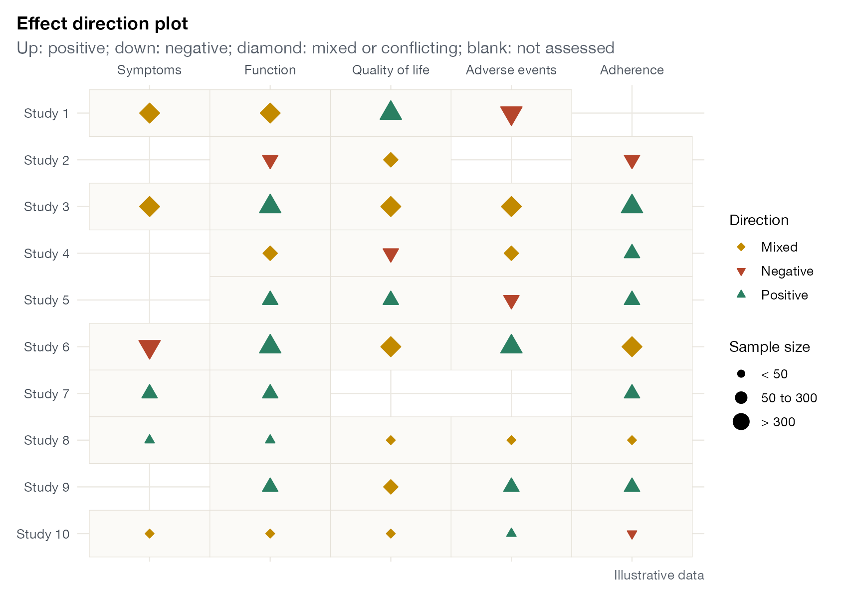
Effect direction plot for ten studies and five outcome domains. Upward triangles: positive effect; downward: negative; diamonds: mixed or conflicting findings within the domain; symbol size reflects sample size. Illustrative data.
Family
Synthesis without meta-analysis
Purpose
Summarize the direction of effects across outcome domains when effect sizes cannot be pooled.
Inputs
Direction of effect for each study and outcome domain, and sample size.
Software
Custom
ggplot2 (shown); R EffectDirectionPlot tools; spreadsheets
What it shows
Thomson and Thomas proposed the effect direction plot as a transparent way to present vote counting based on the direction of effect, which the Cochrane Handbook and the SWiM guideline accept when better methods are impossible. Each cell of a study-by-domain grid shows whether the effect is positive, negative, or mixed, and symbol size shows study size.
How to read it
- Rows: studies; columns: outcome domains.
- Symbols: direction of effect; mixed means conflicting results within the domain.
- Size: sample size category.
- Blank cells: domain not assessed.
Interpretation
Function and adherence show consistent positive effects across most studies of all sizes. Adverse events and quality of life are more mixed, with several negative and conflicting findings. A sign test on the number of positive versus negative directions can accompany the plot.
Pitfalls
- Direction ignores magnitude and precision.
- Rules for “mixed” must be prespecified, especially when a domain includes several outcomes.
- Direction should not be defined by statistical significance.
Code
library(ggplot2)

# Direction of effect for each outcome domain in each study, with symbol size
# for sample size (vote counting based on direction). Illustrative data.
set.seed(21)
studies <- paste("Study", 1:10)
domains <- c("Symptoms", "Function", "Quality of life", "Adverse events", "Adherence")
d <- expand.grid(study = studies, domain = domains)
d$direction <- sample(c("Positive", "Negative", "Mixed"), nrow(d), TRUE, c(0.55, 0.15, 0.30))
d$direction[sample(nrow(d), 8)] <- NA
d$n <- rep(sample(c("< 50", "50 to 300", "> 300"), 10, TRUE), times = length(domains))
d$study <- factor(d$study, levels = rev(studies))

ggplot(subset(d, !is.na(direction)), aes(domain, study)) +
  geom_tile(fill = "#fbfaf7", colour = "#e5e1d8") +
  geom_point(aes(shape = direction, colour = direction, fill = direction, size = n)) +
  scale_shape_manual(values = c(Positive = 24, Negative = 25, Mixed = 23), name = "Direction") +
  scale_fill_manual(values = c(Positive = "#2a7f62", Negative = "#b5452b", Mixed = "#c28a00"),
                    name = "Direction") +
  scale_colour_manual(values = c(Positive = "#2a7f62", Negative = "#b5452b", Mixed = "#c28a00"),
                      name = "Direction") +
  scale_size_manual(values = c("< 50" = 2, "50 to 300" = 3.5, "> 300" = 5),
                    breaks = c("< 50", "50 to 300", "> 300"), name = "Sample size") +
  scale_x_discrete(position = "top") +
  labs(x = NULL, y = NULL, title = "Effect direction plot",
       subtitle = "Up: positive; down: negative; diamond: mixed or conflicting; blank: not assessed",
       caption = "Illustrative data") +
  theme(panel.grid = element_blank(), legend.position = "right")
References
- Thomson HJ, Thomas S. The effect direction plot: visual display of non-standardised effects across multiple outcome domains. Res Synth Methods. 2013;4:95-101. doi:10.1002/jrsm.1060
- Boon MH, Thomson H. The effect direction plot revisited: application of the 2019 Cochrane Handbook guidance on alternative synthesis methods. Res Synth Methods. 2021;12:29-33. doi:10.1002/jrsm.1458