Kilim plot
Multi-outcome absolute effects table plot
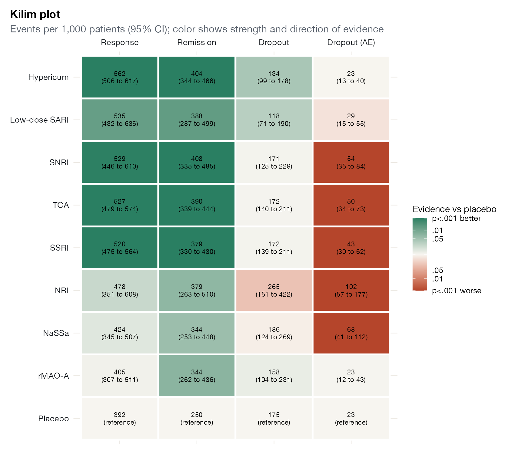
netmeta::Linde2015.
ggplot2 (shown); original R code from the authors
What it shows
Seo and colleagues designed the Kilim plot, named after the patterned rugs it resembles, to report NMA results for many outcomes without resorting to rankings. Each cell gives an absolute effect (for example, events per 1,000 patients) with its interval, and its color encodes both the direction of the effect and how strong the evidence is. Readers weigh benefits against harms on the natural scale.
How to read it
- Rows: treatments (here sorted by P-score for response).
- Columns: outcomes.
- Cell text: absolute risk per 1,000 with 95% CI.
- Color: green for benefit, red for harm, intensity for strength of evidence (569Xlvalue against the reference).
Interpretation
Hypericum gives about 562 responders per 1,000 against 392 on placebo, with no excess dropout due to adverse events (23 per 1,000, the same as placebo). TCA, SSRI, and SNRI improve response and remission similarly, but roughly double dropout due to adverse events (43 to 54 per 1,000). NRI increases both dropout outcomes.
Pitfalls
- Absolute effects depend on the assumed baseline risk; state it and consider several.
- Coloring by p-value mixes effect size and precision; a large imprecise effect and a small precise one can look the same.
- Multiple testing across many cells is implicit.
Code
library(netmeta)

# Antidepressants in primary care (Linde et al. 2015): arm-level binary outcomes
data(Linde2015)
d <- Linde2015
nma_for <- function(v, small) {
  p <- pairwise(treat = list(d$treatment1, d$treatment2, d$treatment3),
                event = list(d[[paste0(v, 1)]], d[[paste0(v, 2)]], d[[paste0(v, 3)]]),
                n = list(d$n1, d$n2, d$n3), studlab = d$id, sm = "OR", allstudies = TRUE)
  netmeta(p, common = FALSE, reference.group = "Placebo", small.values = small)
}
library(ggplot2)

outs <- list(Response = list(v = "resp", small = "undesirable", good = "high"),
             Remission = list(v = "remi", small = "undesirable", good = "high"),
             Dropout = list(v = "loss", small = "desirable", good = "low"),
             `Dropout (AE)` = list(v = "loss.ae", small = "desirable", good = "low"))

# Absolute risk per 1,000 on each treatment, assuming the median placebo-arm
# risk, and the p-value for each treatment versus placebo
cells <- do.call(rbind, lapply(names(outs), function(o) {
  s <- outs[[o]]
  net <- nma_for(s$v, s$small)
  arms <- data.frame(t = c(d$treatment1, d$treatment2, d$treatment3),
                     r = c(d[[paste0(s$v, 1)]], d[[paste0(s$v, 2)]], d[[paste0(s$v, 3)]]),
                     n = c(d$n1, d$n2, d$n3))
  arms <- arms[arms$t %in% "Placebo" & !is.na(arms$r), ]
  p0 <- median(arms$r / arms$n)
  lor <- net$TE.random[, "Placebo"]; se <- net$seTE.random[, "Placebo"]
  risk <- function(x) 1000 * plogis(qlogis(p0) + x)
  data.frame(outcome = o, treatment = names(lor),
             text = sprintf("%.0f\n(%.0f to %.0f)", risk(lor), risk(lor - 1.96 * se), risk(lor + 1.96 * se)),
             p = 2 * pnorm(-abs(lor / se)),
             better = if (s$good == "high") lor > 0 else lor < 0)
}))
cells$strength <- ifelse(cells$treatment == "Placebo", 0,
                         pmin(-log10(cells$p), 3) * ifelse(cells$better, 1, -1))
cells$text[cells$treatment == "Placebo"] <- sub("\n.*", "\n(reference)", cells$text[cells$treatment == "Placebo"])
cells$outcome <- factor(cells$outcome, levels = names(outs))
ord <- netrank(nma_for("resp", "undesirable"))$ranking.random
cells$treatment <- factor(cells$treatment, levels = names(sort(ord)))

ggplot(cells, aes(outcome, treatment, fill = strength)) +
  geom_tile(colour = "white", linewidth = 1) +
  geom_text(aes(label = text), size = 2.9, lineheight = 0.9) +
  scale_fill_gradient2(low = "#b5452b", mid = "#f7f5f0", high = "#2a7f62", limits = c(-3, 3),
                       breaks = c(-3, -2, -1.3, 0, 1.3, 2, 3),
                       labels = c("p<.001 worse", ".01", ".05", "", ".05", ".01", "p<.001 better"),
                       name = "Evidence vs placebo") +
  scale_x_discrete(position = "top") +
  labs(x = NULL, y = NULL, title = "Kilim plot",
       subtitle = "Events per 1,000 patients (95% CI); color shows strength and direction of evidence") +
  theme(panel.grid = element_blank(), legend.position = "right",
        axis.text = element_text(size = 10, colour = "#1b1f24"))
References
- Seo M, Furukawa TA, Veroniki AA, et al. The Kilim plot: a tool for visualizing network meta-analysis results for multiple outcomes. Res Synth Methods. 2021;12:86-95. doi:10.1002/jrsm.1428