MetaPlots
  • Gallery
  • Methods
    • Pairwise meta-analysis
    • Network meta-analysis
    • Anchored indirect comparison (Bucher)

    • MAIC
    • STC and G-computation
    • ML-NMR
    • NMI
    • ML-UMR

    • Diagnostic test accuracy
  • Reporting guide
  • About
A gallery for evidence synthesis

The graphics of meta-analysis and indirect comparison

MetaPlots catalogs the plots used or proposed for pairwise meta-analysis, network meta-analysis, and population-adjusted indirect treatment comparisons, from the forest plot to diagnostics for MAIC, STC, ML-NMR, NMI, and ML-UMR. Every entry pairs a figure rendered from real R code with how to read it and how it is misread.
 plots
 families
9method tags
Rcode for every figure

Effect display 19 Heterogeneity and influence 6 Small-study effects and reporting bias 11 Model checking and Bayesian diagnostics 10 Network geometry and evidence flow 5 Inconsistency 8 Treatment ranking 14 Component, dose-response, and threshold NMA 5 Weighting, balance, and overlap 9 Outcome regression and transportability 4 Multilevel network meta-regression 6 Network meta-interpolation 3 Unanchored multilevel meta-regression 3 Survival and time-to-event 5 Diagnostic test accuracy 3 Synthesis without meta-analysis 3 Risk of bias and reporting 3 Simulation and method evaluation 3

Effect display

Estimates, intervals, and pooled summaries: the forest plot and its many descendants.

Forest plot
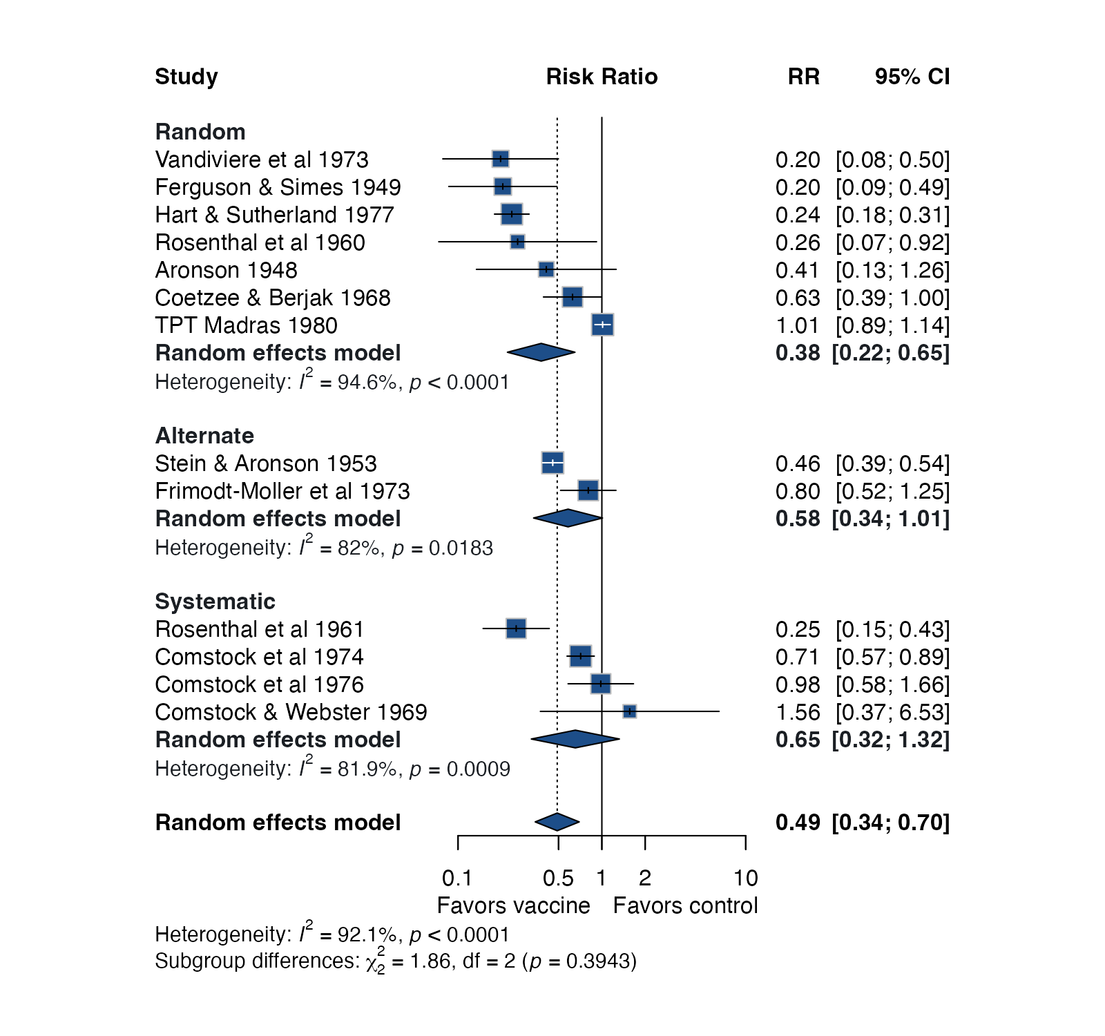
Study estimates and confidence intervals on a common effect scale, with the pooled estimate drawn as a diamond.
MANMAITCMAICSTC
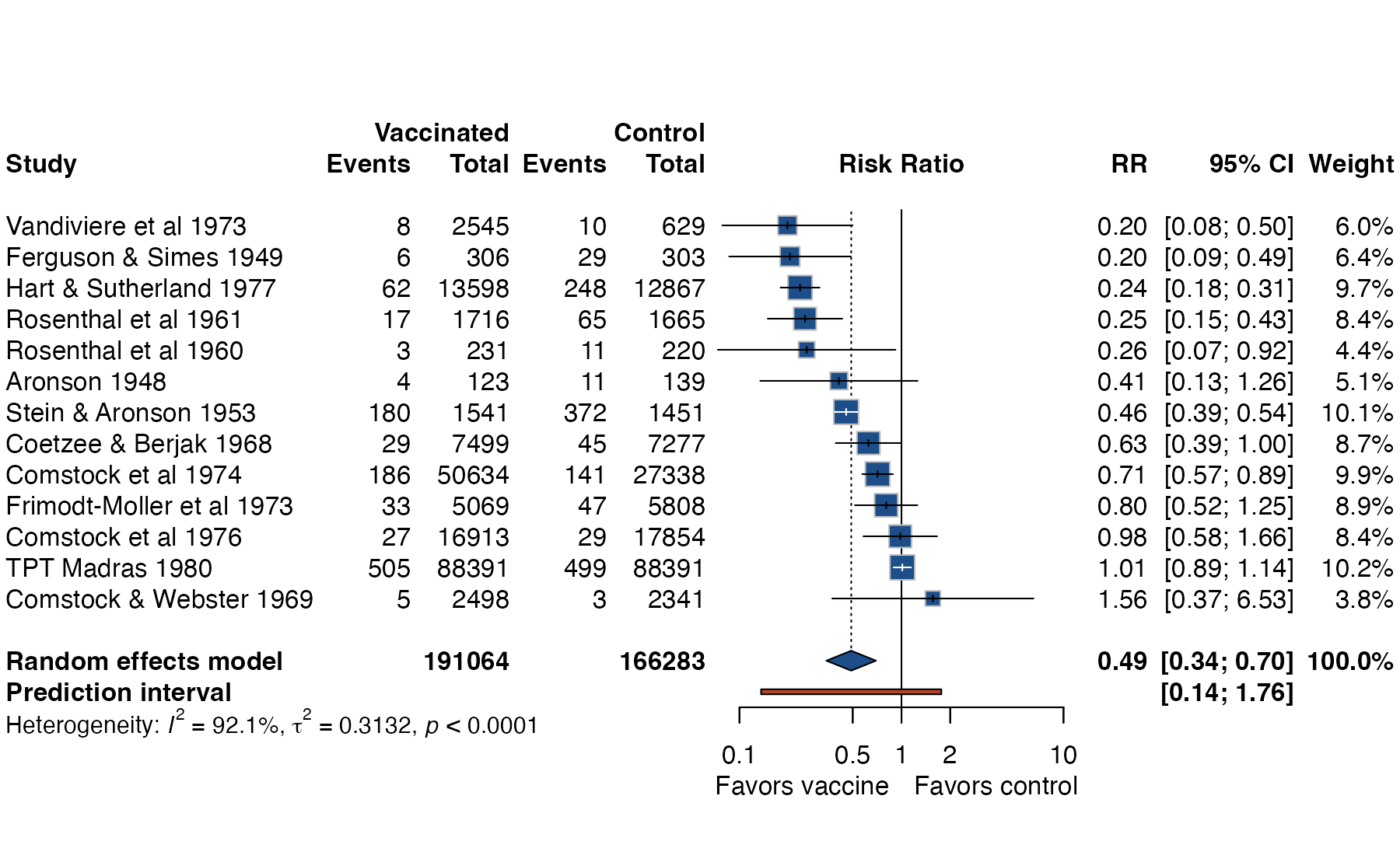
Prediction interval plot
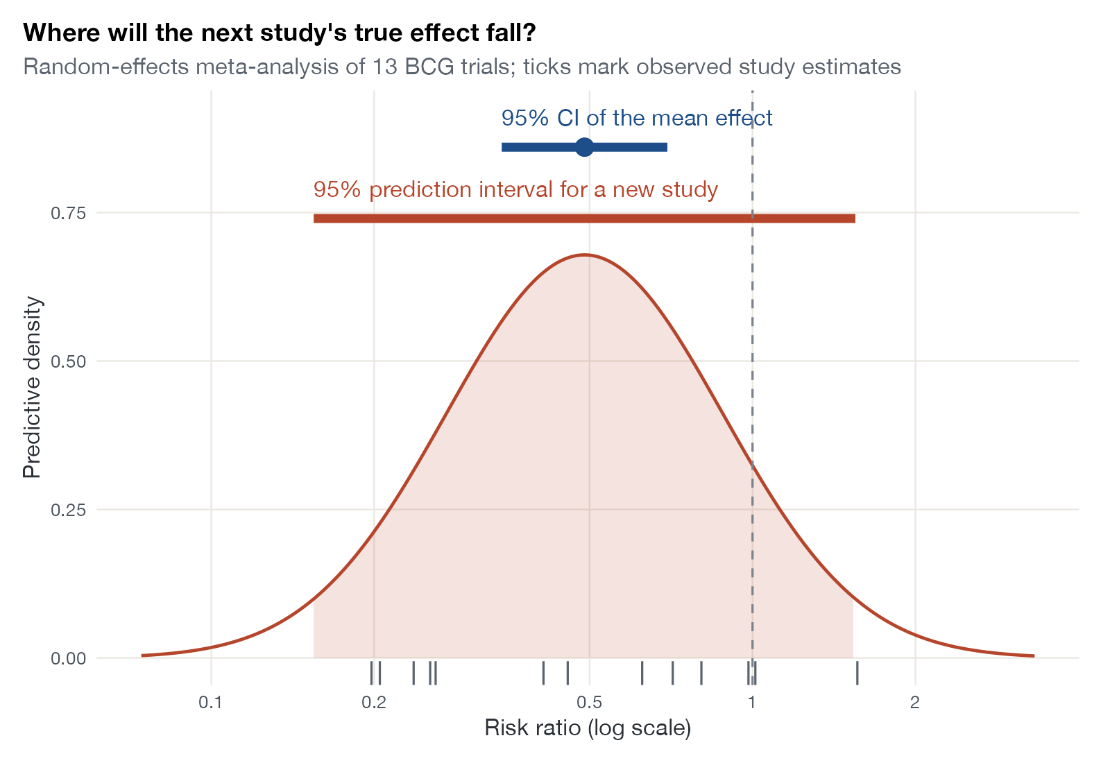
Contrasts the confidence interval for the average effect with the prediction interval for the effect in a new setting.
MANMA
Subgroup forest plot
A forest plot split by a categorical moderator, with a pooled estimate per subgroup and a test for subgroup differences.
MANMANMIML-NMR
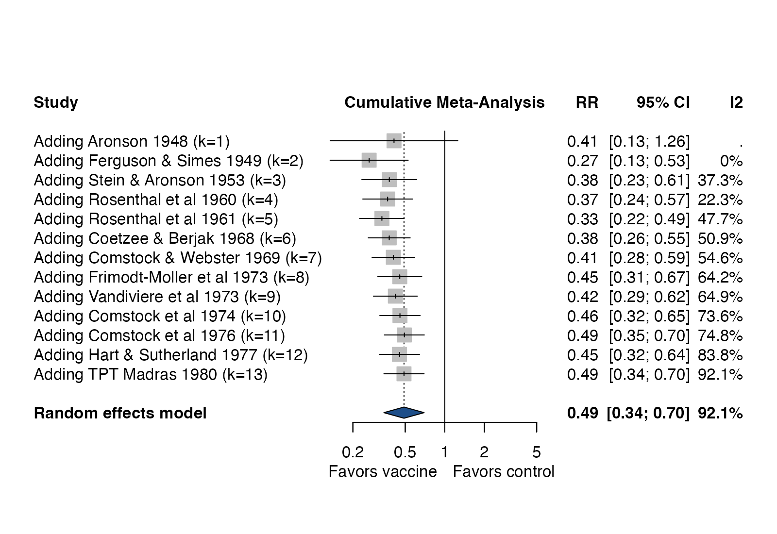
Cumulative meta-analysis plot
Pooled estimate recomputed as each study is added in a chosen order, showing how the evidence evolved.
MA
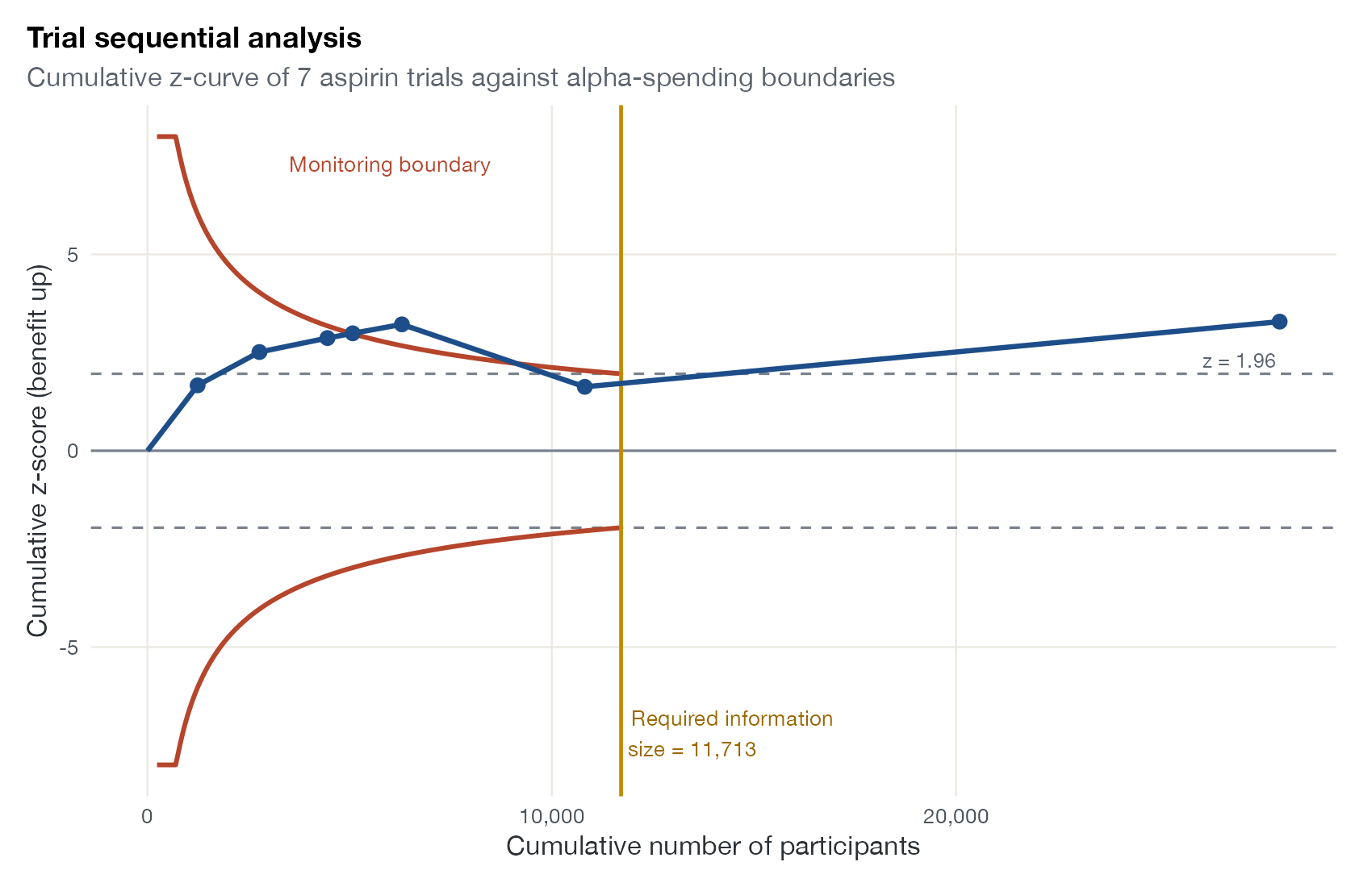
Trial sequential analysis plot
Cumulative z-statistic plotted against accrued information, with alpha-spending boundaries and the required information size.
MA
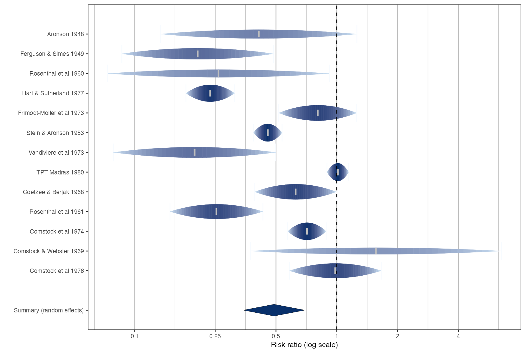
Rainforest plot
A forest plot variant in which each confidence interval is drawn as a likelihood-shaped drop, so that precision and plausibility are visible.
MA
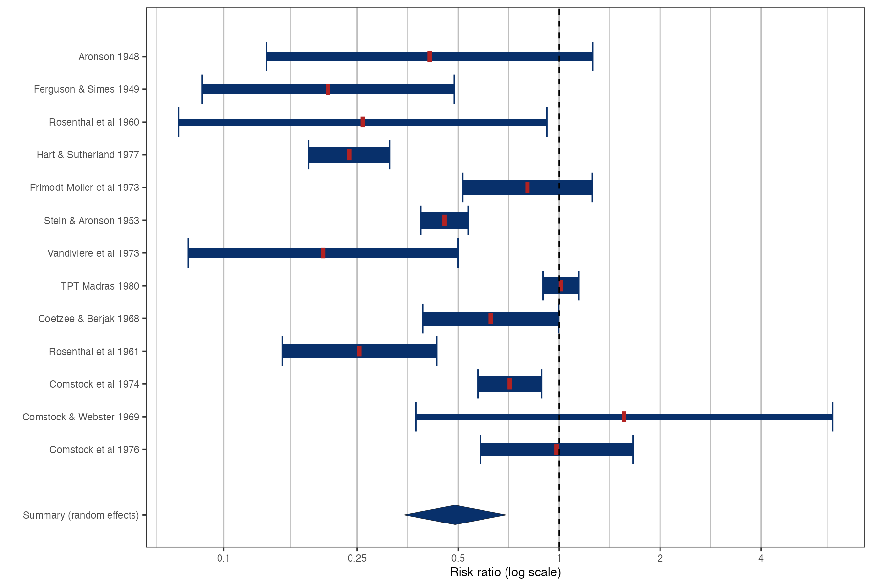
Thick forest plot
A forest plot in which each confidence interval is drawn as a bar whose thickness reflects study weight.
MA
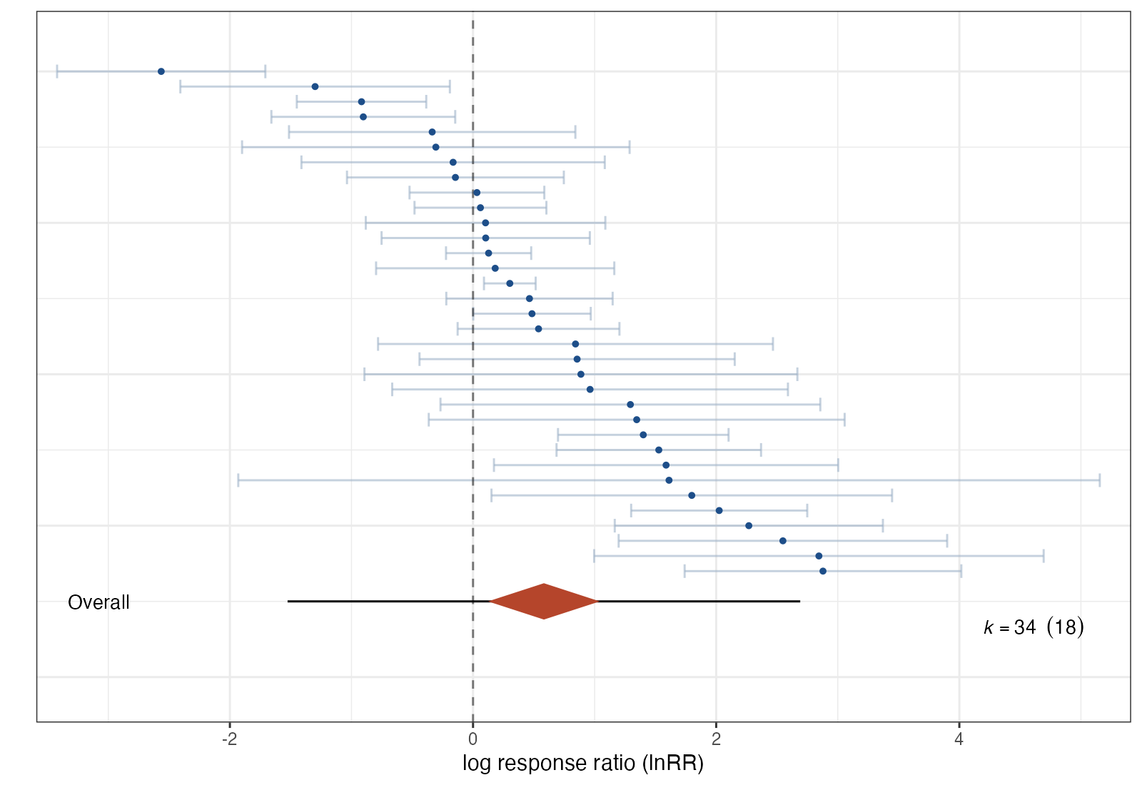
Caterpillar plot
Every effect size sorted by magnitude with its confidence interval, plus the overall mean and prediction interval.
MA
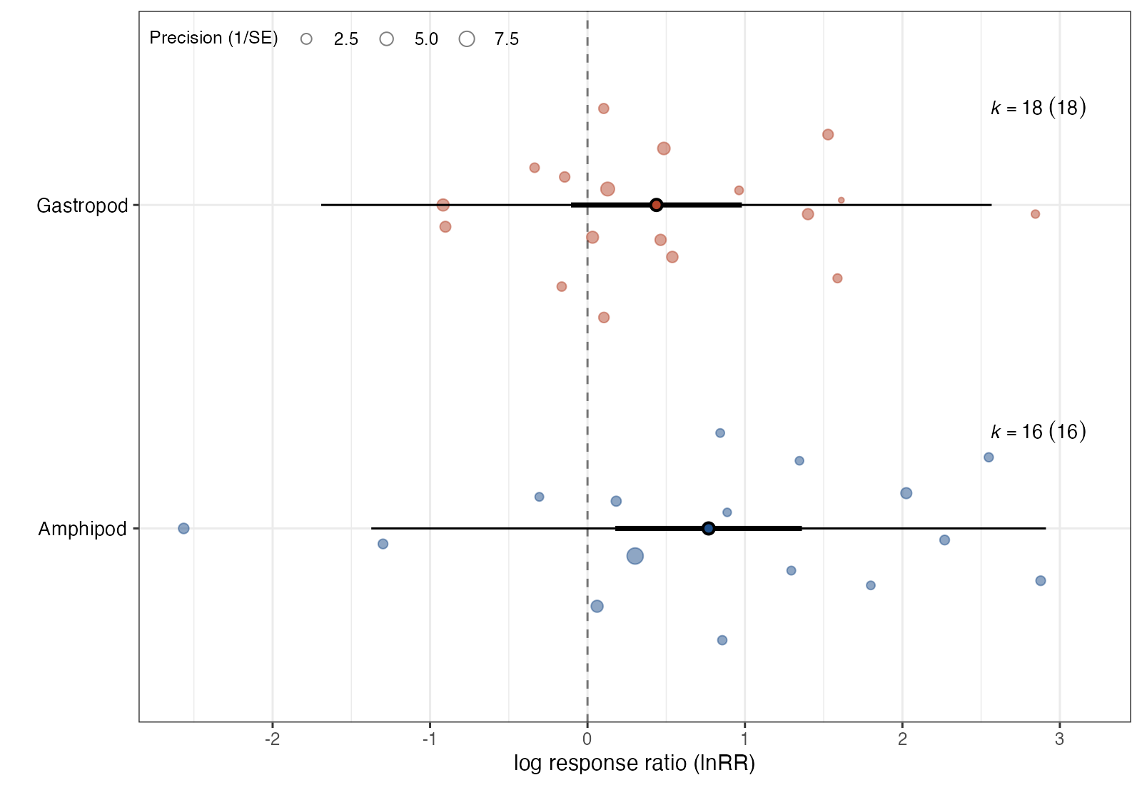
Orchard plot
Pooled estimates, confidence intervals, and prediction intervals per moderator level, drawn over a swarm of the individual effect sizes.
MA
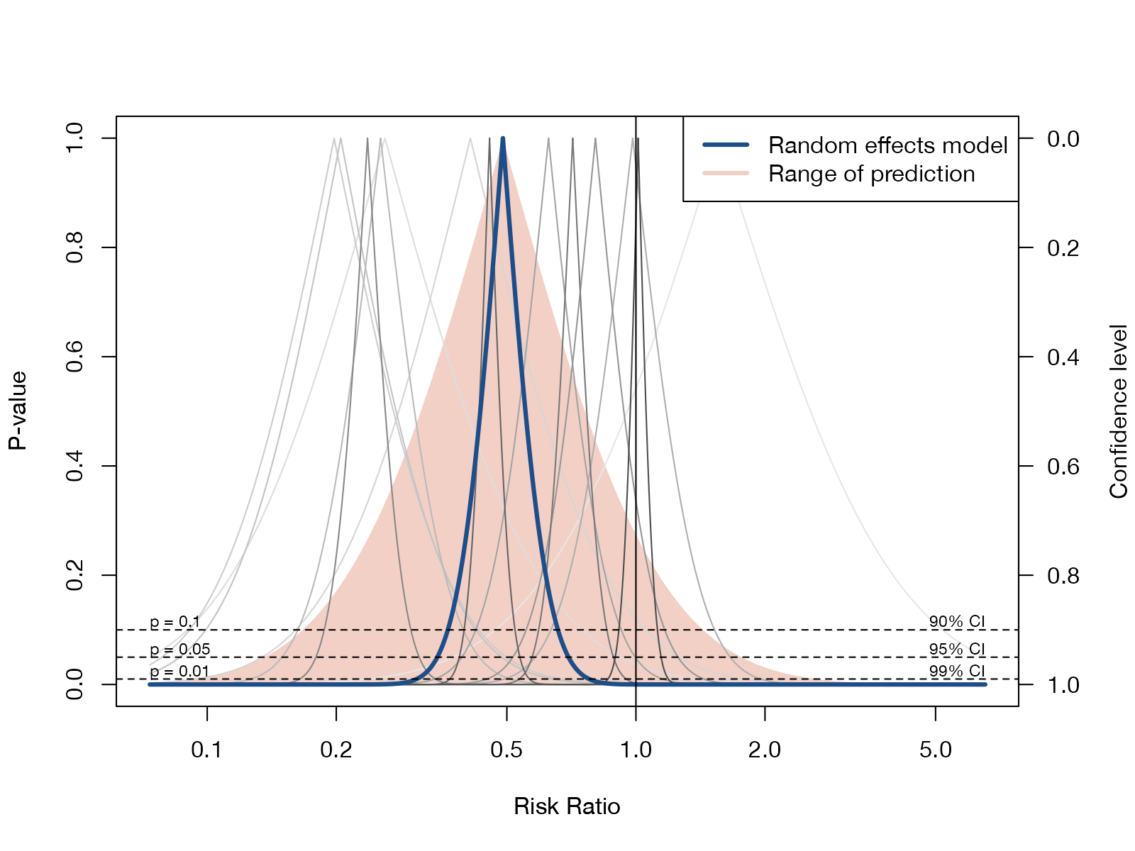
Drapery plot
p-value functions for each study and the pooled estimate, showing evidence across all confidence levels instead of one 95% cutoff.
MA
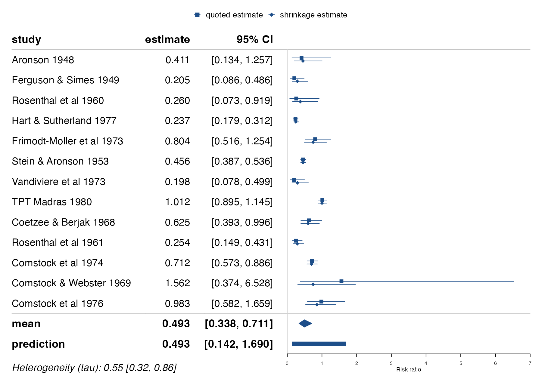
Bayesian shrinkage forest plot
Observed study estimates next to their Bayesian shrinkage estimates, which borrow strength from the other studies.
MANMA
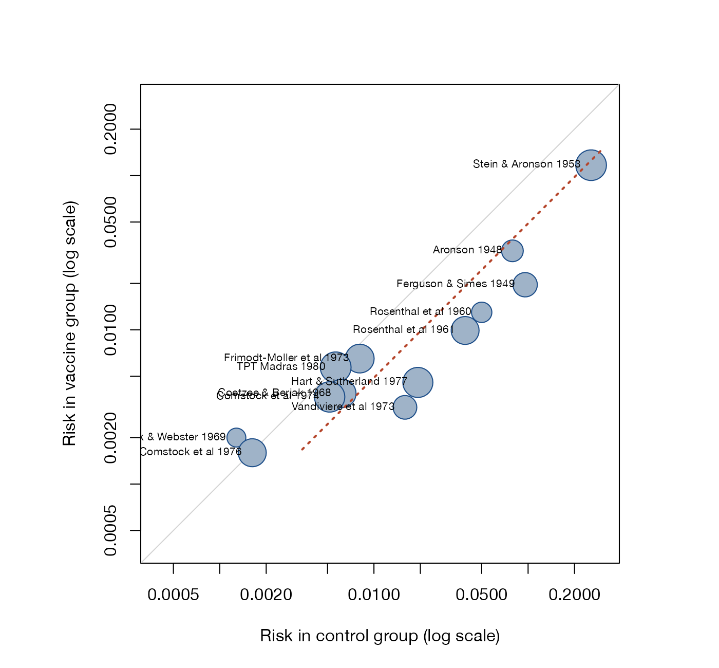
L'Abbé plot
Event risk in the treatment arm against event risk in the control arm, one point per study, around the line of equality.
MA
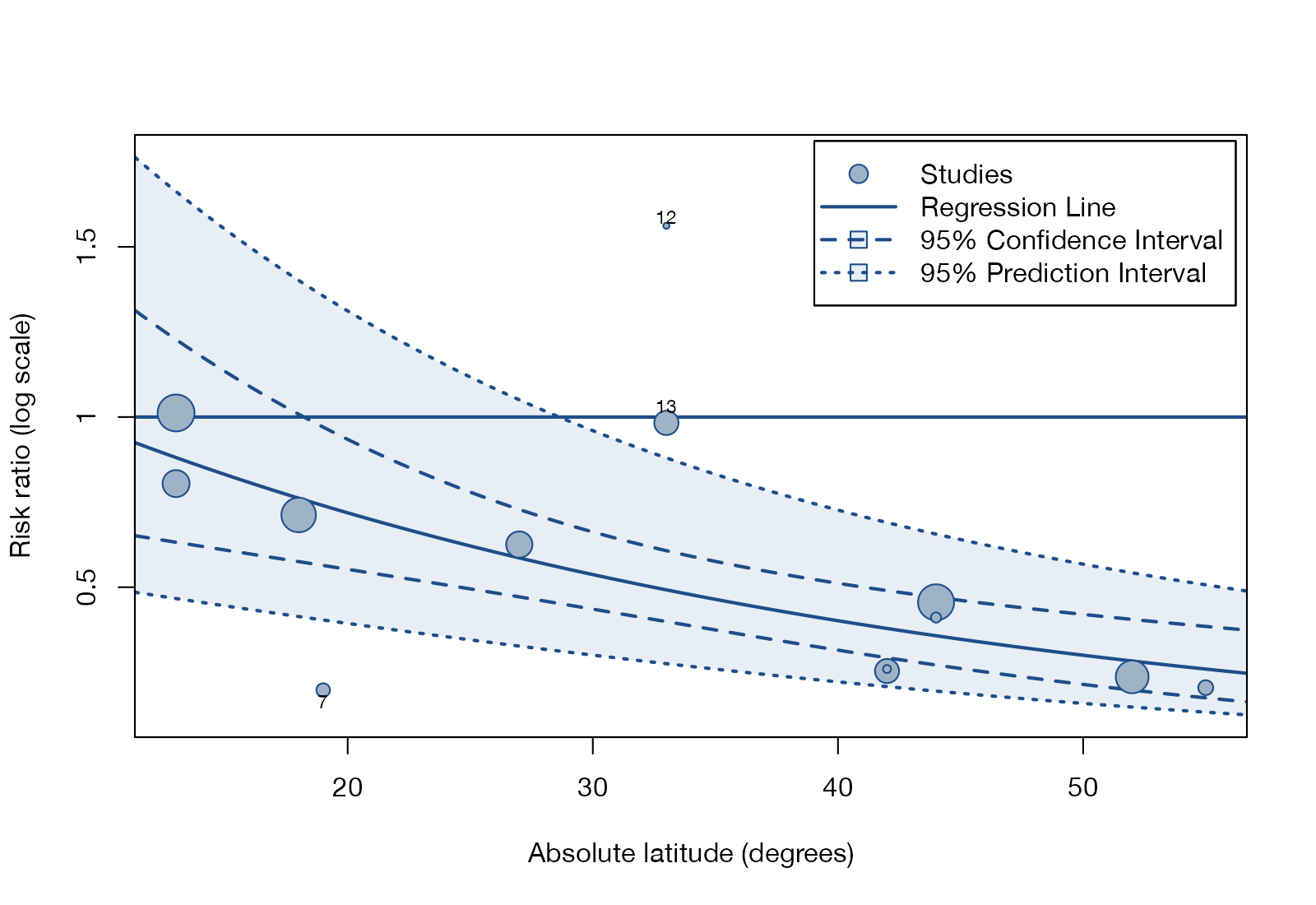
Meta-regression bubble plot
Study effects against a continuous moderator, with bubbles sized by precision and a fitted meta-regression line.
MANMA
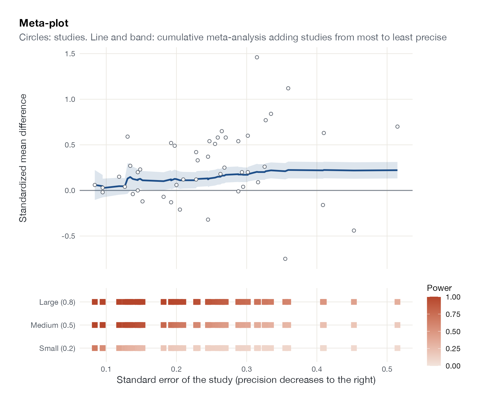
Meta-plot
Study effects against precision, a cumulative meta-analysis from most to least precise study, and each study's power to detect small, medium, and large effects.
MA
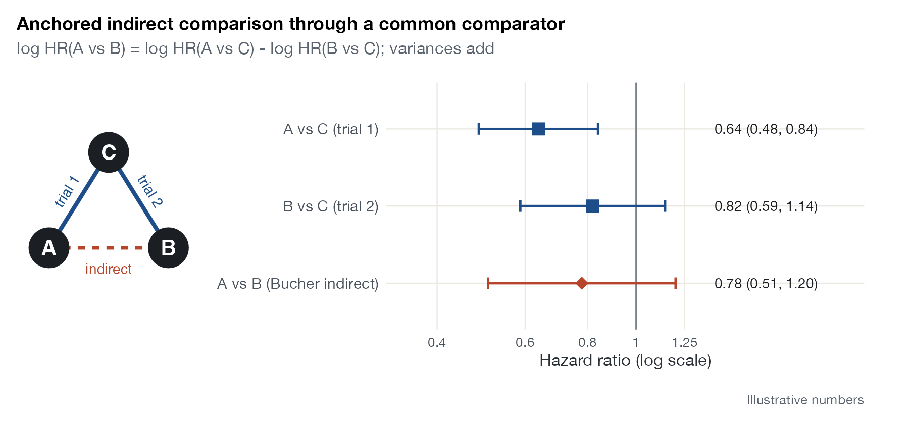
Anchored indirect comparison diagram
Two trials sharing a common comparator and the indirect estimate derived from them, drawn as a network sketch beside a forest plot.
ITCMAICSTC
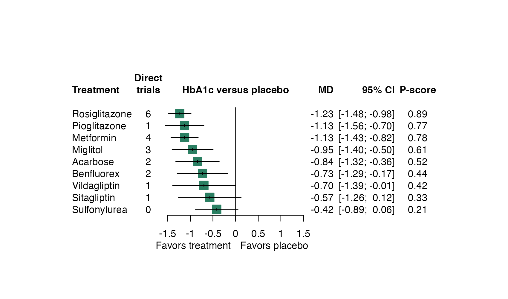
NMA forest plot
Network estimates of every treatment against one reference, with the number of direct trials and a ranking score.
NMAML-NMR
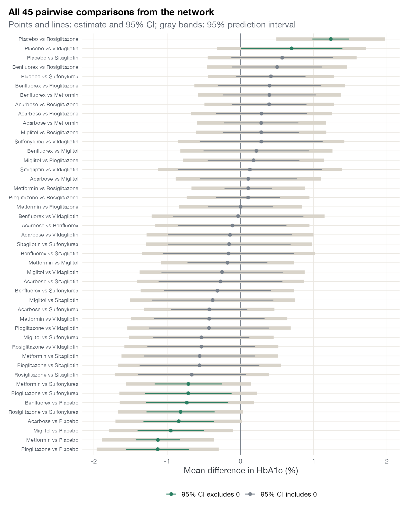
NMA interval plot
Every pairwise network estimate with its confidence and prediction interval on one axis.
NMA
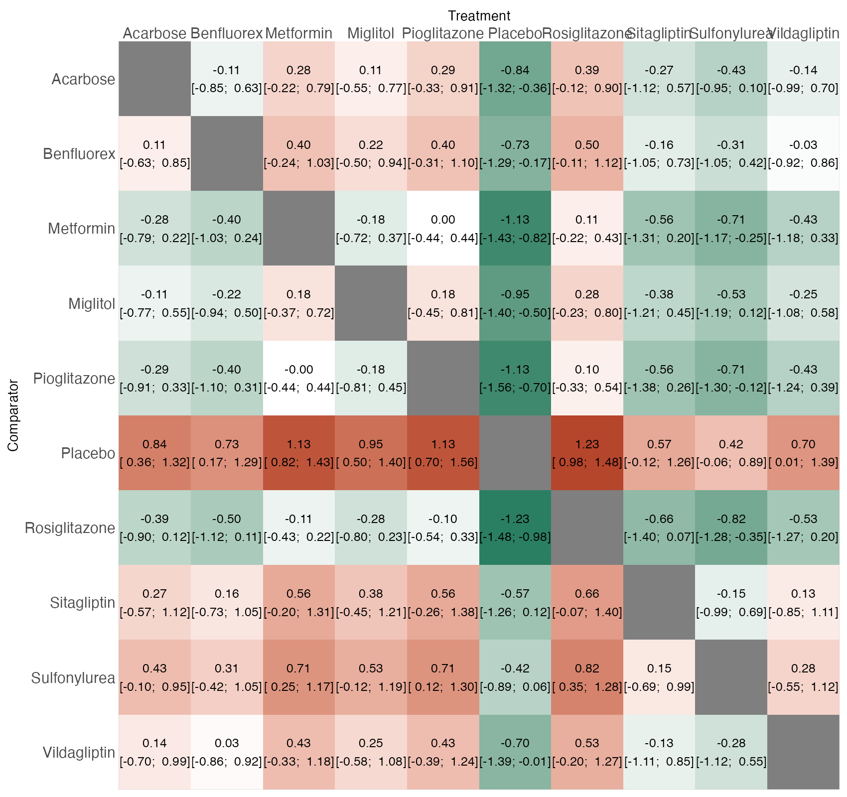
League table heat plot
All pairwise network estimates arranged in a treatment-by-treatment matrix and colored by the size and direction of the effect.
NMA
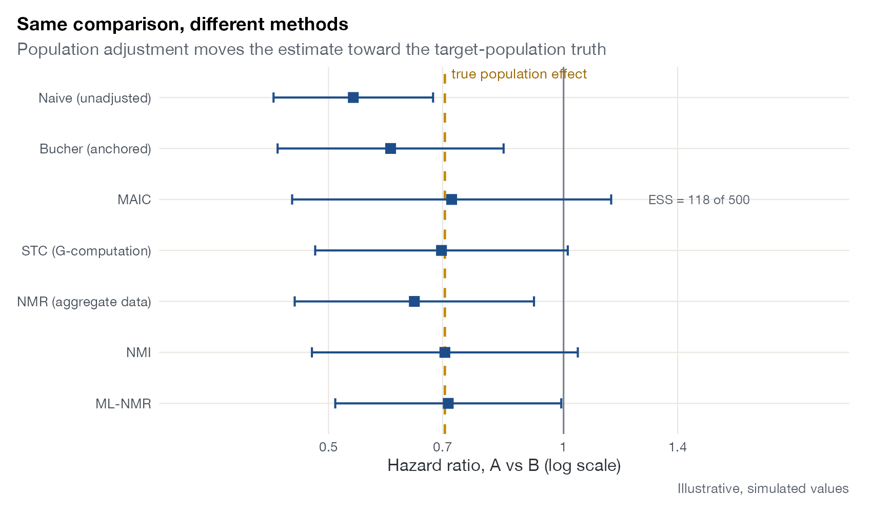
Method-comparison forest plot
The same treatment comparison estimated by several indirect comparison methods, stacked as forest rows, often against a known truth.
ITCMAICSTCML-NMRNMIML-UMR

Heterogeneity and influence

Where between-study variation comes from, and which studies move the pooled result.
Radial plot
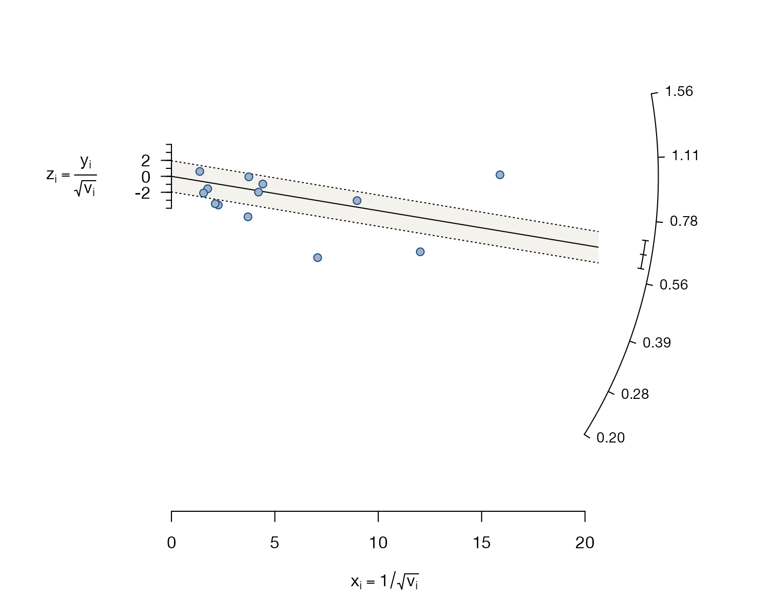
Standardized effects against precision; the slope of a line through the origin is the pooled estimate, and studies far from it are heterogeneous.
MANMA
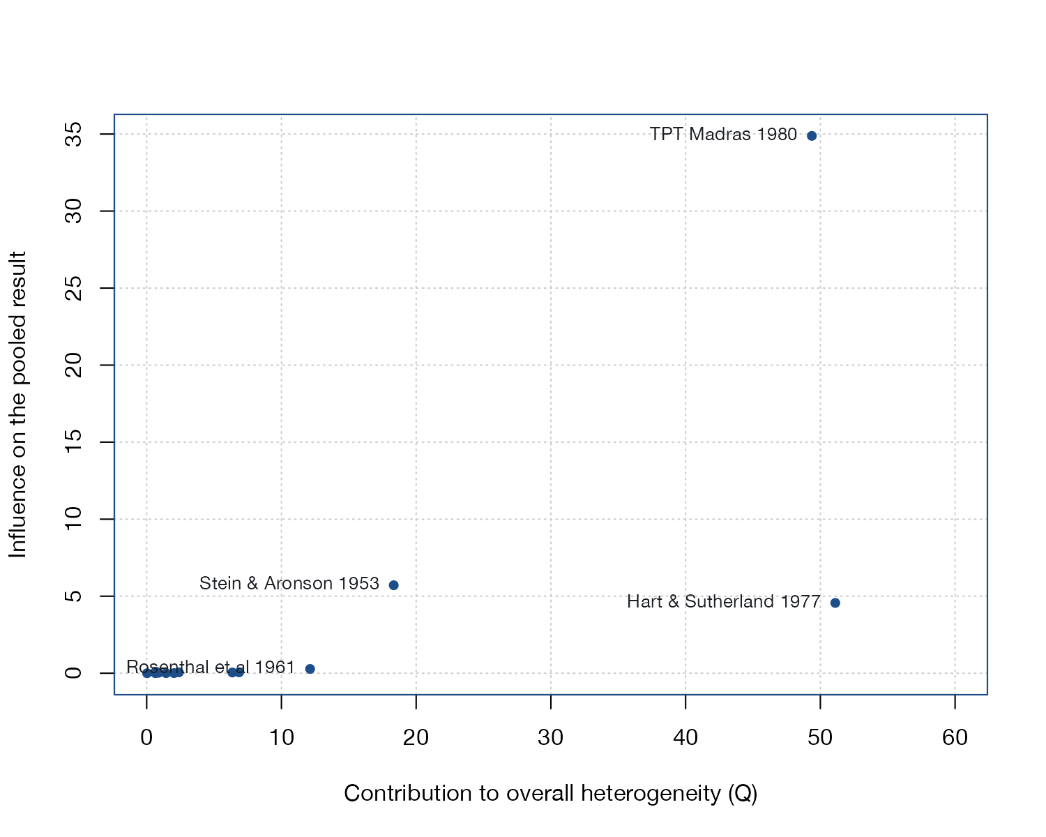
Baujat plot
Each study's contribution to overall heterogeneity against its influence on the pooled estimate.
MA
GOSH plot
Pooled estimate against heterogeneity for every subset of studies, revealing clusters that point to influential studies or latent subgroups.
MA
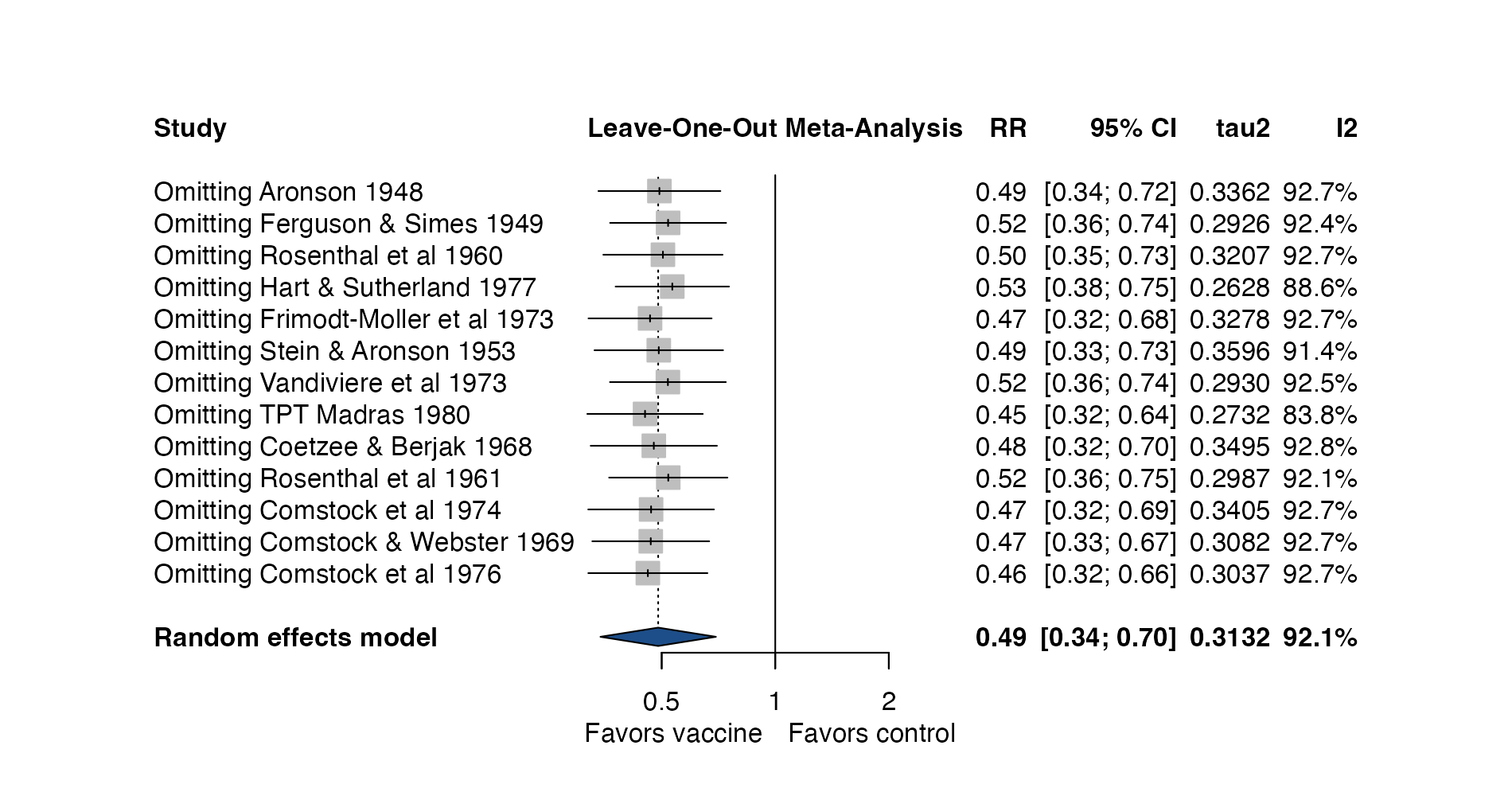
Leave-one-out forest plot
The pooled estimate recomputed after omitting each study in turn, with the resulting heterogeneity.
MANMA
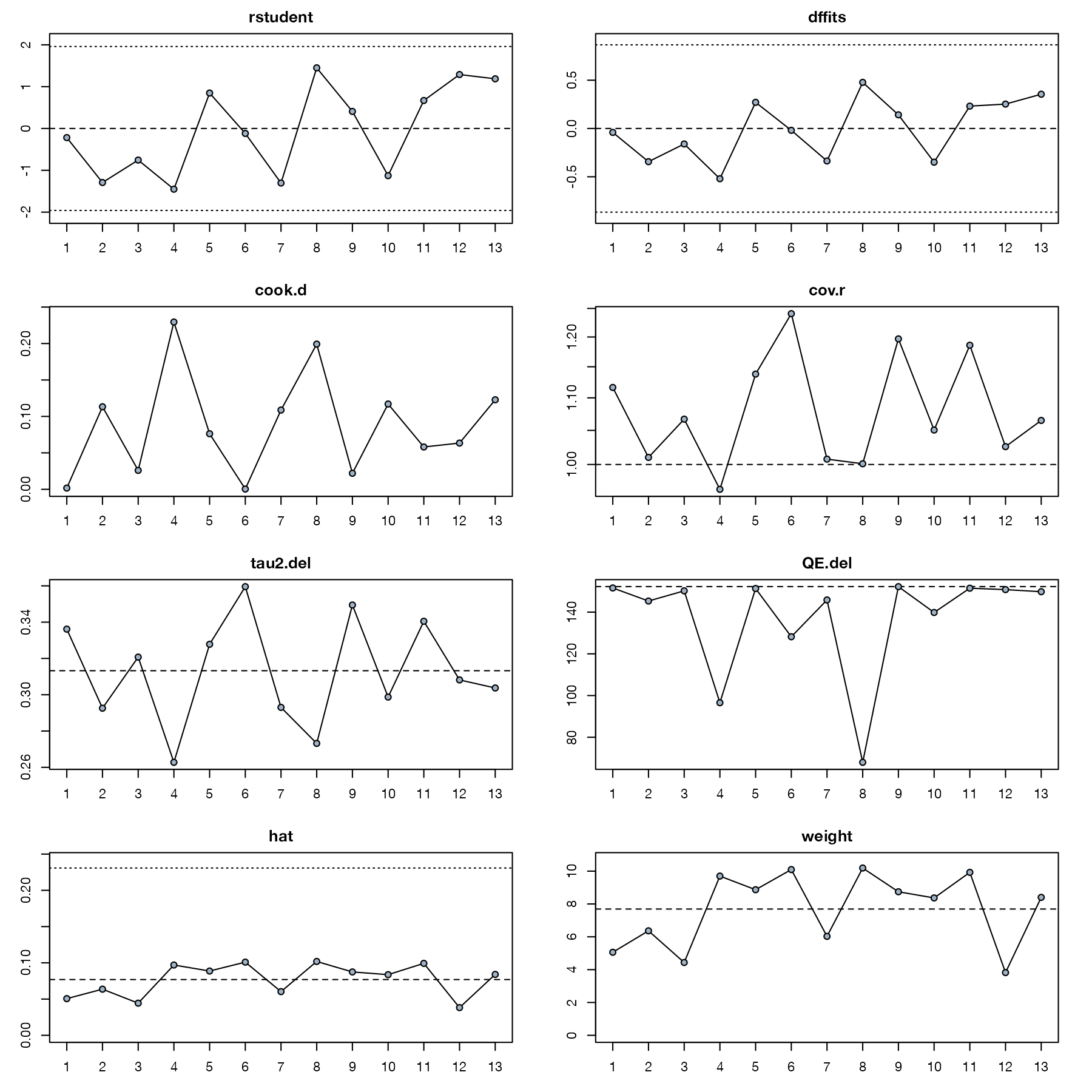
Influence diagnostics panel
Eight case-deletion statistics per study, including studentized residuals, Cook's distance, DFFITS, and hat values, with cutoffs.
MA
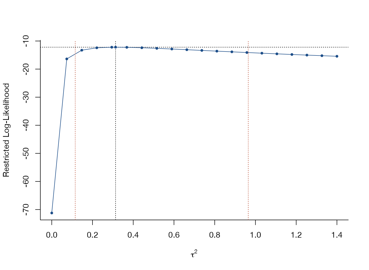
Heterogeneity profile likelihood plot
The restricted log-likelihood across values of the between-study variance, showing its estimate, uncertainty, and whether it is well identified.
MANMA

Small-study effects and reporting bias

Funnel plots and their successors for exploring asymmetry, selective reporting, and sensitivity to it.
Funnel plot
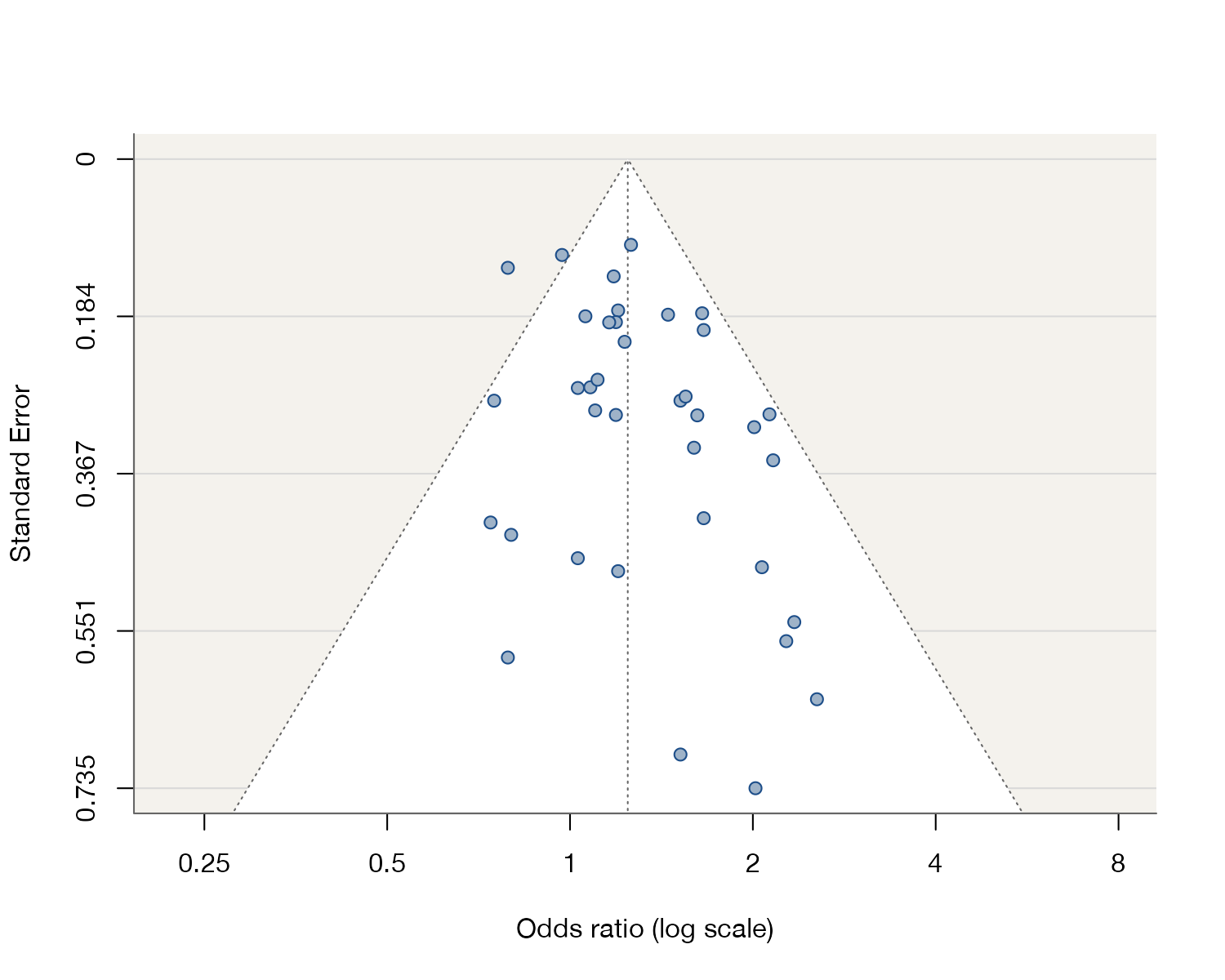
Study effects against their standard errors; asymmetry suggests small-study effects, of which publication bias is one possible cause.
MA
Contour-enhanced funnel plot
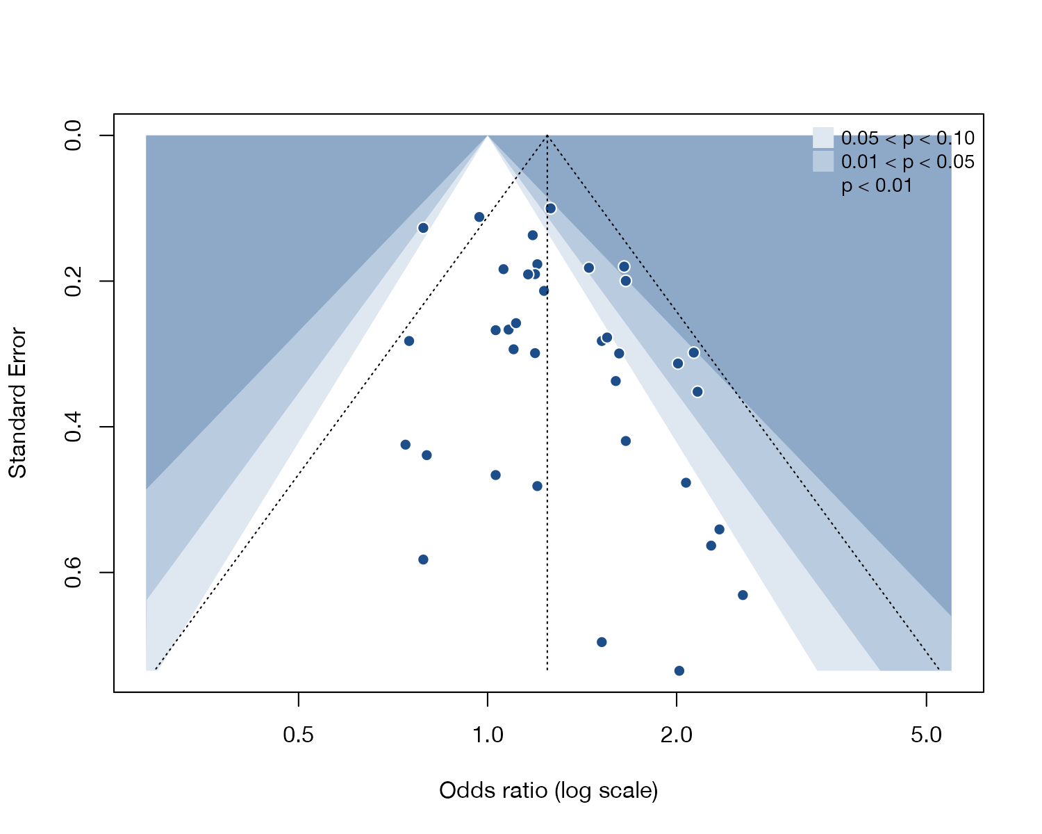
A funnel plot overlaid with regions of statistical significance, to judge whether missing studies fall where non-significant results would be.
MA
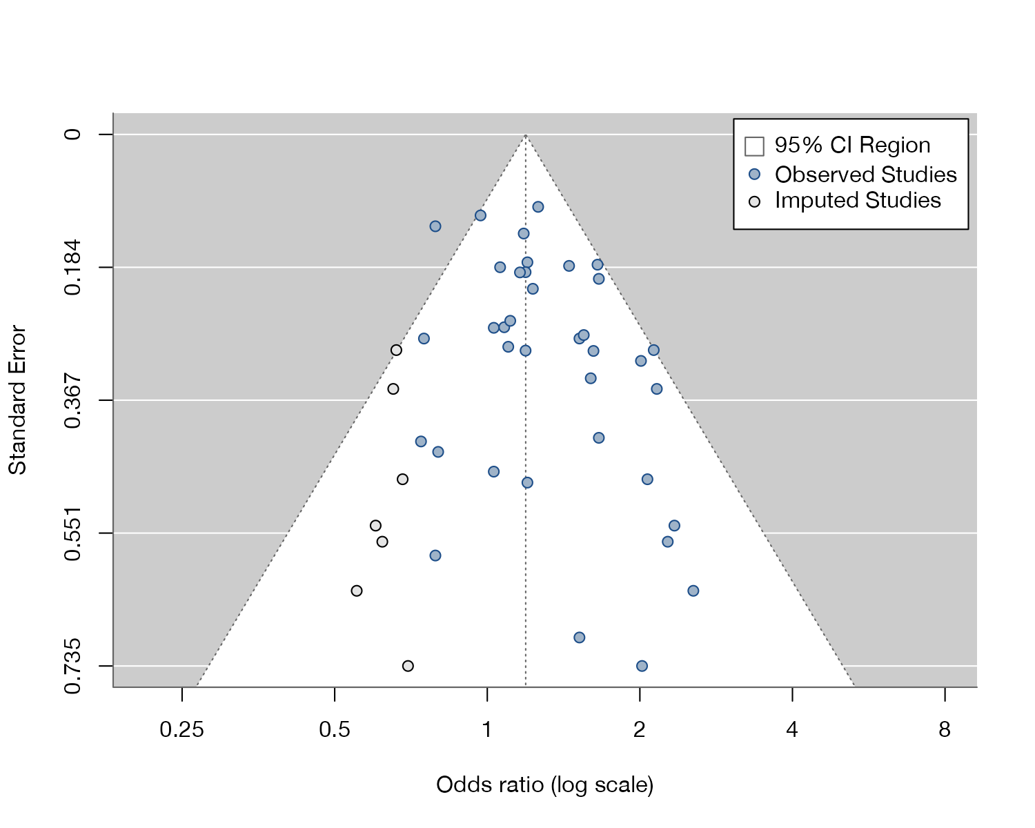
Trim-and-fill funnel plot
A funnel plot with algorithmically imputed "missing" studies that would make it symmetric, and the adjusted pooled estimate.
MA
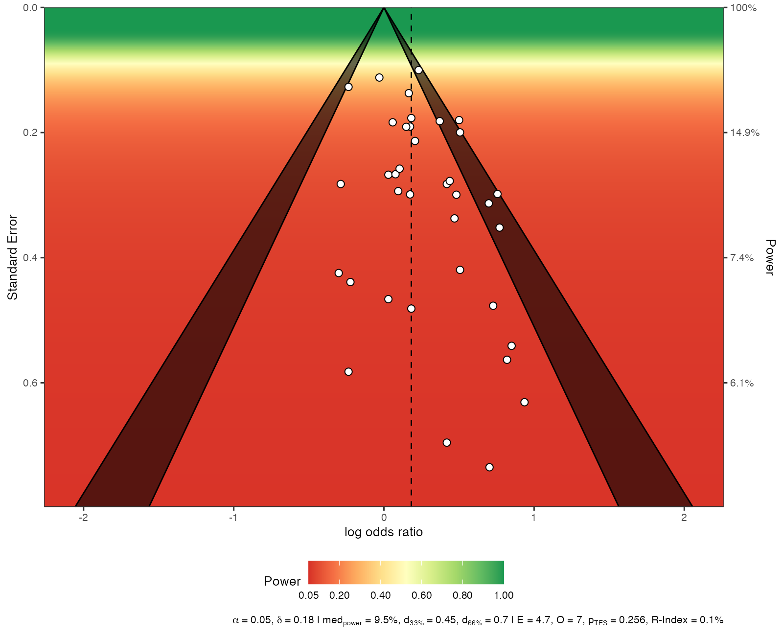
Sunset funnel plot
A funnel plot whose background shows the statistical power of a study at each level of precision to detect an assumed true effect.
MA
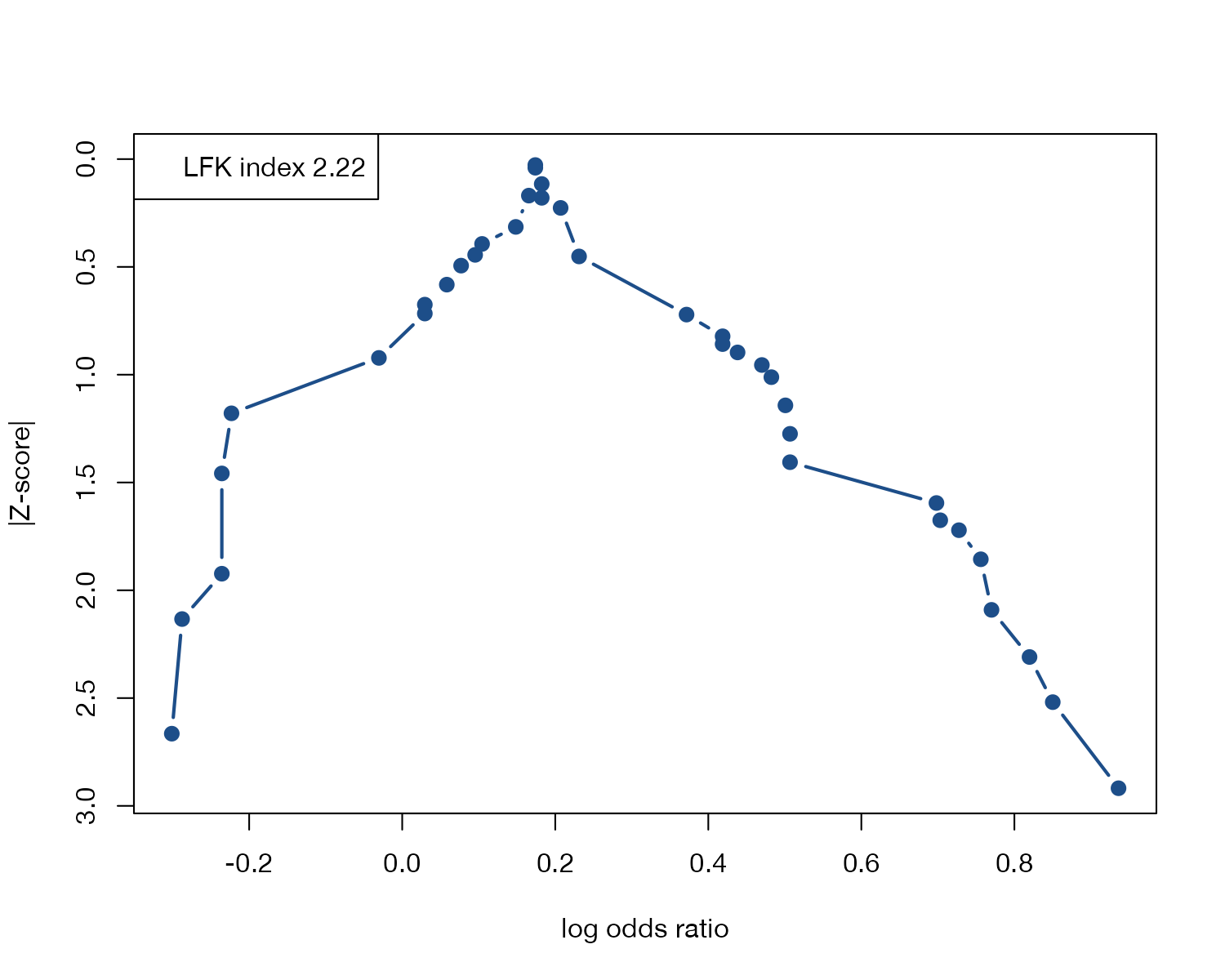
Doi plot
Effect estimates against the absolute z-score in a folded normal quantile display, summarized by the LFK asymmetry index.
MA
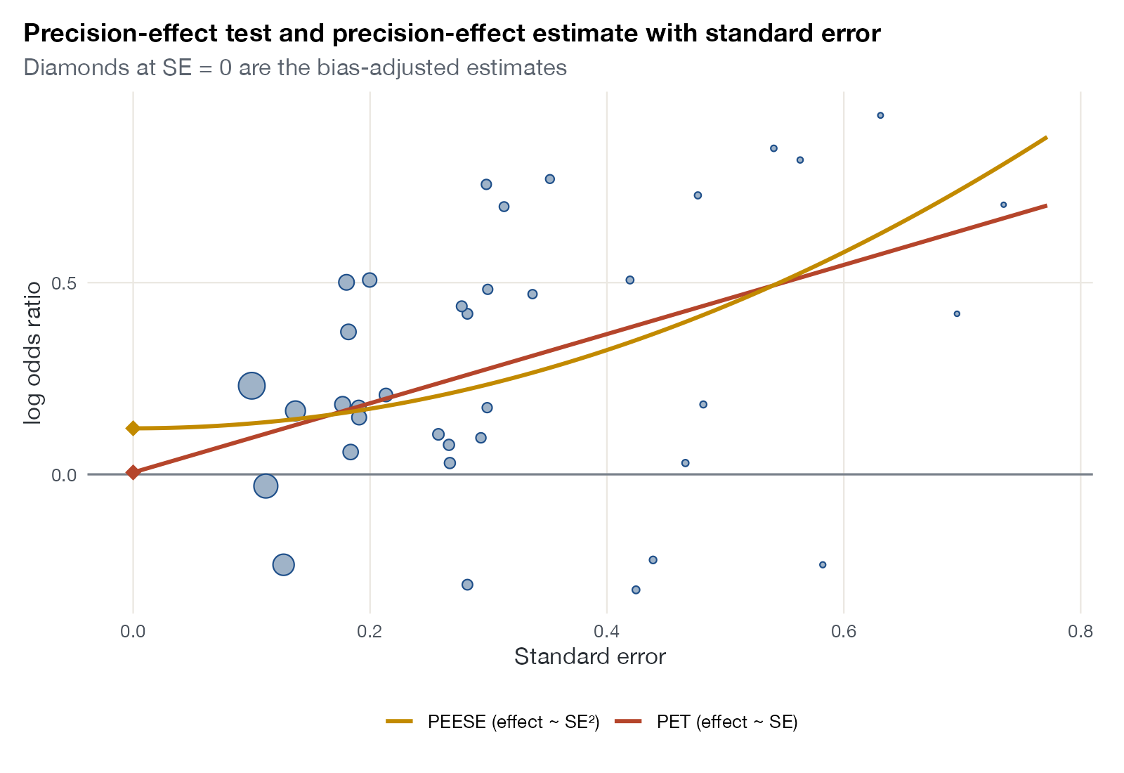
PET-PEESE plot
Study effects against standard error with weighted regression lines whose intercepts estimate the effect in a study of infinite precision.
MA
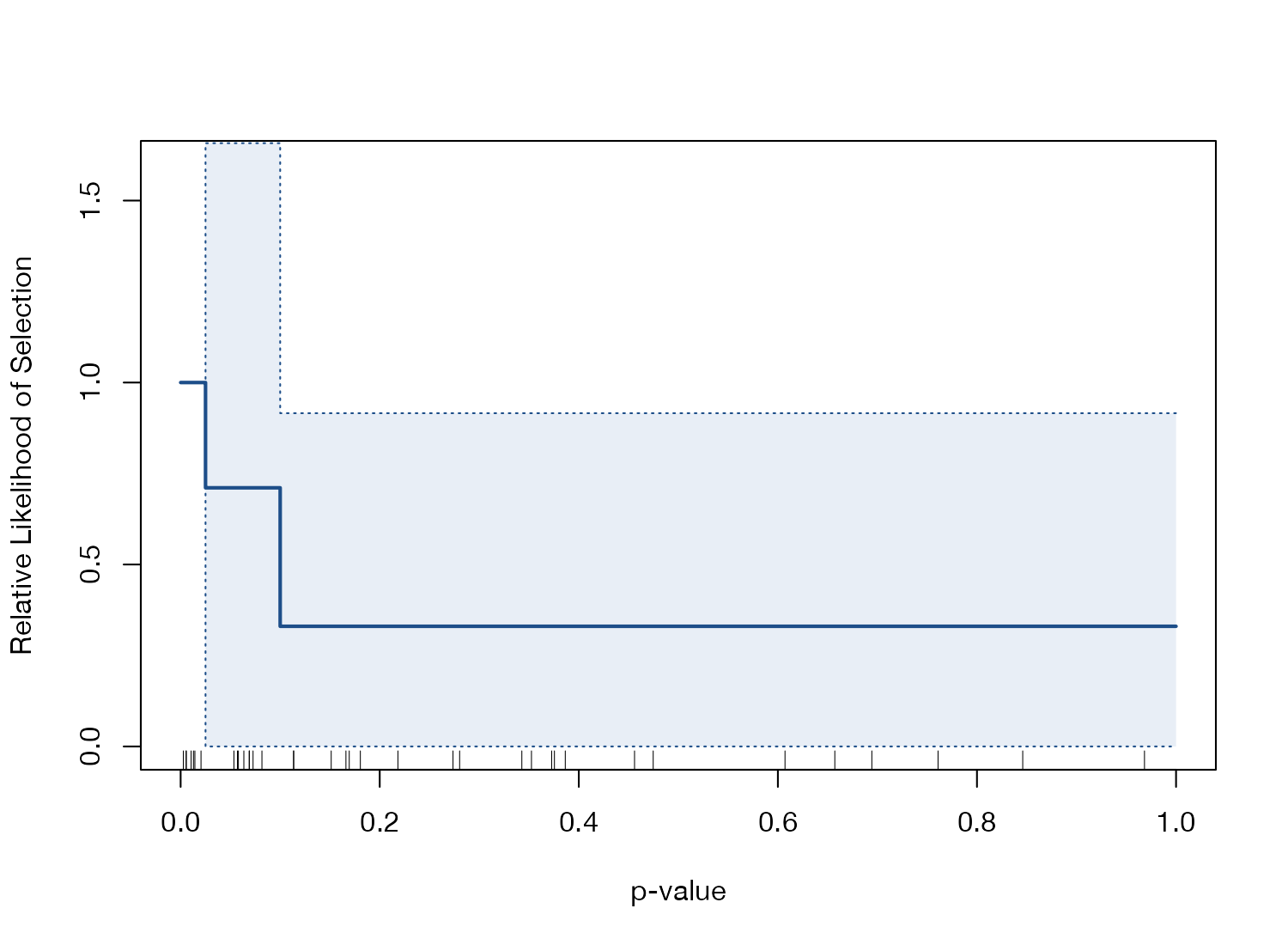
Selection model weight function plot
The estimated relative probability that a study is published as a function of its p-value, from a selection model.
MA
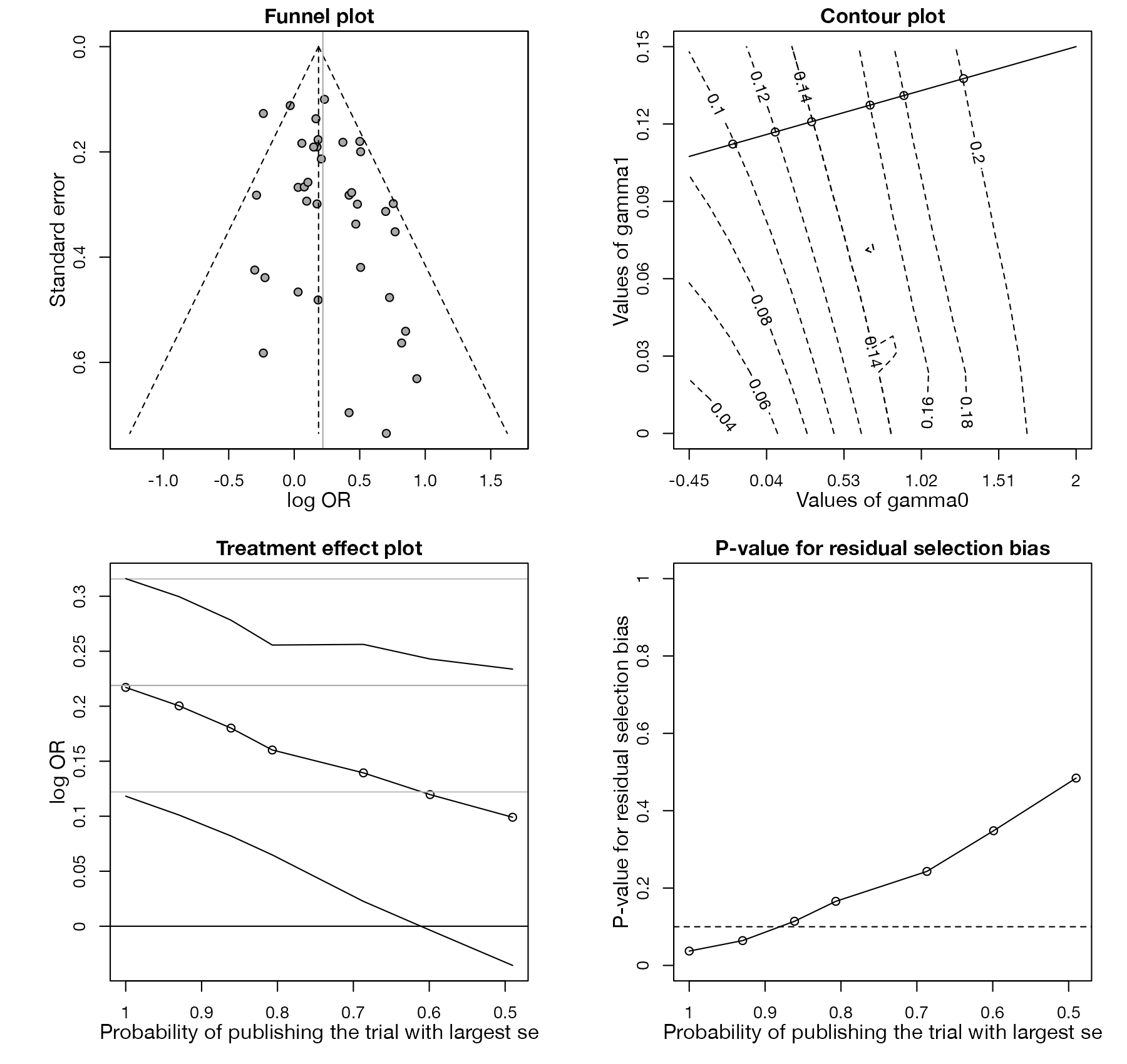
Copas selection model plot
A four-panel sensitivity analysis showing how the pooled estimate changes as the assumed probability of publishing small studies falls.
MA
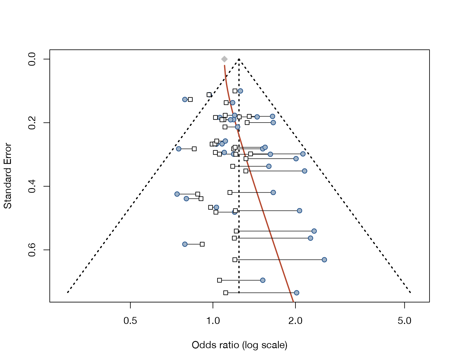
Limit meta-analysis funnel plot
A funnel plot showing each study's estimate shrunk to what an infinitely precise version of it would give, with the limit meta-analysis curve.
MA
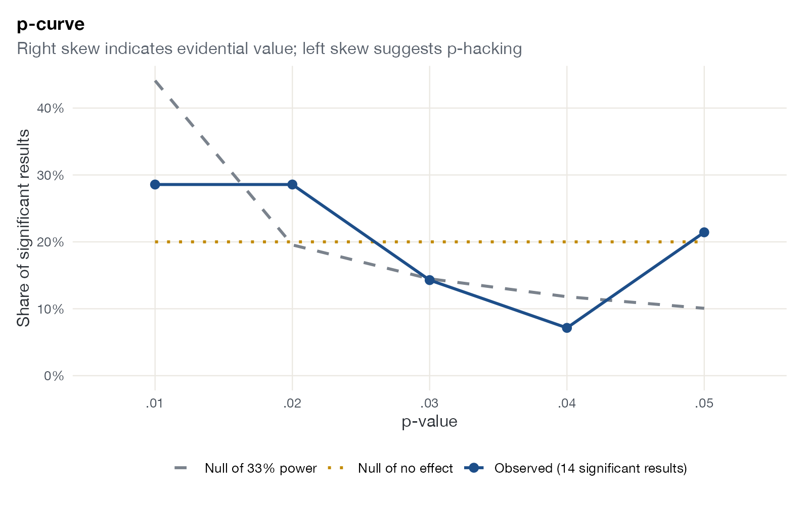
p-curve plot
The distribution of statistically significant p-values, compared with the shapes expected under no effect and under low power.
MA
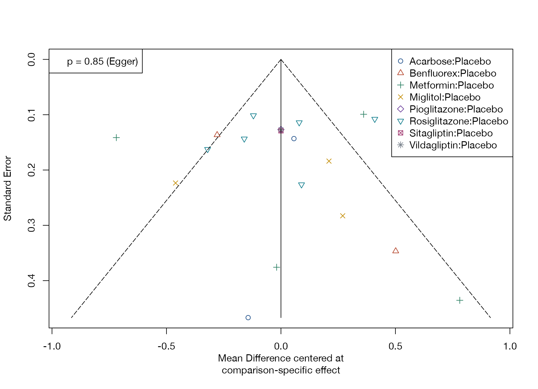
Comparison-adjusted funnel plot
A funnel plot for network meta-analysis in which each study is centered on the summary effect of its own comparison.
NMA

Model checking and Bayesian diagnostics

Residuals, fit, predictive checks, and the computational health of Bayesian models.
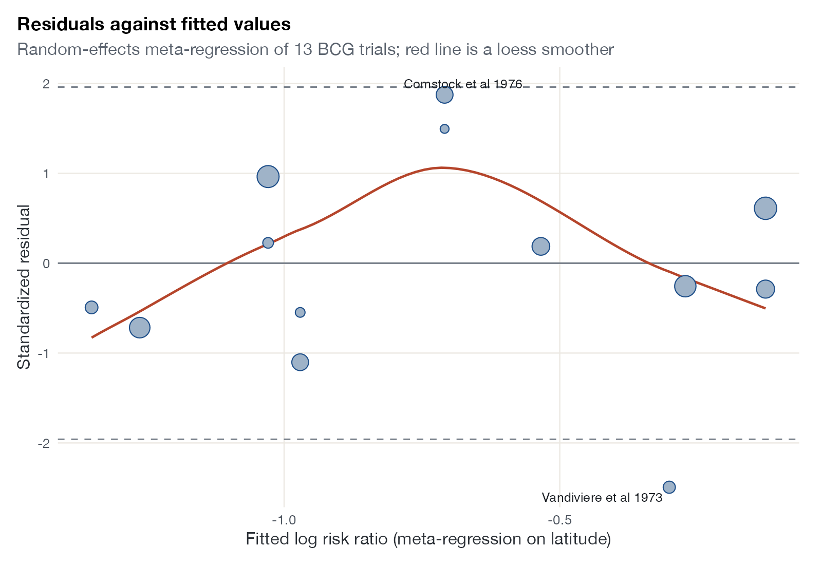
Residual versus fitted plot
Standardized residuals against fitted values from a meta-regression or outcome model, to detect misspecification and outliers.
MANMASTCML-NMRML-UMR
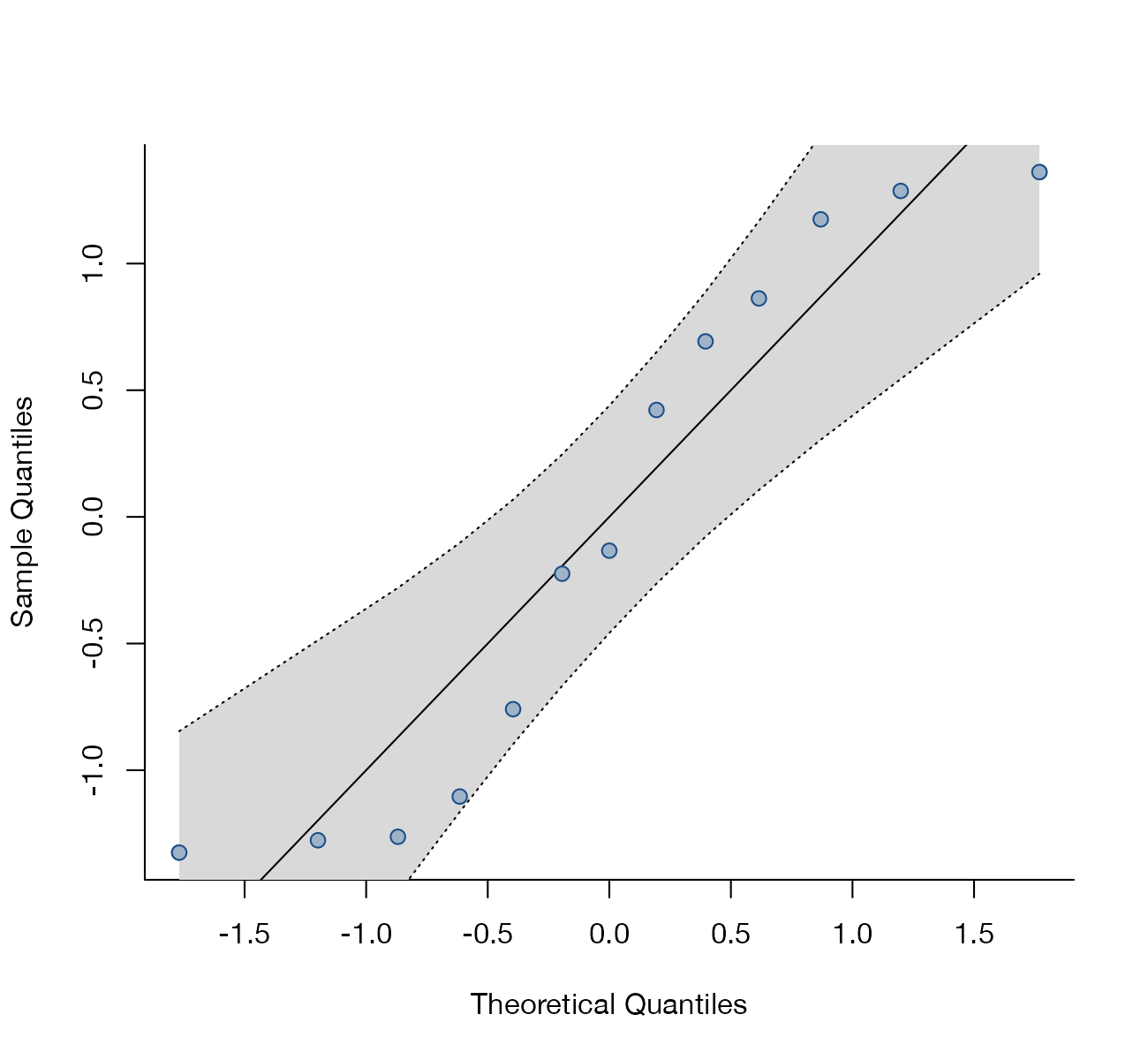
Normal Q-Q plot
Standardized residuals against normal quantiles, with a simulated envelope, to check the normality assumption of the random-effects model.
MANMA
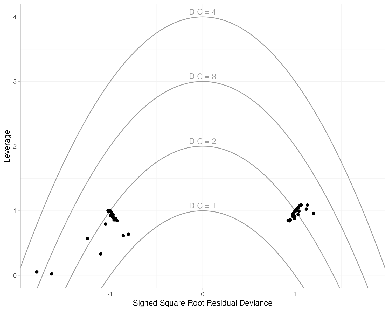
Leverage versus residual deviance plot
Each data point's leverage against its signed Bayesian deviance residual, with contours of its contribution to the DIC.
MANMAML-NMR
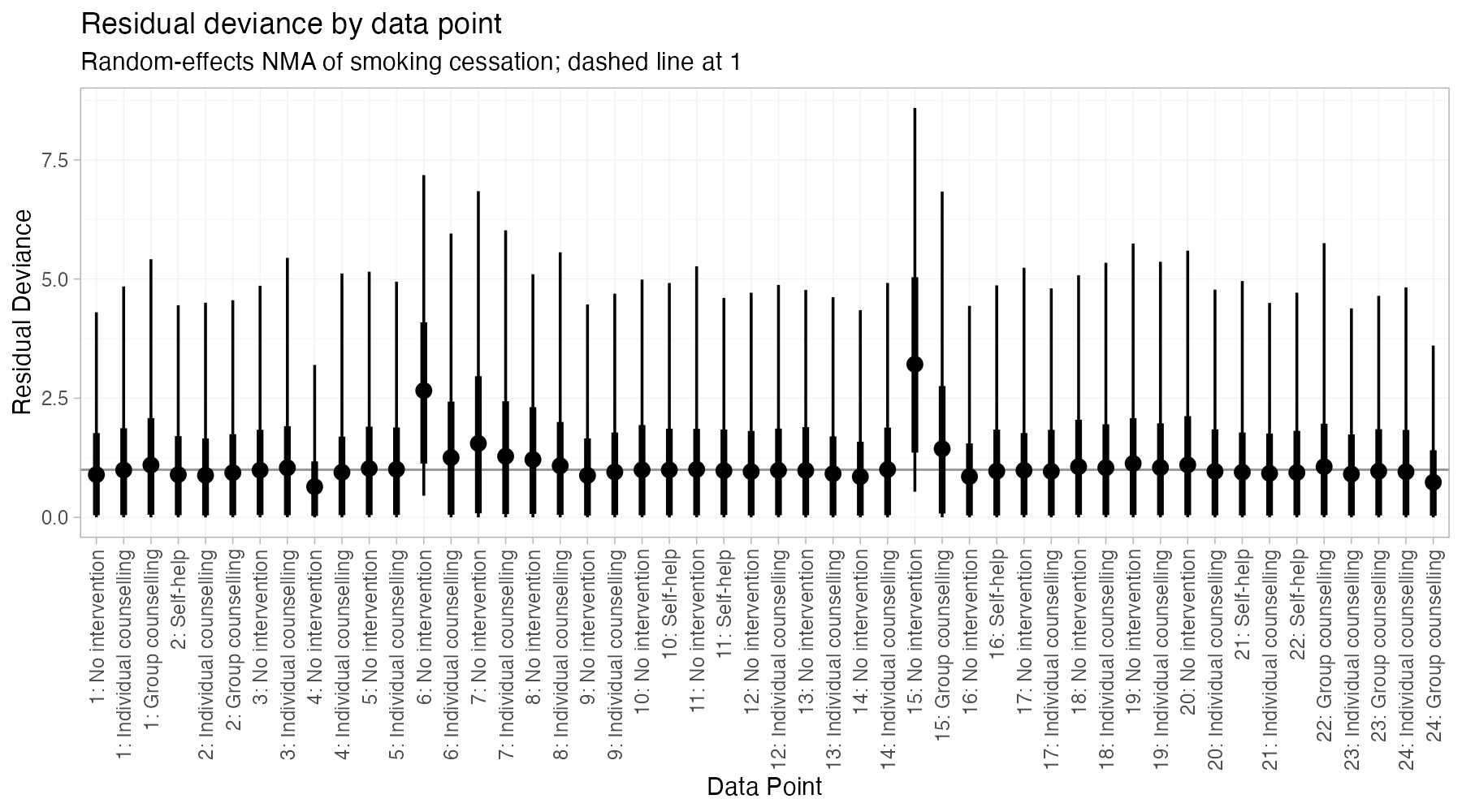
Residual deviance plot
The posterior residual deviance of every data point, which should be about 1 under good fit.
MANMAML-NMR
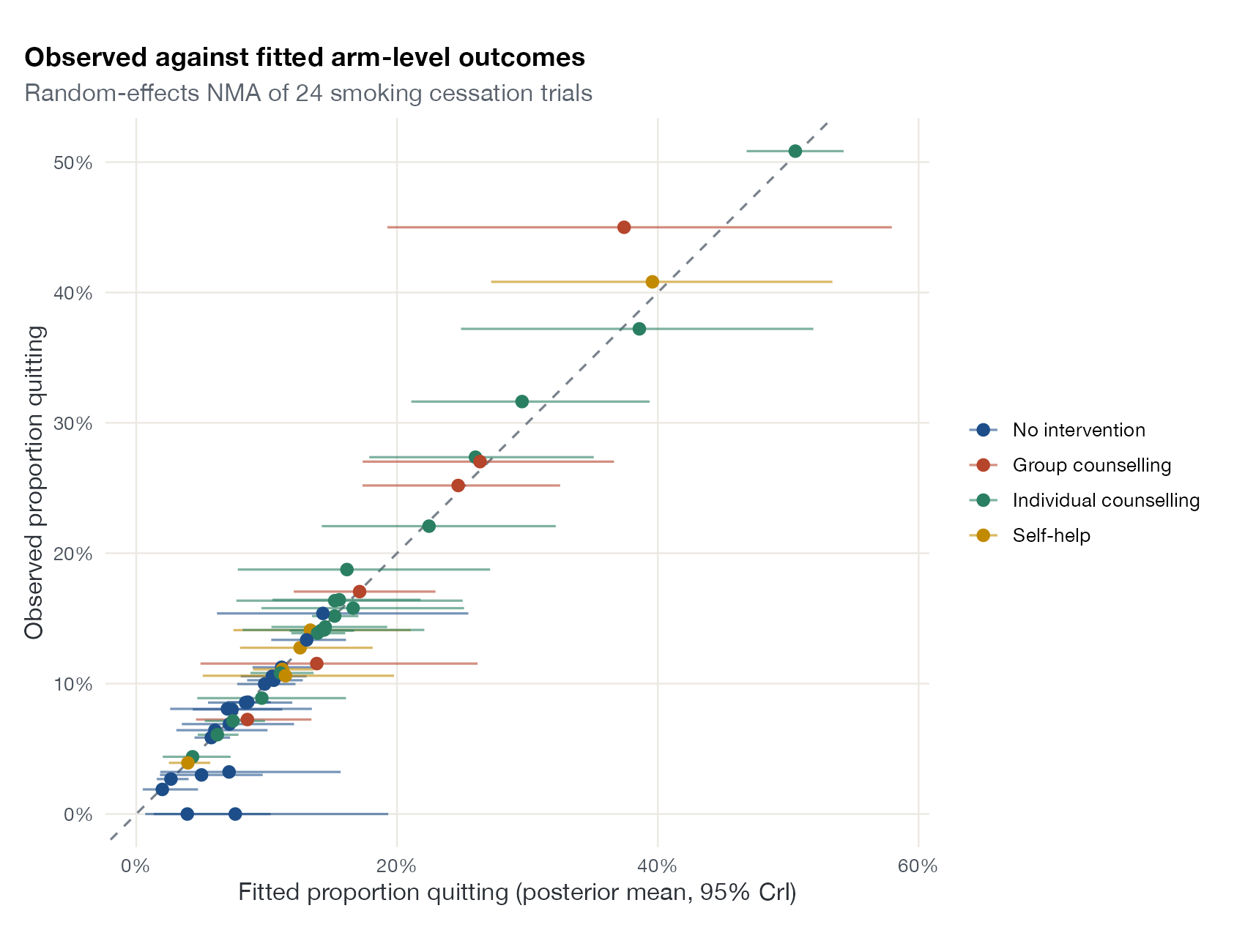
Observed versus predicted plot
Observed arm-level or study-level outcomes against model predictions, around the line of perfect agreement.
NMASTCML-NMRML-UMR
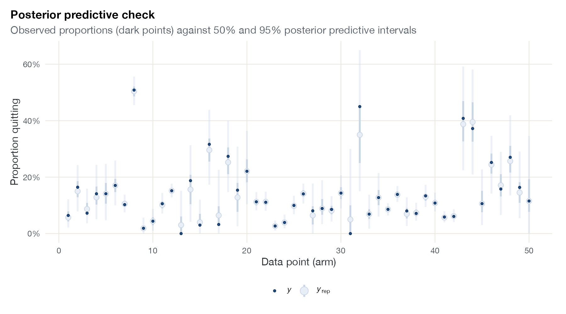
Posterior predictive check
Observed data against data replicated from the fitted Bayesian model, to check whether the model can reproduce what was seen.
MANMAML-NMRML-UMR
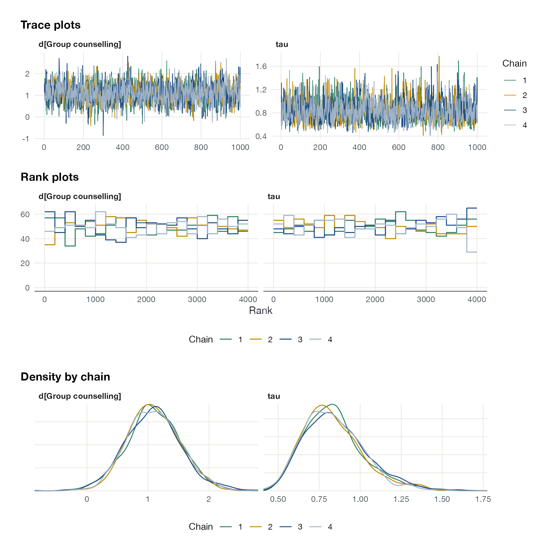
MCMC trace, rank, and density plots
Sampled values by iteration, rank histograms by chain, and per-chain densities, to check that Markov chains have converged and mixed.
MANMAML-NMRML-UMRSTC
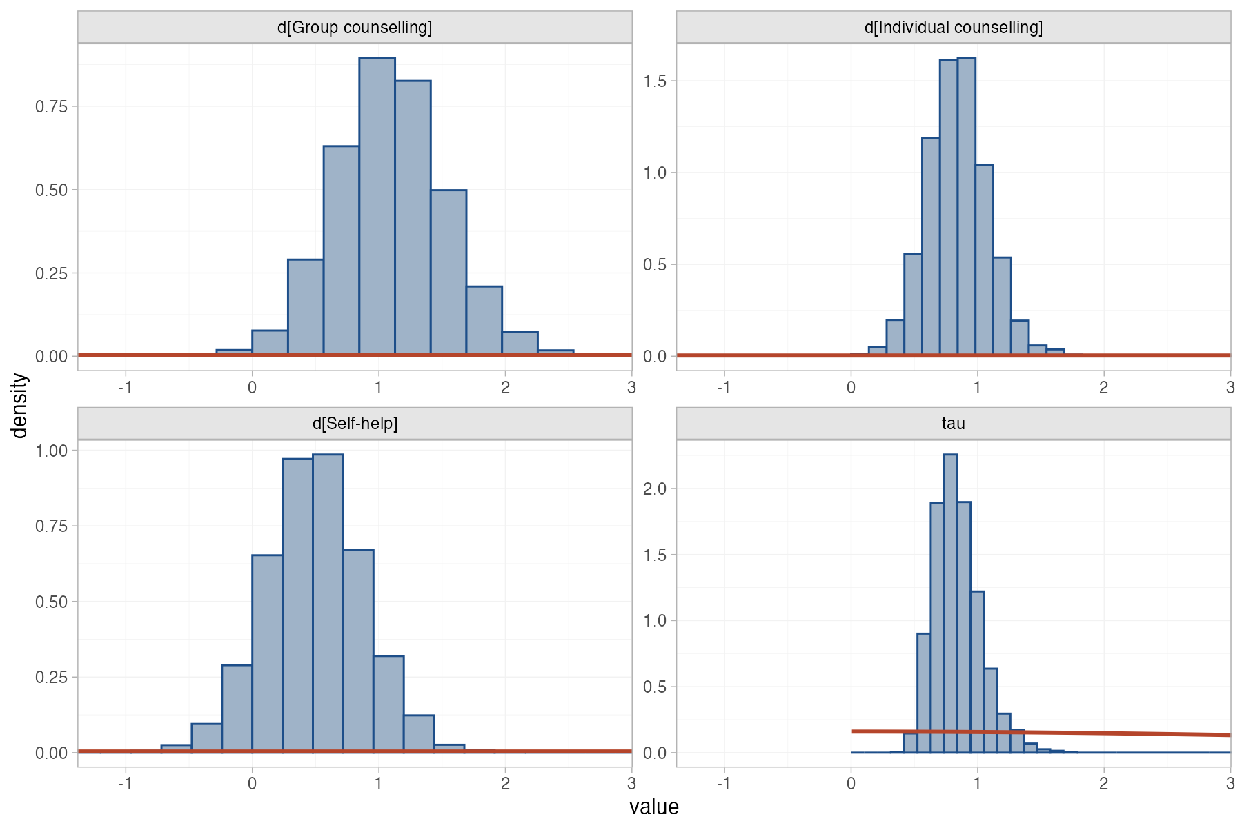
Prior versus posterior plot
Prior densities overlaid on posterior distributions, showing how much the data updated each parameter.
MANMAML-NMRML-UMR
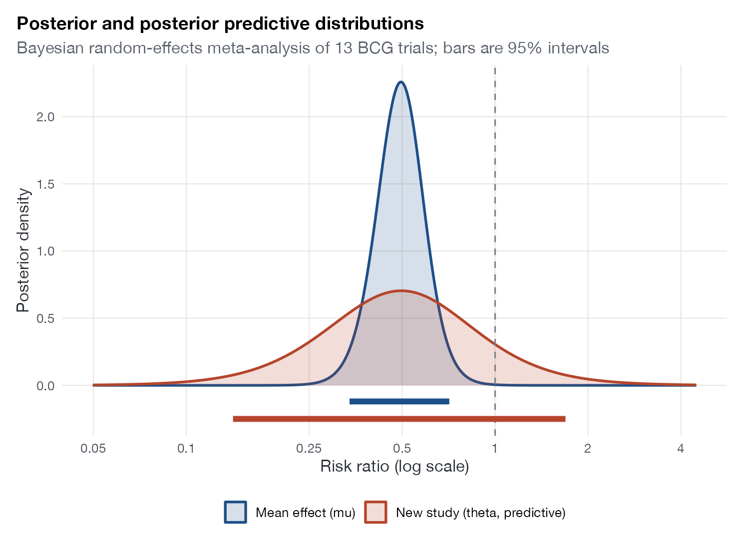
Posterior predictive distribution plot
The posterior of the mean effect next to the posterior predictive distribution of the true effect in a new study.
MANMA
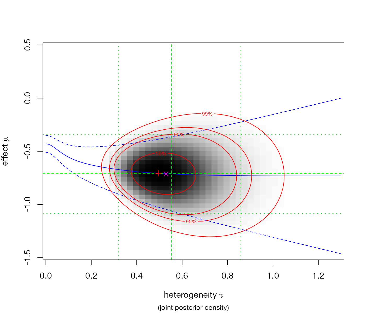
Joint posterior plot of effect and heterogeneity
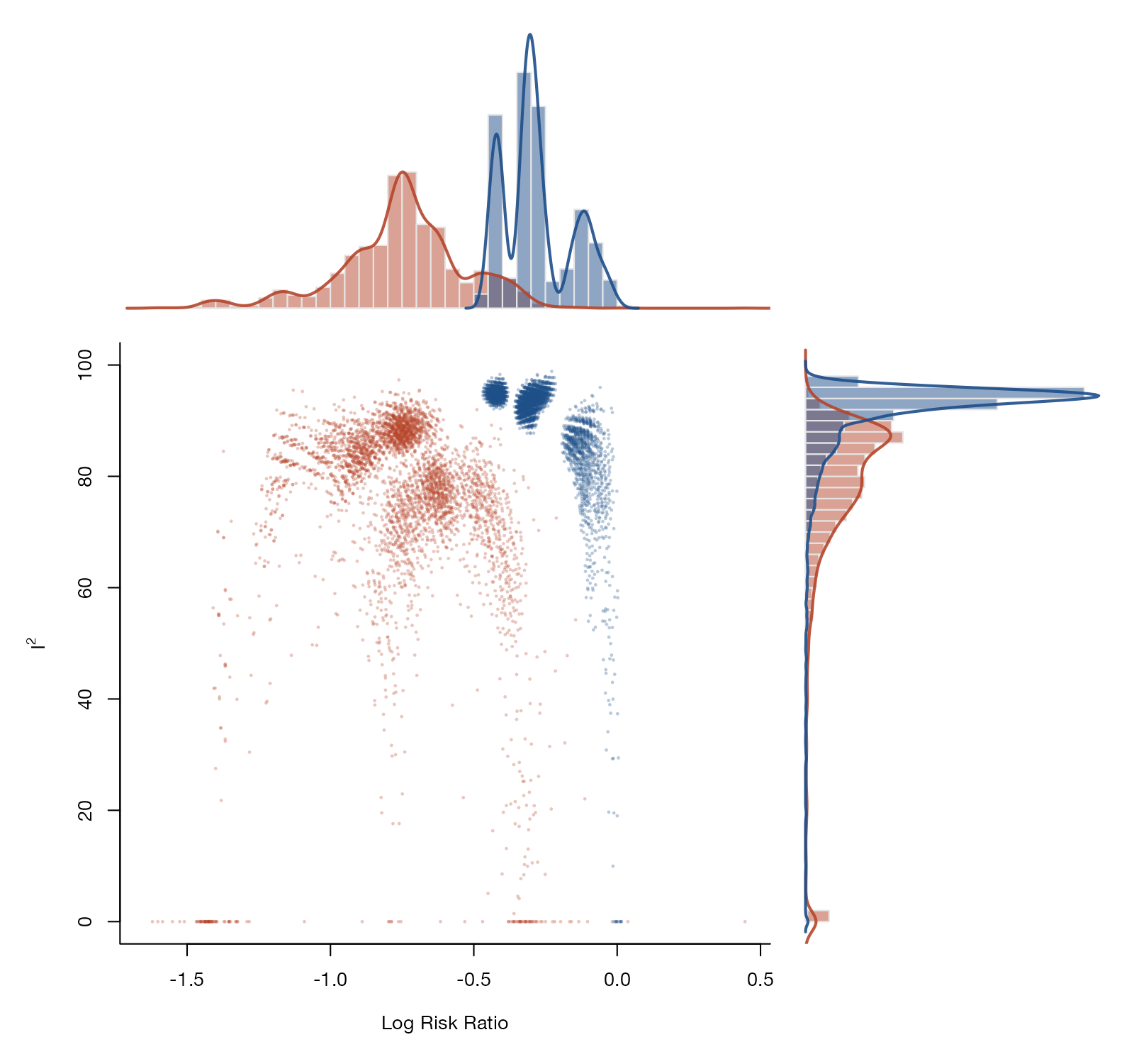
The joint posterior density of the mean effect and the between-study SD, with credible regions and the conditional mean.
MA

Network geometry and evidence flow

Which treatments are compared directly, how much evidence each comparison carries, and where it flows.

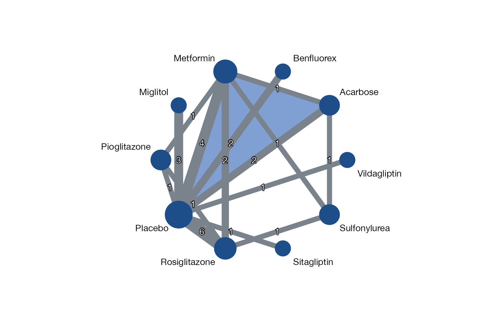
Network graph
Treatments as nodes and direct randomized comparisons as edges, showing how the evidence base is connected.
NMAML-NMRNMI
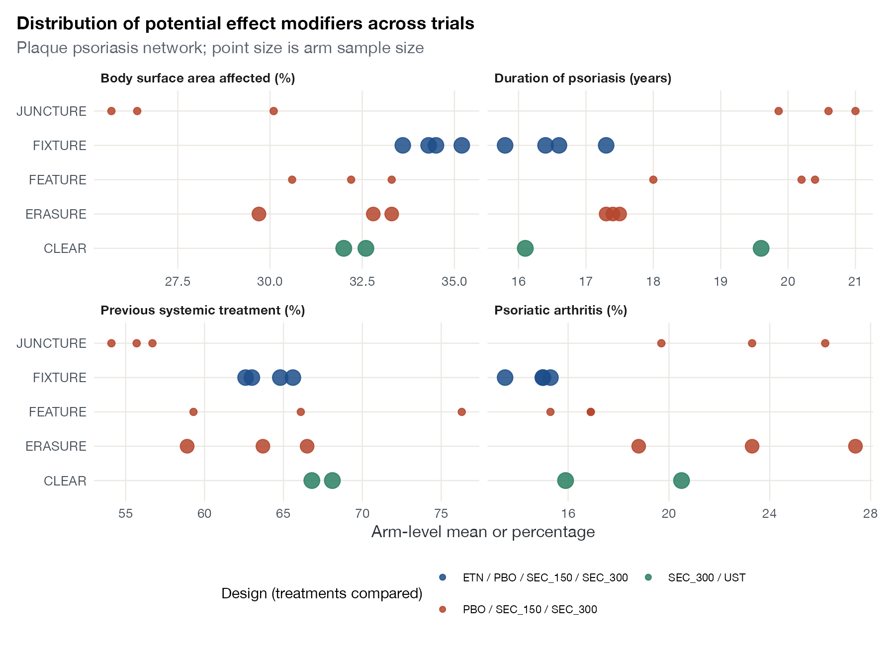
Transitivity plot
The distribution of potential effect modifiers across trials or direct comparisons, to judge whether indirect comparisons are plausible.
NMAML-NMRNMIITC
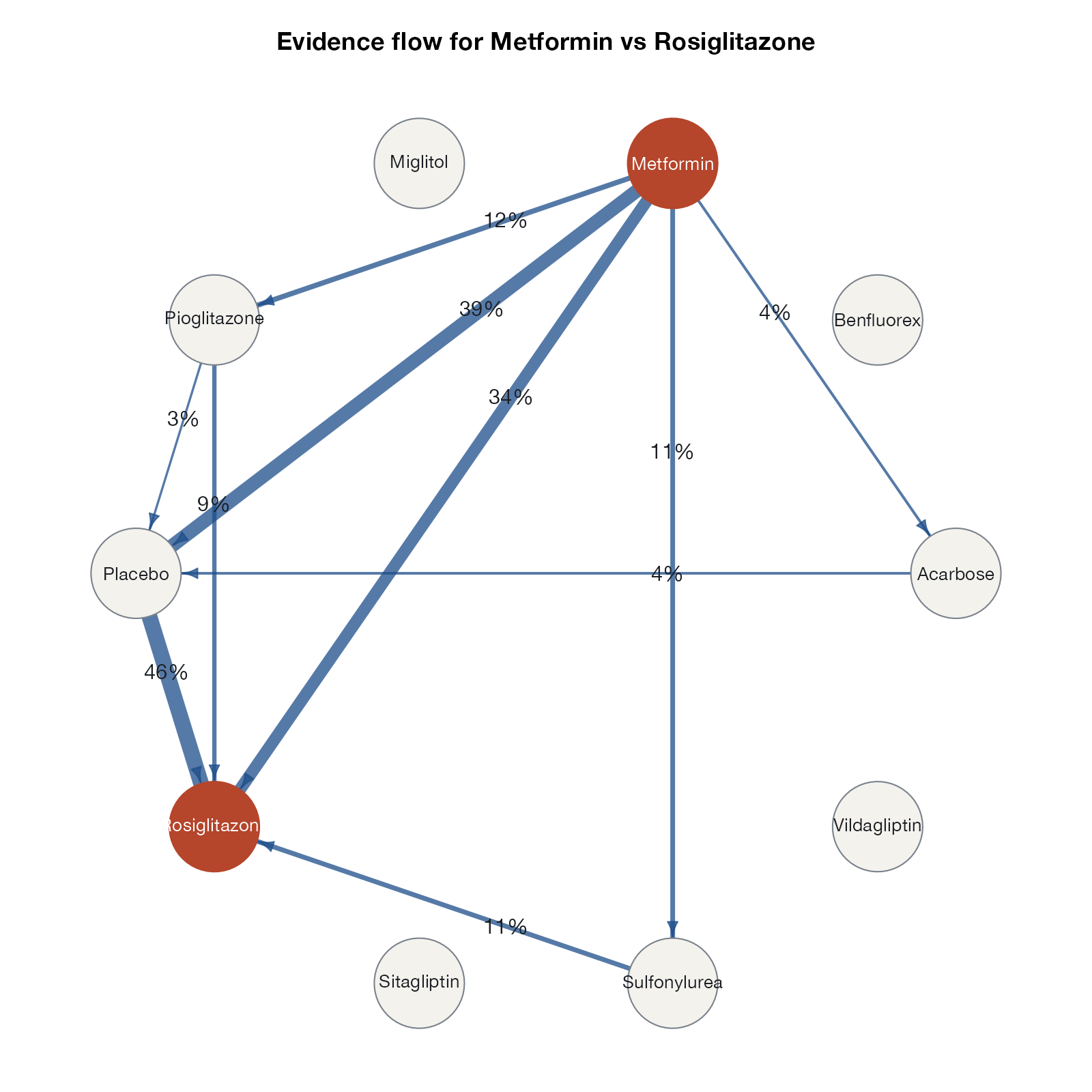
Evidence flow diagram
For one network estimate, arrows show how much evidence flows through each direct comparison, exposing the indirect paths behind the result.
NMA
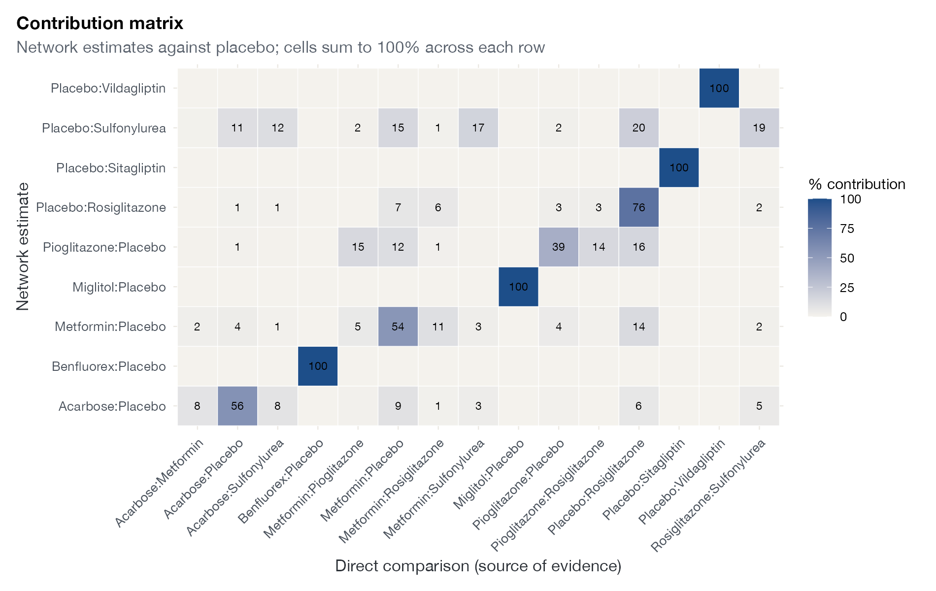
Contribution matrix
The percentage of each network estimate that comes from each direct comparison, drawn as a heat map.
NMA
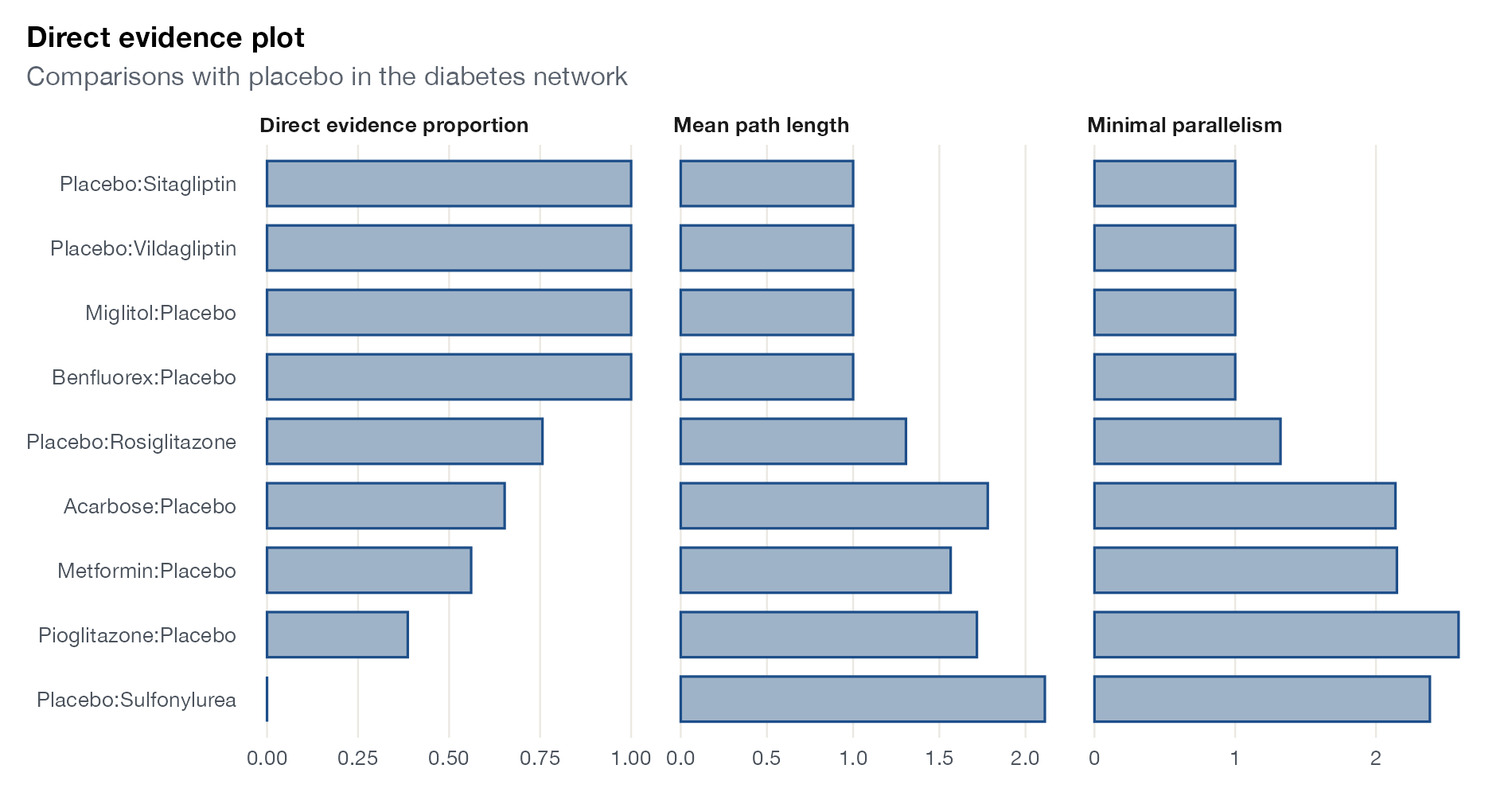
Direct evidence plot
For each comparison, the proportion of direct evidence, the mean length of the paths that contribute, and the minimal parallelism.
NMA

Inconsistency

Agreement between direct and indirect evidence, locally and across the whole network.
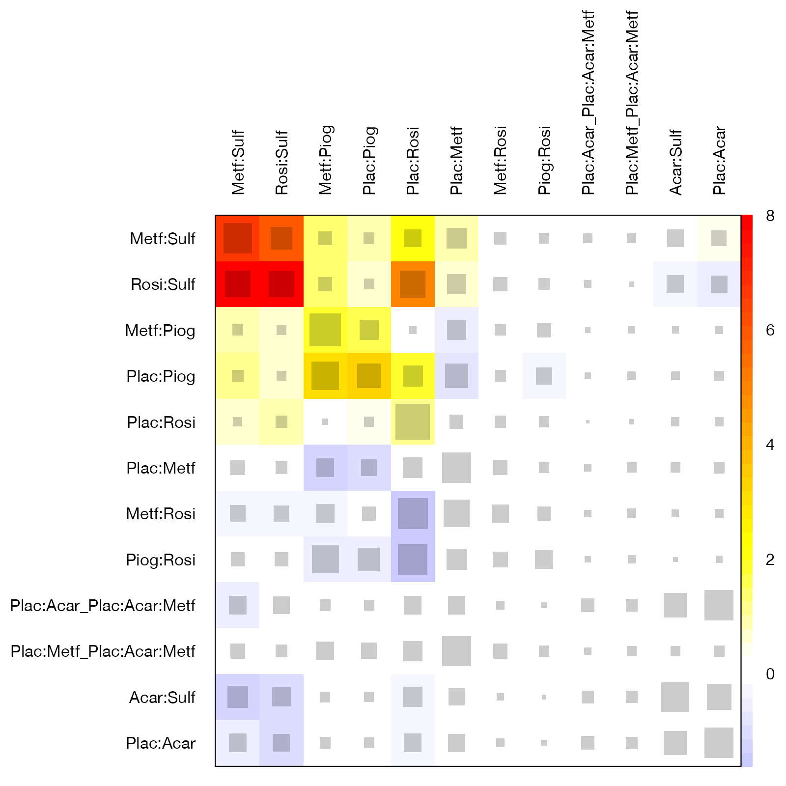
Net heat plot
A matrix showing how much each design contributes to each network estimate and how inconsistency changes when that design is detached.
NMA
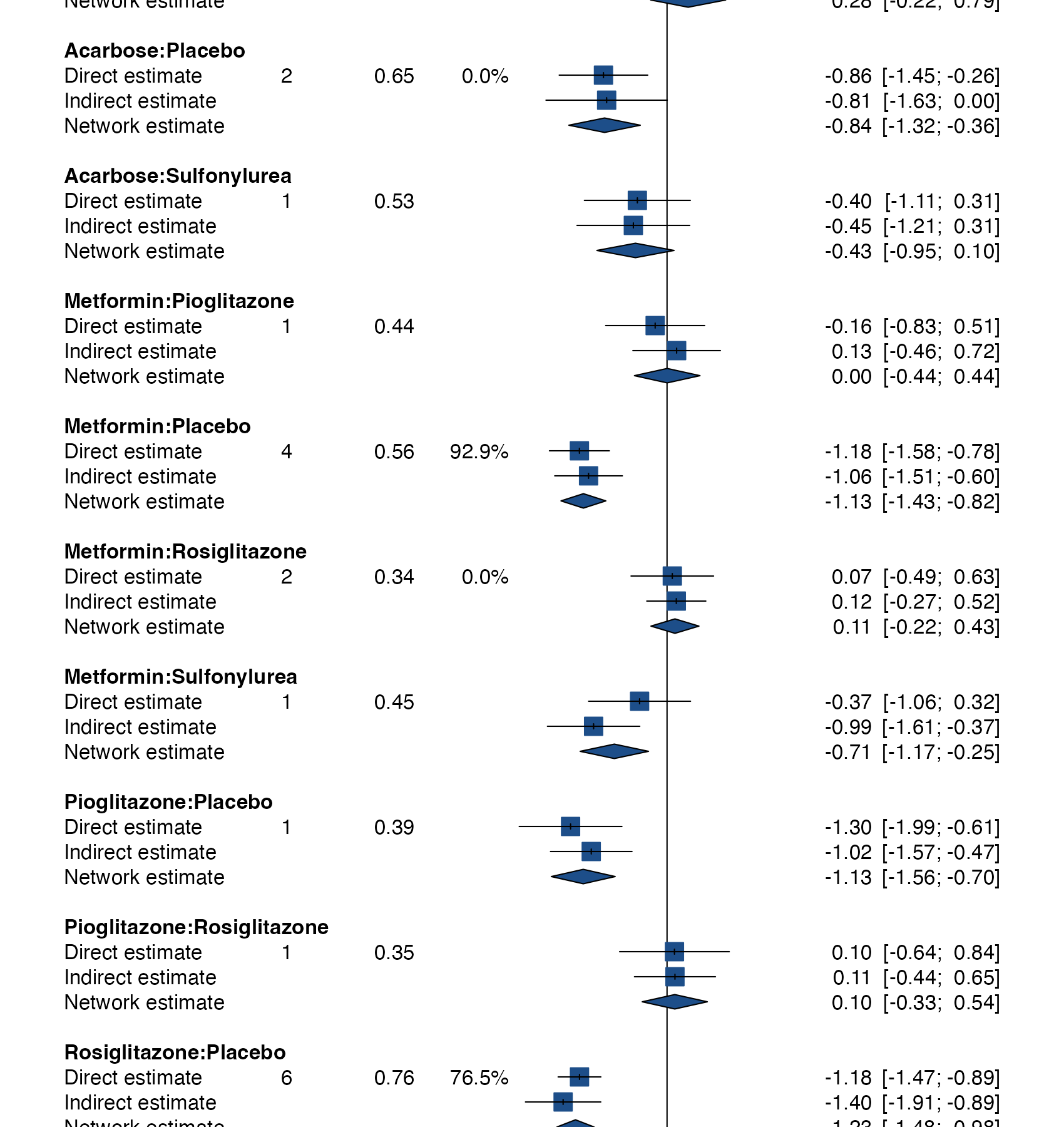
Node-splitting forest plot
Direct, indirect, and network estimates for every comparison informed by both kinds of evidence, stacked as forest-plot rows.
NMA
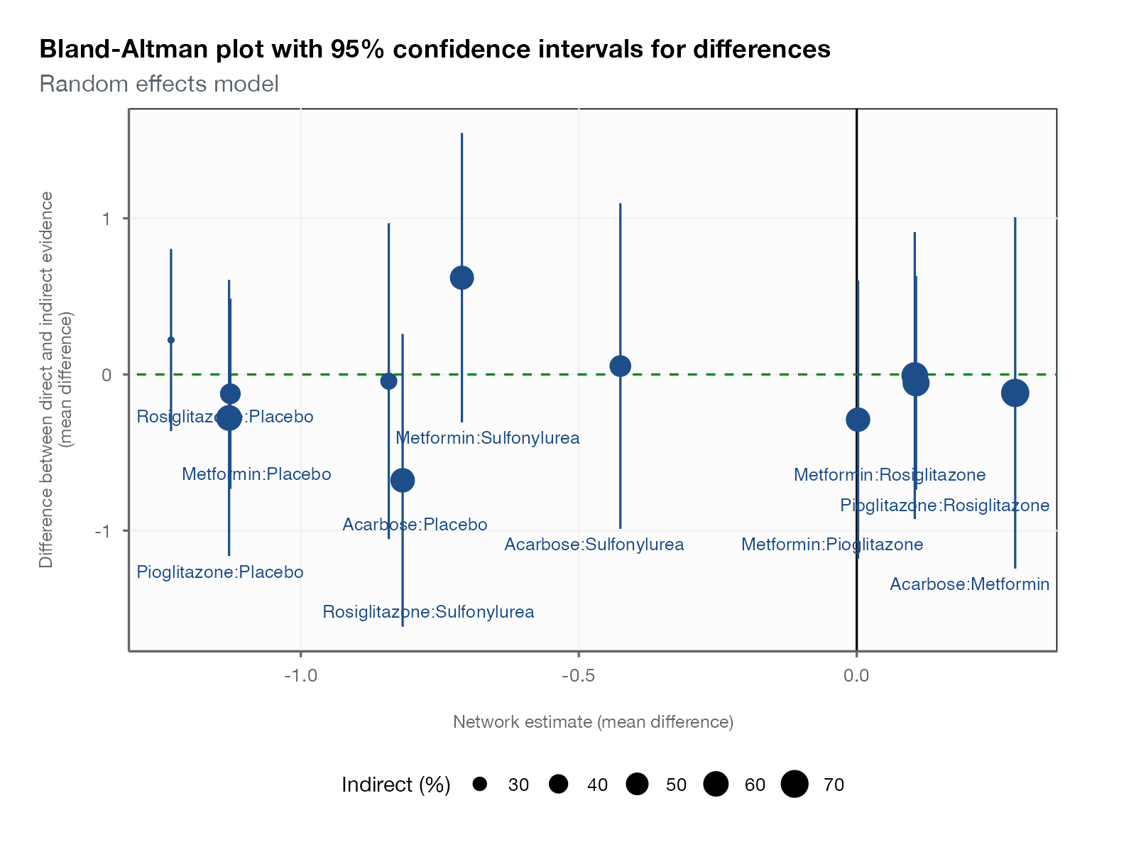
Local inconsistency scatter plot
The difference between direct and indirect estimates against the network estimate for every split comparison, with confidence intervals.
NMA
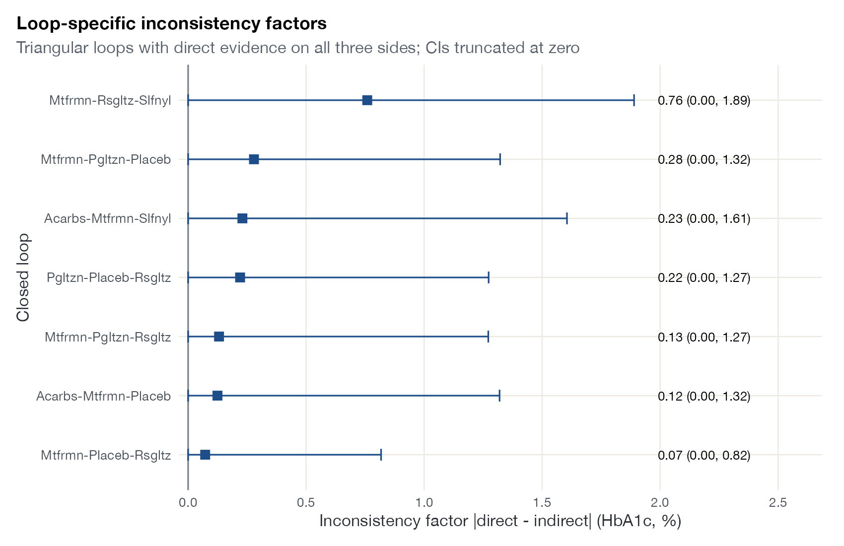
Loop inconsistency plot
The inconsistency factor of every closed loop in the network, with confidence intervals truncated at zero.
NMA
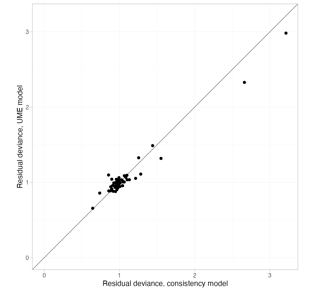
Dev-dev plot
Each data point's residual deviance under the consistency model against the unrelated mean effects model.
NMAML-NMR
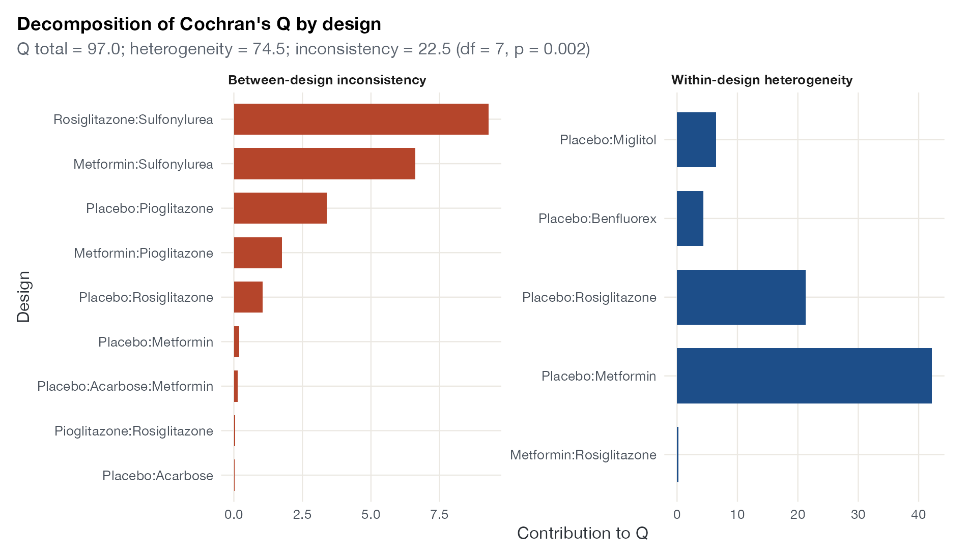
Q decomposition plot
Cochran's Q split into within-design heterogeneity and between-design inconsistency, with the contribution of each design.
NMA
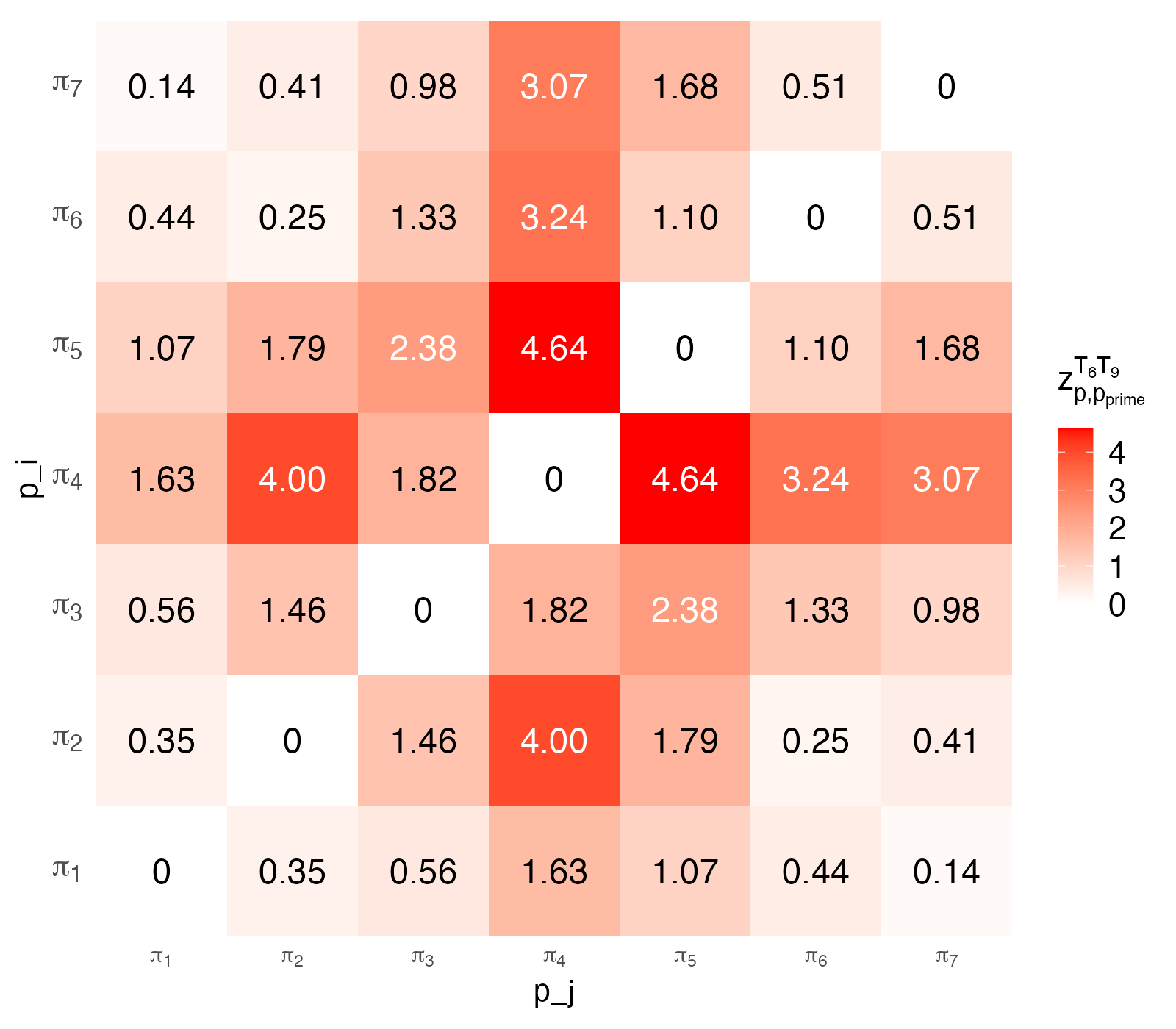
Path-based inconsistency heat plot
Pairwise standardized differences between the estimates of one comparison obtained through each independent path in the network.
NMA
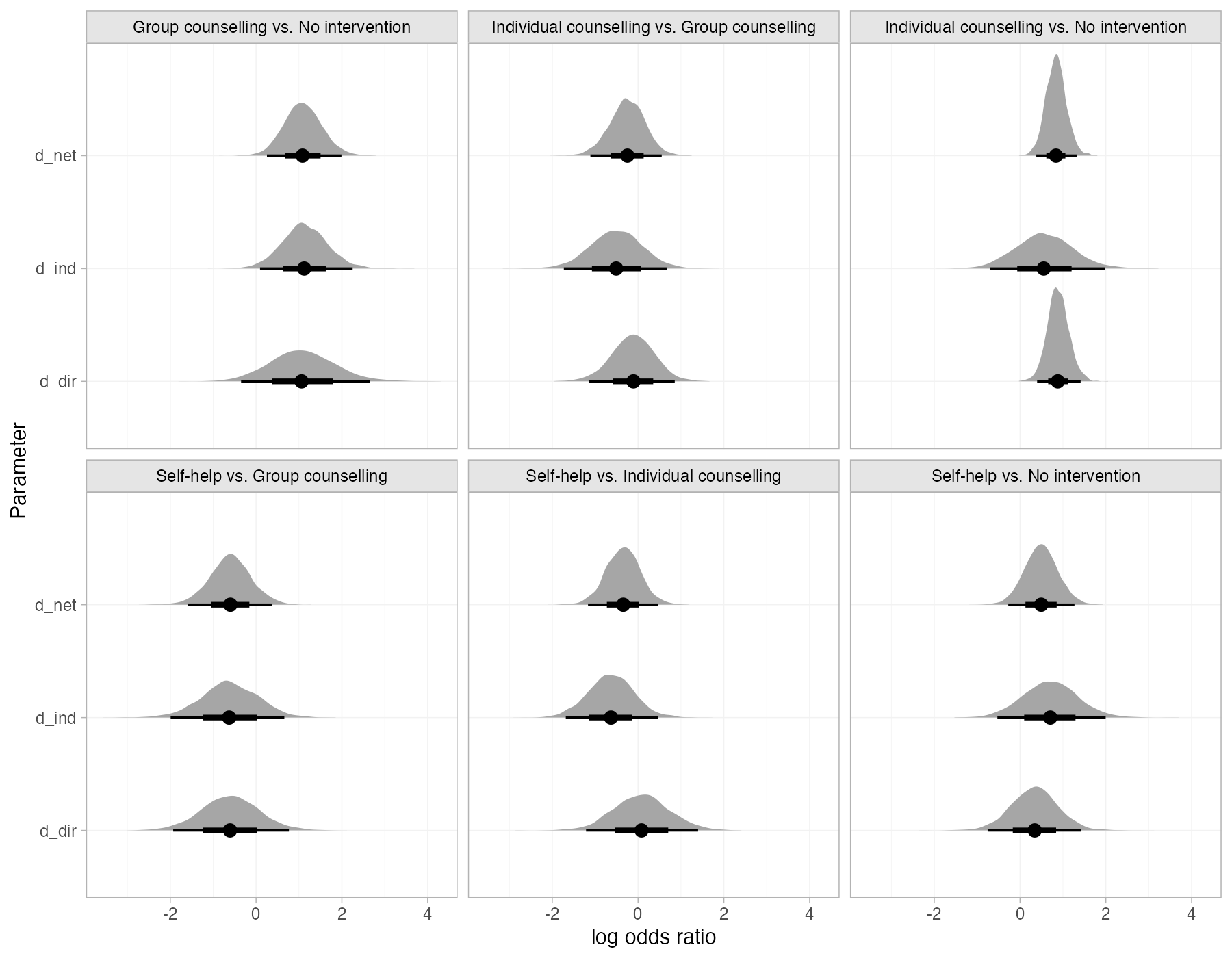
Bayesian node-split density plot
For each split comparison, the posterior distributions of the direct, indirect, and network estimates from Bayesian node-splitting models.
NMA

Treatment ranking

Rank probabilities and their summaries. Always read them next to the effect estimates.
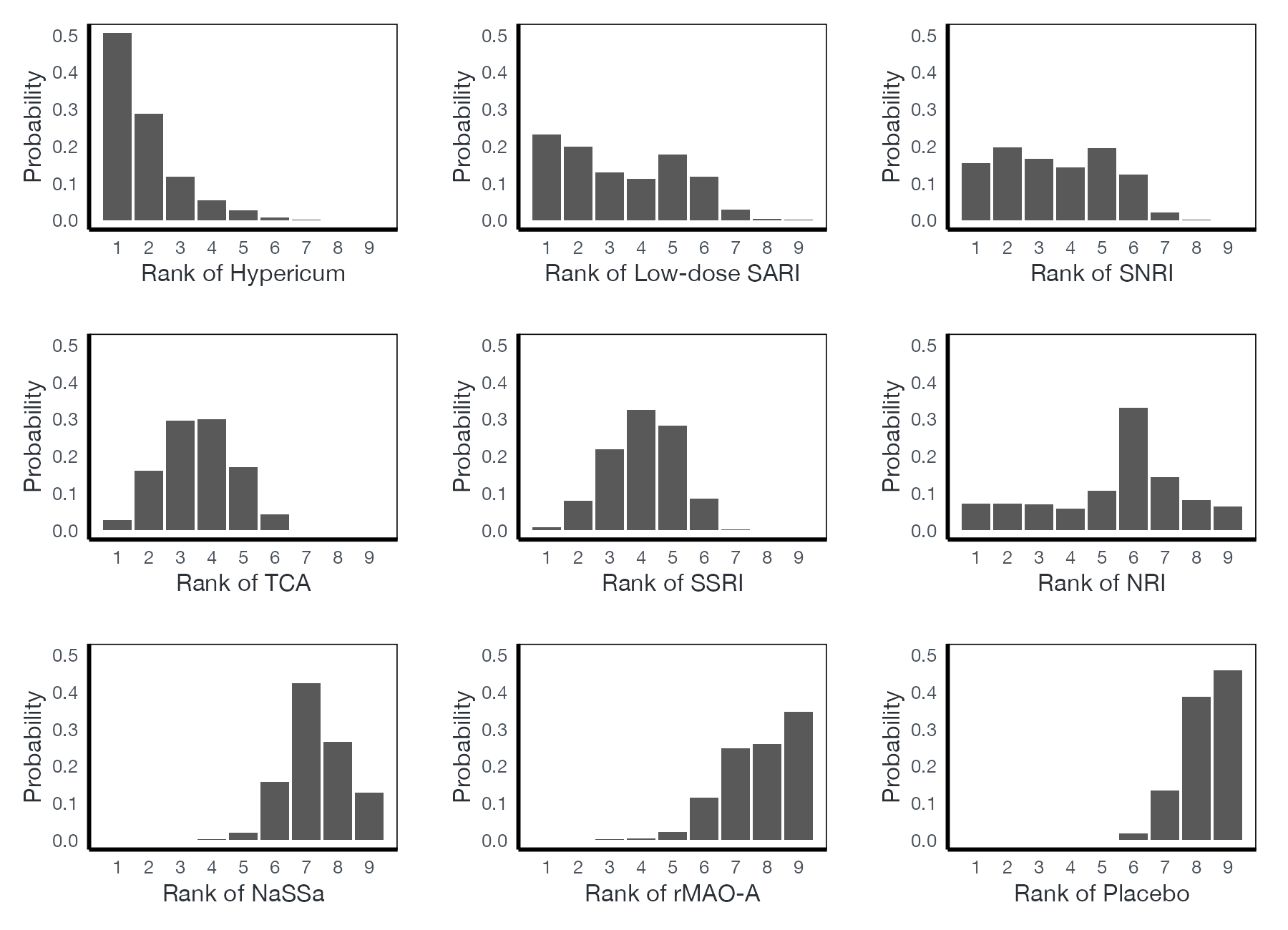
Rankogram
For each treatment, the probability of occupying each rank from best to worst.
NMAML-NMR
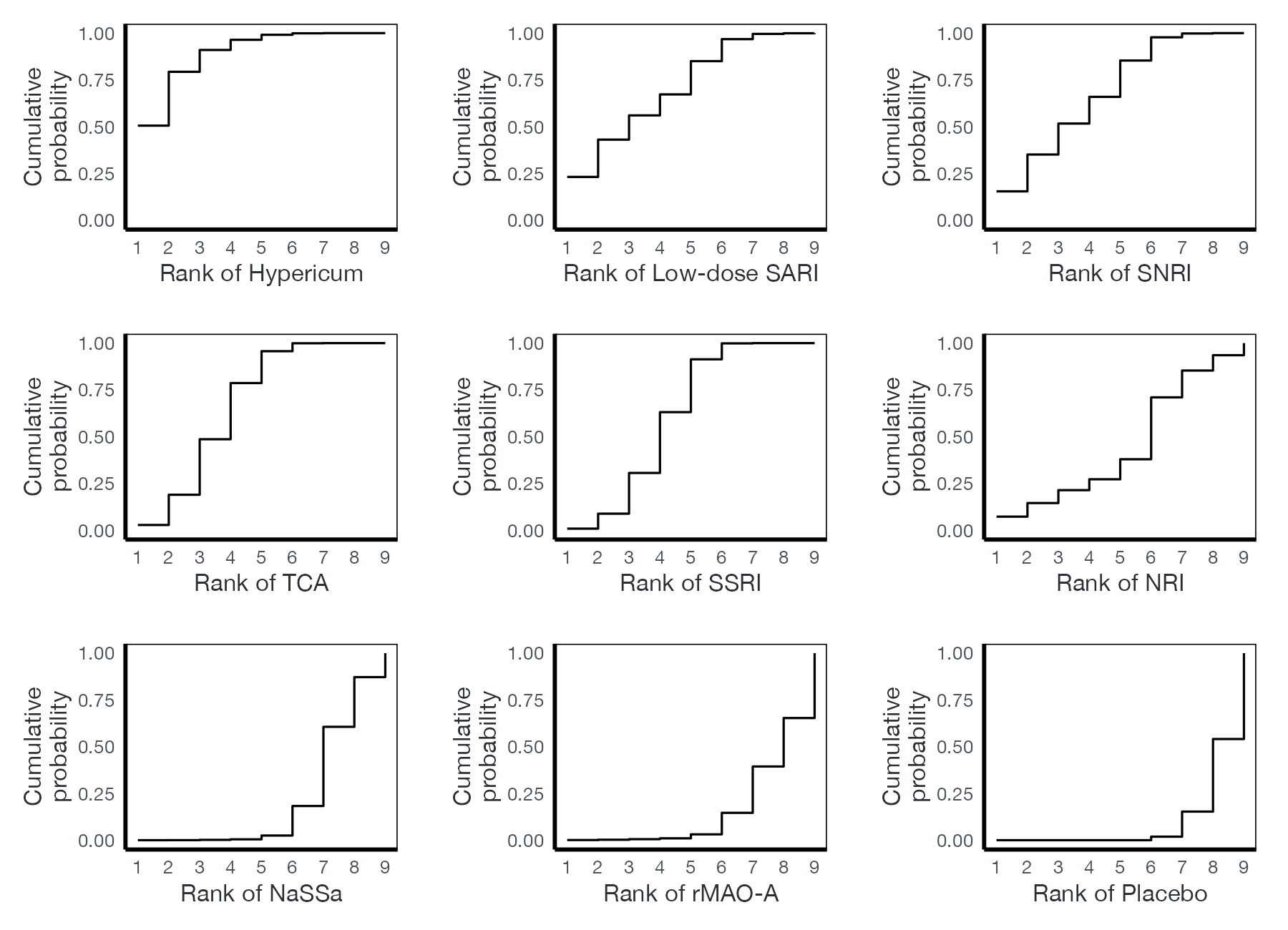
Cumulative ranking plot
The probability of each treatment being at or better than each rank; the area under each curve is its SUCRA.
NMAML-NMR
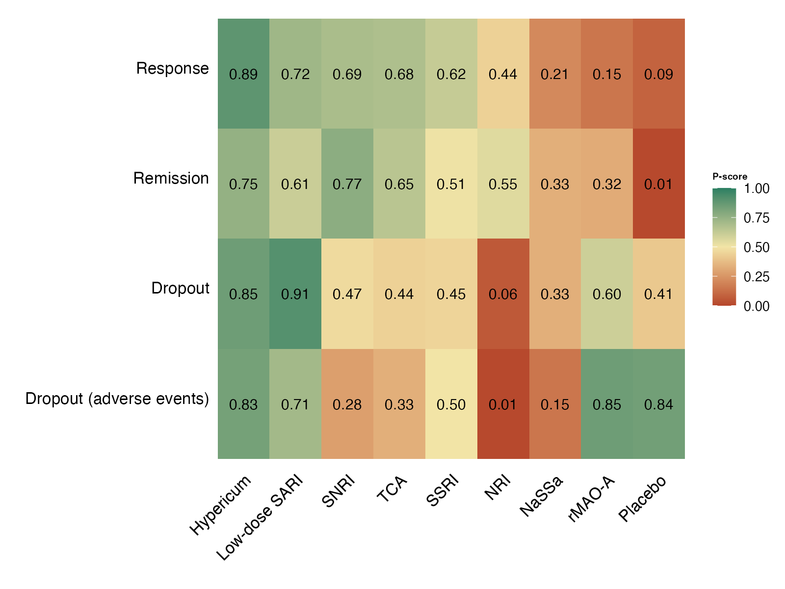
P-score plot
P-scores (or SUCRA values) for each treatment across several outcomes, arranged as a colored matrix.
NMA
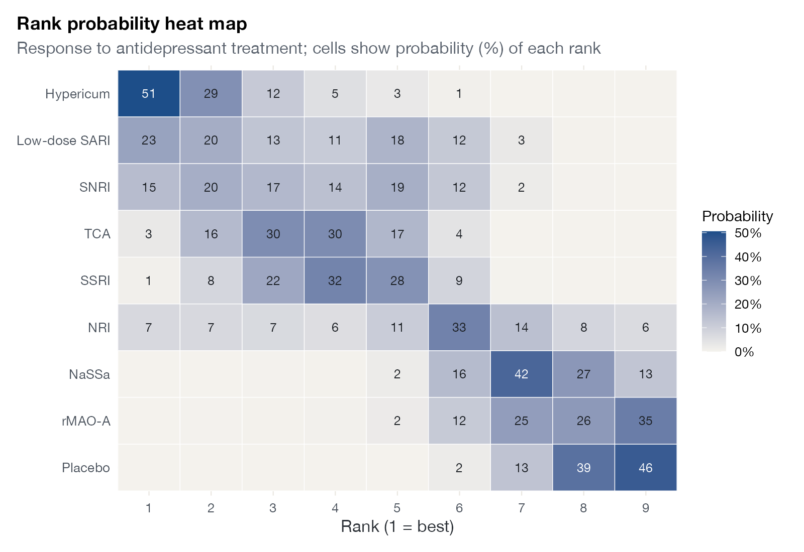
Rank probability heat map
A matrix of treatments by ranks, colored by the probability of each rank.
NMAML-NMR
Rank-heat plot
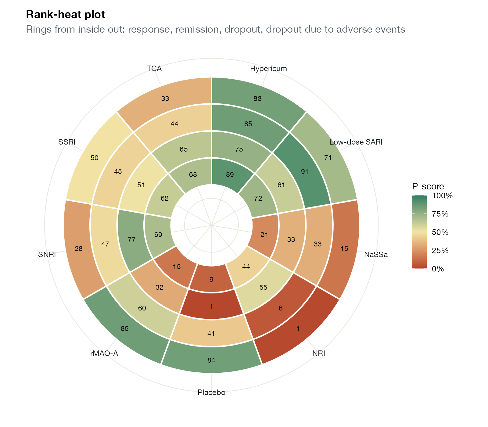
Concentric rings for outcomes and sectors for treatments, colored by ranking score.
NMA
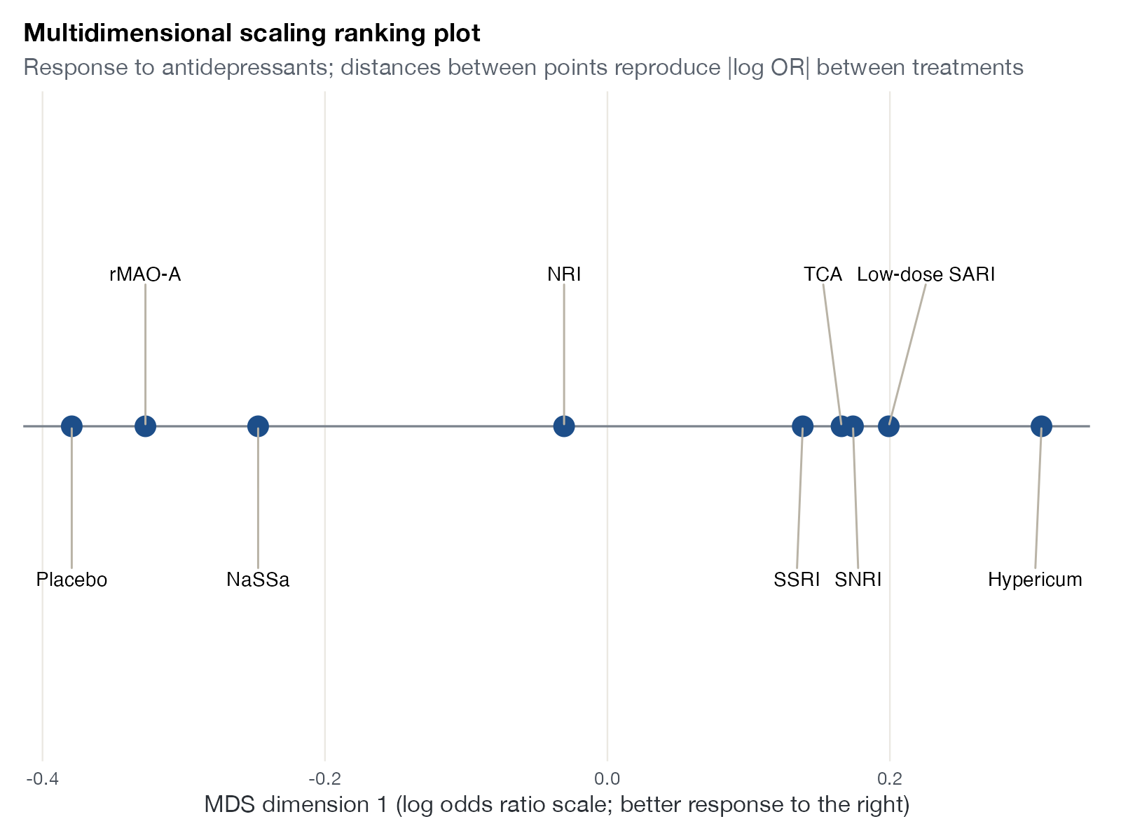
Multidimensional scaling ranking plot
Treatments placed along a dimension recovered by multidimensional scaling of the pairwise effect matrix.
NMA
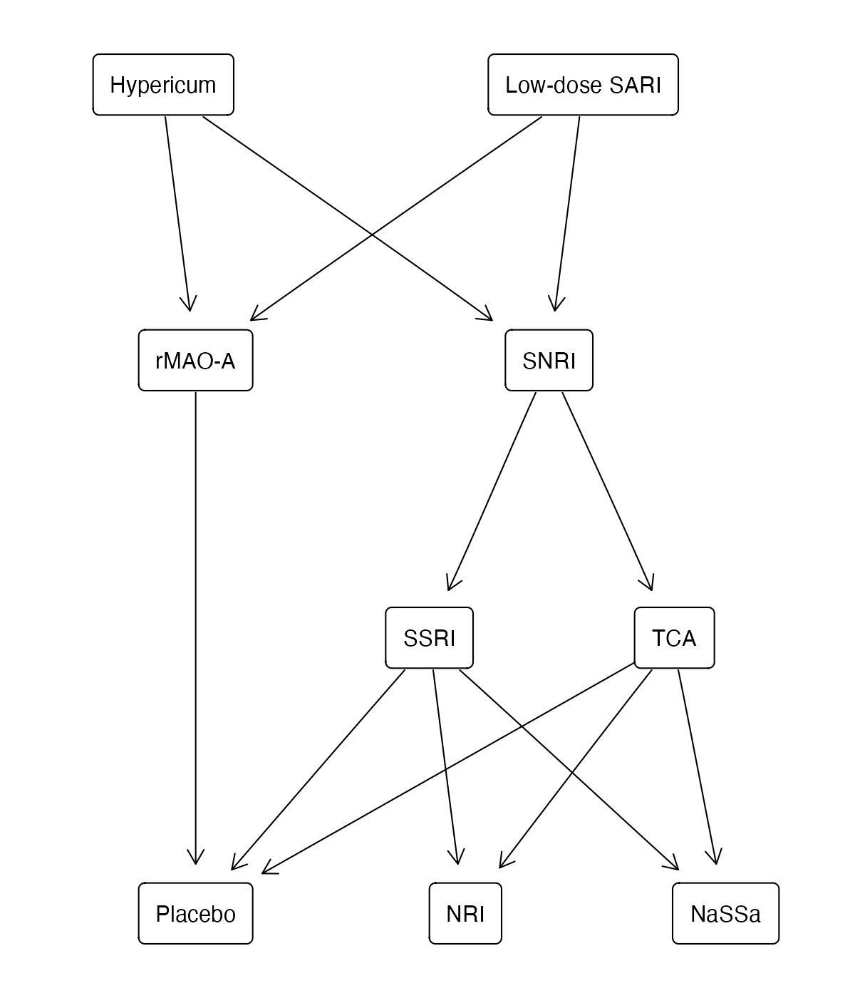
Hasse diagram
Treatments ordered only where one is better than another on every outcome, avoiding a forced single ranking.
NMA
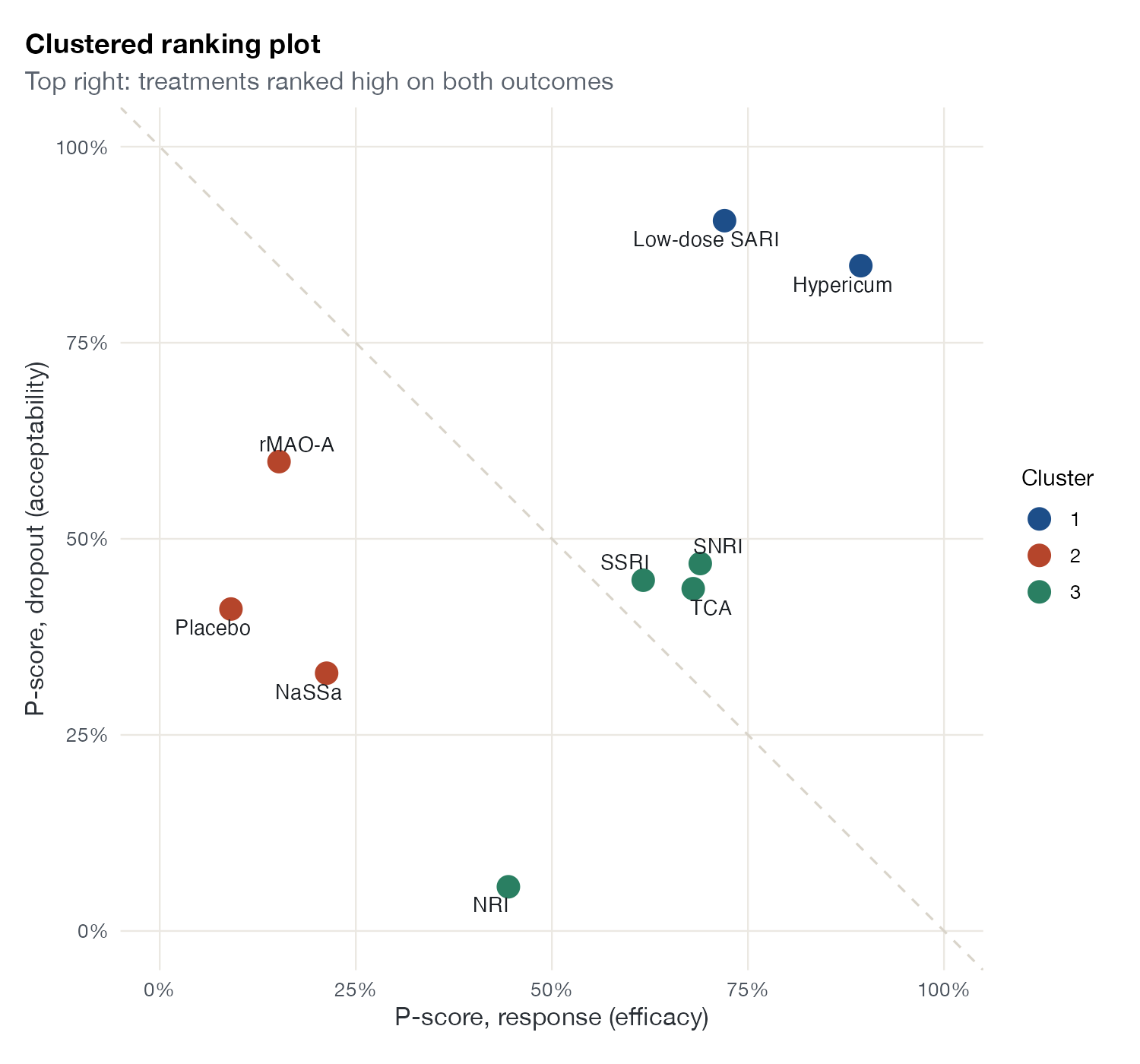
Clustered ranking plot
Ranking scores for two outcomes plotted against each other, with treatments grouped by hierarchical clustering.
NMA
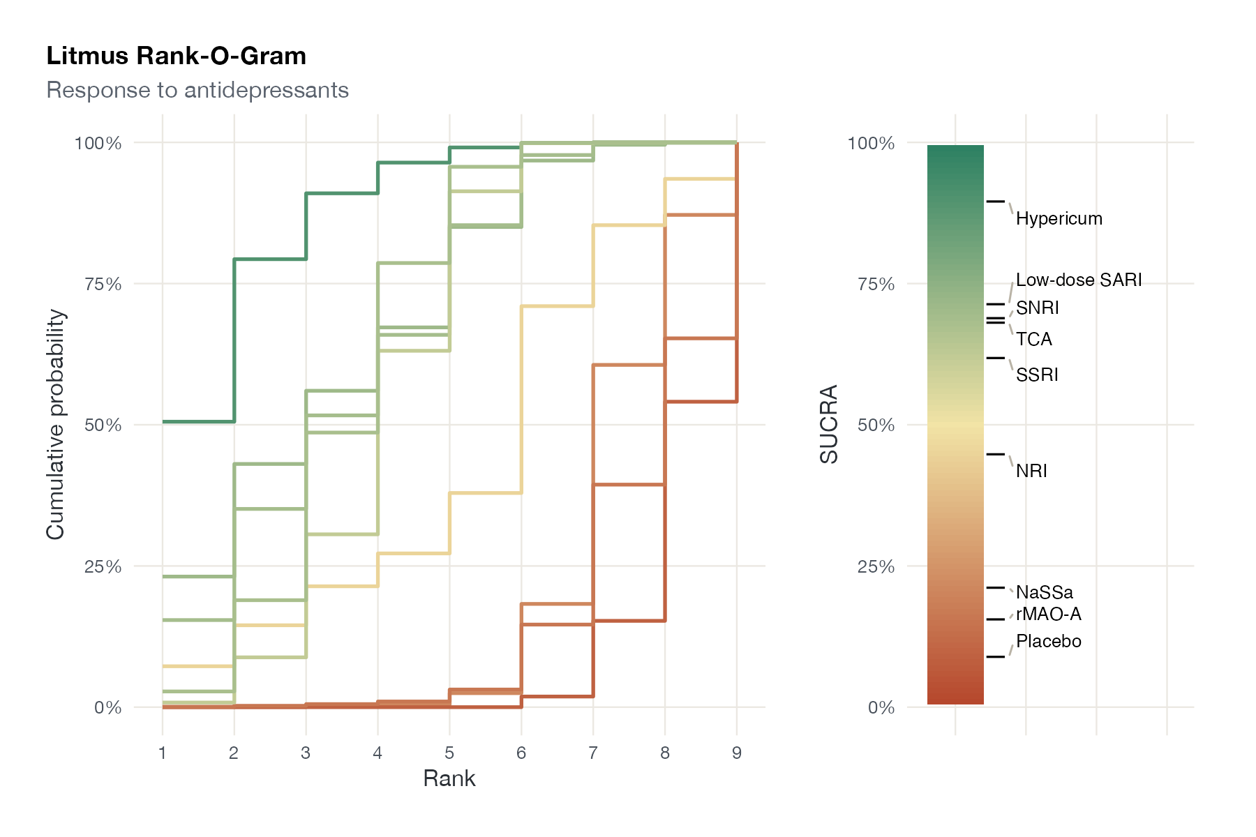
Litmus Rank-O-Gram
Cumulative rank curves colored by SUCRA, paired with a vertical color strip that places each treatment on the SUCRA scale.
NMA
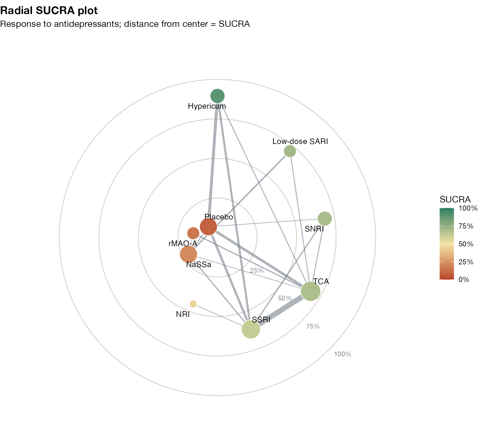
Radial SUCRA plot
Treatments placed at a radius equal to their SUCRA, with the network's direct comparisons drawn between them.
NMA
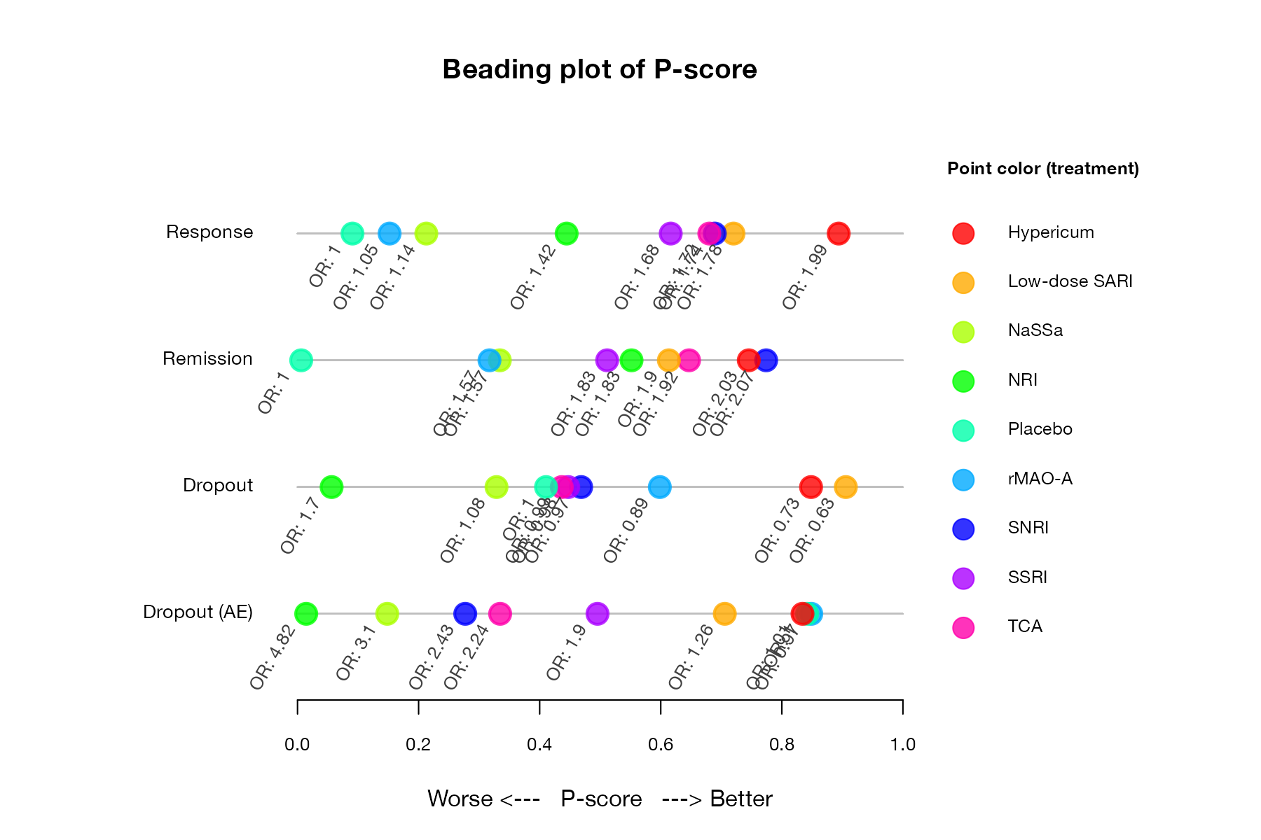
Beading plot
One horizontal thread per outcome, with each treatment as a colored bead positioned at its ranking score.
NMA
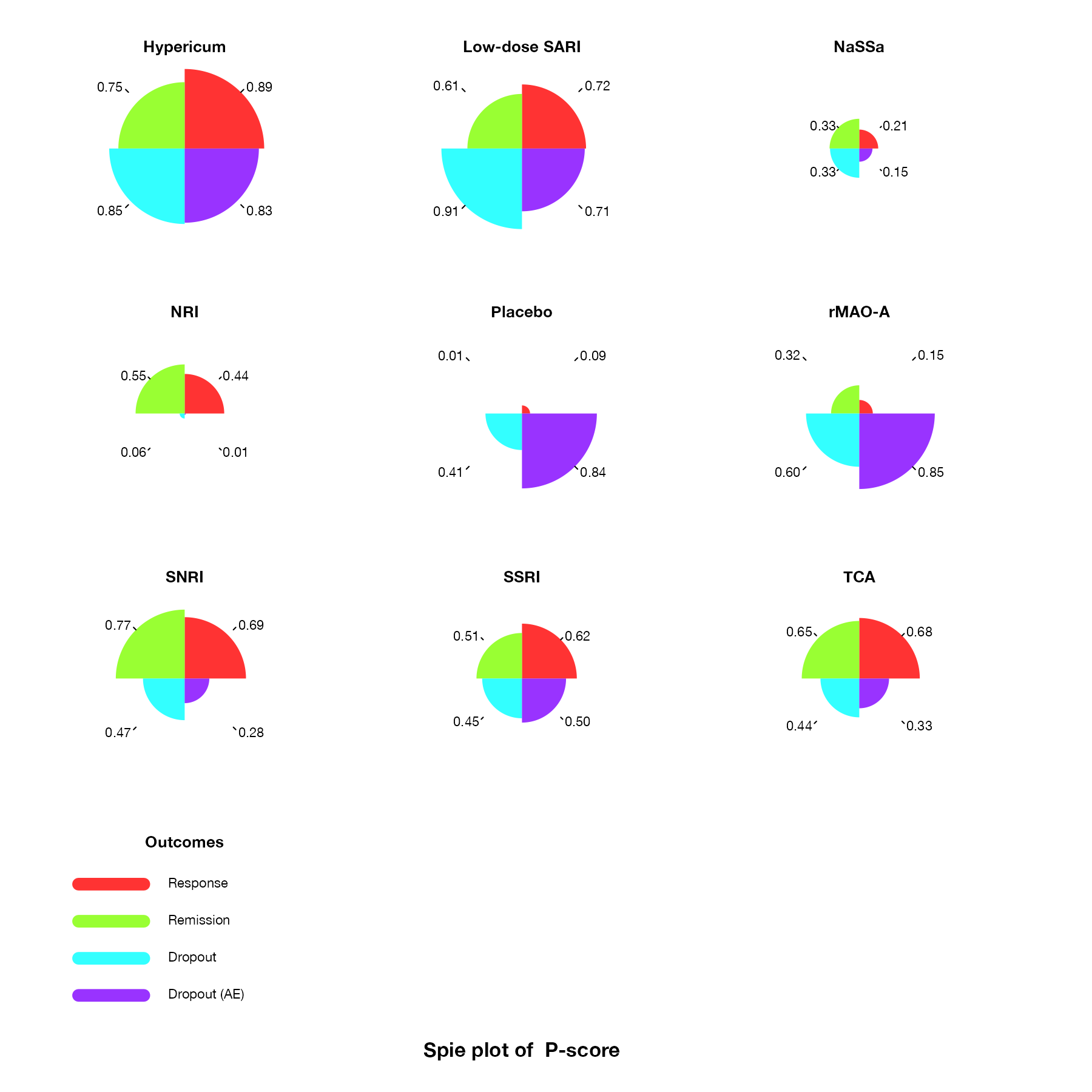
Spie chart
One chart per treatment with equal-angle sectors for outcomes and sector radius proportional to the ranking score.
NMA
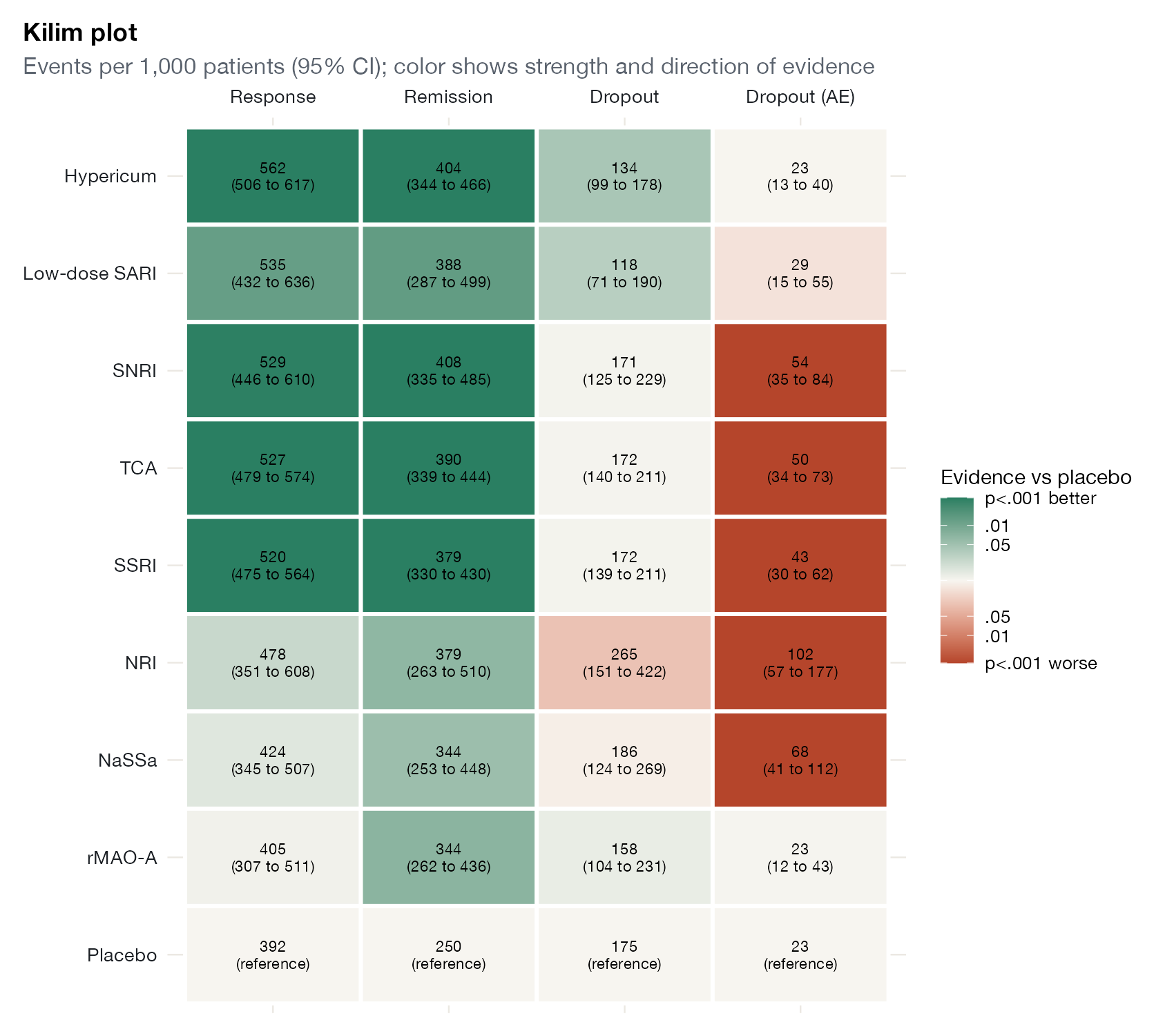
Kilim plot
A table of treatments by outcomes showing absolute effects, with cell colors for the strength and direction of evidence.
NMA
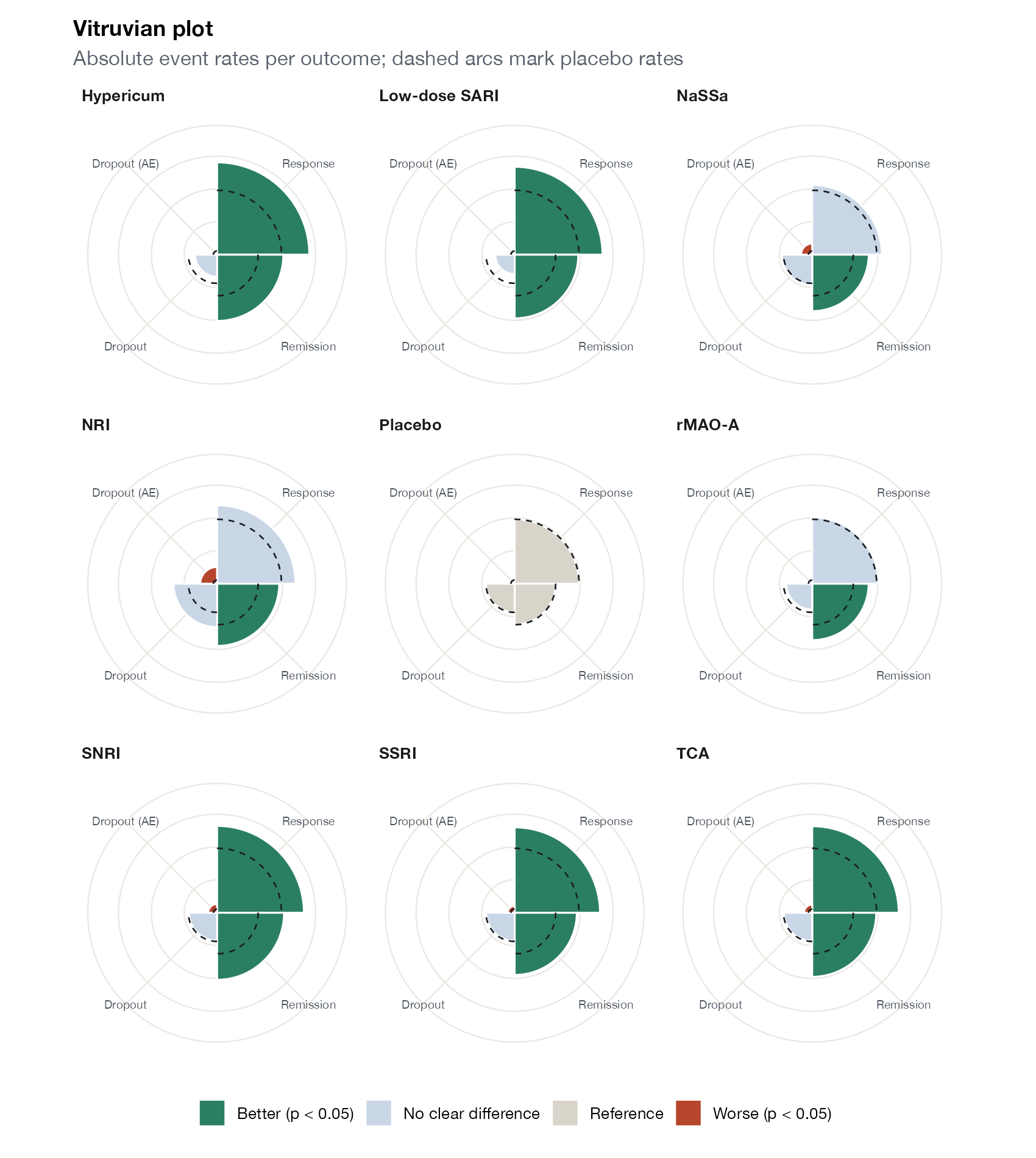
Vitruvian plot
Small multiple circular bar charts, one per treatment, showing absolute outcome rates colored by evidence against the reference.
NMA

Component, dose-response, and threshold NMA

Extensions of NMA for complex interventions, dose-response relationships, and decision robustness.
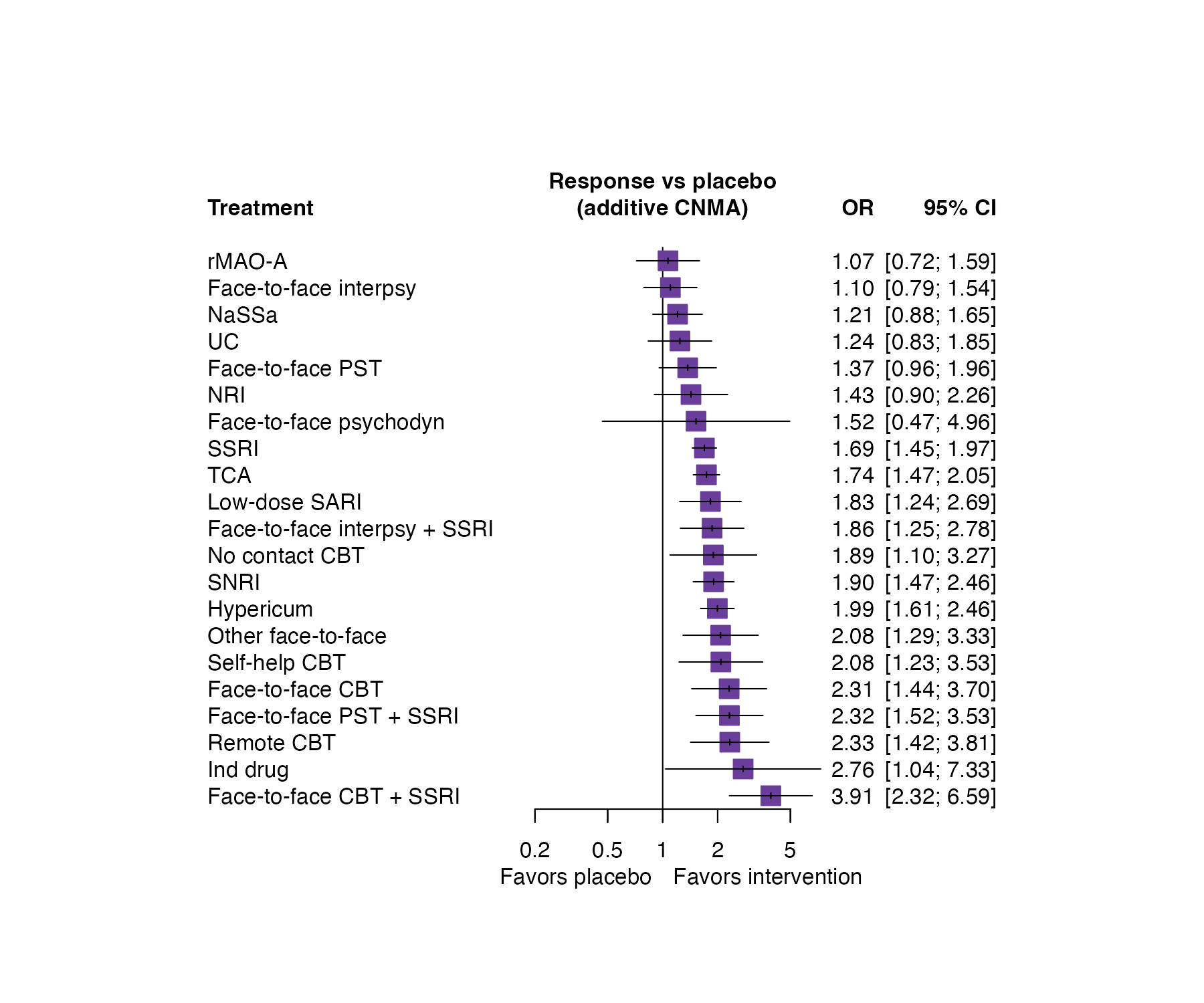
Component NMA forest plot
Effects of complex interventions estimated from an additive component network meta-analysis, where each intervention's effect is the sum of its components.
NMA
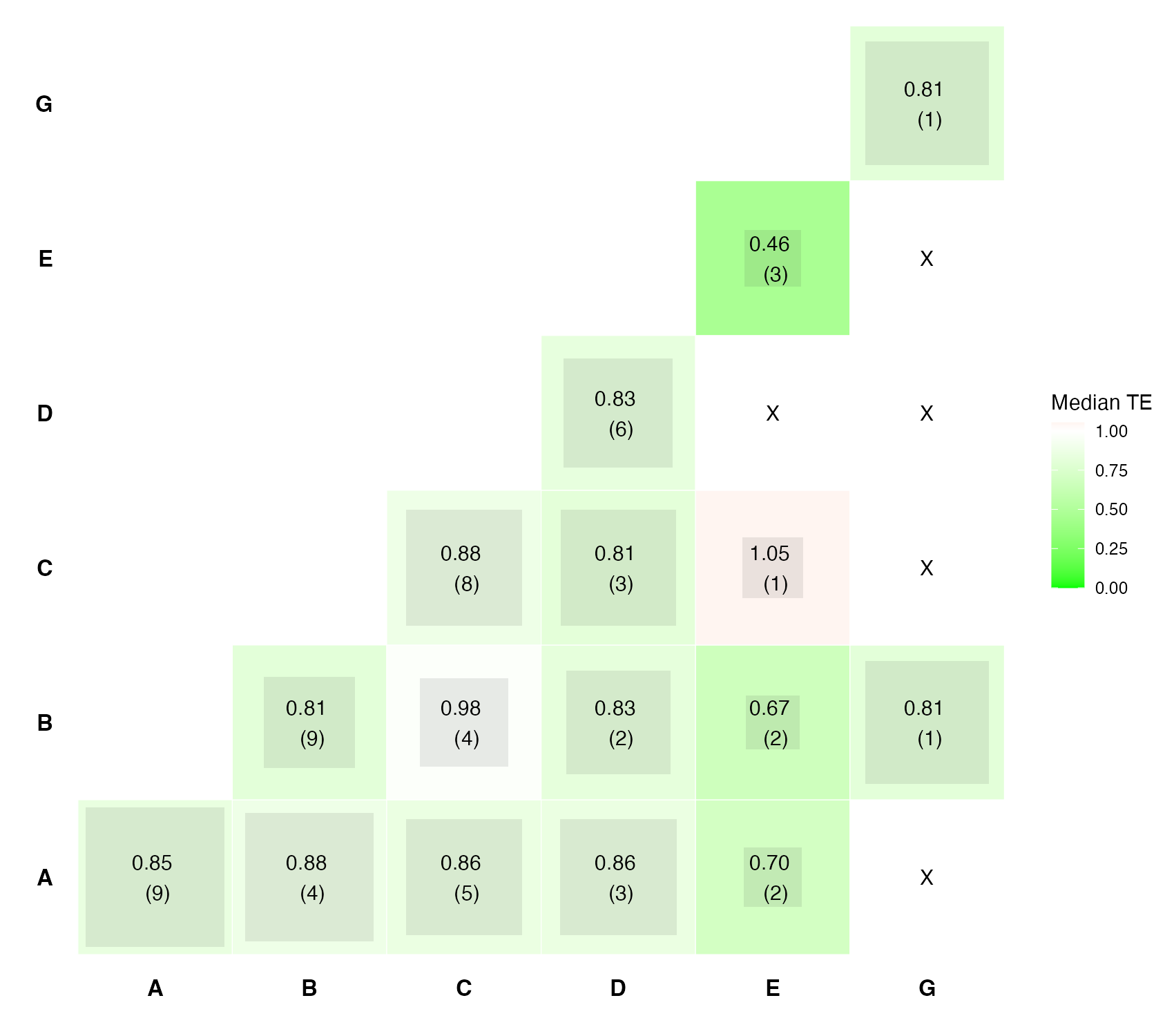
Component heat plot
A matrix of pairs of components, each cell summarizing the relative effects of interventions that contain both.
NMA
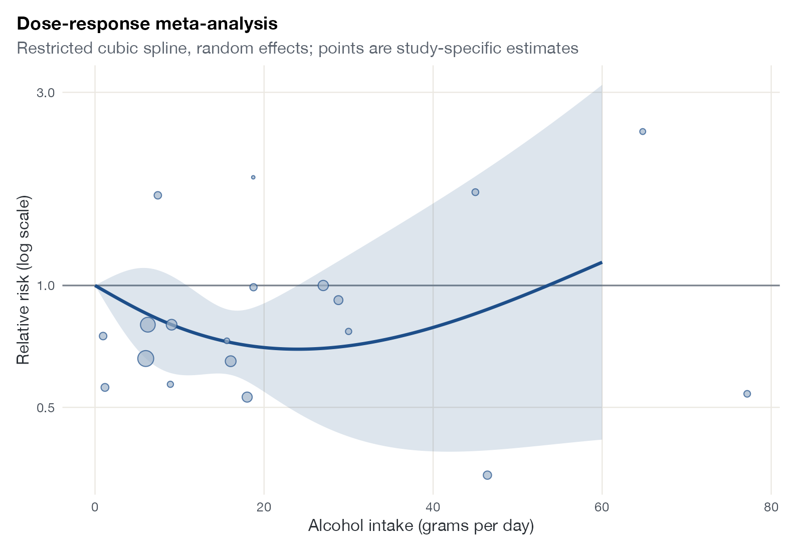
Dose-response meta-analysis plot
A pooled relative risk curve across exposure levels from a dose-response meta-analysis, with study-specific estimates.
MA
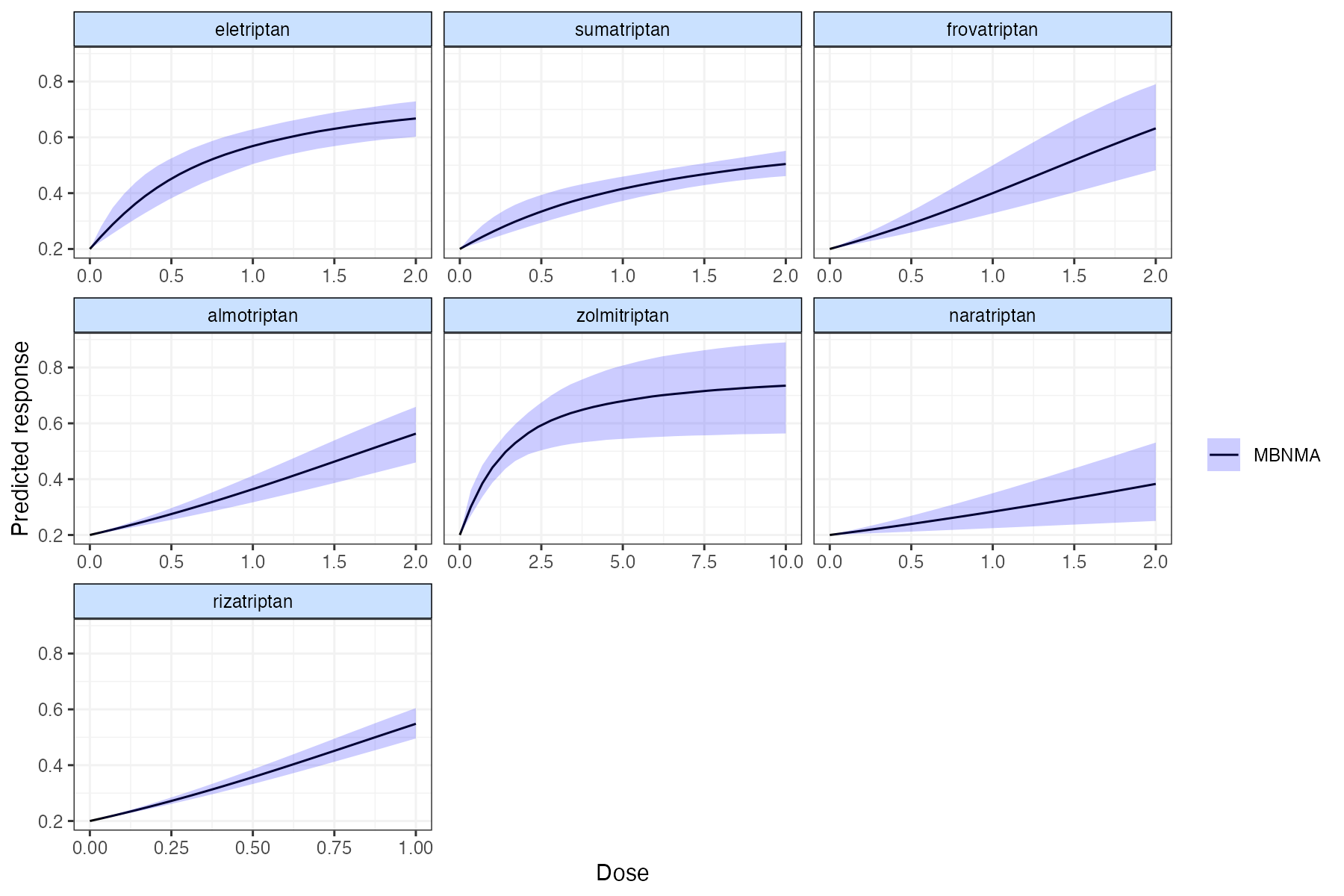
Dose-response NMA plot
Fitted dose-response curves for several agents from a model-based network meta-analysis.
NMA
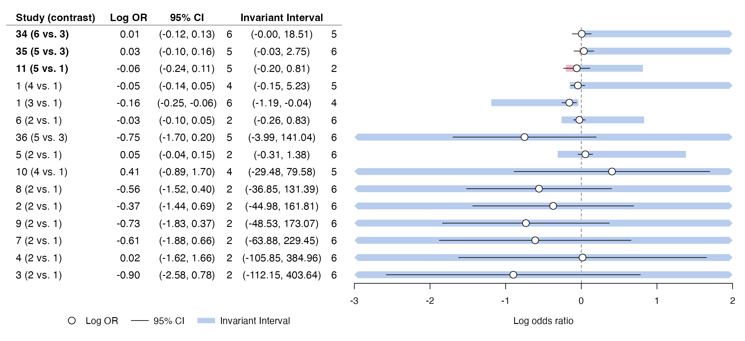
Threshold analysis forest plot
For each study estimate, how far it could change before the treatment recommendation changes, shown as an invariant interval next to the 95% CI.
NMA

Weighting, balance, and overlap

MAIC diagnostics: what the weights did, how much information survived, and whether populations overlap.
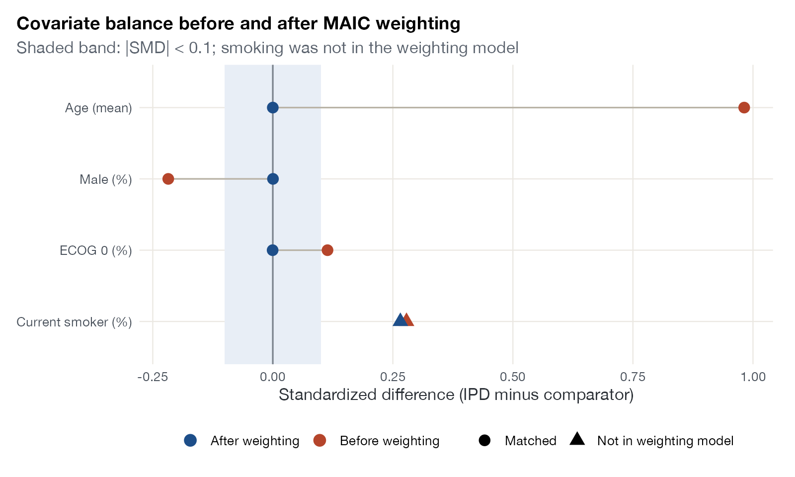
Love plot
Standardized differences between the IPD and the comparator population for each covariate, before and after weighting.
MAICSTCML-NMRNMIML-UMR
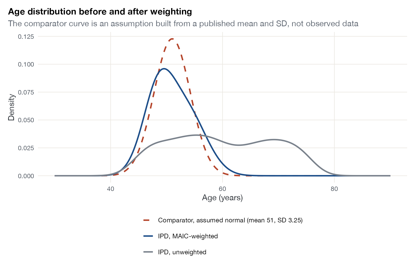
Weighted covariate distribution plot
The distribution of a covariate in the IPD before and after weighting, against the distribution assumed for the comparator population.
MAIC
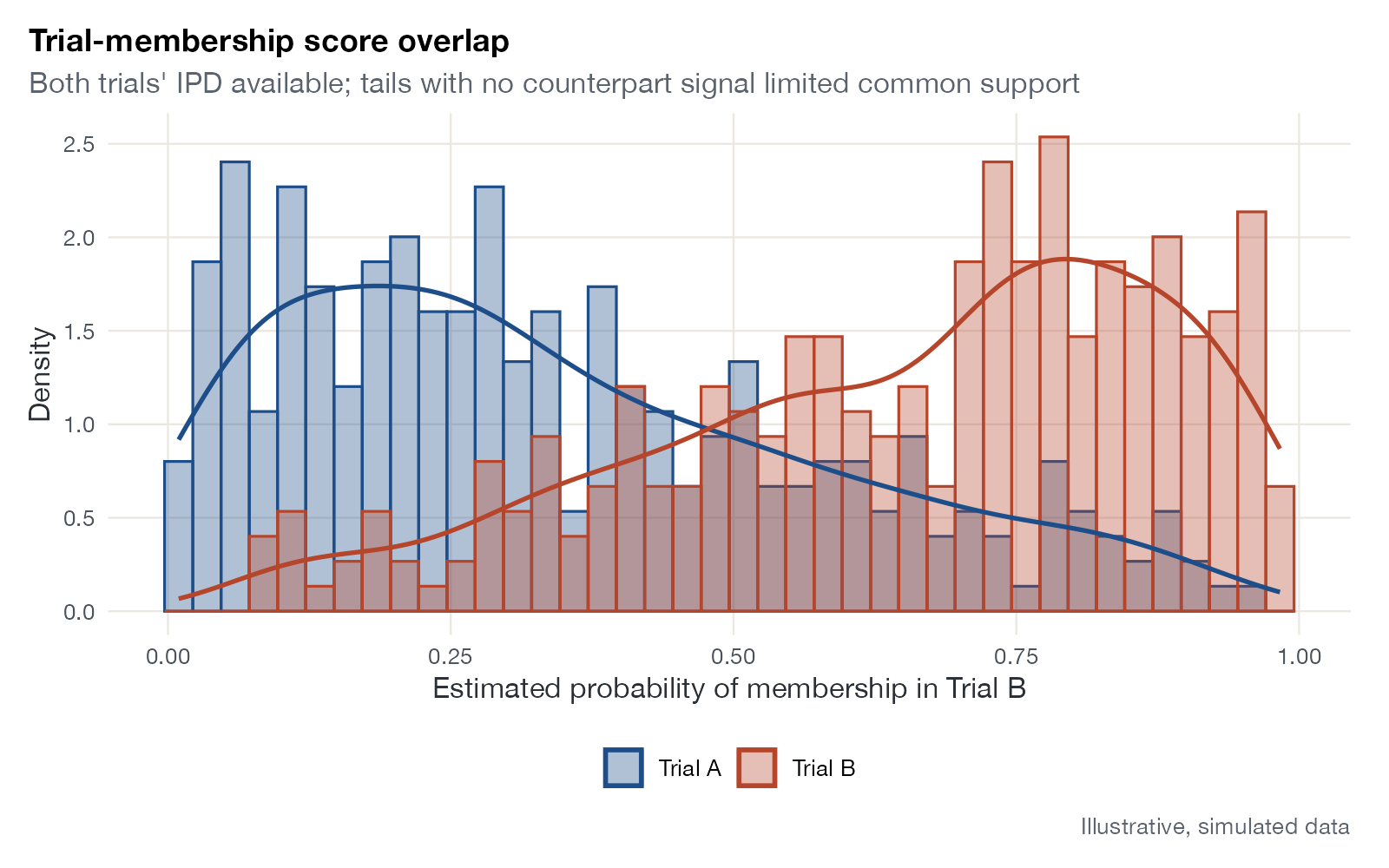
Trial-membership score overlap plot
Distributions of the estimated probability of belonging to one trial, drawn separately for each trial, to assess common support.
MAICSTCML-NMR
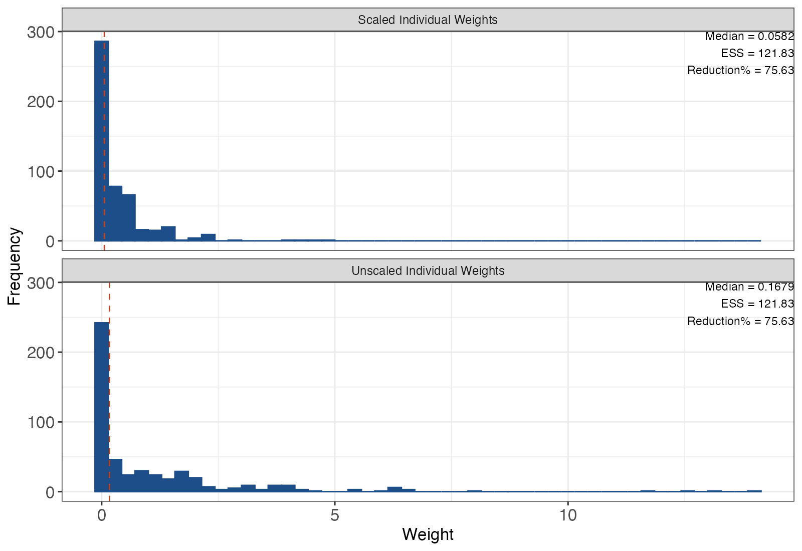
Weight distribution histogram
Distribution of MAIC weights across IPD participants, exposing extreme weights and loss of effective sample size.
MAIC
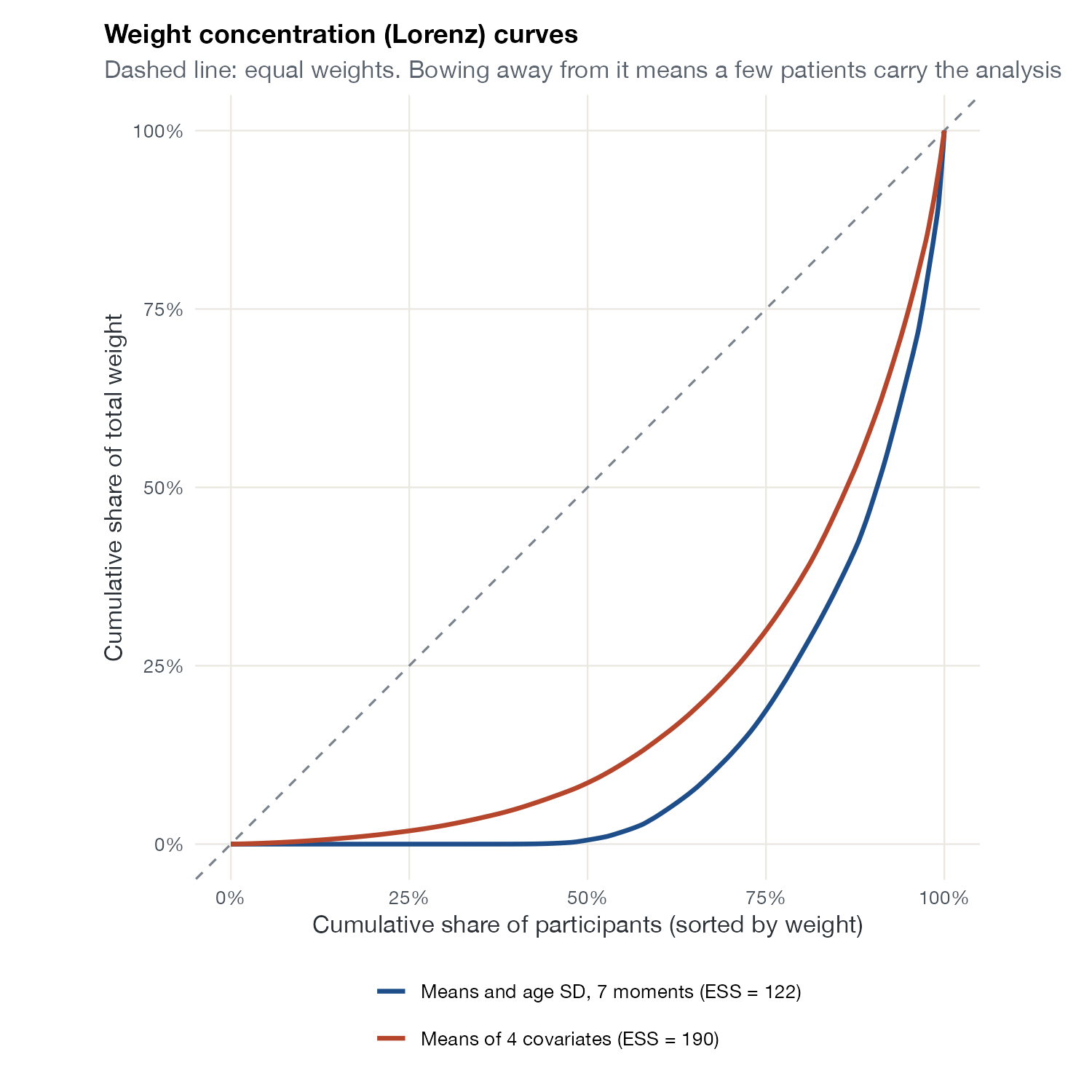
Weight concentration curve
The cumulative share of total weight against the cumulative share of participants, showing how few patients carry the weighted analysis.
MAIC
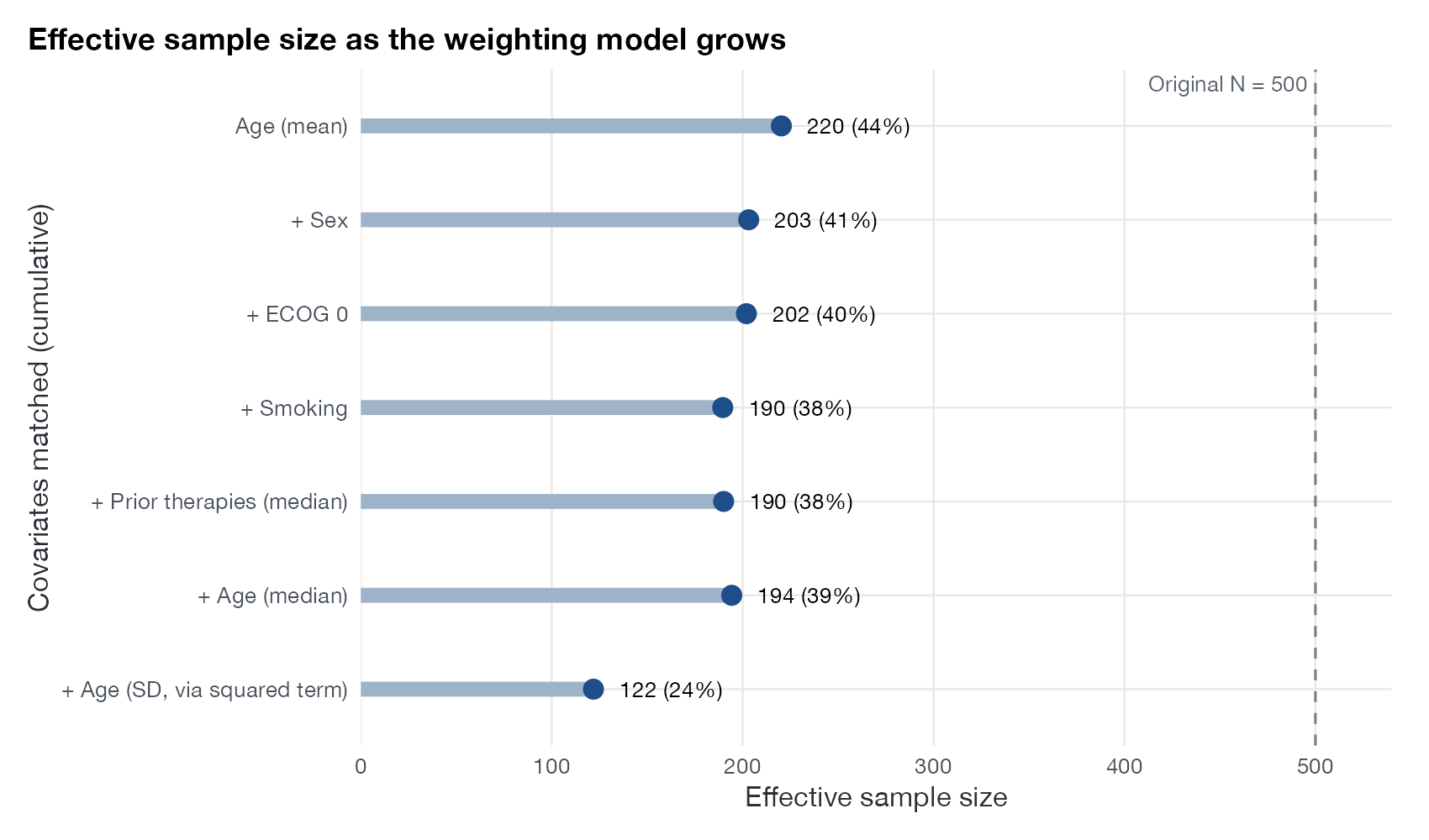
Effective sample size plot
Effective sample size after weighting, compared with the original sample size across weighting models or scenarios.
MAIC
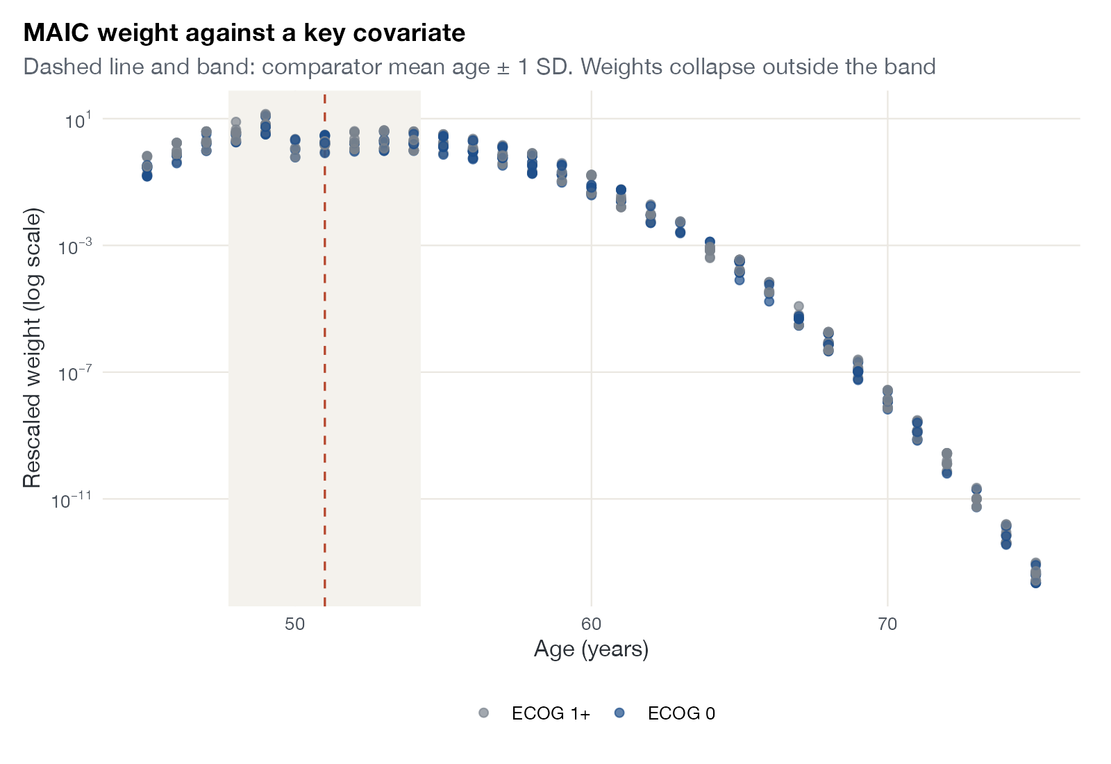
Weight versus covariate plot
MAIC weights plotted against a key covariate, revealing which regions of the IPD drive the weighted analysis.
MAIC
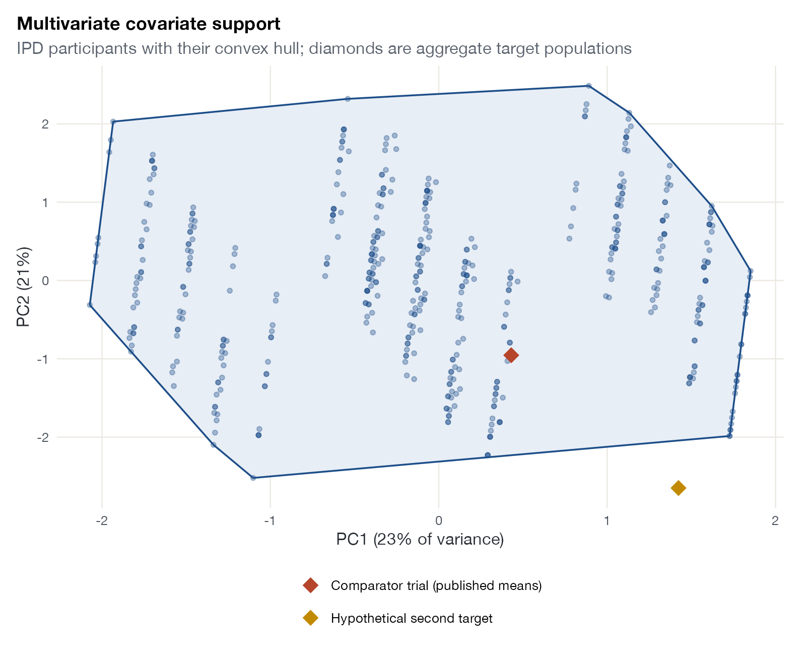
Multivariate support plot
IPD participants projected onto principal components with their convex hull, and target population means projected into the same space.
MAICSTCML-NMRML-UMR
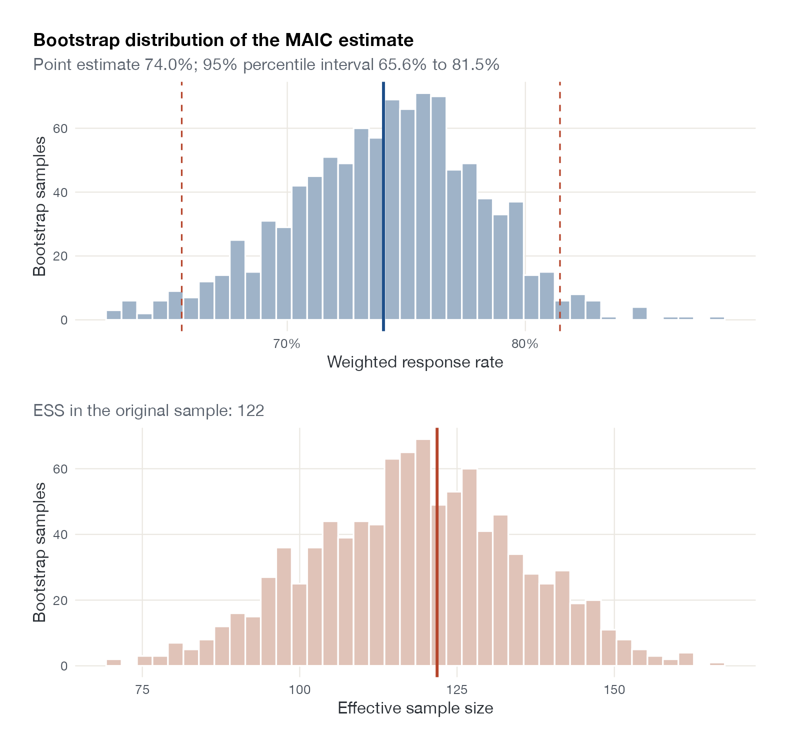
Bootstrap distribution plot
The distribution of the weighted estimate and of the effective sample size across bootstrap resamples with re-estimated weights.
MAICSTC

Outcome regression and transportability

STC and G-computation diagnostics: functional form, extrapolation, and effects in a target population.
Outcome model partial effect plot
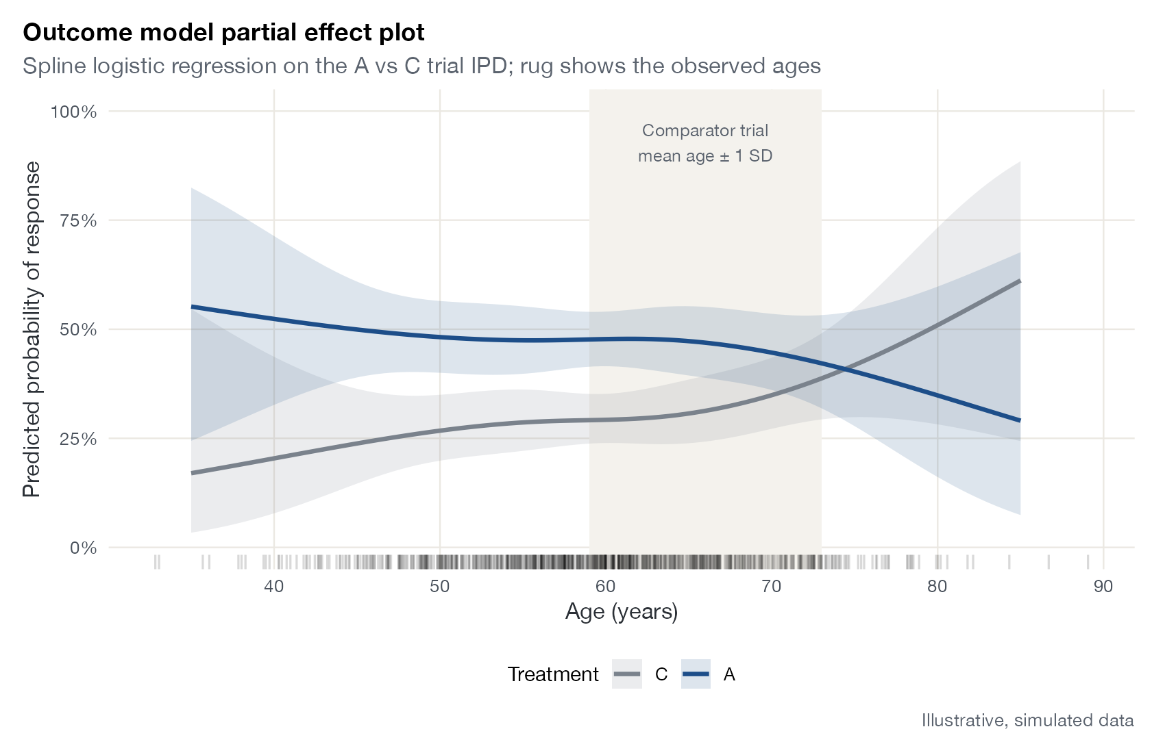
Predicted outcomes from an STC or G-computation outcome model across one covariate, for each treatment, with the observed covariate distribution and the target population marked.
STCML-NMRML-UMR
Marginal effect by target population
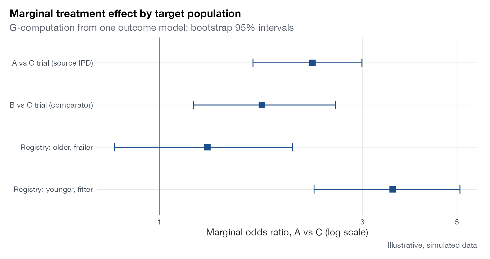
The marginal treatment effect standardized to several target populations, showing that with effect modification the effect is a property of the population.
STCML-NMRNMIML-UMR
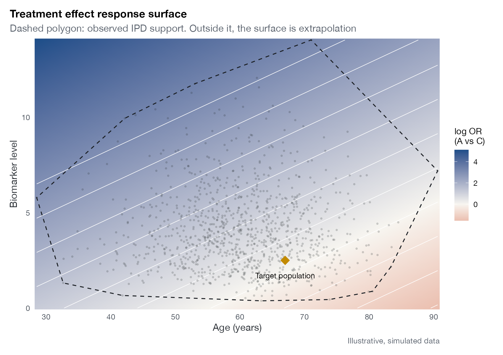
Treatment effect response surface
The conditional treatment effect over a grid of two effect modifiers, with the observed data support overlaid.
STCML-NMRML-UMR
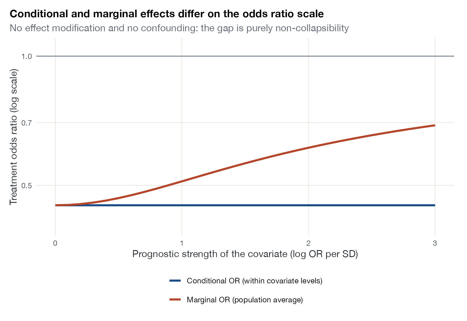
Conditional versus marginal effect plot
How the marginal odds ratio drifts away from a fixed conditional odds ratio as a prognostic covariate becomes stronger.
STCML-NMRML-UMRMAIC

Multilevel network meta-regression

ML-NMR graphics for mixed IPD and aggregate networks, numerical integration, and population-specific effects.
Mixed IPD and aggregate-data network plot
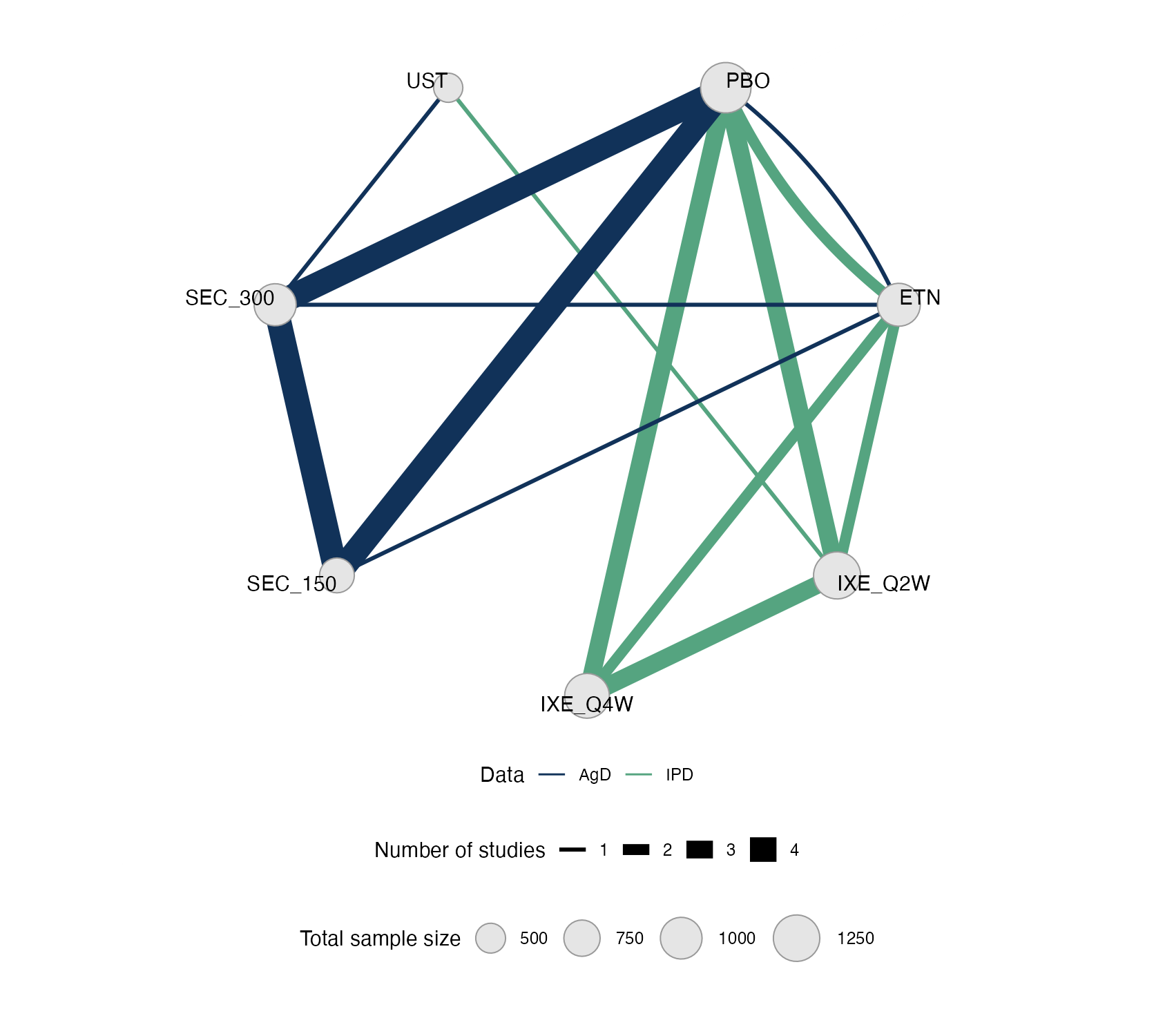
A network graph that distinguishes comparisons informed by individual patient data from those informed by aggregate data.
ML-NMRNMA
Integration error plot
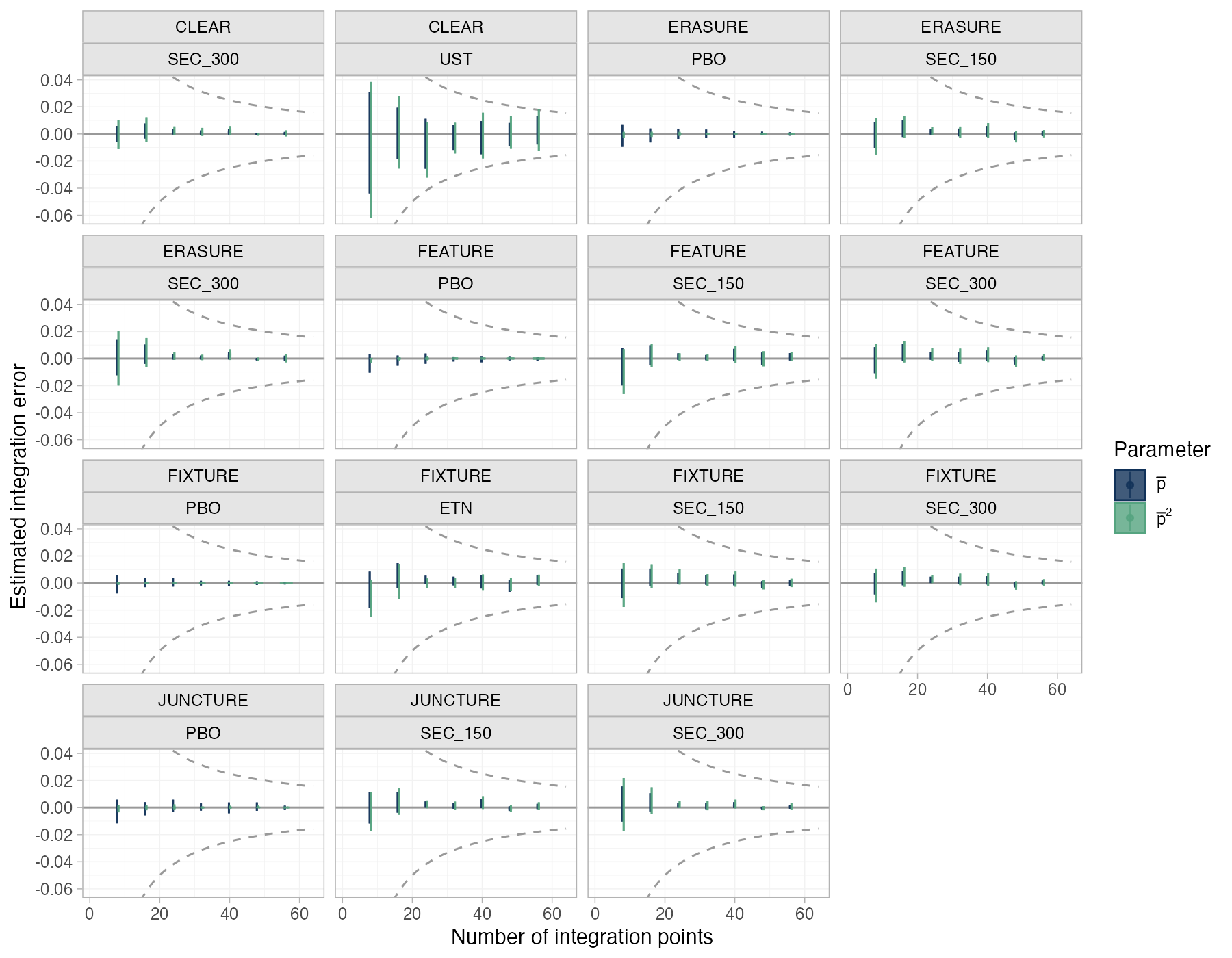
The estimated error of the quasi-Monte Carlo integration over each aggregate study's covariate distribution, as the number of integration points grows.
ML-NMR
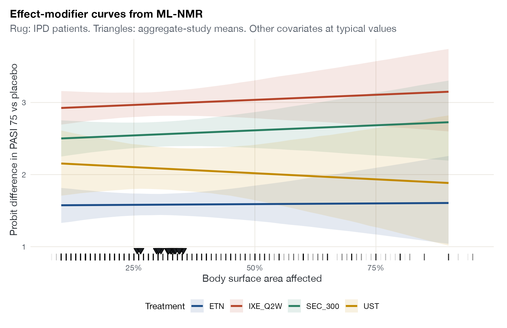
Effect-modifier curve
The conditional treatment effect against a covariate for each treatment, with the observed IPD and aggregate covariate values marked.
ML-NMRSTCNMIML-UMR
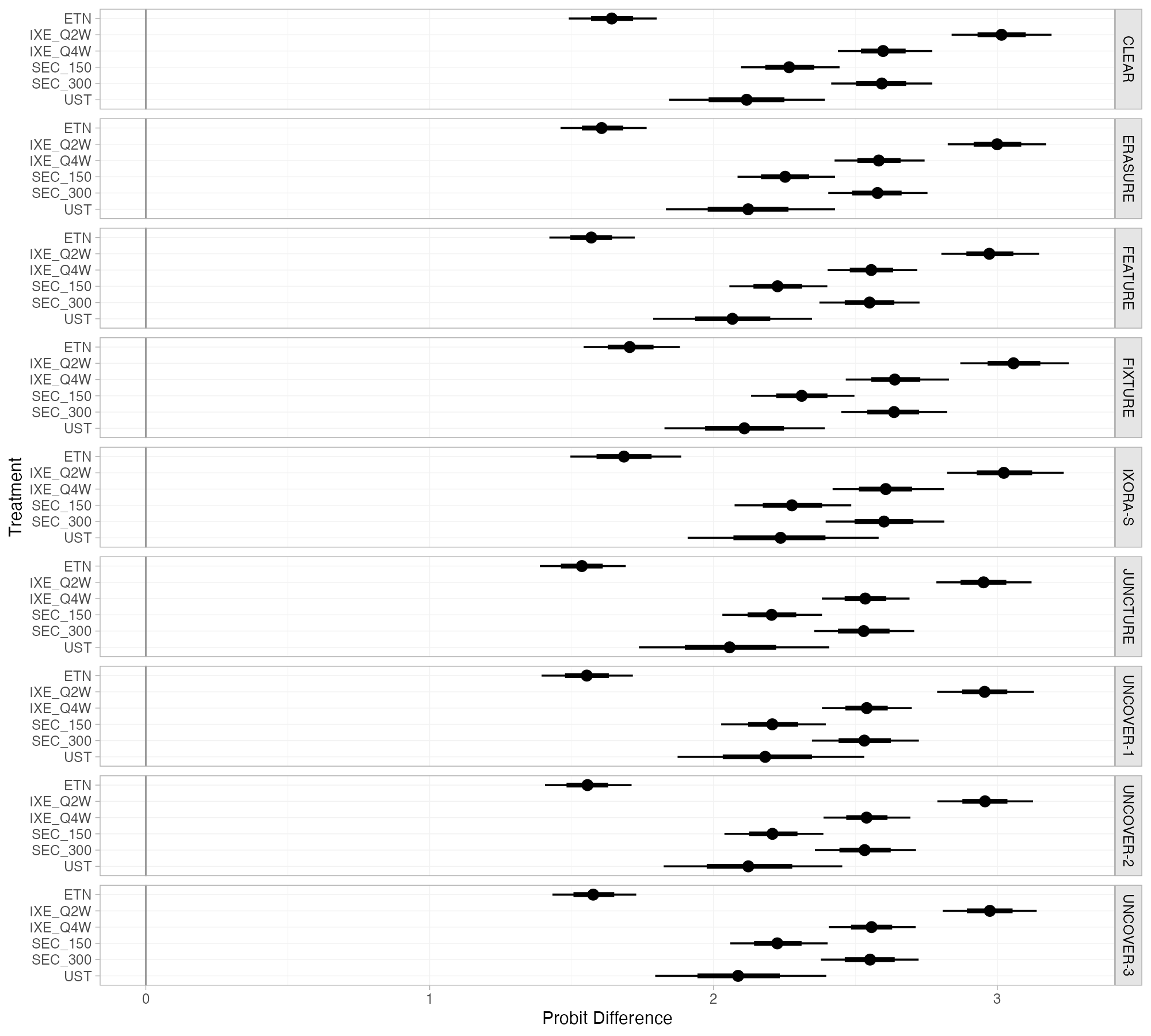
Population-specific relative effects
Population-average conditional relative effects against the reference for each treatment, in each study population of the network.
ML-NMR
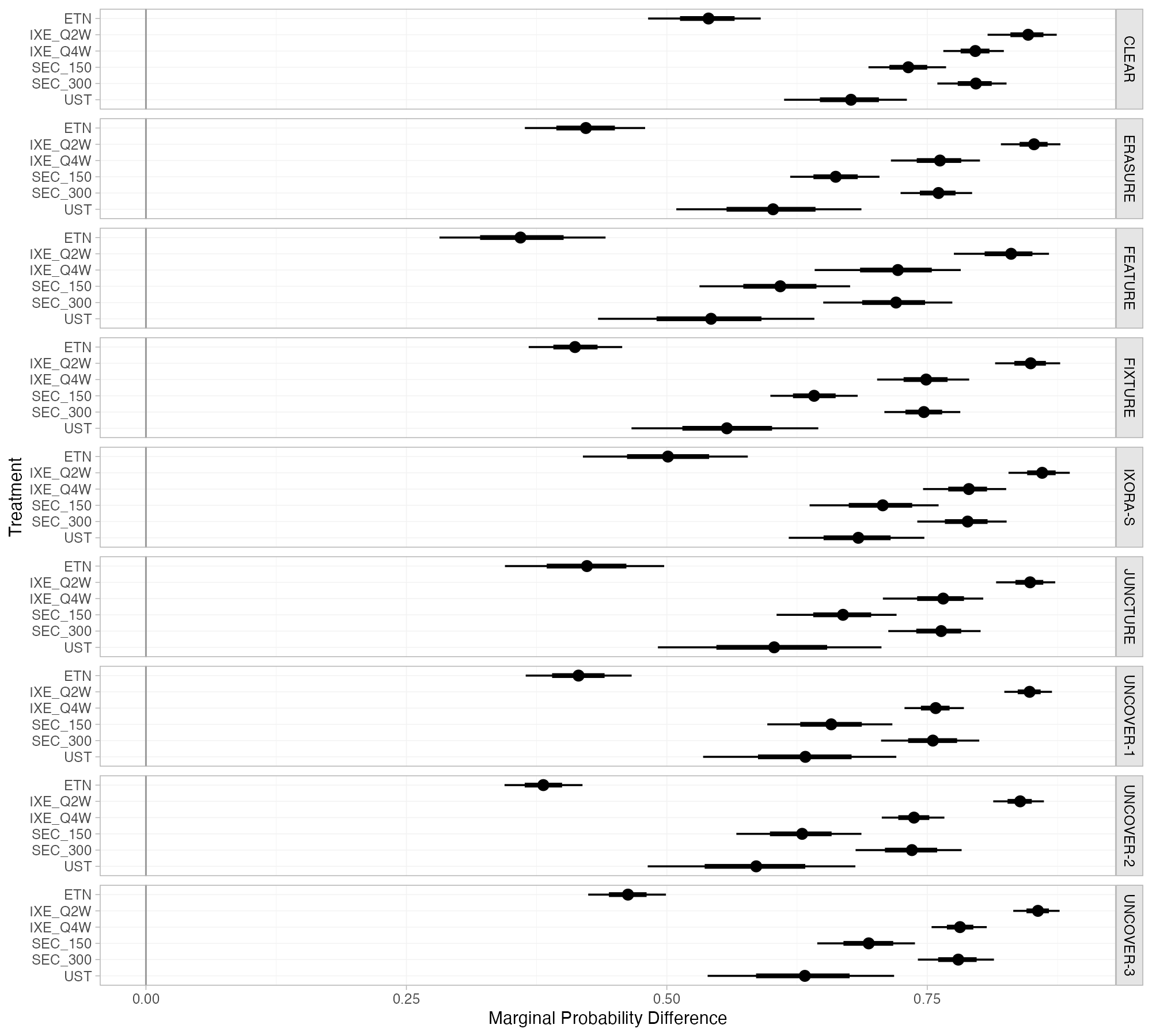
Marginal effects by study population
Marginal treatment effects against the reference, averaged over the covariate distribution of each study population, for every treatment in the network.
ML-NMRML-UMRSTC
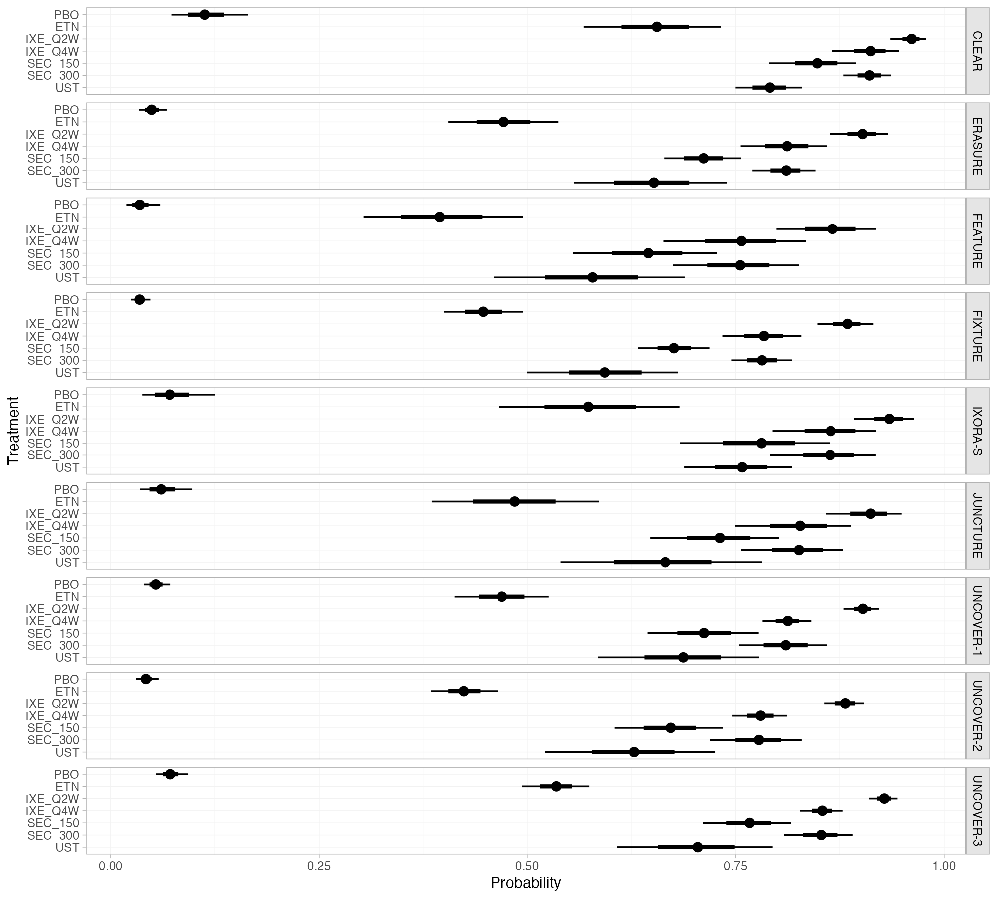
Predicted absolute outcomes by population
Predicted probability of the outcome on each treatment in each study population, including the reference treatment.
ML-NMRNMA

Network meta-interpolation

NMI graphics built on subgroup evidence and interpolation to a common effect-modifier value.
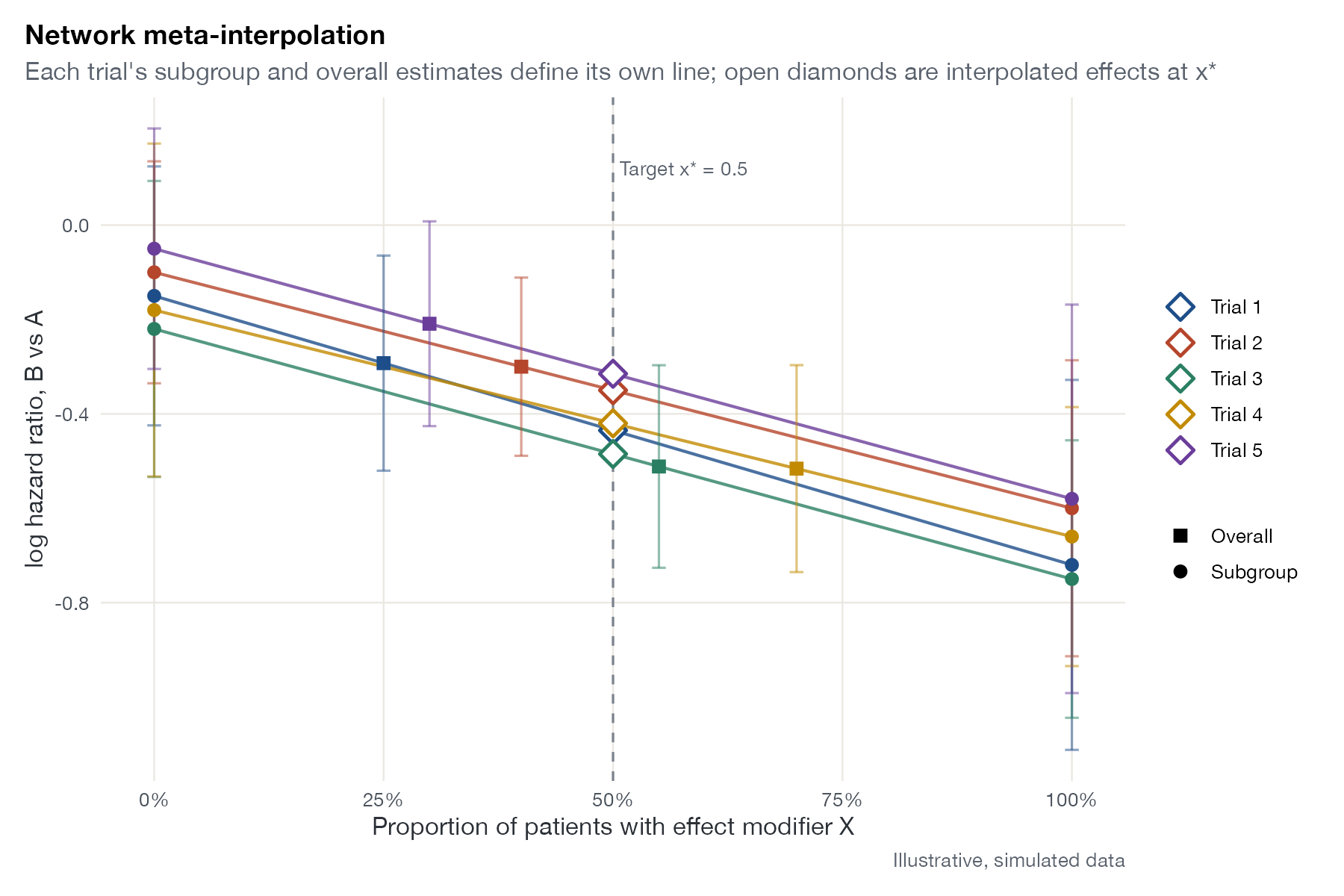
NMI interpolation plot
Each trial's overall and subgroup estimates plotted against effect-modifier prevalence, with lines interpolating every trial to a common target value.
NMI
Effect-modification comparison plot
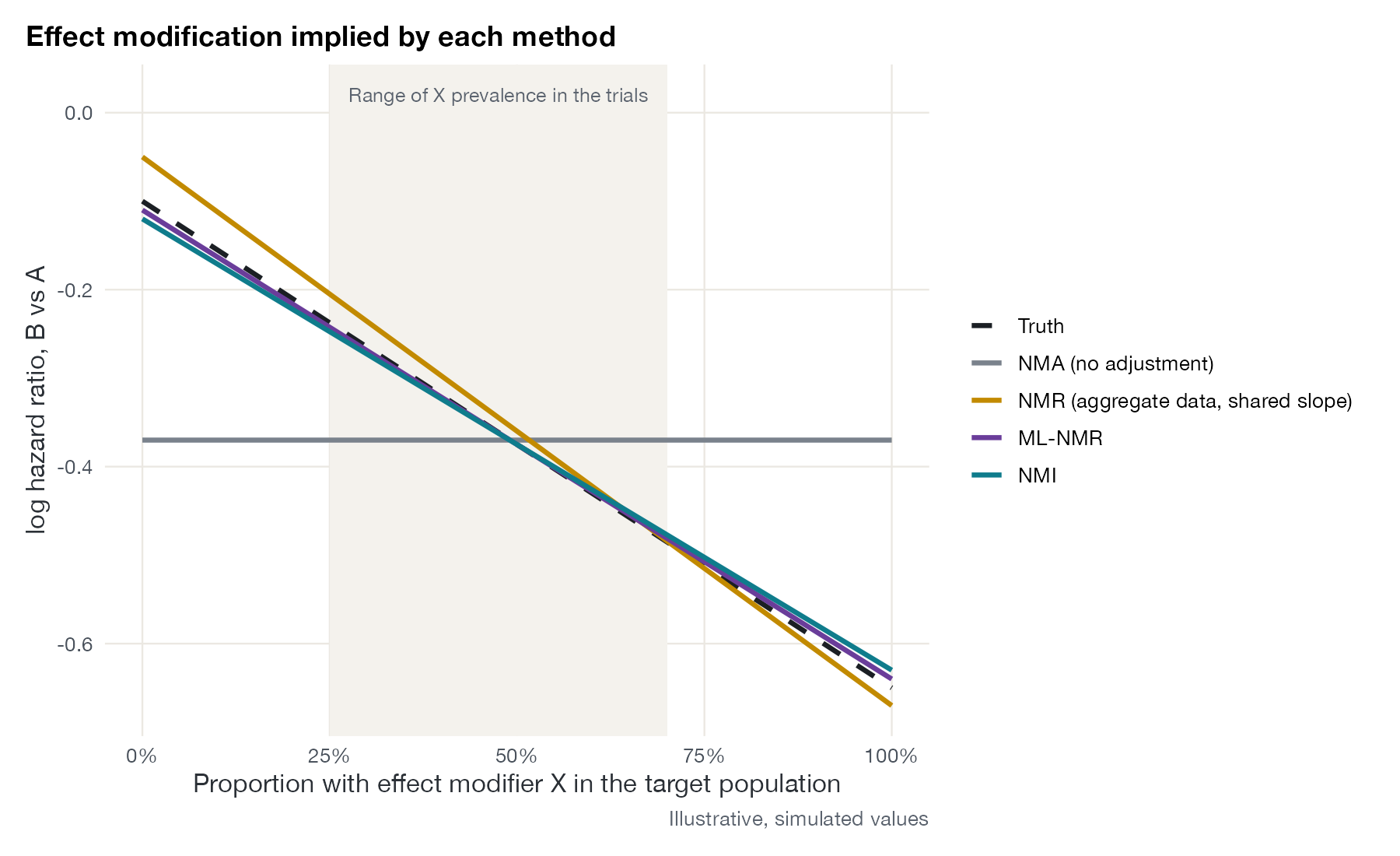
The treatment effect across values of an effect modifier as implied by each synthesis method, compared with the truth in a simulation.
NMIML-NMRNMA
Subgroup data availability matrix
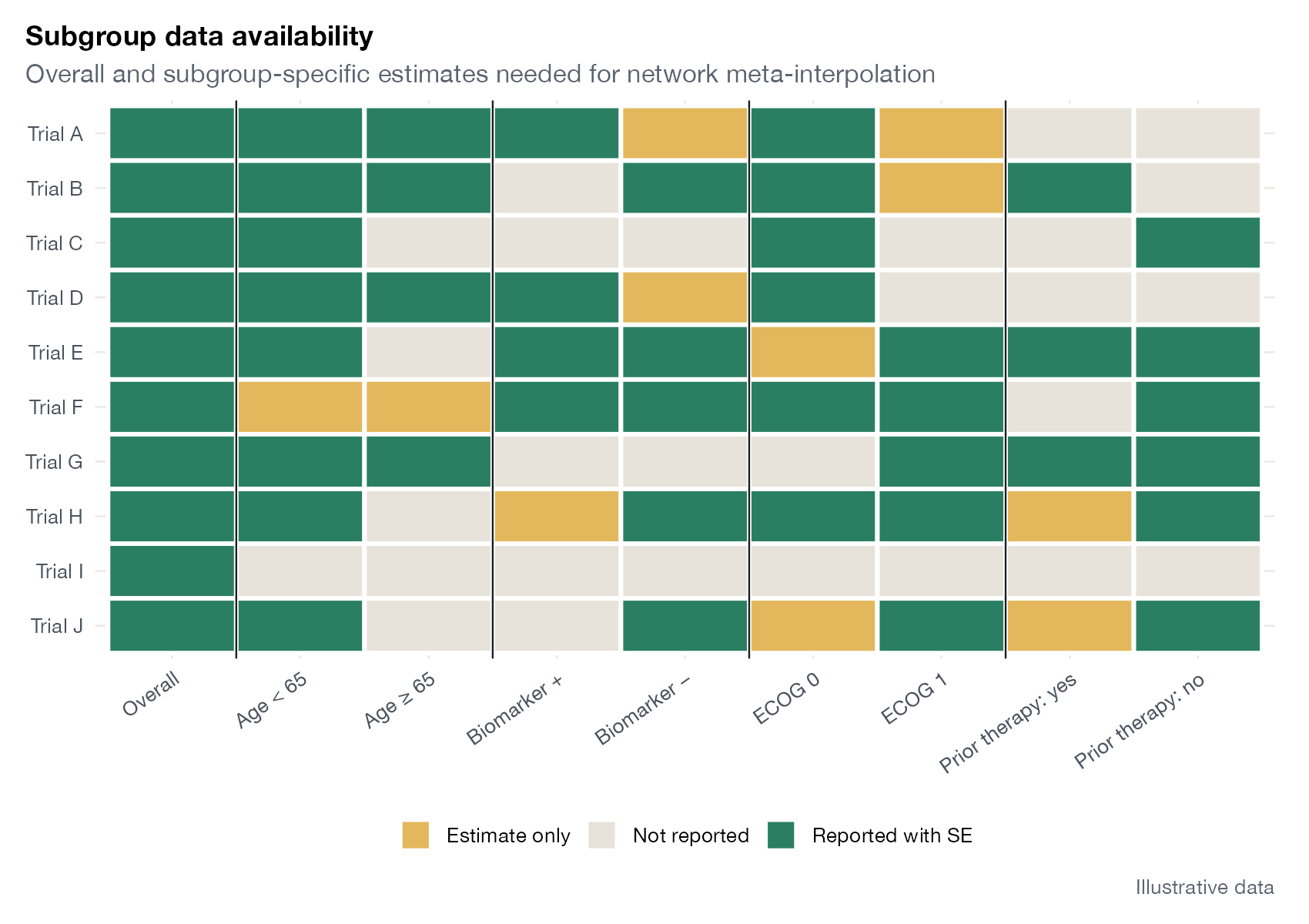
A trial-by-subgroup grid showing which overall and subgroup-specific estimates are reported, and whether they come with standard errors.
NMIML-NMR

Unanchored multilevel meta-regression

ML-UMR graphics for disconnected evidence, where prognostic modeling carries the whole comparison.
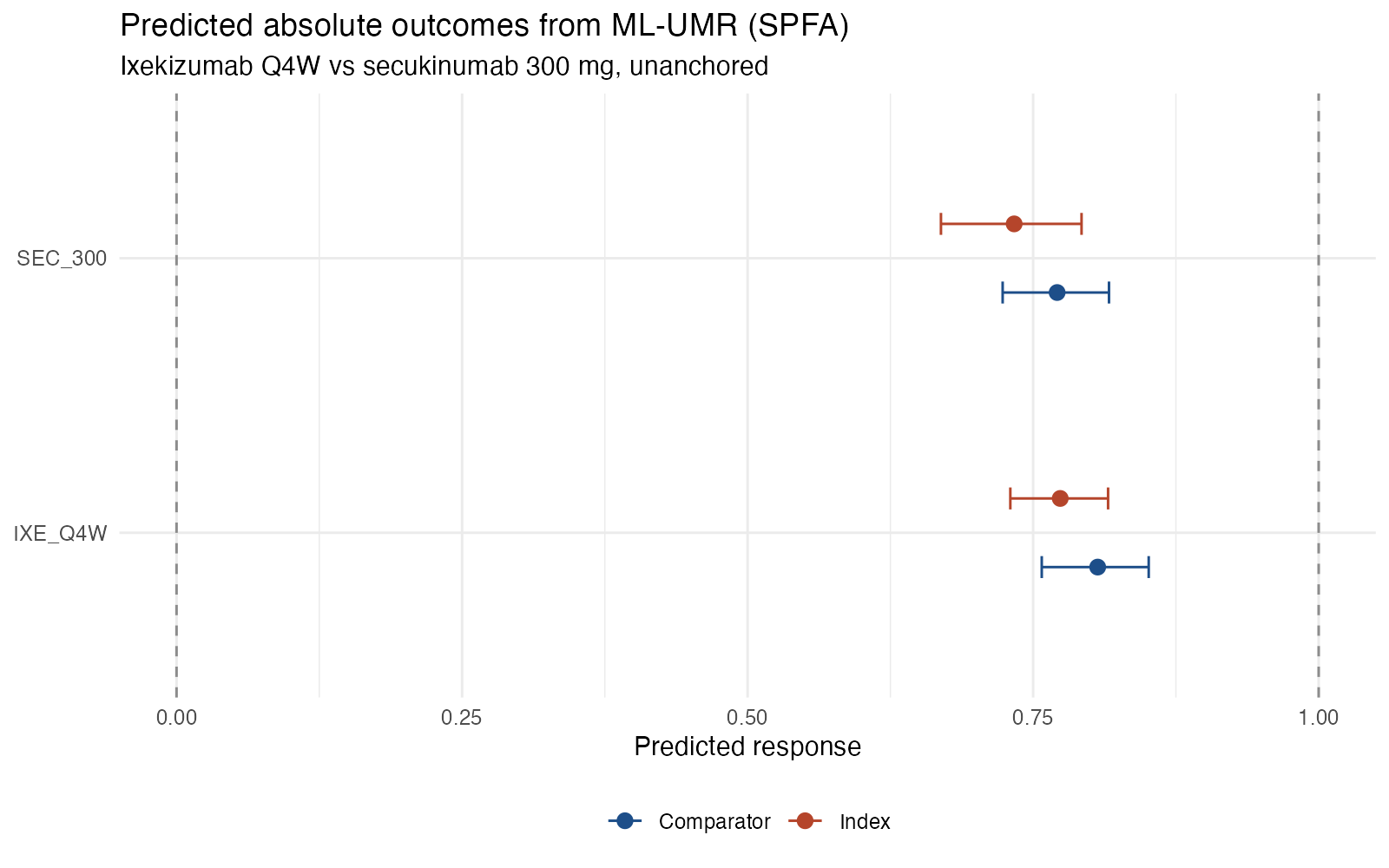
Absolute outcome plot
Posterior predicted outcome on each treatment, standardized to the index and comparator populations, from an unanchored ML-UMR model.
ML-UMRSTCML-NMR
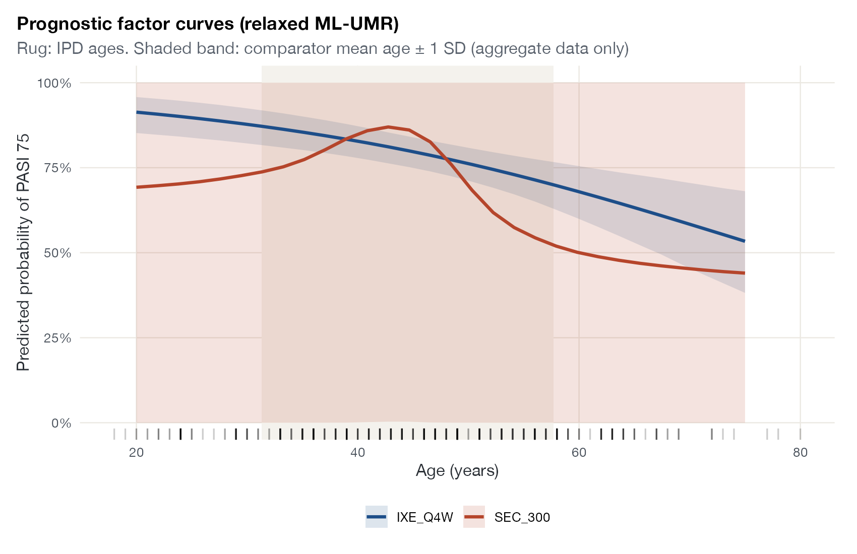
Prognostic factor curve
Predicted outcomes on each treatment across a prognostic factor, showing where the unanchored model is supported by data and where it is not.
ML-UMRSTC
Assumption sensitivity plot
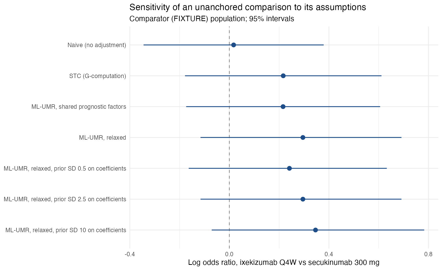
The same unanchored treatment effect under increasingly flexible assumptions and priors, stacked to show how much the answer depends on untestable choices.
ML-UMRMAICSTCML-NMR

Survival and time-to-event

Kaplan-Meier displays, proportional hazards checks, and time-varying effects across ITC methods.
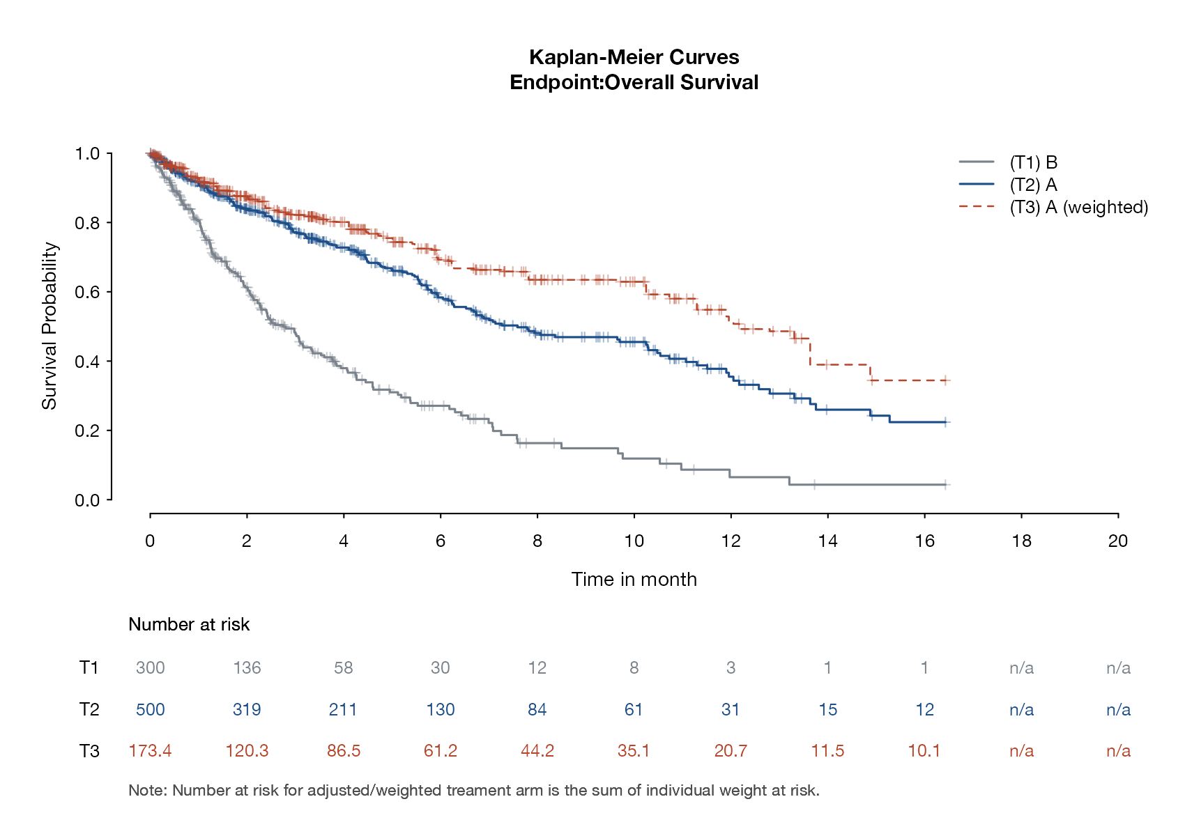
Weighted Kaplan-Meier plot
Kaplan-Meier curves for the IPD treatment before and after MAIC weighting, against the comparator's reconstructed curve.
MAIC
Fitted survival curves with Kaplan-Meier overlay
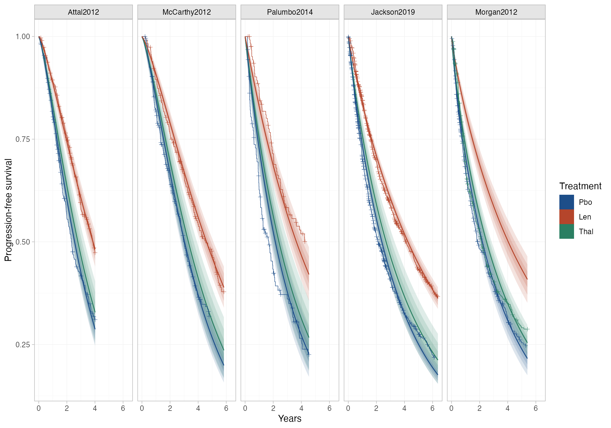
Survival curves predicted by a parametric NMA or ML-NMR model, overlaid on each study's observed Kaplan-Meier curves.
NMAML-NMRSTCMAICML-UMR
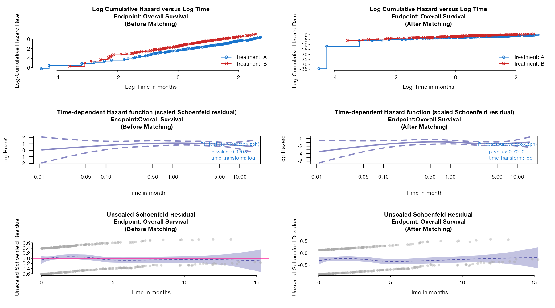
Proportional hazards diagnostic plots
Log cumulative hazard against log time and scaled Schoenfeld residuals over time, before and after weighting, to check proportional hazards.
MANMAMAICSTC
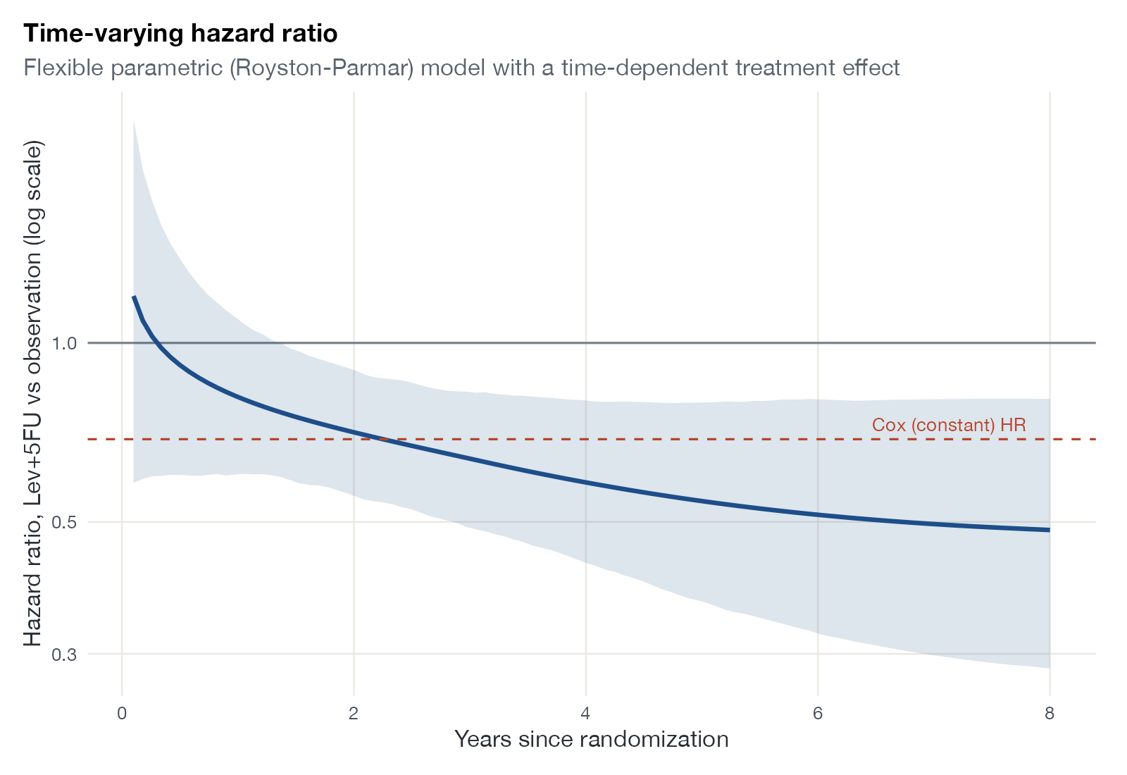
Time-varying hazard ratio plot
The hazard ratio as a function of time from a flexible survival model, compared with the constant hazard ratio from a Cox model.
MANMA
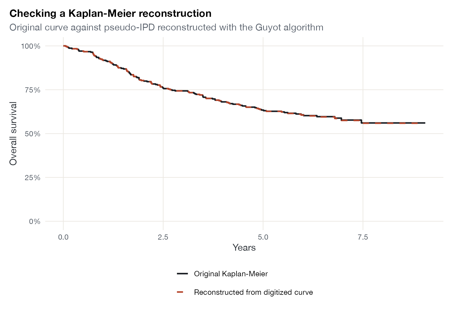
Kaplan-Meier reconstruction check
A published Kaplan-Meier curve overlaid with the curve rebuilt from reconstructed pseudo-IPD, to validate the reconstruction.
MAICSTCML-NMRML-UMRNMA

Diagnostic test accuracy

Paired sensitivity and specificity displays and summary ROC curves for DTA meta-analysis.
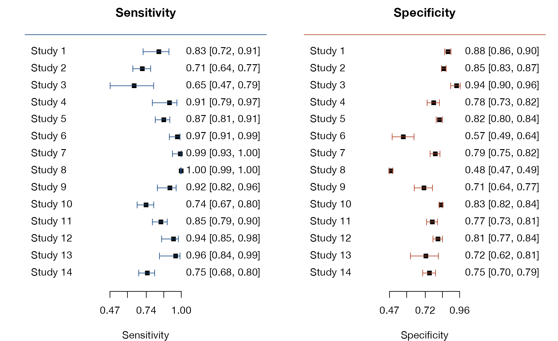
Paired forest plot of sensitivity and specificity
Side-by-side forest plots of each study's sensitivity and specificity with confidence intervals.
DTA
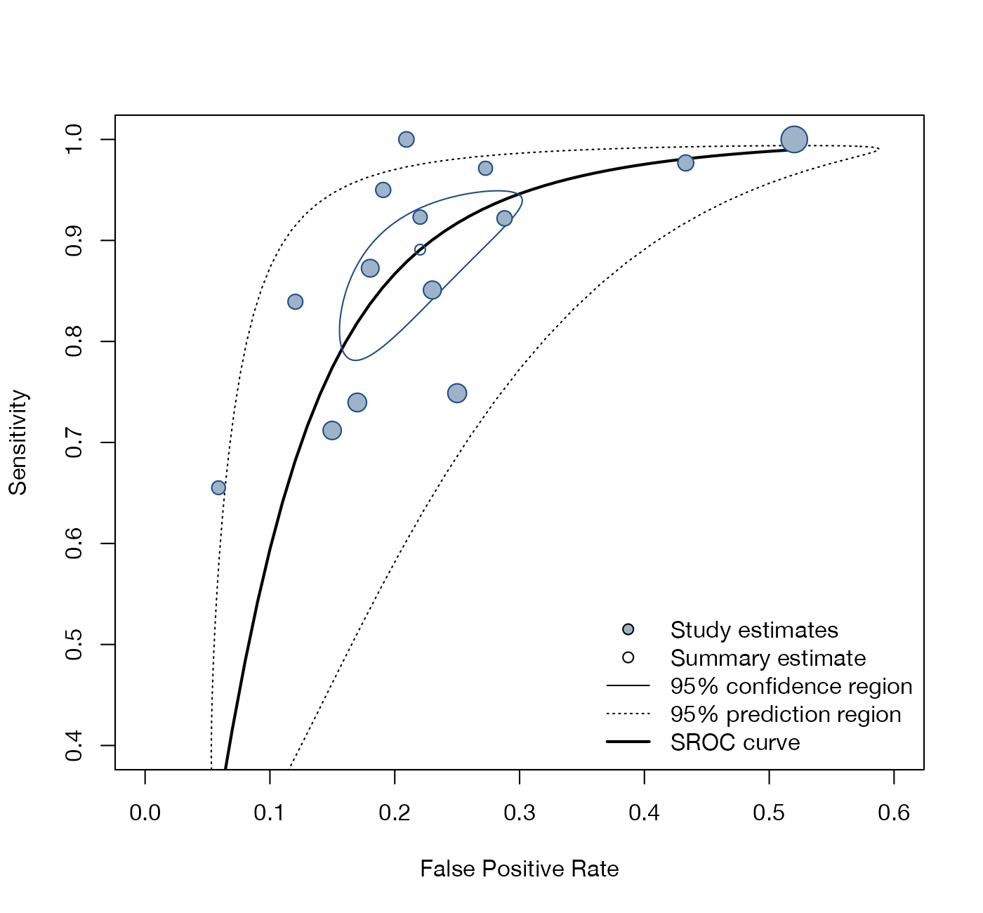
Summary ROC plot
Study estimates in ROC space with the bivariate summary point, its confidence and prediction regions, and the summary ROC curve.
DTA
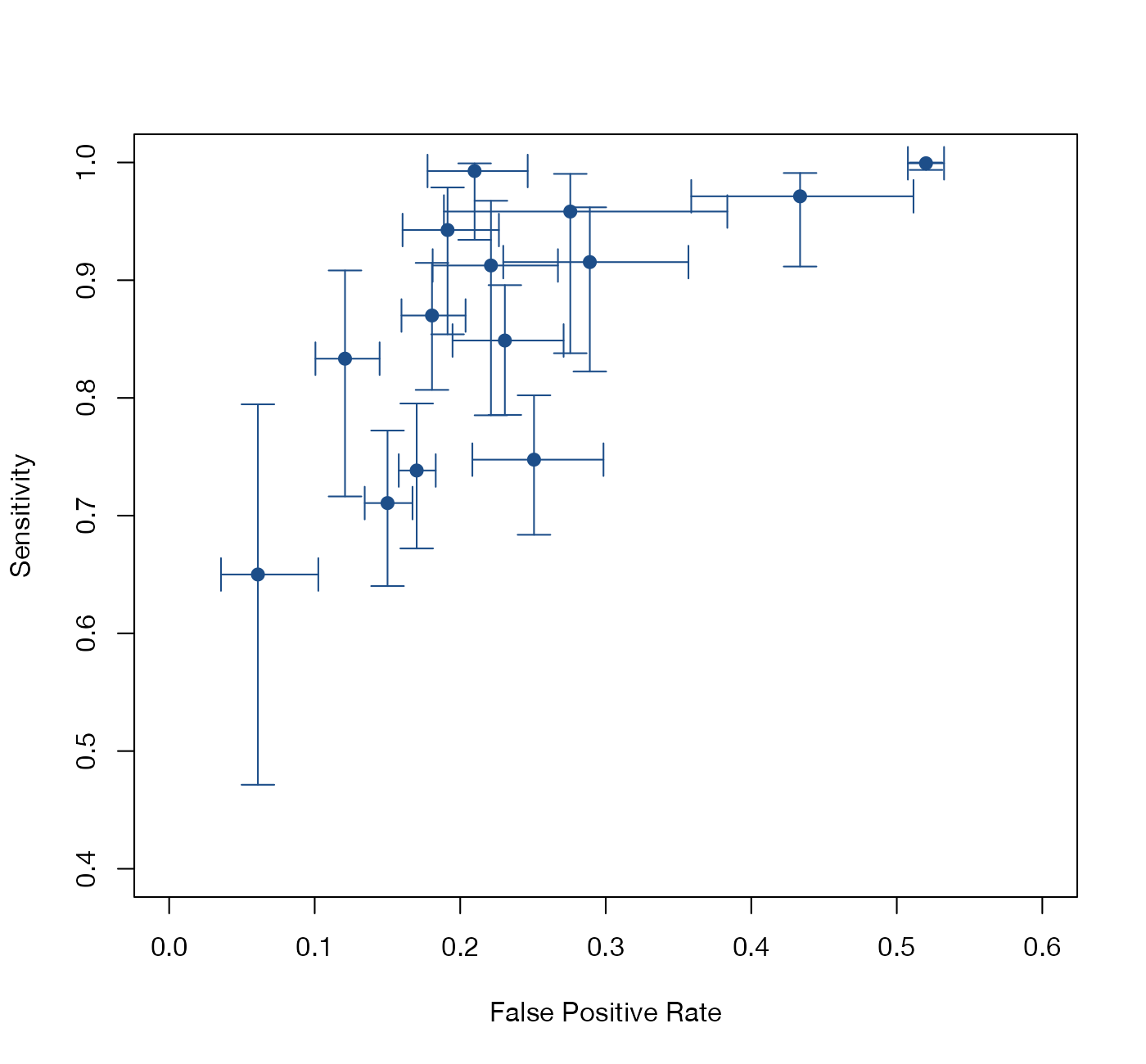
Crosshair plot
Each study in ROC space with confidence intervals for both its false positive rate and its sensitivity.
DTA

Synthesis without meta-analysis

Graphics for reviews where effect sizes cannot be pooled.
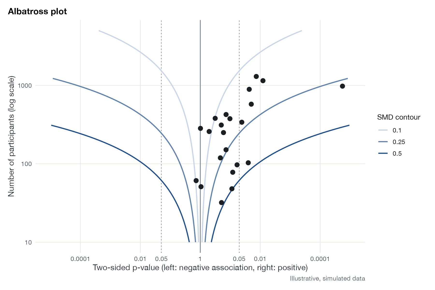
Albatross plot
Studies placed by their p-value and direction against sample size, over contours of standardized effect size, for reviews without pooled effect sizes.
MA
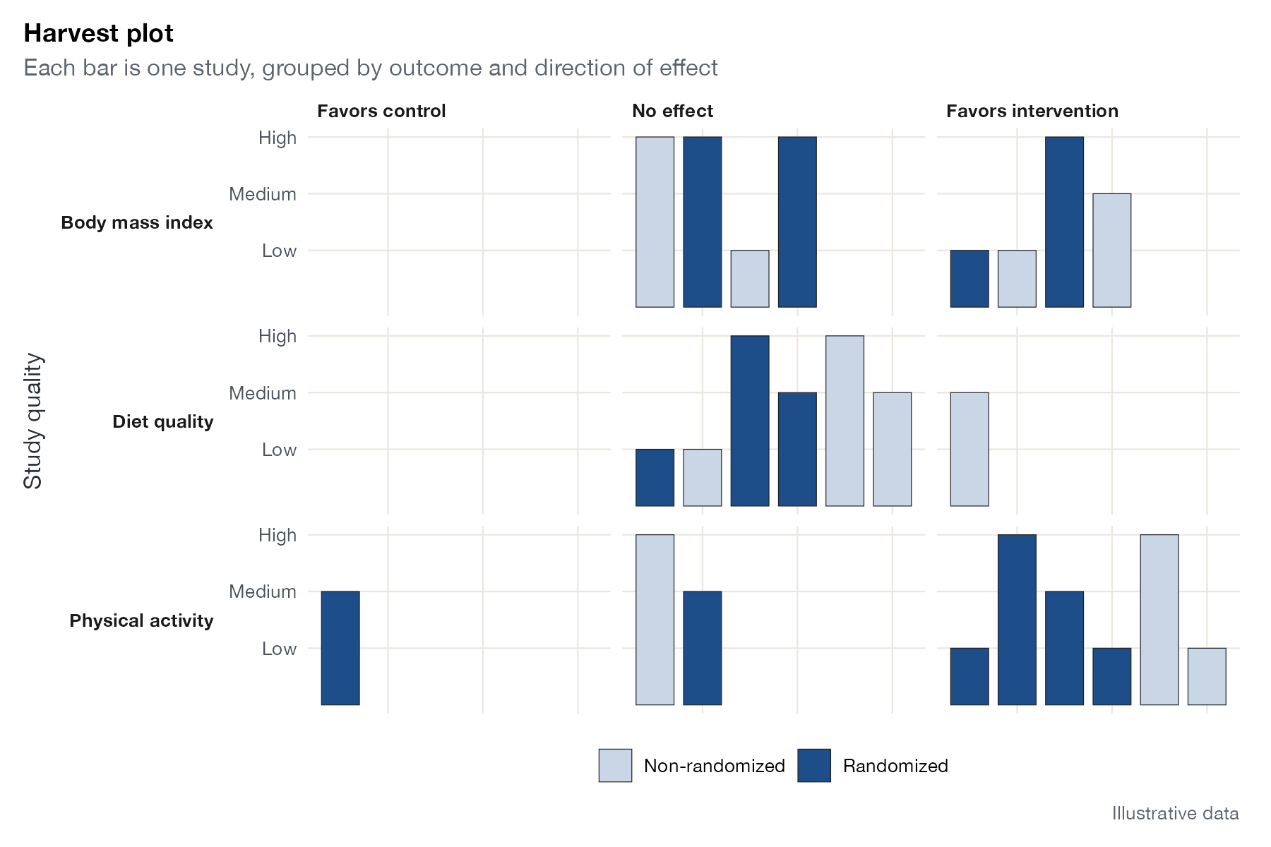
Harvest plot
One bar per study, grouped by outcome and direction of effect, with bar height and shading for study quality and design.
MA
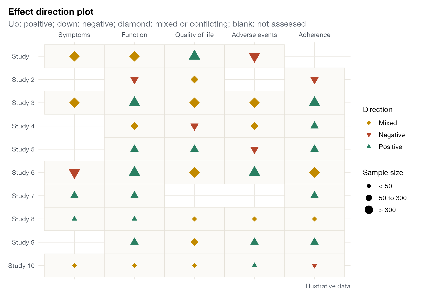
Effect direction plot
A study-by-outcome grid showing the direction of effect with arrows, sized by sample size.
MA

Risk of bias and reporting

Study-level quality displays that accompany the quantitative synthesis.
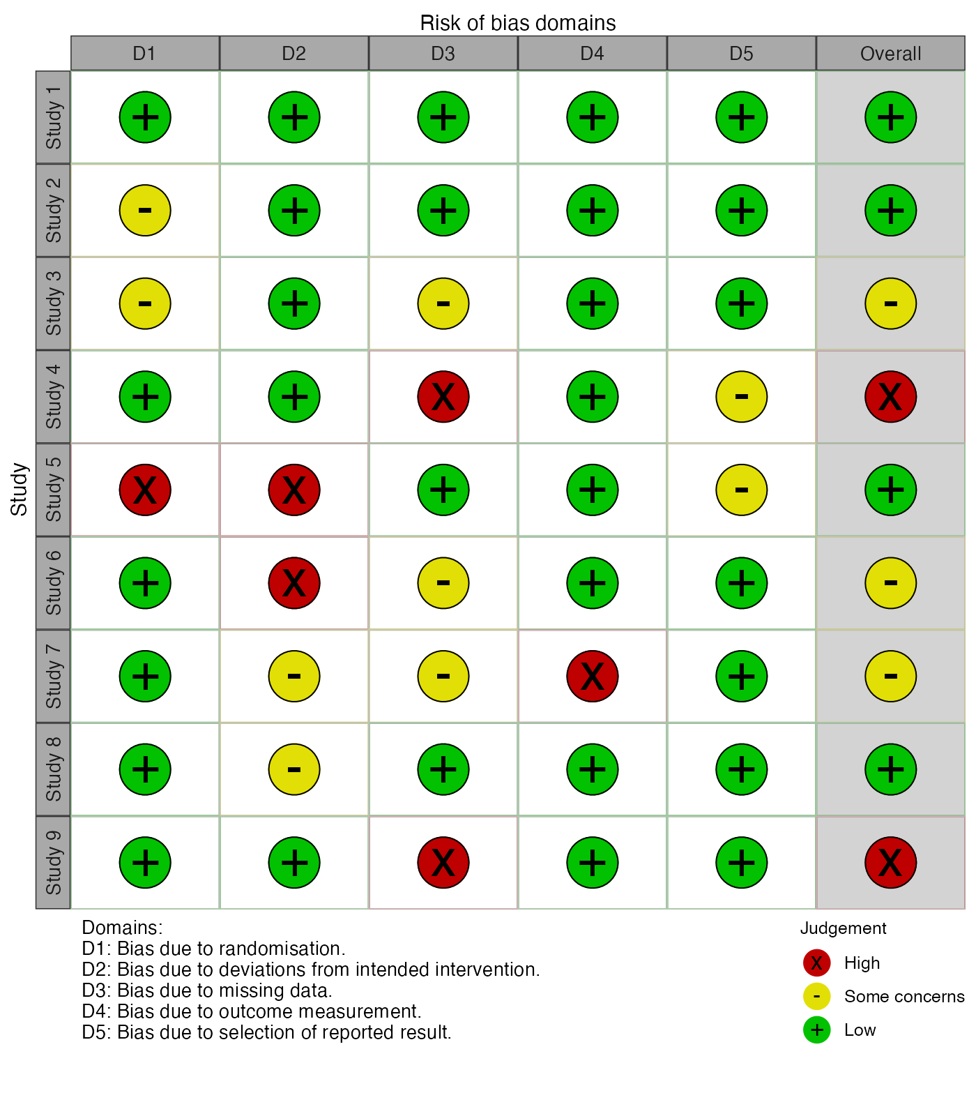
Risk-of-bias traffic light plot
A grid of studies by risk-of-bias domains, with colored symbols for each judgment.
MANMA
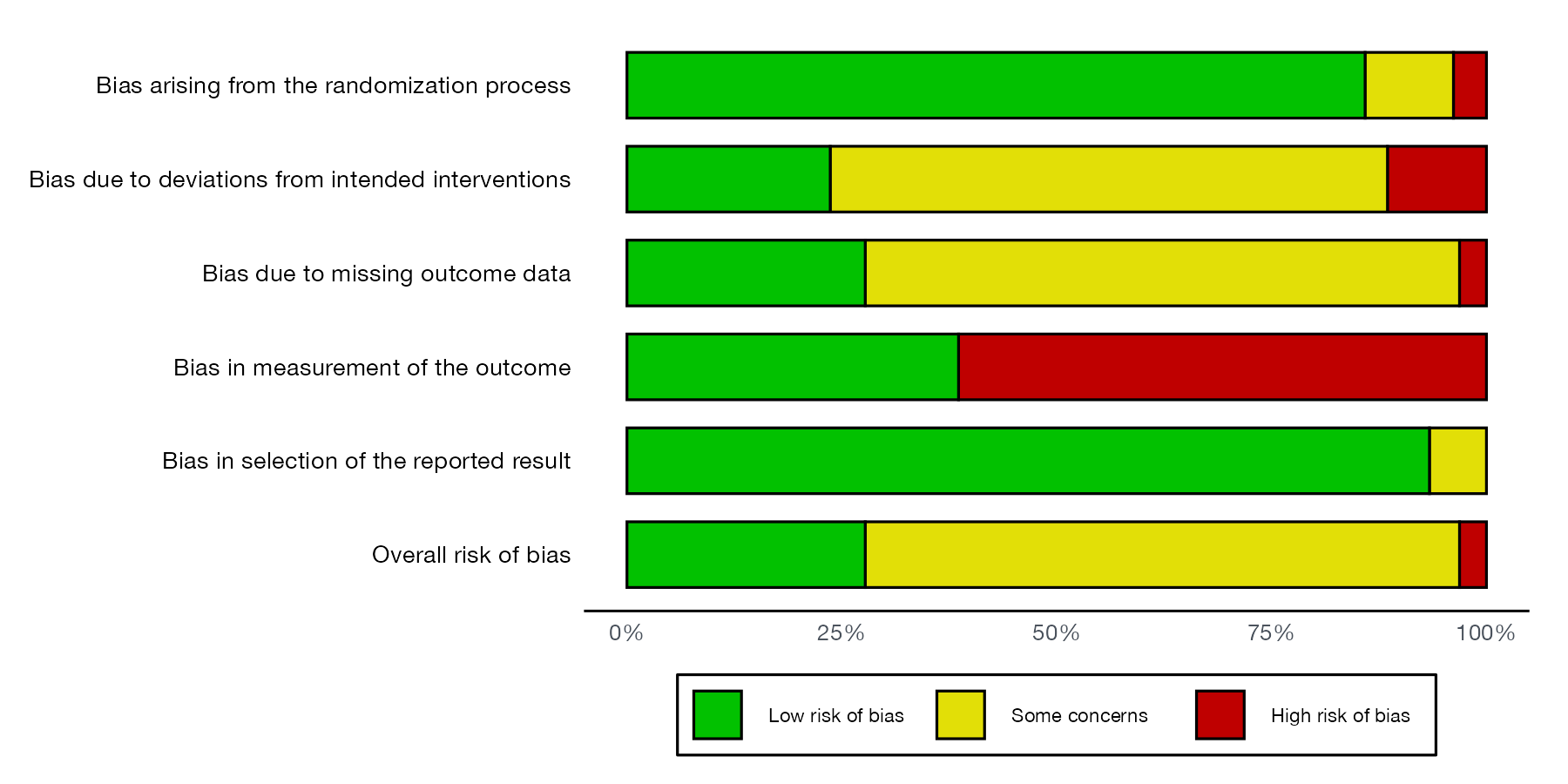
Risk-of-bias summary plot
Stacked bars showing the proportion of studies, or of statistical information, at each level of risk in each domain.
MANMA
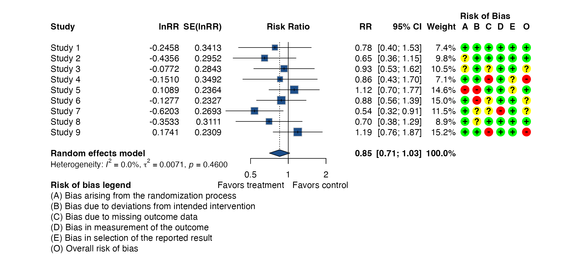
Forest plot with risk-of-bias columns
A forest plot with a traffic-light column for each risk-of-bias domain beside every study.
MA

Simulation and method evaluation

Graphics from the proof-of-concept literature that evaluates methods under known truth.
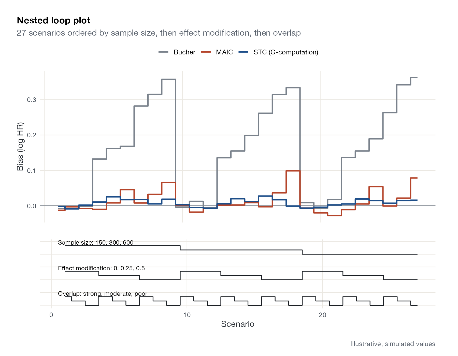
Nested loop plot
Performance of several methods across every scenario of a factorial simulation study, with scenarios ordered in nested loops and their factor levels drawn underneath.
MAICSTCML-NMRNMIML-UMR
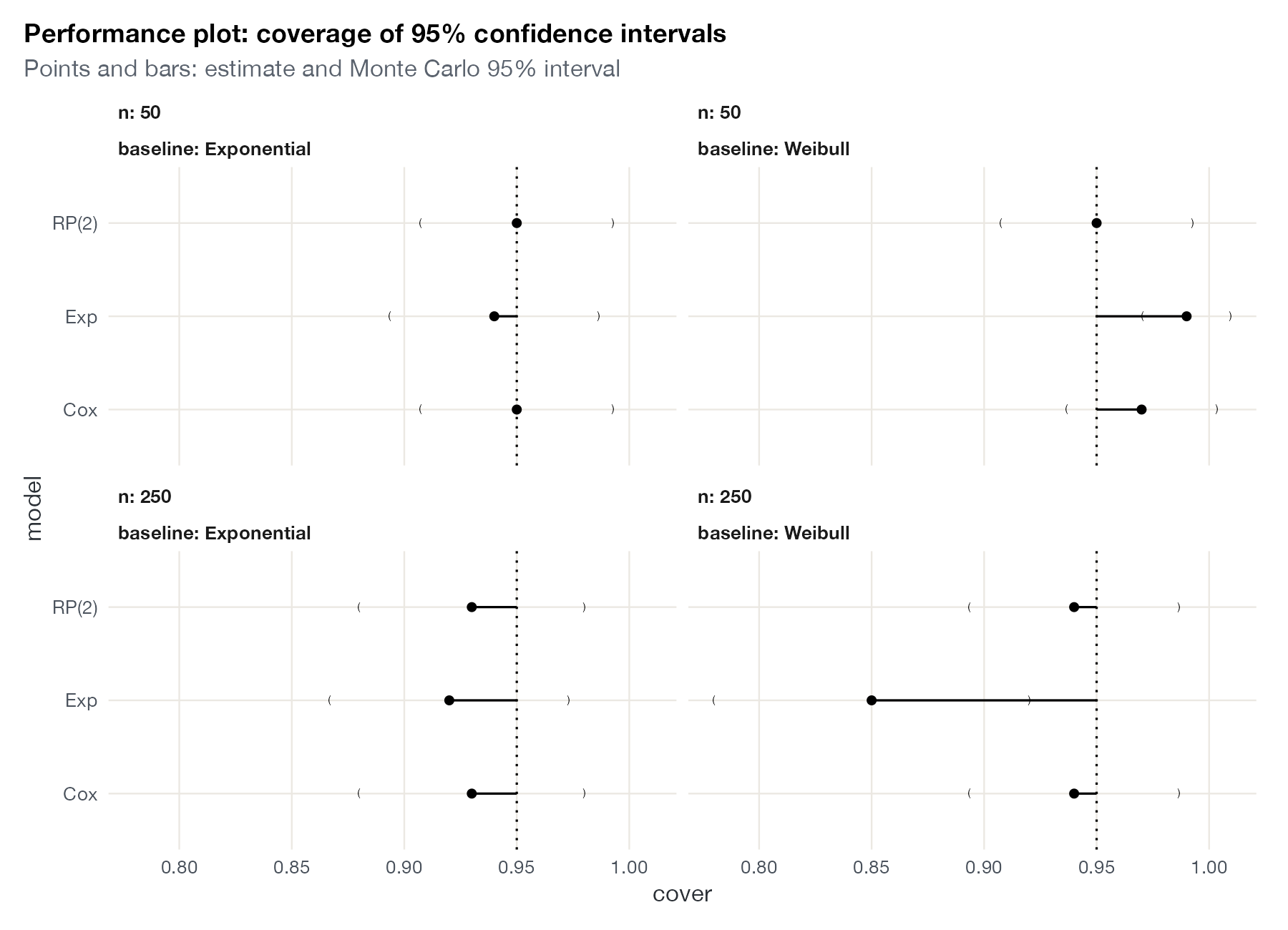
Simulation performance plot
A performance measure for each method and scenario of a simulation study, with Monte Carlo uncertainty intervals.
MANMAMAICSTCML-NMRNMIML-UMR
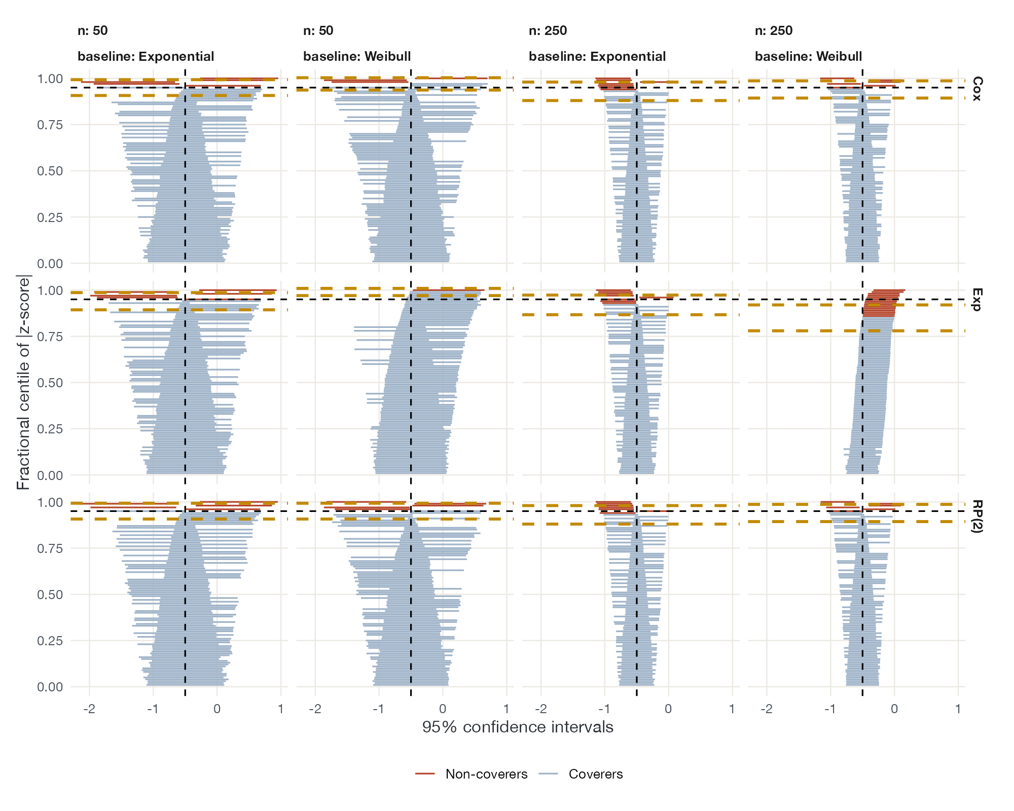
Zip plot
Every replication's confidence interval, ranked by how far its estimate lies from the truth, showing which intervals fail to cover.
MANMAMAICSTCML-NMRNMIML-UMR

No plots match this filter. Try another method or search term.

No matching items

MetaPlots · MIT License


Built with Quarto and R