Presentation quality charts built on ggplot2 that the package itself does not provide. There are fifteen so far:
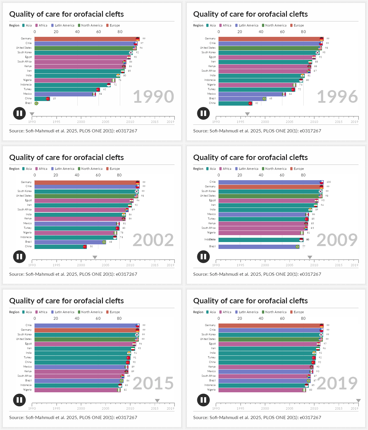
- Bar chart races: an animation of a ranking that changes over time, of the kind used to summarize long panels in talks, teaching material and journal supplements.
- Interactive causal diagrams: a directed acyclic graph in which every node and arrow carries its rationale and references, shown on hover and opened in full on click, and which can show the paths an adjustment set leaves open.
- Interactive network plots: the network of a network meta-analysis, with the baseline characteristics and outcomes of every arm behind each treatment and comparison.
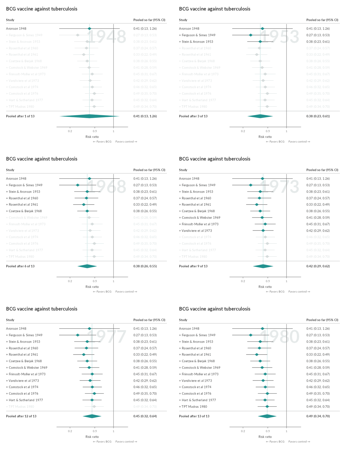
- Interactive forest plots: a meta-analysis with each study’s record and risk of bias traffic lights, and a cumulative replay as an animation.
- League tables: every estimate of a network meta-analysis, with its direct and indirect evidence, where that evidence flows from, and a ranking of the treatments.
- Confidence in a network meta-analysis: five plots that follow CINeMA, from a league table with a confidence profile in every cell to the studies each estimate rests on, estimates against a movable range of little difference, and direct against indirect evidence.
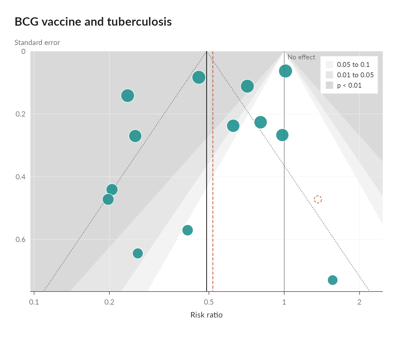
- Funnel plots: small-study effects with significance contours, the pooled estimate without each study, trim and fill and the tests for asymmetry.
- Kaplan-Meier plots: survival curves that read every group, and the hazard ratio, at any time under the pointer, with a linked risk table, proportional hazards tests and the restricted mean survival time up to a movable horizon.
- Swimmer plots: one lane per patient, with responses, progression and death along it, that reorders on demand, with a waterfall of best change and each patient’s course linked to the lanes.
- Responder thresholds: the whole distribution of change by arm, the responders at a prespecified threshold and the difference at every other.
- Diagnostic thresholds: what the cutoff of a test means for 1,000 people at any prevalence, beside the distributions, the ROC curve and the predictive values.
- Bias and tipping points: how strong unmeasured confounding would have to be to change a conclusion, with E-values and measured benchmarks.
- A multiverse of analyses: every defensible analysis of one question as a specification curve, with the choices that move it.
- Nomograms: any regression model, from logistic and Cox to mixed, ordinal and multinomial models, as a nomogram whose handles move, with the prediction and its confidence interval computed in the page.
- Choropleth maps: a map of the world, or of any ‘sf’ map, that steps or plays through the years, with several measures side by side for the same year.
All fifteen are drawn as ordinary ggplot objects. Nothing is hidden behind a separate rendering engine, so a frame or a diagram can be inspected, modified or saved on its own.
Installation
# install.packages("remotes")
remotes::install_github("choxos/ggextreme")
Writing output requires an encoder: gifski or magick for GIF, av or an ffmpeg binary for MP4. Images on the bars require magick.
Bar chart races
ggrace() takes long data with one row per entity per time point, and three bare column names for the value, the label and the time.
library(ggextreme)

race <- ggrace(
  clefts_qci,
  value = qci,
  name = country,
  time = year,
  top_n = 15,
  duration = 15,
  title = "Quality of care for orofacial clefts",
  caption = "Source: Sofi-Mahmudi et al. 2025, PLOS ONE 20(1): e0317267"
)

race                            # plays in the page, as an interactive widget
graph_save(race, "race.html")   # the same, as a single web page
race_frame(race, 200)           # one frame, as a ggplot
animate_race(race, "race.mp4")  # draw every frame and encode
Printed, the race plays like the package’s other interactive graphs: the card’s round button plays and pauses it, the timeline seeks, and hovering over a bar shows its value and rank, while a click follows it through the race.
time may be numeric or a Date. Each entity and time pair must appear once; a repeat is an error rather than a silent average. The encoder is chosen from the file extension, and frames are drawn across cores by default.
Selected arguments:
| argument | effect |
|---|---|
top_n |
number of bars visible at once |
duration, fps, end_pause
|
length in seconds, frame rate, hold on the final frame |
swap |
seconds a bar takes to move into a new rank |
group |
color bars by category and draw a legend |
palette, breaks
|
bar colors; gridline positions |
label_value, label_time
|
formatters for the bar numbers and the time label |
images |
pictures placed at the end of the bars |
timeline, play_button, card
|
optional chrome around the plot |
width, res
|
output size; the layout scales with width
|
Coloring by group
Passing a group column colors the bars by category rather than individually and draws a legend above the axis. Each entity must belong to exactly one category; a factor keeps the legend in the order of its levels.
ggrace(
  clefts_qci, qci, country, year,
  group = region,
  legend_title = "Region",
  top_n = 15
)
The card grows to make room for the legend, wrapping onto more rows when the categories do not fit across it. legend = FALSE keeps the coloring and drops the legend.
Images on the bars
images takes image file paths named by entity. Pictures are cropped to a circle and right aligned just inside the end of each bar; entities without an image simply get none. A circular flag for every ISO 3166-1 country, plus Kurdistan, is bundled, so country races need no extra files.
key <- unique(clefts_qci[c("country", "iso")])
flags <- setNames(race_flags(key$iso), key$country)

ggrace(clefts_qci, qci, country, year, top_n = 15, images = flags)
Any image works, not only flags. Pass paths to logos, portraits or crests in the same way.
Design notes
Three choices govern how the animation reads. They are set out in full in vignette("how-the-animation-works").
- Values are interpolated on a uniform time grid. Bars grow at a steady rate, and unevenly spaced observations play at their true relative speed.
-
Rank is not interpolated. Every frame is ranked on its own values, and a bar that changes rank eases into the new position over
swapseconds. Bars therefore rest in place and trade positions in one short move rather than drifting for a whole time step. - The geometry is fixed. The label column has a constant width and the panel edges are constants, so the chart does not shift sideways when the longest name enters or leaves the visible window. Colors are assigned once across the whole field, so an entity keeps its color when it drops out and returns.
Interactive causal diagrams
ggcausal() draws a DAG from two data frames: edges, with one row per arrow, and nodes, with one row per variable. A rationale and references column on either one explains why that node or arrow is in the diagram. Hovering shows the rationale; clicking opens a panel with the full text and clickable references, which also works on touch screens.
dag <- ggcausal(cleft_dag$edges, cleft_dag$nodes, legend_title = "Role")
dag                           # interactive widget
graph_save(dag, "dag.html")   # a single file for a supplement
graph_save(dag, "dag.png")    # a static figure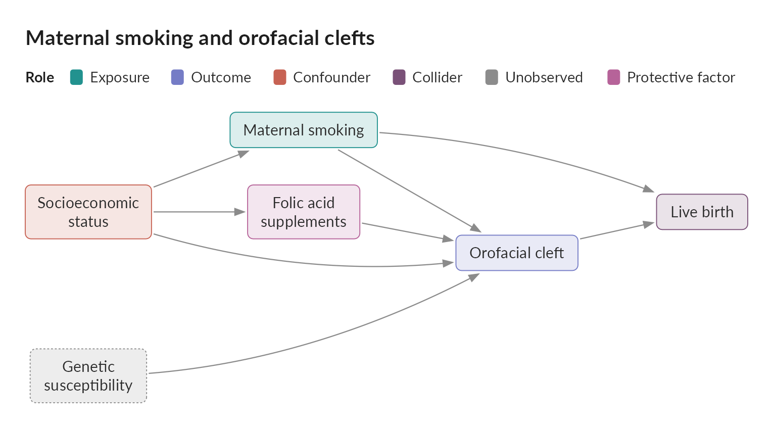
GitHub cannot run the widget, so the image above is static. The interactive version is on the package website.
Nodes are colored by role, with fixed colors for exposures, outcomes, confounders, mediators, colliders, instruments and unobserved variables. The layout is layered so that every arrow points the same way, and an arrow that skips a layer bends around the boxes in between; x and y columns place the boxes by hand instead. Any other column in either data frame appears as a labeled field. The widget embeds a web copy of Lato and works in R Markdown, Quarto, ‘pkgdown’ and ‘shiny’.
With paths = TRUE, the diagram shows which paths between the exposure and the outcome are open or blocked: click a variable to adjust for it, and a panel under the diagram says whether the set is sufficient by the backdoor criterion, why each path is open or blocked, and which minimal sets would be.
ggcausal(cleft_dag$edges, cleft_dag$nodes, paths = TRUE, adjust = "ses")Interactive network plots
ggnma() draws the network of a network meta-analysis from arm level data, one row per study arm. Nodes are treatments and lines join treatments compared directly in at least one study; node area follows the number of participants, line width the number of studies, and a shaded polygon joins the treatments of each multi-arm study. Hovering over a node, line or polygon shows its arms side by side, in the manner of a trial’s baseline table, with the columns chosen in hover; clicking opens the full table with every other column of the data as a row.
net <- ggnma(psoriasis_nma, study, treatment, n = n, group = class,
             legend_title = "Class")
net                              # interactive widget
graph_save(net, "network.html")  # a single file for a supplement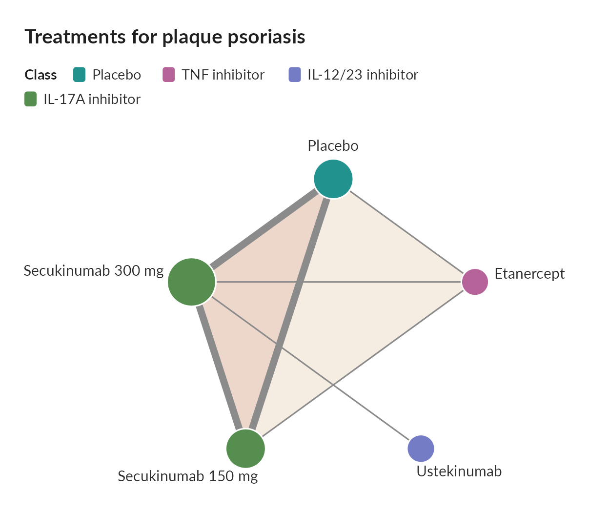
The interactive version is on the package website. Nodes sit on a circle or wherever positions places them. Rows of the arm tables are named from each column’s label attribute, text that is the same across a study, such as a reference, is listed once per study, and DOIs and URLs are linked.
With contributions, a netmeta fit on the same network, the widget gains a menu of comparisons; picking one widens each line by the share of that network estimate flowing through it.
Interactive forest plots
ggmeta() draws the forest plot of a fitted meta-analysis, a metafor rma() fit or a meta object. Hovering over a study shows its effect, weight and chosen columns, and clicking it opens every column of its record. Risk of bias judgments, from RoB 2, RoB 1 or ROBINS-I, are drawn as traffic lights beside each study.
ggmeta(fit,
       columns = c("P2Y12 inhibitor" = "p2y12", Aspirin = "aspirin"),
       rob = c(R = "rob.R", D = "rob.D", Mi = "rob.Mi", Me = "rob.Me",
               S = "rob.S", Overall = "rob.overall"),
       favors = c("Favors P2Y12 inhibitor", "Favors aspirin"))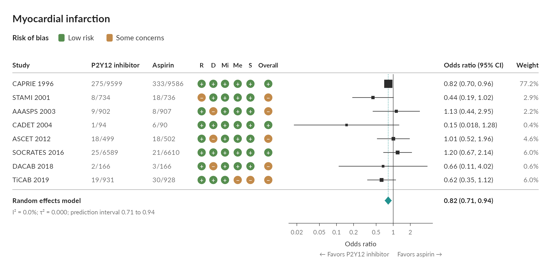
cumulative = TRUE shows the pooled estimate after each study, and animate_meta() replays it as a GIF or MP4, each trial fading in as the pooled diamond eases to its new value:
League tables
ggleague() draws every estimate of a netmeta fit as a grid, network estimates below the diagonal and direct estimates above it, following netmeta::netleague(), with a P-score ranking beside it. Hovering over a cell shows the network, direct and indirect estimates and the share that comes from direct trials; clicking it opens the direct trials arm by arm.
ggleague(nma, psoriasis_nma, study, treatment, small_values = "undesirable")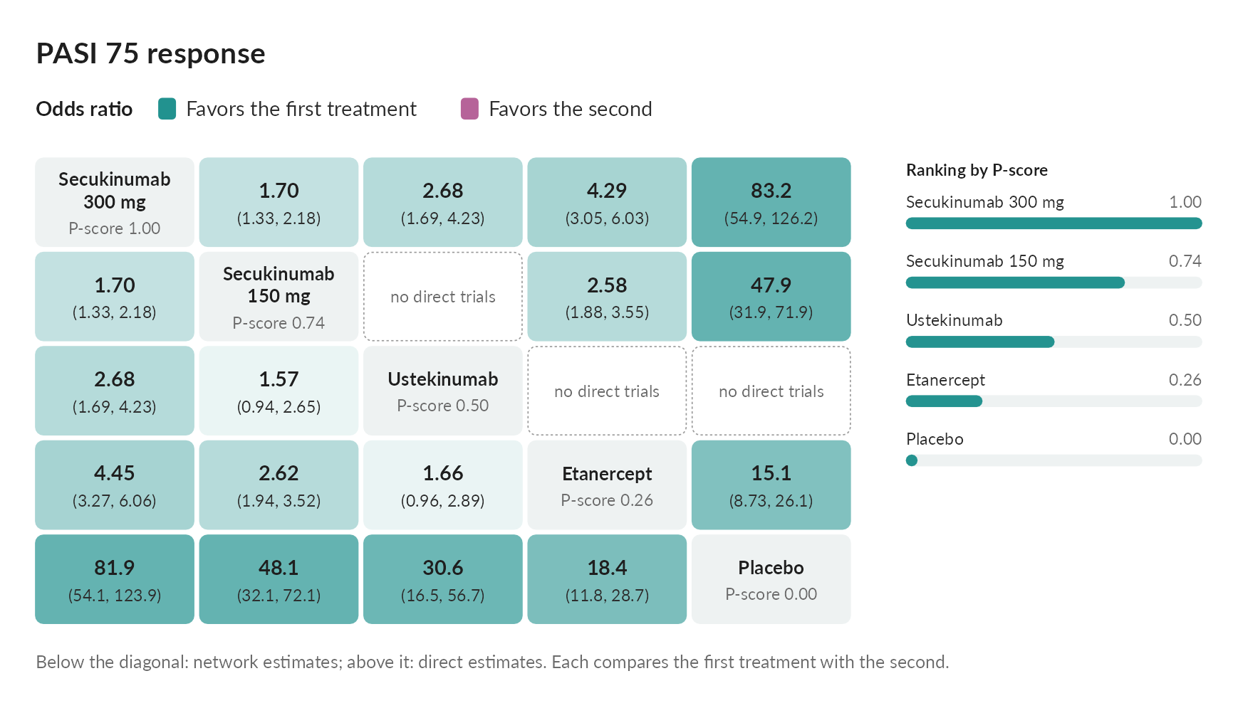
contributions = TRUE adds where each network estimate comes from, by netmeta::netcontrib(): hovering over an estimate outlines the direct comparisons it draws on, with their shares.
Confidence in a network meta-analysis
Five plots follow CINeMA (Nikolakopoulou et al. 2020; Papakonstantinou et al. 2020) in judging how far each estimate of a network meta-analysis can be trusted. cinema_judge() applies its published rules to every comparison in six domains, within-study bias, reporting bias, indirectness, imprecision, heterogeneity and incoherence, with each reason in words and whether a rule computed it or you gave it; judgments made elsewhere, such as the CINeMA web application’s report, can be given instead.
j <- cinema_judge(nma, rob = rob, indirectness = indirectness,
                  reporting = data.frame(judgment = "undetected"),
                  threshold = 1.25, small_values = "undesirable")
cinema_league(j)        # six marks per estimate, never added into a score
cinema_contribution(j)  # which studies each estimate rests on
cinema_clinical(j)      # estimates against a movable range of little difference
cinema_incoherence(j)   # direct, indirect and network estimates side by side
cinema_network(psoriasis_nma, study, treatment, n = n, rob = rob)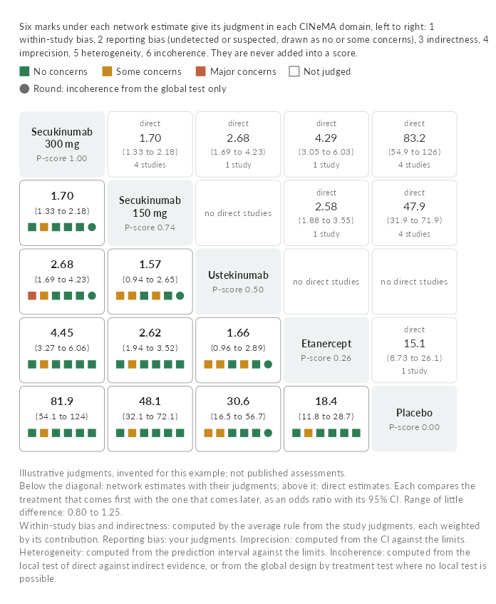
The study judgments in the example are illustrative, not published assessments.
Funnel plots
ggfunnel() draws the funnel plot of a metafor or meta fit, shaded where a study would be significant against no effect, so a gap where studies would not be significant points to publication bias rather than heterogeneity. Hovering over a study shows its effect, weight and risk of bias; clicking it gives the pooled estimate without it. With trim_fill = TRUE the imputed studies and the adjusted estimate are added behind a switch, and a collapsed section under the plot gives Egger’s and Begg’s tests.
Kaplan-Meier plots
ggkm() draws Kaplan-Meier curves by group from a Surv(time, status) ~ group formula. Hovering anywhere along the time axis shows each group’s survival with its confidence interval, the number at risk and the events so far, and the hazard ratio against the reference group at that time, from the smoothed Schoenfeld residuals or a time interaction model, while the matching column of the risk table lights up. With ph_tests = TRUE, a collapsed section under the plot gives the Cox hazard ratios, the log-rank test, the Grambsch and Therneau test and the group by time and group by log time interactions.
ggkm(Surv(years, status) ~ arm, data = colon, ph_tests = TRUE,
     xlab = "Years since randomization")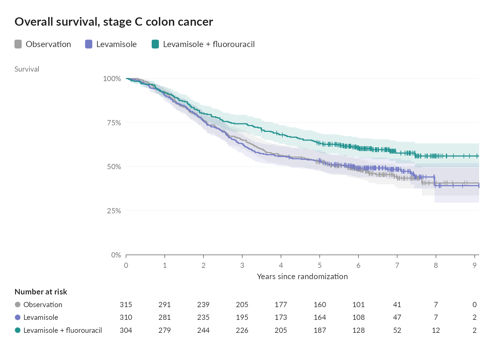
rmst = 5 adds the restricted mean survival time up to five years, with each arm’s mean and its difference from the reference, and a slider that moves the horizon while the prespecified one stays marked.
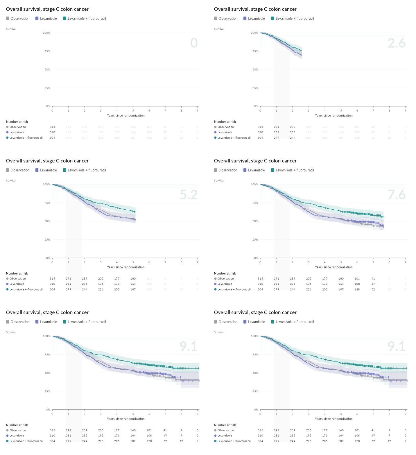
animate_km() draws the curves over follow-up as a GIF or MP4:
Swimmer plots
ggswimmer() gives every patient a lane: the time on treatment or on study, with responses, progression, relapse and death marked along it and an arrow for patients still ongoing. Hovering over a lane shows the patient’s record and fades the rest, clicking it lists their events in order, and buttons under the plot reorder the lanes by duration, arm or best response.
ggswimmer(aml, id, futime / 30.44, events = events, group = arm,
          ongoing = death == 0, ongoing_label = "Alive at last follow-up",
          xlab = "Months since randomization")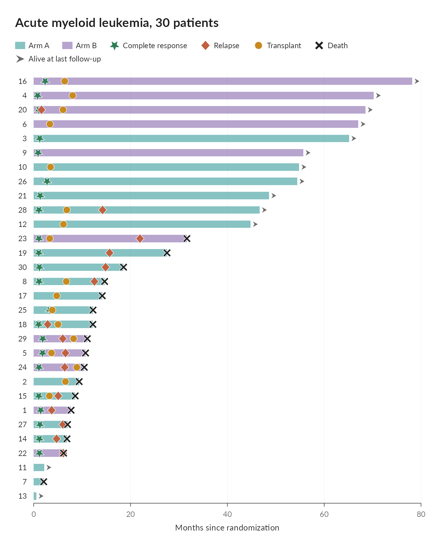
waterfall adds each patient’s best change from baseline beside their lane, and trajectories their change over time under the lanes, with the response and progression thresholds marked; hovering over a patient in any panel lights them in all three.
Responder thresholds
ggresponder() draws, for two arms, the share of patients who improved by at least each amount, with the prespecified threshold marked, beside the difference in responders at every threshold, and a table of responders, their difference, the number needed to treat and the mean difference. A slider moves the threshold.
ggresponder(change ~ arm, pain, threshold = 2, higher_is_better = FALSE)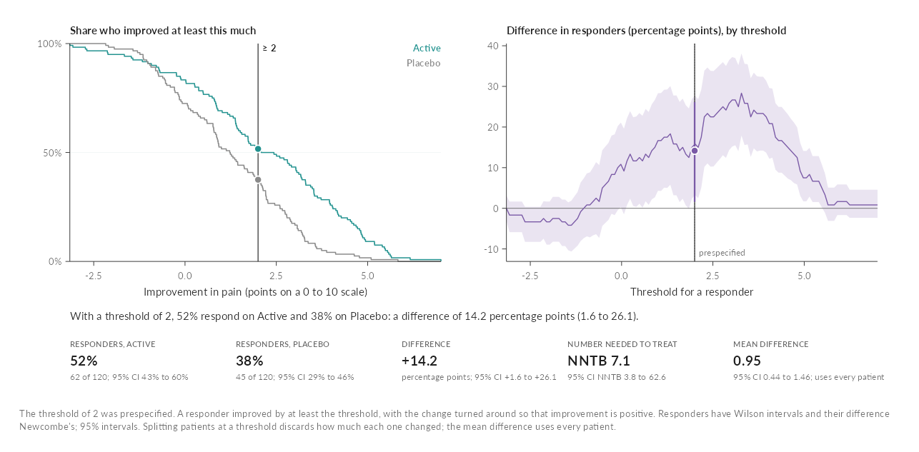
Diagnostic thresholds
ggdiagnostic() shows what a cutoff on a continuous test means: the marker’s distributions, the ROC curve and the predictive values across prevalence, above a grid of 1,000 people found, missed, falsely alarmed or cleared, and a table of every measure with its interval. Drag the cutoff, or set the prevalence of the population the test is for.
pima <- rbind(MASS::Pima.tr, MASS::Pima.te)
ggdiagnostic(type ~ glu, pima, cutoff = 126, prevalence = 0.1,
             labels = c("No diabetes", "Diabetes"))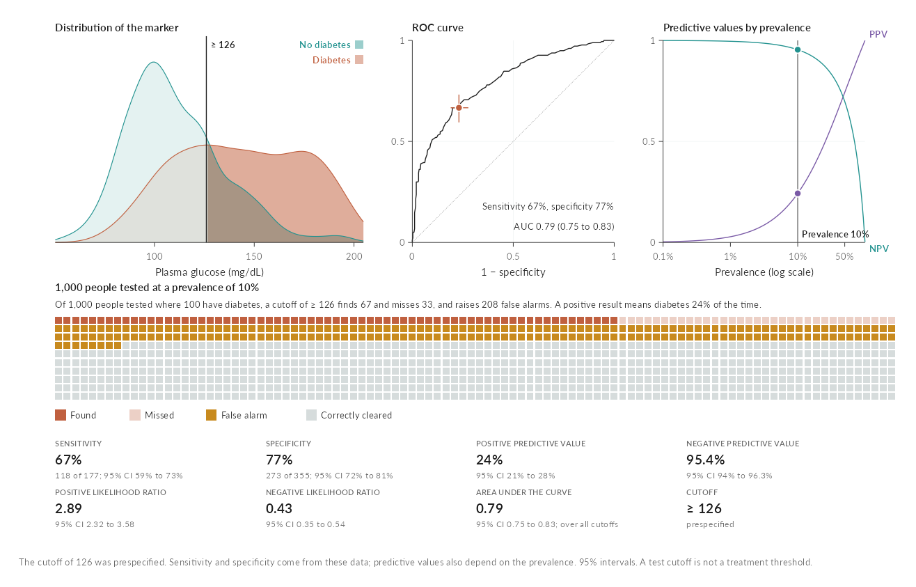
Bias and tipping points
ggsensitivity() shades every pair of strengths an unmeasured confounder could have by what would survive it, marks the E-values for the estimate and its confidence limit, and compares measured covariates as benchmarks. Click the surface to choose a confounder.
ggsensitivity(1.8, 1.4, 2.31, important = 1.25,
              benchmarks = data.frame(label = c("Age", "Smoking"),
                                      exposure = c(1.6, 2.3), outcome = c(1.9, 1.5)))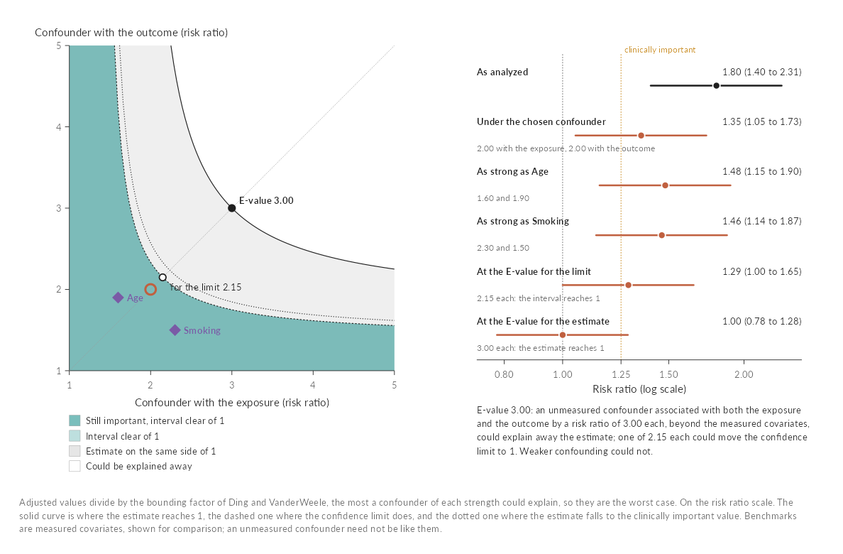
A multiverse of analyses
ggmultiverse() draws every analysis of one question, one row of the data each, as a specification curve above a grid of the choices behind it, with the median estimate for each choice. Drag across the curve, or click a choice, to see what the analyses in view share.
ggmultiverse(specs, or, lo, hi,
             decisions = c("outcome", "adjustment", "model", "missing", "sample"),
             primary = outcome == "Primary definition" & adjustment == "Standard",
             ylab = "Odds ratio")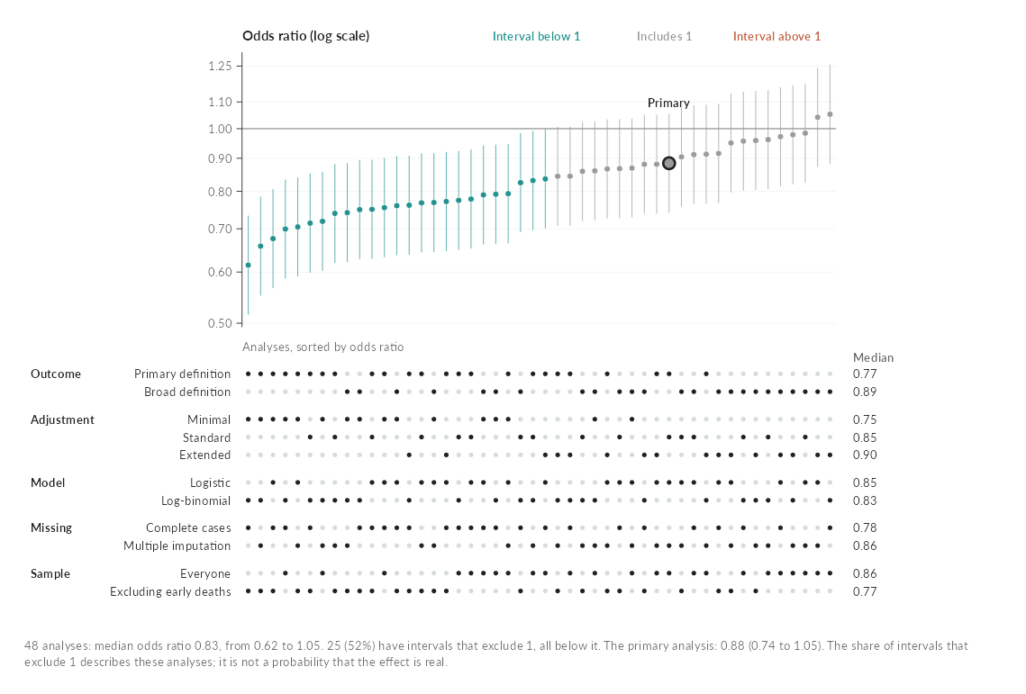
Nomograms
ggnomogram() draws the nomogram of a fitted model and gives every predictor a handle: drag it, click a category or use the arrow keys, and the points, the total and the prediction with its 95% confidence interval follow. It reads linear, generalized linear, mixed (lme4, nlme, glmmTMB), Cox, parametric survival, ordinal and multinomial models, and models from rms and mgcv. Splines, polynomials and interactions work, because the points come from the model’s design matrix, and every class is checked against its own predict().
fit <- glm(low ~ splines::ns(age, 3) + lwt + race + smoke * ht,
           family = binomial, data = bw)
ggnomogram(fit, outcome = "Risk of low birth weight")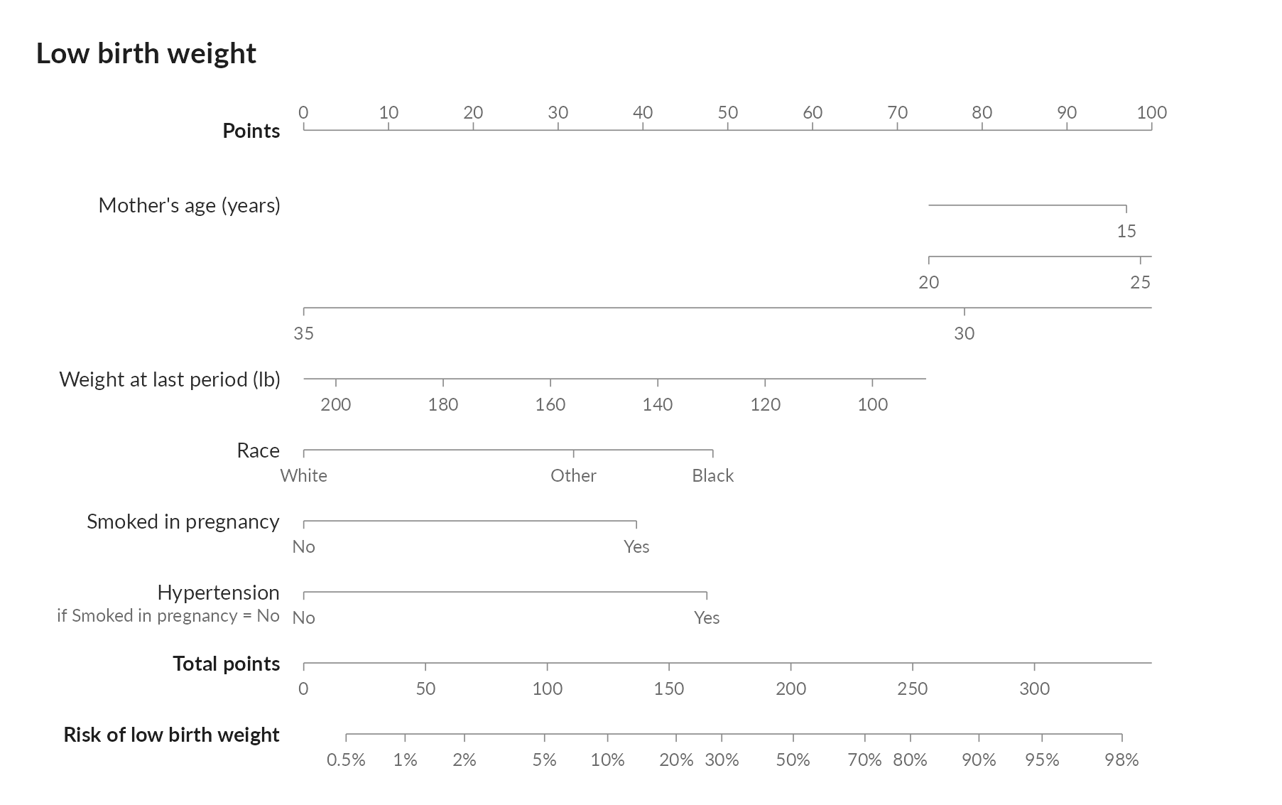
Choropleth maps
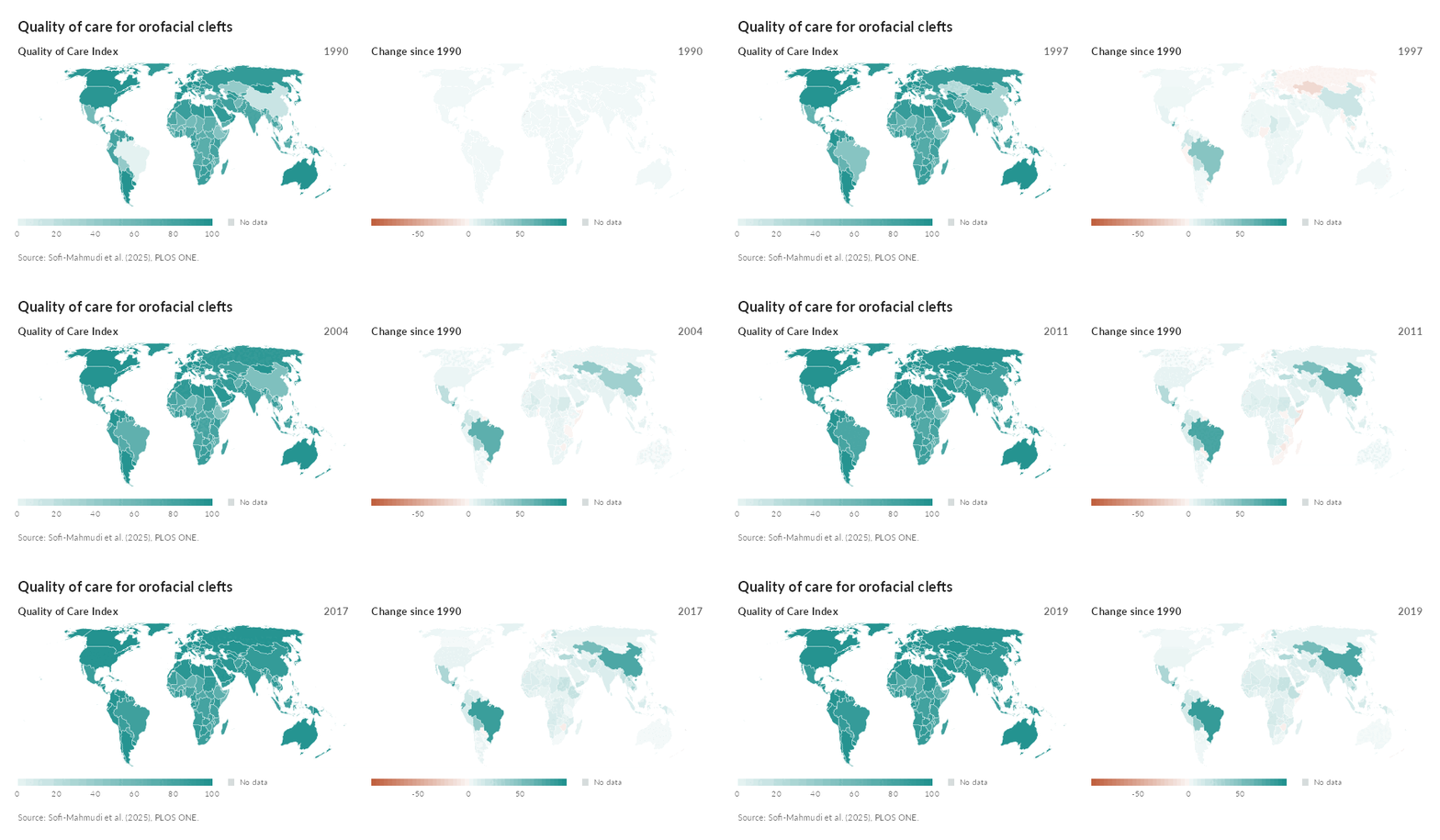
ggchoropleth() colors every country by a measure, one map per measure side by side, with a slider and a play button under them that step through the years. All the maps show the same year: hovering over a country outlines it on every map and lists its value and rank on each measure, and clicking it opens its whole series. Countries match by ISO code or by name, including the forms the WHO and the Global Burden of Disease study use, and any ‘sf’ map of polygons can replace the bundled world map.
qci <- clefts_qci_world
first <- qci$qci[qci$year == 1990][match(qci$iso3, qci$iso3[qci$year == 1990])]
qci$change <- qci$qci - first

ggchoropleth(qci, iso3, year,
             values = c("Quality of Care Index" = "qci",
                        "Change since 1990" = "change"),
             title = "Quality of care for orofacial clefts")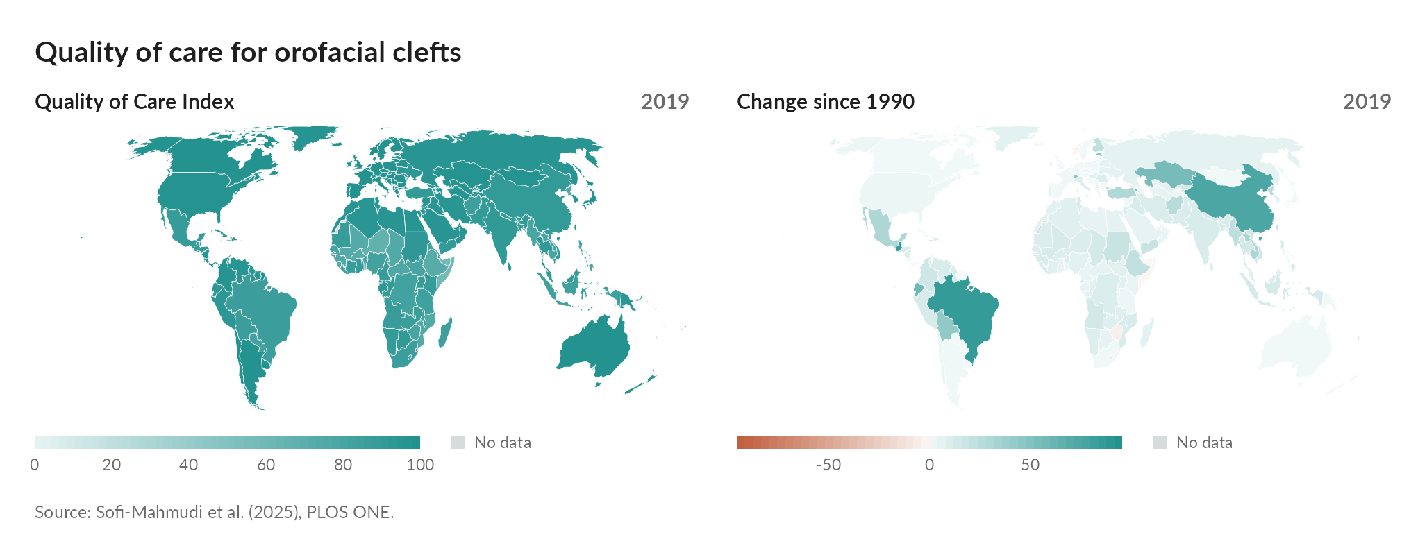
animate_choropleth() plays the years as a GIF or MP4:
Dark pages
Every interactive graph follows the page it sits on. On a dark ‘pkgdown’ or ‘bslib’ page, a dark Quarto theme or a saved page viewed in dark mode, the background, text, lines and neutral fills take dark counterparts, colors that carry meaning keep their hue, and the hover cards and panels follow, even when the page switches theme while it is open. graph_widget(x, theme = "dark") fixes the theme, and graph_save(x, "plot.png", theme = "dark") writes a dark static copy.
Bundled data
clefts_qci gives the Quality of Care Index for orofacial clefts in fifteen countries from 1990 to 2019. The index is a composite of four secondary indices derived from Global Burden of Disease estimates, summarized by principal component analysis and rescaled from 0 to 100.
Sofi-Mahmudi A, Shamsoddin E, Khademioore S, Khazaei Y, Vahdati A, Tovani-Palone MR (2025). Global, regional, and national survey on burden and Quality of Care Index (QCI) of orofacial clefts: Global burden of disease systematic analysis 1990-2019. PLOS ONE 20(1): e0317267. https://doi.org/10.1371/journal.pone.0317267
clefts_qci_world holds the full country panel of the same analysis: 195 countries and territories, named as the Global Burden of Disease study names them and with their ISO 3166-1 alpha-3 codes.
psoriasis_nma gives arm level baseline characteristics and PASI 75 response for five randomized trials in plaque psoriasis (CLEAR, ERASURE, FEATURE, FIXTURE and JUNCTURE), as compiled by Phillippo (2019) and distributed with the ‘multinma’ package. They were analyzed in Phillippo et al. (2020), Journal of the Royal Statistical Society Series A 183(3): 1189-1210, https://doi.org/10.1111/rssa.12579.
cleft_dag is a small illustrative causal diagram for maternal smoking and orofacial clefts. Its rationales were written for the package as a teaching example, and every reference it cites was checked against PubMed.
License
MIT. The package bundles the Lato typeface, and a web subset of it for the interactive graphs, under the SIL Open Font License (inst/fonts/OFL.txt), and country flag artwork from the flag-icons project under the MIT License, with two exceptions noted in inst/extdata/flags/SOURCE.txt. The world map is simplified from Natural Earth’s 1:50m countries, which are in the public domain.