Produces a `ggplot` of either the prevalence of each indicator (a bar chart) or the prevalence over time (a line chart). Requires the `ggplot2` package.
Usage
rt_plot(
  x,
  type = c("prevalence", "trend"),
  indicators = NULL,
  by = NULL,
  year = NULL,
  adjusted = FALSE,
  accuracy = NULL,
  conf_level = 0.95
)
Arguments
- x
Either a data frame with one row per article (it is summarized with [rt_summary()]) or an existing [rt_summary()] result.
- type
`"prevalence"` for a bar chart of each indicator's prevalence (the default), or `"trend"` for prevalence over time (requires `year`).
- indicators, by
Passed to [rt_summary()] when `x` is article-level data. `by` adds facets to the `"prevalence"` plot.
- year
For `type = "trend"`, the name of the column in `x` holding the (numeric) publication year.
- adjusted
If `TRUE`, plot the sensitivity/specificity-corrected prevalence instead of the apparent prevalence. Defaults to `FALSE`.
- accuracy, conf_level
Passed to [rt_summary()].
Examples
data(rt_demo)
# \donttest{
if (requireNamespace("ggplot2", quietly = TRUE)) {
rt_plot(rt_demo) # prevalence bar chart
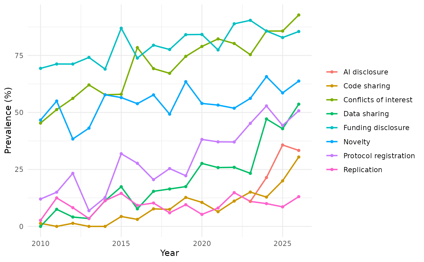
rt_plot(rt_demo, type = "trend", year = "year")
}
#> Warning: Removed 13 rows containing missing values or values outside the scale range
#> (`geom_line()`).
#> Warning: Removed 13 rows containing missing values or values outside the scale range
#> (`geom_point()`).
 # }
# }