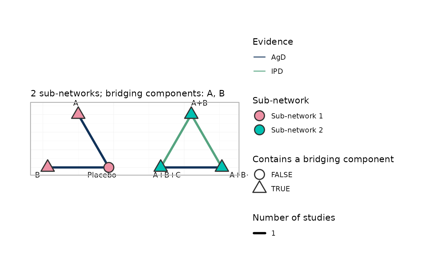
Draws the treatment network with the disconnection made explicit: nodes are colored by sub-network, edges are colored by whether the study carries individual patient data (IPD) or aggregate data (AgD) only, and the components that bridge the sub-networks are named in the subtitle. Treatments that contain a bridging component are outlined, because those are the nodes through which the additive component model reconnects the network.
Usage
# S3 method for class 'cpaic_network'
plot(x, ..., weight_edges = TRUE, show_bridges = TRUE, nudge = 0.25)
Arguments
- x
A
cpaic_network()object.- ...
Unused.
- weight_edges
Scale edge width by the number of studies contributing to a comparison? Default
TRUE.- show_bridges
Outline treatments that contain a bridging component, and name the bridging components in the subtitle? Default
TRUE.- nudge
Distance by which treatment labels are pushed away from their node. Default
0.25.
Details
Each sub-network is laid out on its own circle, so a disconnected network
looks disconnected. Ported in spirit from multinma's plot.nma_data()
(Phillippo et al. 2020), re-implemented on ggplot2 without a ggraph
dependency.
Examples
net <- cpaic_network(cpaic_bin_agd, ipd = cpaic_bin_ipd, sm = "OR",
                     family = "binomial", ipd_covariates = "x1",
                     inactive = "Placebo")
plot(net)